The Art Of Mixing Bold Patterns Without Overwhelming A Room
Ever walked into a room and just felt… energized? Maybe it wasn’t the lighting or the furniture layout, but the patterns grabbing your attention. Mixing patterns can be a game-changer, but let’s be real – it’s a tightrope walk. One wrong step and BAM! – visual chaos. So, how do you nail this balance, turning your space into a vibrant, stylish haven instead of a dizzying funhouse? Let’s figure this out together, shall we?
Understanding the Basics of Pattern Mixing
Let’s get real: pattern mixing isn’t just throwing a bunch of designs together and hoping for the best. There’s some method to this madness, and it starts with grasping the fundamental principles. Think of it like being a DJ – you’re blending different tracks, but they gotta harmonize, right?
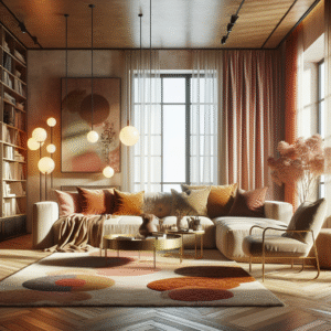
First off, scale matters. You can’t have everything shouting at you. Imagine tiny polka dots next to gigantic floral prints; one will overpower the other. Varying the size of your patterns—small, medium, and large—creates visual interest and balance. It keeps the eye moving and prevents things from feeling static.
Next up, color palettes. This is where the real magic happens. Sticking to a consistent color theme helps tie everything together, even if the patterns themselves are wildly different. Now, I know what you might be thinking: “But isn’t that boring?” Not necessarily! You could have a primary color with a couple of complementary accents. Think navy blue with mustard yellow and a dash of coral. The key is cohesion; colors should talk to each other.
Lastly, texture adds another layer of interest. Different textures can make patterns pop even more. For example, a velvet cushion with a geometric print against a linen sofa with subtle stripes creates a dynamic interplay. You’re not just looking at patterns; you’re feeling them too. It’s like adding instruments to your band; each brings something unique to the stage.
Choosing Your Base Pattern
Think of your base pattern as the lead singer of your décor band. It’s the one that sets the tone and dictates the overall vibe. Picking the right one is crucial. No pressure, though!
Large-scale prints are often excellent choices for a base pattern, especially in rooms where you want to make a statement. Think dramatic floral wallpaper, a bold geometric rug, or even a vibrant, patterned sofa. These larger patterns command attention and provide a foundation upon which you can layer other elements.
When selecting your base pattern, consider the room’s existing features. Does the room have architectural details like wainscoting or crown molding? You might want a pattern that complements these elements rather than clashes with them. What about the natural light? A darker, more intense pattern might work well in a bright, sunny room, while lighter, airier patterns can brighten up a dimly lit space.
Also, consider the mood you’re trying to create. A playful, whimsical pattern might be perfect for a kid’s room or a casual living space. On the other hand, a more sophisticated, geometric pattern might suit a formal dining room or a home office. It’s all about aligning the pattern with the function and feel of the room.
And don’t be afraid to experiment! Grab some swatches, hold them up in your space, and see how they feel. Trust your gut – if a pattern makes you smile, it’s probably a good contender for your base. Sometimes the most unexpected choices turn out to be the most stunning.
Layering Additional Patterns: What Goes With What?
Now that you’ve got your lead singer, it’s time to bring in the backup vocals. Layering additional patterns can feel daunting, but it’s where you really get to flex your creative muscles. The goal is to create a harmonious ensemble, not a chaotic cacophony. So how do you do it?
First, consider the scale. If your base pattern is large, you’ll want to introduce smaller-scale patterns to complement it. Think of it as creating a visual hierarchy. Small geometric prints like herringbone or micro-dots can provide a subtle contrast without competing for attention.
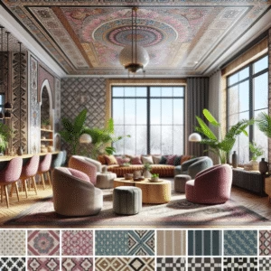
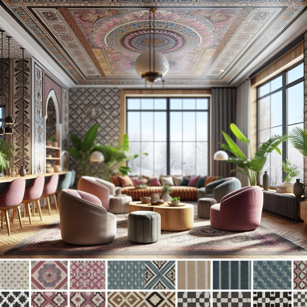
Next, think about the pattern types. Mixing different types of patterns – geometric, floral, and abstract – can add depth and interest. The trick is to find common threads that tie them together. This could be a shared color, a similar line quality, or a complementary theme.
Stripes and florals are a classic combination. The structured linearity of stripes provides a grounding contrast to the organic fluidity of florals. Just make sure the scales are different. A wide stripe paired with a small floral works beautifully, while a skinny stripe might get lost next to a large, bold floral.
Geometric patterns can play well with almost anything. Their inherent structure makes them versatile and easy to incorporate into a variety of schemes. Try pairing a bold geometric rug with softer, more organic patterns on your cushions or throws. The contrast creates a balanced, visually appealing look.
Don’t forget about texture! A heavily textured fabric with a subtle pattern can add depth without overwhelming the space. Think of a chunky knitted throw with a simple stripe or a velvet cushion with a muted geometric design. These tactile elements add another layer of interest, making the space feel richer and more inviting.
Ultimately, mixing patterns is about creating a sense of balance and harmony. It’s about finding patterns that speak to each other without shouting. And the best way to achieve this is to experiment. Grab some swatches, play around with different combinations, and see what feels right. Trust your intuition – if it looks good to you, chances are it will look good in your space.
Color Considerations for a Cohesive Look
Okay, so you’ve got your patterns picked out. Now, how do you make sure they all play nicely together? Color, my friend, is the secret sauce. It’s the glue that binds everything together, ensuring your patterns sing in harmony rather than clash like cymbals in a garbage disposal.
First up, the color palette. Before you even start mixing patterns, establish a clear color scheme. It doesn’t have to be overly strict, but having a defined range of colors will help you make cohesive choices. Think about the overall mood you want to create. Do you want a calming, serene space? Stick to muted tones and subtle variations. Or are you aiming for something bold and vibrant? Embrace saturated hues and playful combinations.
Monochromatic schemes can be surprisingly effective. Using different shades and tints of the same color can create a sense of depth and sophistication. Imagine a room decorated in varying shades of blue, from deep navy to pale sky. You can introduce patterns in different scales and textures, all within the same color family. It’s a subtle way to add interest without overwhelming the space.
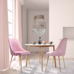
Complementary colors – hues that sit opposite each other on the color wheel – can create a vibrant, dynamic look. Think blue and orange, red and green, or yellow and purple. These combinations create a strong contrast, so use them thoughtfully. Consider using one color as the dominant hue and the other as an accent. This prevents the space from feeling too jarring.
Analogous colors – those that sit next to each other on the color wheel – offer a more harmonious, subtle contrast. Think blues and greens, yellows and oranges, or reds and purples. These combinations create a sense of flow, making the space feel cohesive and inviting.
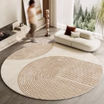
Neutrals are your best friends. When in doubt, a neutral backdrop can help ground even the wildest pattern combinations. Think beige, gray, ivory, or even black. These colors provide a calming canvas that allows your patterns to shine without clashing.
And don’t forget about accents! Small pops of contrasting color can add a touch of whimsy and personality. Think of bright yellow cushions on a navy blue sofa or a vibrant coral throw on a neutral bed. These little splashes of color can bring the whole space to life.
Ultimately, color is your guide. Trust your instincts, experiment with different combinations, and see what resonates with you. The goal is to create a space that feels balanced, harmonious, and – most importantly – reflects your personal style.
Scale and Proportion: Creating Visual Harmony
Alright, let’s talk about scale—the unsung hero of pattern mixing. It’s not enough to just pick pretty patterns; you’ve got to ensure they’re the right size, otherwise, you risk turning your room into a visual shouting match. Think of it like this: you wouldn’t invite a giant to a dollhouse, would you?
First off, variety is your friend. Mixing patterns of different scales creates visual interest and prevents things from feeling monotonous. The general rule is to aim for a combination of large, medium, and small-scale patterns. This creates a dynamic interplay that keeps the eye moving.
The large-scale pattern should be the dominant one. This could be a bold, oversized floral print, a wide stripe, or a large geometric design. It sets the tone and provides a focal point for the room.
Next, introduce a medium-scale pattern. This could be a smaller, more intricate floral print, a narrower stripe, or a tighter geometric design. The medium-scale pattern should complement the large-scale pattern without competing for attention. It adds depth and complexity without overwhelming the space.
Finally, add a small-scale pattern. This could be a micro-dot, a tiny geometric print, or a subtle texture. The small-scale pattern provides a subtle contrast to the larger patterns, adding a touch of finesse and detail.
Proportion is also key. The amount of each pattern you use should be proportional to its scale. For example, you might use a large area rug with a bold, large-scale pattern, but only use cushions with smaller, more intricate patterns. This creates a sense of balance and prevents any one pattern from dominating the space.
Consider the room’s size. In a smaller room, you might want to stick to smaller-scale patterns to avoid overwhelming the space. Conversely, in a larger room, you can afford to be more daring with your pattern choices. Just make sure to maintain a sense of balance and proportion.
And don’t be afraid to break the rules! These are just guidelines, after all. Sometimes the most unexpected combinations can be the most stunning. The key is to trust your instincts and experiment until you find a combination that feels right. Who knows, maybe you’ll invent the next great pattern-mixing trend!
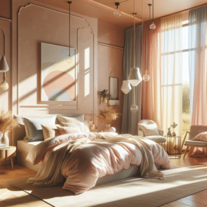
Balancing Boldness: When to Hold Back
Sometimes, less really is more. You know, there’s a fine line between a vibrant, patterned paradise and a visually overwhelming disaster. Knowing when to dial it back is just as crucial as knowing how to layer patterns effectively.
First, consider the room’s function. Is it a space for relaxation, like a bedroom or a reading nook? In these areas, you might want to err on the side of subtlety. Overly bold patterns can be stimulating and distracting, which isn’t ideal for a calming environment.
Think about the existing elements in the room. If you already have a lot of bold colors or statement furniture pieces, adding too many patterns can create a sense of visual chaos. In these cases, you might want to stick to a few carefully chosen patterns that complement the existing elements without competing for attention.
Consider the room’s size. Smaller spaces can quickly feel cluttered and overwhelming with too many patterns. In these areas, you might want to stick to smaller-scale patterns and a more limited color palette. This will help to create a sense of spaciousness and openness.
If you’re unsure, start small. Introduce patterns gradually, starting with a few key pieces like cushions or a rug. Live with them for a while and see how they feel. You can always add more patterns later if you feel the space needs it.
Use negative space to your advantage. Sometimes, the best way to balance boldness is to leave some areas of the room pattern-free. A plain white wall or a solid-colored sofa can provide a visual break, allowing the patterns to shine without overwhelming the space.
And don’t be afraid to edit. Just because you’ve incorporated a pattern into your space doesn’t mean it has to stay there forever. If you find that a particular pattern is clashing or creating a sense of unease, don’t hesitate to remove it. Sometimes, a simple edit can make all the difference.
Ultimately, knowing when to hold back is about trusting your instincts and creating a space that feels balanced, harmonious, and – most importantly – comfortable. It’s about finding the sweet spot where patterns enhance the room without overpowering it.
Using Texture to Enhance Pattern Mixing
You know what can really make patterns pop? Texture. It’s the secret ingredient that adds another dimension to your design, making it not just visually appealing, but also inviting and tactile. Think of it as the bass line in a song – you might not always notice it, but it adds depth and rhythm.
First, let’s define what we mean by texture. It refers to the surface quality of a material, how it feels to the touch or how it appears to feel. Think about the difference between smooth silk and rough burlap, or the nubby texture of a woven rug versus the sleek surface of polished concrete. These are all examples of texture.
Texture can be used to enhance pattern mixing in several ways. For example, a heavily textured fabric can add depth and interest to a subtle pattern. Think of a chunky knitted throw with a simple stripe or a velvet cushion with a muted geometric design. These tactile elements add another layer of richness, making the space feel more inviting.
Texture can also be used to balance bold patterns. If you’re using a lot of vibrant, eye-catching patterns, incorporating some textured elements can help ground the space and prevent it from feeling too overwhelming. Think about pairing a bold floral wallpaper with a linen sofa or a geometric rug with a sheepskin throw. The contrasting textures add a sense of balance and harmony.
Different textures can create different moods. Smooth, sleek textures like silk and glass tend to feel more modern and sophisticated, while rough, nubby textures like burlap and wool feel more rustic and cozy. Consider the overall mood you’re trying to create when selecting your textures.
Layering different textures can add depth and complexity to your space. Think about combining smooth and rough, shiny and matte, soft and hard textures. This creates a dynamic interplay that makes the space feel more visually interesting.
And don’t be afraid to experiment! Try combining unexpected textures to create a unique and personal look. Maybe a leather cushion with a crocheted throw or a velvet sofa with a woven rug. The possibilities are endless!
Ultimately, texture is about adding depth, dimension, and interest to your space. When used thoughtfully, it can enhance pattern mixing, balance boldness, and create a space that feels both visually appealing and inviting.
Lighting’s Role in Showcasing Patterns
Ever notice how a room’s entire vibe changes with the right lighting? Turns out, it’s not just about seeing; it’s about how you see. Lighting plays an essential role in how patterns appear and interact within a space. It can make or break your meticulously planned pattern party.
First, understand the type of light you have. Natural light is your best friend during the day. It showcases patterns in their true colors and can bring out subtle details that might be missed under artificial light. Consider how natural light enters the room and position your patterns accordingly.
Artificial light, on the other hand, is more controllable but also more complex. Different types of bulbs emit different colors of light, which can affect the appearance of your patterns. Warm light (yellowish) tends to soften patterns and make them feel cozier, while cool light (bluish) can make patterns appear sharper and more vibrant. Experiment with different bulbs to see what works best for your space.
Layering your lighting can also enhance pattern mixing. Combine overhead lighting, task lighting, and accent lighting to create a dynamic and inviting atmosphere. Overhead lighting provides general illumination, while task lighting focuses on specific areas, like a reading chair or a desk. Accent lighting is used to highlight particular features, like a patterned wall or a piece of art.
Pay attention to shadows. Harsh shadows can distort patterns and make them appear uneven. Soft, diffused light, on the other hand, can enhance patterns and make them feel more cohesive. Use lampshades, dimmers, and strategic placement to control shadows and create the desired effect.
Consider the reflective properties of your patterns. Some materials, like silk and velvet, reflect light, while others, like wool and burlap, absorb light. Use this knowledge to your advantage. For example, a silk cushion with a bold pattern can add a touch of glamour to a dimly lit space, while a wool rug with a subtle pattern can ground a bright, sunny room.
And don’t forget about the time of day. The way patterns look during the day can be very different from how they look at night. Take the time to observe your patterns under different lighting conditions and adjust your lighting accordingly.
Ultimately, lighting is about creating a mood and enhancing the visual appeal of your space. When used thoughtfully, it can showcase patterns in their best light, bringing out their colors, textures, and details.
Common Mistakes to Avoid When Mixing Patterns
Alright, let’s talk about what *not* to do. We’ve covered all the fun stuff, but knowing the pitfalls can save you from a design disaster. Trust me, I’ve seen it all—patterns clashing like cymbals in a washing machine. So, let’s navigate these treacherous waters together.
First off, don’t go overboard. Too many patterns can create a sense of chaos and overwhelm the space. Stick to a limited number of patterns – typically no more than three or four – and ensure they complement each other.
Don’t ignore scale. Mixing patterns of similar scales can create a sense of monotony and make the space feel flat. Aim for a combination of large, medium, and small-scale patterns to create visual interest and depth.
Don’t forget about color. Clashing colors can ruin even the most well-intentioned pattern mixing. Stick to a defined color palette and ensure that all your patterns share at least one common color.
Don’t neglect texture. Ignoring texture can make your patterns feel flat and lifeless. Incorporate a variety of textures to add depth and interest to your space.
Don’t overcrowd small spaces. Smaller rooms can quickly feel cluttered and overwhelming with too many patterns. Stick to smaller-scale patterns and a limited color palette to create a sense of spaciousness and openness.
Don’t be afraid to break the rules, but do it thoughtfully. While it’s important to experiment and find your own personal style, it’s also important to understand the basic principles of pattern mixing. Break the rules only when you have a clear understanding of why you’re doing it.
And don’t be afraid to ask for help. If you’re feeling overwhelmed or unsure, don’t hesitate to consult a professional designer. They can provide valuable insights and guidance, helping you create a space that’s both stylish and harmonious.
Ultimately, avoiding these common mistakes is about being mindful, intentional, and trusting your instincts. Take the time to plan your pattern mixing carefully, and don’t be afraid to experiment until you find a combination that feels just right.
Bringing It All Together: Creating a Mood Board
Before you start slinging patterns around like confetti, let’s talk about a secret weapon: the mood board. It’s a visual playground where you get to test-drive your ideas without committing to anything permanent. Call it your pattern mixing laboratory!
First, gather your inspiration. This could be anything from magazine clippings and fabric swatches to paint samples and photos of rooms you love. The goal is to collect a variety of visual elements that represent the mood and style you’re trying to create.
Next, create a digital or physical board. You can use online tools like Pinterest or Canva to create a digital mood board, or you can simply gather your materials and arrange them on a large piece of cardboard. Choose whatever method works best for you.
Arrange your elements. Start by placing your base patterns on the board. Then, add in your secondary patterns, textures, and colors. Play around with different combinations until you find a layout that feels balanced and harmonious.
Consider the overall balance. Look at your mood board as a whole. Does it feel balanced and cohesive? Are there any elements that stand out or clash with the rest? Make adjustments as needed until you’re happy with the overall look.
Refine your choices. Once you’ve created a basic mood board, take some time to refine your choices. Remove any elements that don’t quite fit, and add in any missing pieces. The goal is to create a mood board that accurately reflects your vision for the space.
Test your ideas. Use your mood board to test out different pattern combinations, color palettes, and textures. See how they look together and make adjustments as needed. This is your chance to experiment and take risks without committing to anything permanent.
Finalize your plan. Once you’re happy with your mood board, use it as a guide for your actual pattern mixing. Refer to it as you select your patterns, colors, and textures, and make sure everything aligns with your overall vision.
Ultimately, creating a mood board is about visualizing your ideas and ensuring that everything works together harmoniously. It’s a valuable tool that can help you avoid costly mistakes and create a space that’s both stylish & cohesive.
Speaking of cohesion, did you know there are resources online that can help you create your own mood board? Check out Canva’s mood board creator to get started! They also have some great articles from Architectural Digest on the subject to fuel your creative fire.
FAQ: Your Pattern Mixing Questions Answered
Disclaimer
The information provided in this article is intended for general knowledge and informational purposes only, and does not constitute professional design advice. Mixing patterns in interior design is subjective and depends on personal preferences and specific room conditions. Readers should experiment cautiously and consider consulting with a professional interior designer for personalized advice tailored to their unique needs and circumstances. The author and publisher are not responsible for any decisions made based on the information in this article.
Categories
- Art Curation & Gallery (15)
- Bedding Style Trends (33)
- Bedroom Makeover (18)
- Furniture Care (20)
- Home Decor & Design Ideas (96)
- Living Room Decor (19)
- Mix & Match Techniques (19)
- Rug Sizing & Placement (19)
- Seasonal Home Decor (19)
- Wall Art & Painting Tips (18)
Recent Posts


Recent Comments
Archives
Product Gallery
-
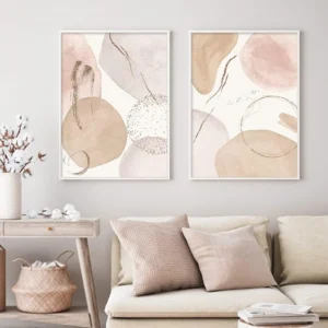 Abstract Bohemian Geometric Beige Poster Canvas Painting Wall Art Printing Picture Bedroom Living Room Home Decoration Picture
$3.82 – $22.12Price range: $3.82 through $22.12
Abstract Bohemian Geometric Beige Poster Canvas Painting Wall Art Printing Picture Bedroom Living Room Home Decoration Picture
$3.82 – $22.12Price range: $3.82 through $22.12
-
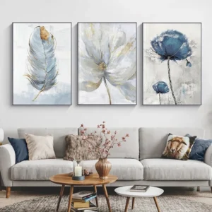 Scandinavian Flower Canvas Posters Nordic Art Wall Painting Print Abstract Flowers Feather Decoration Picture for Living Room
$5.73 – $32.74Price range: $5.73 through $32.74
Scandinavian Flower Canvas Posters Nordic Art Wall Painting Print Abstract Flowers Feather Decoration Picture for Living Room
$5.73 – $32.74Price range: $5.73 through $32.74
-
 Abstract Native Indian riding Horse Figure Painting Canvas Posters and Prints Cuadros Art Wall Picture vintage room decor
$3.80 – $26.44Price range: $3.80 through $26.44
Abstract Native Indian riding Horse Figure Painting Canvas Posters and Prints Cuadros Art Wall Picture vintage room decor
$3.80 – $26.44Price range: $3.80 through $26.44