Unleash Your Home’s Secret Power: How Color Psychology Transforms Your Space
Ever walked into a room and felt an instant shift in your mood? Maybe a serene calm washed over you in a spa-like bathroom, or a burst of creativity sparked in a vibrant office. It wasn’t magic; it was likely the silent, powerful influence of color psychology transforming your space. Our homes are more than just four walls and a roof; they’re canvases reflecting our lives, aspirations, and emotions. Yet, many of us overlook one of the most potent tools in our design arsenal: color.
Think about it. The hues surrounding you, from the paint on your walls to the throw pillows on your sofa, transmit powerful subconscious messages to your brain. These messages can energize or calm you, inspire focus or encourage relaxation, even subtly influence your relationships and overall well-being. Ignoring this profound connection means missing out on an incredible opportunity to optimize your living environment. You might be inadvertently creating a space that drains your energy or dampens your spirits without even realizing it. We’re here to change that.
This comprehensive guide dives deep into the fascinating world of color psychology and its incredible impact on your home. We’ll peel back the layers, revealing how specific shades and tones evoke particular emotional and psychological responses. You’ll learn to identify the underlying energies of different colors and how to harness them intentionally. Forget fleeting trends; this is about understanding the timeless principles that allow you to craft spaces that genuinely elevate your daily life. Prepare to unlock a secret language that your home has been speaking all along.
By the end of this article, you won’t just understand color theory; you’ll have a practical, actionable toolkit to consciously choose colors that align with your desired mood, activity, and personal goals for every room. We’ll explore the science, the applications, and the nuanced combinations that truly make a difference. From vibrant living rooms to tranquil bedrooms, productive home offices to welcoming kitchens, get ready to unleash your home’s secret power and create environments that don’t just look good, but actively make you feel good, too. Are you ready to see your home in a whole new spectrum?
Understanding the Core of Color Psychology: Beyond Just Aesthetics
What Exactly is Color Psychology? The Science & History
Let’s kick things off by defining what we mean when we talk about color psychology. It’s not just a fancy term for picking pretty shades; it’s the study of how colors affect human behavior, mood, or thought processes. This field explores the emotional and physiological responses individuals have to different colors. Its roots stretch back centuries, with ancient civilizations like the Egyptians and Chinese practicing chromotherapy (color therapy), believing colors had healing properties. Think of the use of blue to soothe or red to stimulate. While modern science has brought more empirical data, the fundamental observations remain compelling.
Today, psychological research, marketing studies, and interior design principles all converge to give us a clearer picture. Scientists have explored how light waves, perceived as colors by our eyes, trigger distinct neurological pathways. For example, red light can increase heart rate and adrenaline production, while blue light can induce a sense of calm. These aren’t just cultural associations; there’s a biological component to our responses. We’re talking about more than personal preference; we’re delving into universal human reactions modulated by individual experiences and cultural contexts. Understanding this foundational layer is key to truly transforming your space.
Why Your Home Needs Color Psychology: More Than Just Pretty Walls
Perhaps you’re thinking, “It’s just paint, right?” Wrong. Your home is a sanctuary, a workspace, a gathering hub, and a place of rest. Each area serves a different purpose, and the colors within those spaces exert a powerful, often subconscious, influence on how those purposes are fulfilled. Imagine trying to relax in a vivid red bedroom or focus in a neon yellow study. It feels off, doesn’t it? That’s because the colors are working against the intended function of the room.
By intentionally applying principles of color psychology, you move beyond merely decorating to actively engineering your environment for success and well-being. We’re talking about:
- Boosting Mood & Energy: Waking up in a refreshing bedroom, feeling energized in your kitchen.
- Increasing Productivity & Focus: Creating an office space free from visual distractions, promoting concentration.
- Enhancing Relaxation & Comfort: Designing living areas that invite unwinding, reducing stress and anxiety.
- Improving Social Interaction: Crafting dining rooms that encourage lively conversation and connection.
- Reflecting Personal Identity: Ensuring your home truly feels like “you,” a genuine extension of your personality.
This isn’t about rigid rules, but about informed choices. When you understand the power of color, you gain a significant advantage in shaping your daily experiences within your own four walls. It allows you to transform your house from a functional dwelling into a dynamic, supportive, and emotionally resonant haven.
The Spectrum of Emotions: Deconstructing Individual Colors and Their Impact
Red: The Powerhouse of Passion, Energy, and Boldness
When you think of the color red, what comes to mind? Love, danger, energy, excitement, warmth. Red is undoubtedly a powerhouse color, commanding attention and stirring strong emotions. It’s physiologically stimulating, known to increase heart rate, blood pressure, and even appetite. This makes it a fantastic choice for spaces where you want to evoke vitality and passion, but it requires careful application.
Using Red in Your Home:
- Dining Room & Kitchen: Red can stimulate conversation and appetite, making it excellent for entertaining spaces. A deep cranberry or rust red accent wall in a dining room can create a vibrant, cozy atmosphere. In a kitchen, pops of red in appliances or accessories add energy without overwhelming.
- Entryways: A bold red front door or an accent wall in an entryway creates a memorable first impression, signaling warmth and dynamism.
- Exercise Areas: Small doses of red can provide motivation and energy to workout spaces.
- Avoid in Bedrooms & Studies: Generally, avoid extensive use of red in bedrooms, as its stimulating nature can interfere with relaxation and sleep. Similarly, in focus-driven areas like home offices, it might be too distracting or agitating.
Pro Tip: If you love red but fear its intensity, use it as an accent. Think cushions, artwork, a single piece of furniture, or even a floral arrangement. Combining it with neutrals like cream or charcoal can temper its boldness beautifully.

Orange: The Warm Embrace of Creativity, Enthusiasm, and Joy
Orange is often described as the friendly, extroverted sibling of red. It combines red’s energy with yellow’s happiness, resulting in a color that radiates warmth, enthusiasm, and creativity. Orange is less aggressive than red but still incredibly stimulating, fostering feelings of joy, optimism, and even appetite. It’s an inviting and communicative color known to inspire social interaction and creative thought.
Implementing Orange in Interiors:
- Living Rooms & Family Rooms: A great choice for communal areas where you want to encourage conversation and a welcoming atmosphere. Terracotta, burnt orange, or a muted peach can evoke warmth and comfort.
- Playrooms & Creative Studios: Its association with creativity and excitement makes it ideal for spaces where imagination flourishes.
- Kids’ Rooms: Can be fun and uplifting, but use in moderation to avoid overstimulation.
- Dining Areas: Similar to red, orange can enhance a joyful dining experience.
Design Consideration: Brighter oranges can be intense, so consider softer shades like apricot, peach, or rust for larger areas. Pair orange with blues (its complementary color) for a vibrant contrast, or with greens and creams for a more earthy, natural feel.

Yellow: The Sunshine of Happiness, Optimism, and Intellect
Yellow is pure sunshine; it’s the color most universally associated with happiness, optimism, and cheerfulness. Visually, it’s the easiest color to spot, radiating warmth and energy. Beyond mood, yellow also stimulates mental activity, linking it to intellect and concentration. However, like all powerful colors, bright yellow in large doses can be overwhelming or even induce anxiety, particularly in babies. The key is in the shade and application.
Decorating with Yellow:
- Kitchens & Breakfast Nooks: A fantastic choice to inject a feeling of warmth, energy, and cheerfulness, making mornings brighter.
- Home Offices & Studies: Pale yellows can stimulate mental focus and creativity without being too distracting. Think soft lemon or butter yellow.
- Entryways: A welcoming yellow can instantly uplift spirits upon entering your home.
- Living Rooms: Incorporate yellow through accessories, artwork, or a feature chair to add a joyful pop without committing to a full wall.
Shade Matters: Opt for softer, muted yellows for larger surfaces. Bright, aggressive yellows are better suited for accents. Pair yellow with grays for a sophisticated look, or with blues for a fresh, classic combination. Gold tones offer a luxurious take on yellow.

Green: The Harmony of Nature, Balance, and Renewal
Green is the color of nature, growth, and renewal. It frequently signifies balance, harmony, and stability. Psychologically, green is incredibly soothing to the eye and mind, reducing stress and promoting a sense of well-being. It’s often used in environments where peace and mindfulness are desired, creating a fresh and grounding atmosphere. It links us to the outdoors, fostering feelings of tranquility and health.
Integrating Green into Your Home:
- Bedrooms: Soft greens (sage, mint, olive) are perfect for creating a serene and restful bedroom environment, promoting relaxation and sleep.
- Bathrooms: Fresh greens can make a bathroom feel like a peaceful, spa-like sanctuary.
- Home Offices & Studies: Lighter greens can aid concentration and reduce eye strain, making them great for prolonged work.
- Living Rooms: Creates a comforting, natural, and balanced feel. Deep forest or emerald greens add sophistication.
Versatility of Green: From vibrant lime to deep forest, green offers enormous versatility. Pair it with browns and creams for an organic feel, or with golds for a more opulent look. Plants are also an excellent, living way to introduce green.

Blue: The Calm Sea of Serenity, Trust, and Productivity
Blue is consistently associated with calmness, serenity, peace, and stability. It evokes images of tranquil oceans and vast skies, offering a sense of openness and relaxation. Blue also has a strong connection to trust, logic, and productivity, which is why it’s often favored in corporate environments. Physiologically, it has a calming effect, lowering heart rate and promoting introspection. However, too much cold blue can feel sterile or even melancholic.
Designing with Blue:
- Bedrooms: Light to medium blues are ideal for creating a peaceful and restful sleep sanctuary, promoting deep relaxation.
- Bathrooms: Aqua and sky blues evoke cleanliness, freshness, and a spa-like tranquility.
- Home Offices: Soft blues can enhance focus, clarity, and productivity without overstimulation.
- Living Rooms (Carefully): While calming, ensure it doesn’t feel too cold. Combine with warm metallics, natural wood, or cozy textures to balance the coolness.
Working with Blue’s Temperature: Blues can range from cool (leaning towards green) to warm (leaning towards violet). Consider warmer blues or blues with gray undertones for areas where you want calm without coldness. Pair with white for crispness, or with yellow/orange for lively contrast.

Purple: The Royal Tapestry of Luxury, Creativity, and Spirituality
Purple, historically associated with royalty and nobility due to the expense of its dyes, carries connotations of luxury, wealth, and sophistication. It marries the stability of blue with the energy of red, often evoking a sense of mystery, creativity, and spirituality. Lighter purples, like lavender and lilac, are soothing and romantic, while deeper purples, like plum or aubergine, are dramatic and luxurious.
Incorporating Purple into Your Home:
- Bedrooms: Especially in lighter, softer shades, purple can be very calming and romantic, fostering a sense of peaceful retreat.
- Creative Studios & Art Spaces: Its link to creativity makes it inspiring for areas where imagination is key.
- Powder Rooms: A bold, deep purple can create a dramatic and luxurious feel in a small space.
- Living Rooms: Use deeper purples as accents for a touch of elegance and sophistication, perhaps on an accent wall or rich velvet upholstery.
Purple’s Nuances: Be mindful of the specific shade. Too much bright purple can be overwhelming, while drab purples can feel depressing. Combine with metallics like gold or silver for added opulence, or with charcoal grays for modern sophistication.

Pink: The Gentle Embrace of Gentleness, Romance, and Compassion
Pink, a lighter shade of red, softens red’s intensity and energy. It’s widely associated with gentleness, romance, sweetness, and compassion. Psychologically, pink can be calming and nurturing, often used in environments where comfort and unconditional love are desired. It’s often linked to femininity, but its versatility, especially in muted or deeper tones, extends far beyond traditional gender stereotypes.
Designing with Pink:
- Bedrooms: Soft, dusty pinks or rose hues create a romantic, comforting, and serene atmosphere, perfect for relaxation.
- Nurseries & Kids’ Rooms: Gentle pinks are a classic choice, offering a nurturing and sweet environment.
- Bathrooms: A blush pink can add warmth and a touch of vintage charm, making a bathroom feel soft and inviting.
- Living Rooms: Use muted or sophisticated salmon pinks as accents in upholstery, artwork, or throw blankets for warmth and a contemporary edge.
Beyond “Girly”: Forget the bubblegum stereotypes. Think sophisticated blush, dusty rose, or even terracotta-pinks. These shades pair beautifully with grays, whites, and natural wood tones for a modern, elegant look.

Brown: The Earthy Embrace of Stability, Security, and Comfort
Brown is often overlooked as a fundamental color in interior design, yet it’s deeply grounding and profoundly comforting. Associated with earth, wood, and nature, brown evokes feelings of stability, security, warmth, and resilience. It’s a natural, honest color that provides a strong, reliable foundation, making a space feel cozy and inviting. While not stimulating, it fosters a sense of belonging and protection.
Utilizing Brown in Your Home:
- Living Rooms & Family Rooms: Rich browns in leather, wood furniture, or paint create a deep, comforting, and sophisticated atmosphere.
- Bedrooms: Earthy browns and taupes can foster a very cozy and secure feeling, conducive to rest.
- Dining Rooms: Darker browns can lend a sense of tradition and formality, encouraging lengthy, comfortable meals.
- Home Offices: Wood tones are naturally brown and excellent for grounding a workspace, promoting a sense of professionalism and focus.
Incorporating Brown: Brown works beautifully as a base color. Pair it with creams, whites, and varying textures for richness. Combine with greens or blues to bring in natural harmony, or with pops of orange or red for warmth and balance. Don’t be afraid to mix different shades of brown.

Black & White: The Timeless Dance of Sophistication, Purity, and Contrast
Black and white, though often considered achromatic (without color), are perhaps the most impactful duo in design. Their power lies in their inherent contrast and symbolic weight. White signifies purity, cleanliness, simplicity, and spaciousness. Black represents sophistication, power, mystery, and formality. Together, they create a timeless, classic aesthetic that can be incredibly dramatic or elegantly minimalist.
Designing with Black & White:
- White:
- Versatility: The ultimate neutral, white reflects light, making rooms feel larger, brighter, and cleaner.
- Best For: Any room where you want to foster a sense of openness, freshness, and simplicity. Great for smaller spaces or minimalist designs.
- Pro Tip: There are many shades of white! Choose warm whites (with yellow/pink undertones) for a cozier feel or cool whites (with blue/gray undertones) for a crisper look.
- Black:
- Drama & Sophistication: Use black to define space, add drama, and ground a room. It adds instant sophistication and can make other colors pop.
- Best For: Accent walls, trim, furniture, or architectural details. Small spaces like powder rooms can feel incredibly luxurious in an all-black or predominantly black scheme.
- Pro Tip: Always balance black with ample light and other colors to prevent a space from feeling oppressive or too dark. High-gloss black can add a modern edge.
- Black & White Together:
- Classic Contrast: The ultimate pairing for timeless elegance and high contrast. Think striped rugs, checkerboard floors, or black-framed art on white walls.
- Modern Edge: Creates a chic, contemporary aesthetic that allows textures and forms to stand out.
Balance is Key: While powerful, a room entirely in stark black and white can sometimes feel austere. Introduce natural textures (wood, linen), pops of a single accent color (like a vibrant green plant or a mustard throw), or metallic details to soften the edge and add warmth.

Gray: The Modern Canvas of Neutrality, Sophistication, and Calm
Gray has risen to prominence as a highly versatile and sophisticated neutral. It sits between black and white, serving as a bridge that can be warm or cool, depending on its undertones. Gray is associated with composure, modernity, wisdom, and elegance. Psychologically, it offers a sense of stability and calm, providing an excellent backdrop for almost any other color. It’s often seen as intellectual and timeless.
Decorating with Gray:
- Living Rooms: A popular choice for living rooms, allowing for easy updates with accent colors and creating a calm, sophisticated foundation.
- Bedrooms: Soft grays can be incredibly soothing and modern, promoting a peaceful sleep environment.
- Home Offices: Light to medium grays provide a professional and focused atmosphere, reducing visual clutter.
- Any Room: As a primary neutral, gray is exceptionally adaptable.
Warm vs. Cool Gray: Understand the undertones. Grays with blue or green undertones are cool and crisp; grays with beige or yellow undertones (greige) are warm and inviting. Choose based on the desired temperature of your room. Pair with white for a minimalist look, or with vibrant colors for striking contrast.

Strategic Color Application: Painting Your Mood, Room by Room
Now that we’ve deconstructed individual colors, let’s get practical. How do we apply this knowledge to specific areas of your home? Remember, each room has a primary function, and the colors you choose should support that function. This is where color psychology transforms your space from merely decorated to truly purposeful.
The Heart of the Home: Kitchen & Dining Room Color Psychology
The kitchen is often considered the heart of the home – a place for nourishment, gathering, and sometimes, even work. Dining rooms are where connections are deepened over meals. Colors here should encourage appetite, conversation, and a sense of welcome.
- Best Colors:
- Warm Colors (Red, Orange, Yellow): Excellent for stimulating appetite and conversation. A vibrant red or orange accent encourages energy. Sunny yellows uplift mood and make the space feel bright.
- Green: Fresh, natural greens (like sage or olive) can make a kitchen feel clean and organic, especially when paired with natural wood.
- Blue (Carefully): While some might shy away, soft blues can be refreshing. However, avoid overly cool blues that might suppress appetite.
- Neutrals: Whites, creams, and light grays keep the space feeling clean and spacious, allowing food and decor to be the stars.
- What to Avoid: Overly cool or dark colors that might make the space feel less inviting or diminish appetite.
- Considerations: Think about visual flow if your kitchen and dining area are open concept. Use color to define zones or create a cohesive feel.

The Oasis: Bedroom & Bathroom Color Psychology
These are your most private sanctuaries – spaces for rest, rejuvenation, and self-care. The primary goal here is to promote relaxation, calm, and a sense of cleanliness.
- Best Colors for Bedrooms:
- Blues: The ultimate calming color, perfect for promoting sleep and tranquility. Soft sky blue, dusty blue.
- Greens: Nature-inspired greens (sage, mint, muted olive) are wonderfully soothing and grounding.
- Soft Purples: Lavender and lilac offer a gentle, dreamy, and romantic atmosphere conducive to rest.
- Neutrals: Creams, grays, and whites create a serene backdrop, allowing luxurious textures to take center stage.
- Soft Pinks: Blush and dusty rose can create a comforting and gentle haven.
- Best Colors for Bathrooms:
- Blues & Greens: Evoke cleanliness, freshness, and a spa-like tranquility (aqua, seafoam, mint).
- Whites & Off-Whites: The classic choice for hygiene and brightness, making small bathrooms feel larger.
- Grays: A sophisticated neutral that pairs well with white fixtures and chromework.
- Pinks (Blush/Rose): Can add warmth and a touch of luxury, making skin tones look more flattering.
- What to Avoid: Overly stimulating colors like bright reds, oranges, or vivid yellows in large doses, as they can disrupt sleep and relaxation.
- Considerations: For bathrooms, consider how color reflects on skin tones. Warmer tones are often more flattering.

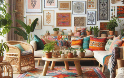
The Social Hub: Living Room & Family Room Color Psychology
Living and family rooms are typically the most communal spaces, designed for relaxation, entertainment, and social interaction. Colors here should be inviting, comfortable, and reflective of your personal style while accommodating various activities.
- Best Colors:
- Neutrals (Gray, Beige, Cream): Provide a versatile foundation that allows you to introduce warmer or cooler accents through furniture and decor.
- Warm Colors (Muted Orange, Terracotta, Deep Red Accents): Can foster a conversational, cozy atmosphere. Use warmer shades or as accents.
- Greens & Blues: Soothing and balanced, creating a comfortable environment. Deep forest green or navy blue can add sophistication.
- Yellow (Accents): Pops of yellow can inject cheer and optimism.
- What to Avoid: Overly aggressive or stark colors that might feel uninviting or too chaotic for a relaxing space.
- Considerations: How much natural light does the room receive? Darker colors might work in a well-lit room, while lighter shades are better for boosting brightness in dim spaces.

The Productivity Zone: Home Office & Study Color Psychology
With more people working from home, the home office needs to be a zone of concentration, creativity, and efficiency. Colors here should support focus without causing fatigue or distraction.
- Best Colors:
- Blues: Promotes clarity, logic, and calm, aiding concentration and productivity. Medium to light blues.
- Greens: Reduces eye strain and promotes a sense of balance, good for prolonged focus. Sage, moss green.
- Yellow (Pale): Can stimulate intellect and creativity without being too distracting. Think soft lemon or butter yellow.
- Grays & Neutrals: Excellent base colors for a professional and focused environment, allowing for pops of more stimulating colors in accessories.
- What to Avoid: Highly stimulating reds or vibrant oranges in large quantities, as they can be too distracting or agitating for a work environment.
- Considerations: Ensure the chosen colors support sustained focus. A monochromatic scheme can be very effective in this space.

The Gateway: Entryway & Hallway Color Psychology
Entryways and hallways are transitional spaces, offering the first impression of your home and guiding visitors (and yourself) through different zones. Their colors should be welcoming and create a sense of flow.
- Best Colors:
- Warm & Inviting (Orange, Yellow, Red Accents): A welcoming pop of color on a front door or an accent wall can set a cheerful tone.
- Light Neutrals (White, Cream, Light Gray): Keep these often smaller spaces feeling open, bright, and clean.
- Blues & Greens: Can create a calming and grounding transition from the outside world.
- What to Avoid: Overly dark or brooding colors that can make a narrow space feel even smaller and less inviting.
- Considerations: These areas often lack natural light, so choose colors that can brighten or reflect light effectively.

Beyond the Wall: Incorporating Color with Intention
Applying color psychology isn’t just about paint. It’s about a holistic approach to your design choices. Every element brings color into your space, and understanding this allows for powerful transformations without even picking up a paint brush.
Furniture: Anchoring Your Color Scheme
Your larger furniture pieces (sofas, beds, dining tables, rugs) often establish the dominant color or neutral base of a room. Choosing these strategically is paramount.
- Neutral Staples: A large neutral sofa (gray, beige, cream) provides a long-term, versatile foundation. You can then infuse color through smaller, more easily changeable pieces.
- Bold Statements: A vibrant velvet armchair in an unexpected hue – a deep teal, a mustard yellow, or a rich emerald green – can serve as a focal point and introduce a strong psychological element without overwhelming the space.
- Wood Tones: The natural browns of wood furniture (light oak to dark walnut) add inherent warmth, stability, and a connection to nature (brown = stability, comfort).
- Metals: Gold and brass add warmth and luxury (often associated with yellow). Silver and chrome add coolness and modernity (associated with gray/white).
Case Study: The Teal Sofa
Consider a living room with primarily white walls. Introducing a plush, deep teal velvet sofa immediately injects a sense of sophistication, calm (blue), and a touch of creativity (green). This single piece dictates the mood more than any small accessory, making the room feel luxurious yet comfortable, far from the sterile white it might have been.

Textiles & Soft Furnishings: The Mood Makers
Throw pillows, blankets, curtains, and rugs are incredible tools for introducing, softening, or emphasizing color and texture. They are also relatively inexpensive and easy to change, making them perfect for seasonal updates or mood shifts.
- Pillows & Throws: Use these to add pops of complementary or accent colors. A bright yellow throw on a gray sofa lifts the mood (yellow = happiness). Soft lavender pillows in a bedroom enhance calm (purple = serenity).
- Curtains: The color of your curtains can significantly impact the light quality and overall feel. Sheer white curtains amplify light and purity. Rich burgundy or deep blue velvet drapes add drama and warmth.
- Rugs: A large rug grounds a room and can define its color palette. A geometric rug with dominant blues and greens sets a tranquil yet artistic tone, while a Persian rug with rich reds and oranges adds warmth and heritage.
Tool Recommendation: Websites like Society6 or Minted offer endless choices for throw pillows, art prints, and even curtains, allowing you to filter by specific color schemes to find exactly what resonates with your desired mood.

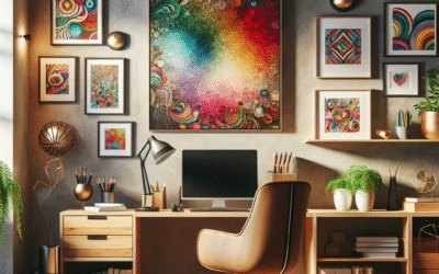
Artwork & Decor: Personalizing Your Palette
Art, vases, sculptures, books, and other decorative elements are fantastic for fine-tuning your color scheme and expressing your personality. They are often where you can get most daring with color.
- Statement Pieces: A vibrant piece of abstract art can introduce a full spectrum of emotions. A dominant yellow painting in a neutral study can serve as a potent intellectual stimulant.
- Vases & Ceramics: A collection of blue and white pottery evokes classic calm. A single bright red vase acts as an energetic focal point.
- Books: Arranging books by cover color can create a powerful aesthetic, adding blocks of chosen hues.
- Plants: Living green elements are not only aesthetically pleasing but also bring the calming, renewing energy of green directly into your home.
Expert Quote: “Art is not just decoration; it’s an emotional investment. The colors in your chosen pieces directly influence the emotional landscape of your room,” says renowned interior designer, Sarah Lavoine.

Lighting: The Unsung Hero of Color Perception
Never underestimate the power of lighting. It doesn’t just illuminate; it transforms how we perceive every color in a room. Natural light, warm artificial light, or cool artificial light drastically alters a color’s appearance and emotional impact.
- Natural Light: Varies throughout the day (cool in the morning, warm in the afternoon). Colors will appear truest in natural daylight.
- Warm Light (2700K-3000K): Yellowish light, enhances reds, oranges, yellows, and warm browns, making a room feel cozier and more inviting. Can make cool colors appear slightly muted.
- Cool Light (3500K-5000K+): Bluish-white light, enhances blues, greens, and grays, making a space feel brighter, crisper, and more modern. Can make warm colors seem drab.
Recommendation: Always test paint samples in the actual room, at different times of day, with both natural and artificial lighting, before committing. Use LED bulbs with adjustable color temperatures for ultimate flexibility.

Advanced Color Strategies: The Art of Nuance and Combination
Mastering **color psychology** isn’t just about picking one color; it’s about understanding how colors interact, how shades transform, and how to build a cohesive and balanced palette that truly transforms your space.
Monochromatic, Analogous, Complementary: Demystifying Color Harmonies
These are the foundational principles of color theory, guiding how colors are combined to create appealing and psychologically effective palettes.
- Monochromatic: Using different shades, tints, and tones of a single color.
- Effect: Creates a sophisticated, calm, and harmonious look. Very soothing and subtle.
- Example: A bedroom in varying shades of blue – from a pale sky blue on the walls, a medium dusty blue for bedding, to a deep navy accent chair.
- Consideration: To avoid flatness, incorporate diverse textures and materials.
- Analogous: Using colors that are next to each other on the color wheel.
- Effect: Creates a harmonious and pleasing sense of flow. Often found in nature.
- Example: A living room combining greens (nature, balance), blues (calm, serenity), and perhaps a touch of yellow-green (freshness). Imagine a sage green wall, a deep teal sofa, and botanical art with hints of yellow.
- Consideration: Choose one dominant color and use the others as accents.
- Complementary: Using colors that are directly opposite each other on the color wheel.
- Effect: Creates high contrast and visual excitement, injecting energy and vibrancy.
- Example: A dining room with a deep red accent wall and vibrant green chairs. Or a modern space with navy blue walls and mustard yellow accents.
- Consideration: Use the 60-30-10 rule (60% dominant, 30% secondary, 10% accent) to ensure the contrast is invigorating, not overwhelming. Often best in small doses or for creating focal points.

**Visual Suggestion:** An infographic showcasing the color wheel with examples of monochromatic, analogous, and complementary selections, possibly demonstrating their application in a simple room illustration.
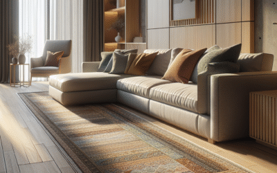
The Power of Neutrals: Grounding Your Palette
Neutrals (white, black, gray, beige, brown) are the unsung heroes of interior design. They provide the necessary balance, allowing other colors to truly shine. They offer a sense of calm, sophistication, and timelessness.
- Why Neutrals are Powerful:
- Versatility: They work with almost any color scheme.
- Spaciousness: Light neutrals make rooms feel larger and brighter.
- Timelessness: They rarely go out of style, providing a stable foundation.
- Allows for Flexibility: Easy to update a room’s mood by simply changing colorful accents.
- Warm vs. Cool Neutrals:
- Warm Neutrals: Beiges, creams, greiges (gray-beige), and warmer browns. Create cozy, inviting, and comfortable spaces.
- Cool Neutrals: Whites with blue/gray undertones, cool grays, charcoal. Create modern, crisp, and sophisticated spaces.
Design Tip: Even in a predominantly neutral room, introduce texture and varying shades within the neutral palette to prevent it from feeling bland. Think chunky knit throws, linen curtains, matte walls, glossy ceramics, and varied wood tones.

The 60-30-10 Rule: Balancing Your Colors Like a Pro
This classic interior design rule is a fantastic guideline for creating balanced and visually appealing color schemes that apply the principles of **color psychology** effectively.
- 60% Dominant Color: This is your primary color, usually on your walls or large furniture pieces. It sets the overall mood and tone of the room. This could be a soothing blue for a bedroom or a warm neutral for a living room.
- 30% Secondary Color: This color supports the dominant color and adds interest without competing. It’s often found in upholstery, rugs, or an accent wall. If your dominant is off-white, your secondary might be a deep green or a sophisticated gray.
- 10% Accent Color: This is your striking pop! It’s used for smaller decorative items like throw pillows, artwork, vases, or flowers. This is where you can be bold with a complementary color, like a vibrant yellow in a blue/green scheme, adding personality and energy.
Comparison: 60-30-10 Rule vs. Monochromatic
| Feature | 60-30-10 Rule | Monochromatic Scheme |
|---|---|---|
| Primary Goal | Visual interest, balance, deliberate contrast | Serenity, sophistication, subtle harmony |
| Color Count | Typically 3 distinct colors (or shades) | Multiple shades/tints of one core color |
| Energy Level | Can be dynamic & exciting or calm & subtle, depending on choice | Generally calm, peaceful, understated |
| Best For | Living rooms, dining rooms, eclectic styles | Bedrooms, minimalist spaces, highly sophisticated aesthetics |
By consciously applying this rule, you ensure that your chosen colors work together harmoniously, creating a space that feels intentional and balanced.

**Visual Suggestion:** An infographic dividing a room into 60%, 30%, and 10% sections, color-coded to represent the rule.
Personalizing Your Palette: Your Unique Color Story
While color psychology offers universal guidelines, your home should ultimately reflect you. Your personal experiences, culture, and memories undeniably intertwine with how colors resonate. This section is about marrying universal principles with individual preferences to truly unleash your home’s secret power.
Beyond Trends: Discovering Your Personal Color Profile
Don’t chase fads. A home rooted in personal meaning will always feel more authentic and comforting. Instead, consider these aspects:
- Childhood Memories: Were there colors that made you feel safe, joyful, or inspired as a child? A grandma’s yellow kitchen, a blue-and-white striped blanket, the green of a favorite park. These associations run deep.
- Cultural Influences: Different cultures assign different meanings to colors. While red means good luck in some Asian cultures, it can signify danger in others. Understand what colors mean to you given your heritage.
- Favorite Clothes & Art: What colors do you naturally gravitate towards in your wardrobe or in art that you admire? These are often indicators of colors that make you feel good.
- Nature’s Palette: What natural landscapes bring you peace? A beach (blues, sands), a forest (greens, browns), a desert sunset (oranges, purples). Mimicking these natural harmonies can bring a sense of calm.
- Your Energy Levels: Are you naturally high-energy and need calming environments at home, or do you need pops of warmth to feel lifted?
Actionable Insight: Create a Mood Board. Gather images, fabric swatches, paint chips, and magazine cutouts that feature colors you love and moods you desire. Don’t overthink it; just collect what resonates. You’ll often find a natural color scheme emerging.

Navigating Personal Preferences vs. Psychological Impact
Sometimes, your favorite color might not be the “best” psychological choice for a particular room. For instance, if your favorite color is bright red, but you want a tranquil bedroom, there’s a dilemma. This is where subtle application and understanding come in.
- Compromise with Shades & Tones: Instead of a fire engine red bedroom, opt for a deep burgundy or a gentle rose. You still get the essence of your favorite color family without the overstimulation.
- Strategic Accents: Use your beloved vibrant color in smaller, impactful ways. A single piece of art, a throw, or a vase. This satisfies your preference without sabotaging the room’s function.
- Incorporate in Personal Spaces: Dedicate a small nook, a powder room, or a piece of furniture to your truly “difficult” favorite color if you can’t live without it.
- Understand “Why”: Ask yourself *why* you love a certain color. Is it the energy, the sophistication, the calmness? Then seek out other colors or specific shades that fulfill that same emotional need in a more balanced way.
Example: Yellow Lover, Productive Office
If you adore bright yellow but want an office conducive to focus, a full yellow wall might be too distracting. Instead, opt for a pale, soft butter yellow on the walls, paired with crisp white trim. Then, introduce a few strategic pops of a vibrant yellow in a desk lamp, a piece of artwork, or a notepad. You satisfy your love for yellow while maintaining a productive environment.

When to Break the Rules (Gracefully!)
Design rules are guidelines, not unbreakable laws. Once you understand the principles of color psychology, you gain the confidence to tastefully bend or break them for a truly unique and impactful space.
- Unexpected Pops: A traditional home can feel revitalized with an unexpected neon green accent or a single fuchsia pillow.
- Bold Monochromatic: An entire room in deep, saturated blue can be incredibly dramatic and sophisticated, even if it “breaks” the rule of keeping bedrooms light. The key is in the uniform saturation and careful balance with textures and lighting.
- Dark & Moody: Sometimes, a small, dark room in a deep charcoal or navy can transform into a surprisingly cozy and luxurious retreat, rather than feeling oppressive. It’s about embracing its natural limitations.
- Eclectic Combinations: Mixing colors from different harmonies (e.g., a dominant cool blue with a warm accent orange, and then introducing a vibrant green for unexpected energy) can create a truly personalized and artistic space, but requires a good eye and confidence.
Tool Recommendation: Pinterest and Instagram are invaluable for seeing real-world examples of how designers and homeowners successfully break color “rules” while maintaining a beautiful aesthetic. Use them for inspiration, not just direct copying.

Common Color Mistakes & How to Avoid Them
Even with good intentions, it’s easy to stumble when applying color. Understanding common pitfalls in color psychology and design can save you time, money, and decor headaches.
Ignoring the Role of Lighting (Natural & Artificial)
This is arguably the biggest mistake. A color chip in a store will look drastically different on your wall. Why? Lighting.
- Problem: Choosing a color based solely on a small swatch or how it looks in another home, without testing it in your unique lighting conditions.
- Solution:
- Invest in Samples: Buy sample pots and paint large swatches (at least 2’x2′) on multiple walls in the room you intend to paint.
- Observe Throughout the Day: Watch how the color changes with natural light from morning to evening.
- Check with Artificial Light: See how it looks with your typical nighttime lighting (warm or cool bulbs). A color that looks great in daylight might appear harsh or muddy under artificial light.

Overlooking Undertones (Warm vs. Cool)
Colors often have subtle undertones that can clash with existing elements or throw off your desired temperature for a room.
- Problem: You choose a “gray” that looks perfect, but on the wall, it suddenly looks purple, blue, or green in certain lights, clashing with your warm wood floors or beige sofa.
- Solution:
- Identify Undertones: Hold the paint swatch against a pure white background. Look closely to see if it leans yellow, pink, blue, green, or purple.
- Match Undertones: Try to match the undertones of your paint color to the undertones of your existing furniture, flooring, and textiles. Warm grays (greiges) pair well with warm browns; cool grays pair well with whites and cool blues.

Choosing Paint First
Many people pick a paint color they love, then struggle to find furniture or decor that matches.
- Problem: Committing to a wall color too early, limiting your choices for more expensive or permanent elements.
- Solution:
- Design Around Key Pieces: Start with the more permanent or expensive items first – rugs, sofas, artwork. These often have complex patterns or specific colors that are harder to replicate.
- Paint is Flexible: Paint is the easiest and most affordable element to change. It’s much simpler to find a paint color that complements a chosen rug or sofa than the other way around.

Fear of Using Bold Color (Or Overuse of It)
It’s a common dichotomy: either too scared to use color, resulting in bland spaces, or using too much, leading to visual chaos.
- Problem (Fear): Sticking only to neutrals because of the perceived risk, leading to rooms that lack personality or warmth.
- Solution (Fear): Start small. Introduce bold colors through easily changeable accents – throw pillows, artwork, a painted piece of furniture, or a vibrant plant pot. Even a single accent wall can make a huge impact without committing a whole room.
- Problem (Overuse): Painting every wall a bright, stimulating color, or combining too many clashing hues, making a room feel overwhelming or disorganized.
- Solution (Overuse): Revisit the 60-30-10 rule. Use a bold color strategically as an accent (10%), or a secondary color (30%), allowing neutrals to dominate. Give the eye places to rest. Less is often more with strong colors.

Tools & Resources for Your Color Journey
Empowering yourself with the right resources can make your color journey smoother and more successful. Remember, the goal is to confidently apply color psychology to transform your space.
Online Color Tools & Apps
- Adobe Color Wheel: An excellent free online tool for exploring color harmonies (monochromatic, analogous, complementary, triadic, etc.). You can generate palettes from a single base color or even upload an image to extract its dominant colors. This is invaluable for seeing color relationships.
- Sherwin-Williams ColorSnap Visualizer / Benjamin Moore Personal Color Viewer: Most major paint brands offer apps or online tools that allow you to “paint” a photo of your own room with different colors. While not perfectly accurate, they give a good conceptual idea.
- Coolors.co: A super-fast color palette generator. Hit the spacebar, and it generates five harmonious colors. You can lock colors you like and continue generating new combinations for inspiration.
- Pinterest & Instagram: Not direct “tools,” but immense visual inspiration libraries. Search for “blue living room ideas,” “green bedroom decor,” or “monochromatic schemes” to see how professionals and homeowners effectively use color.
Professional Help: When to Consult a Designer
While this guide aims to empower you, sometimes a complex project or indecision warrants professional expertise.
- When to Consider It:
- You’re undertaking a whole-house renovation and need cohesive flow.
- You have very specific psychological goals (e.g., designing for ADHD, anxiety, or highly specific spiritual needs).
- You’re stuck between several options and need an objective, trained eye.
- You have a unique architectural feature or existing elements that are difficult to work around.
- What a Designer Offers:
- Expert Eye: They understand spatial relationships, light, and how colors interact in person.
- Experience: They’ve seen what works (and what doesn’t) in countless homes.
- Access: Often have access to trade-only resources and unique materials.
- Problem-Solving: Can help resolve color dilemmas and create unexpected, beautiful solutions.
Cost vs. Value: While an upfront cost, a good designer can prevent expensive mistakes, save time, and ultimately create a home that truly functions and feels better, optimizing the psychological impact of your space effectively.
Educational Resources & Books
- “Color: A Course in Mastering the Art of Mixing Colors” by Betty Edwards: While focused on art, its principles of color perception and mixing are incredibly valuable for any visual medium, including interiors.
- “Color Theory: An Essential Guide to Color-from Basic Principles to Practical Applications” by Patti Mollica: A great primer on the science and application of color.
- Blogs & Workshops: Many interior designers offer online blogs, courses, or workshops focused specifically on color theory for interiors. Search for local or online options.
Continuous learning and observation will refine your eye and deepen your understanding of how color psychology can transform your space in profound ways.
FAQ: Your Color Psychology Questions Answered
What is the most calming color for a bedroom?
Blue is consistently ranked as the most calming color for bedrooms due to its association with skies and oceans, promoting a sense of serenity and peace. Soft greens like sage or mint, and gentle purples like lavender, are also excellent choices for creating a restful environment, effectively using color psychology to enhance sleep.
Can certain colors really improve productivity in a home office?
Yes, absolutely. Colors like light blues and greens can enhance focus, clarity, and reduce eye strain, making them ideal for a home office. Pale yellows can also stimulate intellect and creativity without causing overstimulation. These colors leverage color psychology to create environments conducive to sustained work and concentration.
Are there colors to avoid in small spaces?
While there are no strict “rules,” it’s generally advisable to use lighter, cooler colors in small spaces. Whites, off-whites, light grays, and soft blues or greens reflect more light, making a room feel larger and more open. Dark, saturated, or overly bright colors can make a small space feel even more confined and sometimes oppressive, impacting mood negatively.
How can I incorporate bold colors without overwhelming a room?
The key is strategic placement and proportion. Use bold colors as accents (the 10% in the 60-30-10 rule) on items like throw pillows, artwork, a single piece of furniture, or a small accent wall. Pair them with a dominant neutral palette to provide balance and give the eye a place to rest. This harnesses the energy of the bold color without creating chaos.
Does cultural background influence color perception in home decor?
Yes, significantly. While some psychological responses to color are universal (e.g., red for stimulation), cultural contexts deeply influence aesthetic preferences and symbolic meanings. For instance, white signifies purity in Western cultures but mourning in some Eastern cultures. Always consider your personal and cultural associations when choosing colors for your home to ensure they resonate authentically.
How do I choose the right white paint for my walls?
Choosing white involves understanding undertones and light. Whites can have warm (yellow, pink, beige) or cool (blue, gray, green) undertones. Test large swatches in your room, observing them throughout the day with both natural and artificial light. Consider existing elements like flooring and trim; choose a white with undertones that harmonize with them to create a cohesive look.
Is it okay to use different color schemes in adjacent open-concept rooms?
Yes, it’s possible and common to define zones in open-concept spaces using distinct, yet harmonious, color schemes. The trick is to ensure there’s a cohesive element that links them, such as a consistent neutral trim, a repeated accent color, or a shared foundational color from an analogous palette. This creates visual interest while maintaining a sense of flow and connection.
What are “greige” colors, and why are they so popular?
Greige is a blend of gray and beige, making it a versatile neutral that can lean warm or cool depending on its dominant undertone. Its popularity stems from its ability to bridge the gap between warm and cool palettes, offering more warmth than pure gray and more sophistication than pure beige. It serves as an excellent flexible backdrop that complements a wide range of other colors and decor styles.
Content Disclaimer
The information provided in this article regarding color psychology and interior design is intended for general educational purposes and as guidance for personal home improvement. It is not intended to be professional design, psychological, or medical advice. Individual results and experiences with color may vary due to personal preferences, cultural backgrounds, and unique environmental factors. While we strive for accuracy, users are encouraged to consult with qualified interior designers or other relevant professionals for personalized advice and specific design projects. This content should not be used as a substitute for professional consultation.