No More Decor Dilemmas: Mastering Color Psychology for a Home You Love
Have you ever walked into a room and instantly felt a certain way—calm, energized, or even anxious? More often than not, the culprit (or hero) is color. Our homes are our sanctuaries, evolving reflections of who we are and who we aspire to be. Yet, so many of us struggle to translate that vision into a cohesive, comforting reality. The endless paint swatches, fabric samples, and decor choices can feel overwhelming, leading to decor dilemmas that leave us stuck in a design rut. But what if there was a powerful, yet often overlooked, tool that could guide your decisions and genuinely transform your living spaces?
That tool is color psychology. Understanding how different shades and hues influence our emotions, thoughts, and behaviors can unlock a new level of intentional design. This isn’t just about picking pretty colors; it’s about crafting an environment that actively supports your well-being, boosts productivity, inspires creativity, or fosters relaxation. Whether you’re dreaming of a serene bedroom, a vibrant living room, or a focused home office, mastering color psychology for your home is the secret ingredient you’ve been searching for.
In this comprehensive guide, we’ll dive deep into the fascinating world of color. We’ll explore the underlying principles of color psychology, demystify the emotional impact of various hues, and provide actionable strategies to apply these insights to every corner of your home. Get ready to move beyond fleeting trends and create interior spaces that resonate deeply with your soul, making those decor dilemmas a thing of the past.
The Foundation: What is Color Psychology in Interior Design?
At its core, color psychology studies the human response to color. While often subtle, this response is deeply ingrained, influenced by biology, culture, and personal experiences. In interior design, color psychology isn’t merely an academic concept; it’s a practical framework for creating environments that evoke specific feelings and support desired activities. It’s the difference between a functional room and a truly flourishing one.
Think about it: hospitals often use muted blues and greens to promote healing and calm, while fast-food restaurants frequently employ reds and yellows to stimulate appetite and encourage quick service. These aren’t accidental choices; they are deliberate applications of color psychology. For your home, this means intentionally selecting colors that align with the function and desired mood of each space. When you learn to master color psychology, you stop guessing and start designing with purpose.
Why Color Matters More Than You Think
- Emotional Impact: Colors have a direct link to our limbic system, influencing mood, stress levels, and even heart rate.
- Perception of Space: Colors can make a room feel larger or smaller, warmer or cooler, cozier or more expansive.
- Behavioral Influence: Certain colors can encourage concentration, promote rest, or stimulate conversation.
- Personal Expression: Your home’s color palette is a powerful extension of your personality and aesthetic preferences.
- Well-being: Thoughtful color choices contribute to a sense of comfort, security, and overall happiness within your living environment.
Understanding these impacts is the first step towards resolving your decor dilemmas. By the end of this guide, you’ll possess the knowledge to approach your interior design with confidence, using color as your most potent tool.
The Emotional Spectrum: Decoding Individual Colors & Their Impact
Each color, with its myriad shades and tints, tells a unique story. Understanding these narratives is crucial when applying color psychology to your home. Let’s break down the emotional and psychological associations of the most common colors and consider their practical applications.
Red: Energy, Passion, & Power vs. Aggression

Red is the most intense color, immediately grabbing attention. It’s often associated with love, passion, warmth, and excitement. Physiologically, red can increase heart rate, blood pressure, and metabolism, making it an energizing choice. However, too much red can also evoke feelings of anger, aggression, or a sense of being overwhelmed. Moderation is often key.
- Psychological Associations: Energy, passion, love, warmth, excitement, danger, anger, urgency.
- Ideal Home Applications:
- Dining Rooms: Stimulates appetite and conversation.
- Entryways: Creates a warm, welcoming, and impactful first impression.
- Accent Walls/Decor: Use as a vibrant focal point in living rooms or studies rather than painting an entire space. Think throw pillows, artwork, or a statement piece of furniture.
- Avoid In: Bedrooms (unless used sparingly for romantic energy), quiet study areas where concentration is paramount.
Blue: Serenity, Trust, & Productivity vs. Coldness

Blue is consistently cited as a favorite color globally. It embodies tranquility, stability, and trust, often linked to the sky and sea. Scientifically, blue light has been shown to slow heart rate and lower blood pressure, making it a naturally calming hue. Yet, in excess or with stark shades, blue can feel cold, impersonal, or melancholic. The key is to find the right balance and warmth within the blue spectrum.
- Psychological Associations: Calm, peace, trust, stability, intellect, logic, sadness, coldness.
- Ideal Home Applications:
- Bedrooms: Promotes relaxation and restful sleep. Light blues are particularly effective.
- Bathrooms: Creates a spa-like, pristine atmosphere.
- Home Offices/Studies: Enhances focus and productivity (mid-tone blues).
- Living Rooms: Can create a sophisticated, serene gathering space, especially with warmer undertones.
- Avoid In: Spaces meant for high energy or appetite stimulation, unless balanced with warmer accents.
Yellow: Optimism, Creativity, & Cheeriness vs. Anxiety

Yellow is the color of sunshine, inherently optimistic and uplifting. It’s associated with happiness, energy, and mental clarity, stimulating creativity and communication. Physiologically, yellow can activate memory and stimulate the nervous system. However, bright, oversaturated yellows can be overwhelming, even triggering anxiety or frustration, particularly in large doses. Soft, buttery yellows are usually more comforting.
- Psychological Associations: Happiness, optimism, energy, warmth, creativity, stimulating, anxiety, caution.
- Ideal Home Applications:
- Kitchens: Boosts energy and cheerfulness, encouraging conversation.
- Entryways/Hallways: Creates a bright, welcoming transition.
- Playrooms/Nurseries: In soft shades, it’s playful and stimulating.
- Home Offices: Can spark creativity and mental agility when used as an accent.
- Avoid In: Bedrooms (unless very muted), main living areas in overly bright tones as it can be fatiguing.
Green: Nature, Balance, & Harvest vs. Envy

Green is the color of nature, growth, and renewal. It offers a sense of balance, harmony, and peace, often associated with health and prosperity. The eye requires very little adjustment to see green, making it a restful color. Darker greens convey stability and tradition, while lighter shades feel fresh and invigorating. Few negative psychological associations exist, aside from envy and sickness, which are less prevalent in interior contexts.
- Psychological Associations: Nature, growth, harmony, balance, renewal, health, peace, wealth, envy.
- Ideal Home Applications:
- Living Rooms: Creates a calming, grounded atmosphere.
- Bedrooms: Promotes tranquility and rest, especially sage or olive greens.
- Home Offices (lighter shades): Reduces eye strain and offers a natural, focused environment.
- Kitchens: Herb greens can feel fresh and organic.
- Avoid In: Really none, as green is incredibly versatile and generally positive; it works in almost every room depending on the shade.
Purple: Luxury, Creativity, & Spirituality vs. Gloom

Historically associated with royalty and nobility, purple exudes luxury, creativity, and spirituality. It’s a complex color, blending the energy of red with the serenity of blue. Lighter lavenders and lilacs are often seen as romantic and soothing, while darker purples convey sophistication and mystery. Too much dark purple, however, can sometimes feel gloomy or overpowering.
- Psychological Associations: Royalty, luxury, creativity, wisdom, spirituality, magic, mystery, melancholy.
- Ideal Home Applications:
- Bedrooms (especially lavender/lilac): Romantic, restful, and encourages introspection.
- Creative Spaces/Studios: Inspires imagination and artistry.
- Powder Rooms: A great place for a bold, luxurious statement.
- Accent Decor: Adds sophistication and depth in any room.
- Avoid In: High-traffic, functional areas if overly dark, as it can feel heavy.
Orange: Enthusiasm, Warmth, & Social vs. Overstimulation

Orange is a vibrant, energetic color that radiates warmth and enthusiasm. It combines the energy of red with the happiness of yellow, making it a friendly and social hue. Orange is often associated with creativity, adventure, and communication. It can stimulate conversation and bring people together. Like red, however, too much bright orange can be overstimulating or feel childish.
- Psychological Associations: Enthusiasm, creativity, warmth, joy, innovation, social, affordability, overstimulating.
- Ideal Home Applications:
- Living Rooms/Family Rooms (especially muted tones like terracotta or burnt orange): Creates a welcoming, social atmosphere.
- Dining Rooms: Can stimulate appetite and lively discussion, similar to red but slightly softer.
- Children’s Play Areas: Playful and energetic.
- Avoid In: Bedrooms (unless subtle and muted), areas where quiet focus is needed.
Pink: Nurturing, Love, & Tranquility vs. Immaturity

Pink, a lighter shade of red, is associated with nurturing, compassion, and unconditional love. It’s perceived as soft, gentle, and calming, often evoking feelings of comfort and tenderness. Light pinks are particularly soothing, while brighter fuchsias can be more playful and energetic. The misconception of pink solely as a “feminine” color is shifting, with more diverse applications emerging.
- Psychological Associations: Nurturing, love, compassion, gentleness, tranquility, playfulness, innocence.
- Ideal Home Applications:
- Bedrooms: Creates a soft, romantic, and peaceful ambiance. Think blush or rose.
- Nurseries: Gentle and calming for infants.
- Guest Rooms: Welcoming and comforting.
- Avoid In: Professional home offices if trying to project extreme seriousness, or areas where too much softness might feel saccharine.
Brown: Earthiness, Stability, & Comfort vs. Dreariness

Brown connects us to the earth, soil, and wood, evoking feelings of stability, comfort, and reliability. It’s perceived as a strong, grounding, and wholesome color. Brown can bring warmth and a natural feel to any space, particularly when derived from natural wood tones or fabrics. However, overly dark or dull browns can sometimes appear heavy, drab, or even dreary if not balanced with lighter elements.
- Psychological Associations: Earthiness, stability, comfort, reliability, warmth, nature, sadness (if dull).
- Ideal Home Applications:
- Living Rooms: Creates a cozy, grounded, and inviting space.
- Home Offices/Libraries: Conveys a sense of tradition, focus, and intellectual depth.
- Bedrooms: In warm, mid-tones, it can be very comforting and natural.
- Kitchens: Wood accents bring warmth and a classic feel.
- Avoid In: Small rooms with poor lighting if used excessively, as it can make the space feel smaller and darker.
White: Purity, Cleanliness, & Simplicity vs. Sterility

White is the color of new beginnings, purity, and absolute clarity. It signifies cleanliness, simplicity, and order, and can make any space feel larger, brighter, and more expansive by reflecting light. White acts as a perfect backdrop for other colors and textures. The potential downside is that too much pure white can feel sterile, cold, or unwelcoming, like a hospital. The solution often comes in using off-whites, creams, or pairing white with natural textures.
- Psychological Associations: Purity, cleanliness, simplicity, freshness, spaciousness, sterility, emptiness.
- Ideal Home Applications:
- Any Room: As a primary wall color to maximize light and create an open feel.
- Kitchens & Bathrooms: Enhances a sense of hygiene and modernity.
- Minimalist Interiors: Creates a clean, uncluttered aesthetic.
- As a Trim/Accent: Brightens and sharpens any color palette.
- Avoid In: Rooms where a strong sense of warmth or coziness is paramount, unless layered with textiles and natural elements.
Black: Sophistication, Power, & Strength vs. Oppression

Black is the absence of light, often associated with sophistication, formality, and power. It can convey strength, elegance, and drama, acting as a powerful accent or creating a luxurious, cocoon-like ambiance. Black works exceptionally well as a grounding element in a room. However, excessive use of black, especially in small spaces, can feel oppressive, melancholic, or even intimidating. It requires confident application.
- Psychological Associations: Sophistication, power, elegance, mystery, formality, grief, oppression, emptiness.
- Ideal Home Applications:
- Accent Walls: Creates striking drama and sophistication.
- Furniture & Decor: Provides strong contrast and grounding.
- Home Theaters/Gaming Rooms: Enhances light absorption for better viewing.
- Powder Rooms: A bold design statement in a small space.
- Avoid In: Main living areas or bedrooms (unless extremely well-lit and balanced), children’s rooms.
Gray: Neutrality, Balance, & Calm vs. Dreariness

Gray, often seen as a bridge between black and white, signifies neutrality, balance, and compromise. Its versatility makes it a popular choice in modern interior design, offering a sophisticated backdrop that allows other elements to shine. Gray can be calming and stabilizing, but too much cool gray, or the wrong shade, can sometimes lean towards dreariness, aloofness, or a lack of energy, often referred to as “institutional.” Warming grays (greiges) or grays with blue/green undertones are popular for creating nuanced spaces.
- Psychological Associations: Neutrality, balance, sophistication, calm, practicality, aloofness, dreariness.
- Ideal Home Applications:
- Main Living Areas: Provides a versatile and elegant backdrop.
- Bedrooms: Creates a tranquil, sophisticated retreat.
- Home Offices: Promotes focus and professionalism without being distracting.
- Bathrooms: Clean, modern, and spa-like.
- Avoid In: Children’s play areas (unless used as a calm anchor), or rooms that heavily rely on vibrant energy.
“Colors are the smiles of nature. When designing, choosing a color is more than just a shade; it’s selecting a mood, an emotion, a feeling that will envelop you in your own sacred space.” – A seasoned interior designer
Applying Color Psychology to Your Home: Room by Room Strategies
Color psychology isn’t a one-size-fits-all solution; its application must be tailored to the specific function and desired atmosphere of each room. Let’s explore how to wisely deploy your newfound knowledge to create truly personalized spaces.
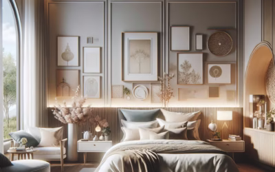
The Bedroom: Your Sanctuary of Rest & Relaxation
The primary goal here is to promote sleep, intimacy, and tranquility. Calm, soothing colors are paramount. Avoid overly stimulating hues like bright reds or harsh yellows.
- Best Choices:
- Light Blues: Evoke calm, peacefulness, and serenity. Often associated with improved sleep.
- Greens (Sage, Olive): Connects to nature, promoting balance and healing.
- Soft Pinks/Blush: Nurturing, comforting, and romantic.
- Warm Grays/Greiges: Sophisticated, tranquil, and grounding.
- Subtle Purples (Lavender): Calming, spiritual, and allows for introspection.
- Tips:
- Use muted tones on walls.
- Incorporate rich, deeper versions of these colors through textiles like bedding, curtains, and rugs for depth.
- Consider softer lighting to enhance the calming effect.
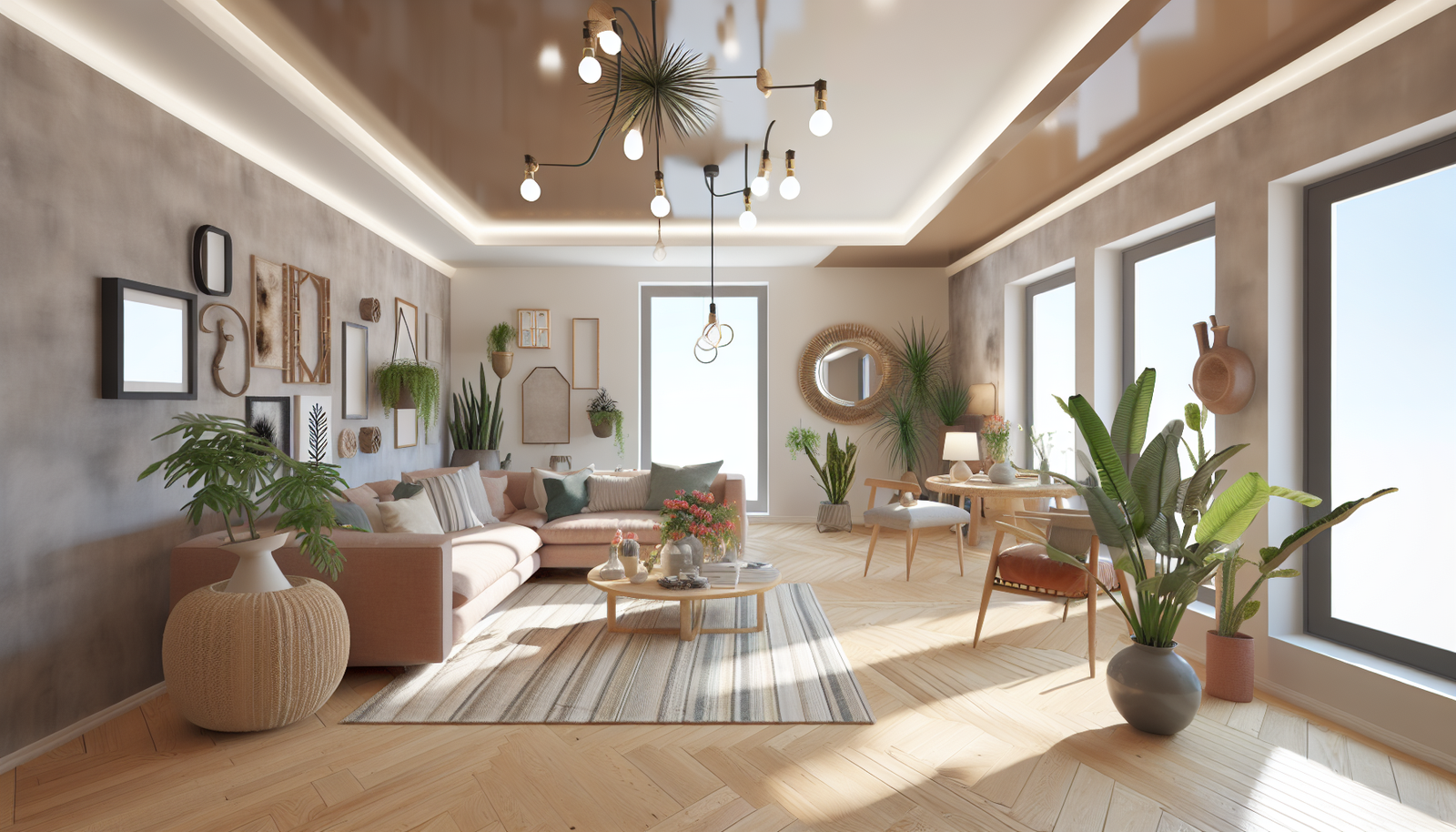
The Living Room: Your Social Hub & Relaxation Zone
This is often a multi-functional space for entertaining, relaxing, and spending time with family. It requires a balance of warmth, comfort, and perhaps a touch of vibrancy to spark conversation. Your choice will depend on whether you prioritize cozy interaction or expansive serenity.
- Best Choices:
- Warm Grays/Greiges: Versatile backdrop, allowing accent colors to pop.
- Greens (Mid-tone to Deep): Brings nature indoors, creating a grounded and inviting feel.
- Blues (Warmer, Deeper Shades): Sophisticated, calming, and promotes comfortable conversation.
- Oranges (Terracotta, Burnt Orange): Inviting, social, and warm, great for a cozy feel.
- Reds (Accent): Use in small doses for warmth, energy, and to stimulate interaction.
- Tips:
- Consider your primary use. Is it mainly for quiet evenings or lively gatherings?
- Combine a neutral base with carefully selected accent colors in furniture, art, or accessories to layer moods.
- Textural elements are key to making bolder colors feel inviting rather than overwhelming.
The Kitchen & Dining Room: Culinary Creativity & Connection
These spaces are about nourishment, gathering, and often, energy. Colors here can stimulate appetite, conversation, and a sense of cleanliness.
- Best Choices:
- Yellows (Soft to Bright): Cheerful, energizing, and stimulates appetite. Great for breakfast nooks.
- Oranges (Citrus, Terracotta): Warm, inviting, and promotes social interaction and joy.
- Reds (Accent Walls, Dinnerware): Ignites appetite and robust conversation.
- Greens (Herb Green, Avocado): Fresh, natural, and promotes a healthy, vibrant feel.
- White: Clean, crisp, and timeless, making the space feel hygienic and open.
- Tips:
- Too much cool blue can suppress appetite; use sparingly or balance with warm elements.
- Think about how light interacts with kitchen surfaces – glossier finishes can amplify color.
- Focus on freshness and a welcoming atmosphere.
The Home Office/Study: Focus, Productivity, & Creativity
The ideal home office should be conducive to concentration and free from distractions, yet also perhaps inspire creativity depending on your profession. Minimize overly aggressive or overly passive colors.
- Best Choices:
- Blues (Mid-tone): Enhances focus, logic, and reduces anxiety.
- Greens (Natural, Sage): Reduces eye strain, promotes a sense of calm, and fosters natural balance.
- Grays: Professional, sophisticated, and neutral background for minimal distraction.
- White/Off-White: Creates a clean, uncluttered mental space, good for creative thought.
- Yellows (Accent): A small splash can ignite creativity and optimism on a desk or shelf.
- Tips:
- Introduce natural elements like plants to enhance the positive effects of green.
- Keep the palette relatively simple to avoid visual clutter.
- Ensure good lighting to mitigate any potential drabness from neutral colors.
The Bathroom: Cleanliness, Rejuvenation, & Serenity
Bathrooms are spaces for personal renewal. The focus is on cleanliness, freshness, and often, a spa-like tranquility.
- Best Choices:
- Blues (Aqua, Sky Blue): Invokes cleanliness, freshness, and a spa-like atmosphere.
- Whites: Ultimate cleanliness, purity, and spaciousness.
- Greens (Mint, Seafoam): Natural, refreshing, and calming.
- Grays: Modern, sophisticated, and clean-lined.
- Pinks (Blush): Soft, comforting, and romantic for a more luxurious feel.
- Tips:
- High-gloss or semi-gloss paints are practical for moisture resistance and reflect light, enhancing color.
- Introduce luxurious textures in towels and accessories to soften potentially stark schemes.
- Mirror placement can amplify the perception of spaciousness and color.
Beyond the Basic Hue: The Nuances of Tone, Tint, & Shade
Color psychology isn’t just about choosing ‘blue’ or ‘green.’ The specific tone, tint, and shade significantly alter a color’s psychological impact. These aspects are critical for mastering color psychology for a truly nuanced home design.
Understanding the Terminology:
- Hue: This is the pure color – red, blue, yellow, etc.
- Tint: A hue mixed with white. Tints are lighter, softer, and often more optimistic or gentle (e.g., pink is a tint of red, lavender is a tint of purple).
- Shade: A hue mixed with black. Shades are darker, deeper, and often convey sophistication, seriousness, or intensity (e.g., maroon is a shade of red, navy is a shade of blue).
- Tone: A hue mixed with gray. Tones are often perceived as more muted, complex, and mature. They are excellent for creating sophisticated and less aggressive palettes (e.g., sage green, dusty rose).
How Nuances Influence Mood:
A bright primary red has a vastly different impact than a deep maroon or a soft coral. Similarly, a vibrant royal blue is distinct from a soothing sky blue or a sophisticated navy. For instance:
- Bright vs. Muted: Bright, saturated colors are stimulating and energetic. Muted, desaturated colors (tones) are calming, sophisticated, and less demanding on the eye. If your decor dilemmas involve feeling overstimulated, explore muted versions of your favorite hues.
- Dark vs. Light: Dark shades can create elegance, depth, and a sense of coziness or drama. Lighter tints make spaces feel airy, expansive, and fresh.
- Warm vs. Cool Undertones: Even within the same color family, undertones matter. A “cool gray” (with blue undertones) will feel different than a “warm gray” (with yellow or brown undertones). Warm undertones tend to be more inviting and cozy, while cool undertones are often more crisp and tranquil.
Actionable Tip: When selecting paint, always get samples and observe them in your room at different times of day. Lighting, both natural and artificial, dramatically alters how a color appears and its psychological effect.
The Power of Color Combinations: Creating Harmonious Palettes
Few rooms exist with a single color. The magic happens when colors interact. Understanding basic color theory allows you to create harmonious, impactful, and psychologically effective palettes.
Basic Color Harmonies for Your Home:

- Monochromatic: Varying tints, tones, and shades of a single hue.
- Psychological Impact: Creates a cohesive, sophisticated, and serene atmosphere. Very calming due to lack of contrast.
- Application: Perfect for bedrooms or minimalist spaces where tranquility is key. Layer different shades of blue or green for subtle depth.
- Analogous: Colors adjacent to each other on the color wheel (e.g., blue, blue-green, green).
- Psychological Impact: Naturally harmonious and pleasant to the eye, creating a balanced and comfortable feel.
- Application: Ideal for living rooms or any space where a harmonious flow is desired. Think golden yellows, oranges, and reds for a warm, inviting space.
- Complementary: Colors opposite each other on the color wheel (e.g., blue and orange, red and green).
- Psychological Impact: High contrast, creating vibrancy and visual excitement. Used carefully, it can add drama and energy.
- Application: Best used with one color dominant and the other as an accent. A deep blue wall with burnt orange throw pillows. Perfect for adding energy to a creative space or an entryway.
- Triadic: Three colors equally spaced on the color wheel (e.g., red, yellow, blue).
- Psychological Impact: Provides rich, vibrant, and balanced contrast. Often feels playful and energetic.
- Application: Great for children’s rooms or eclectic living spaces. Use one dominant color and the other two as accents to prevent overwhelming the space.
The Importance of Neutrals (Beyond White & Gray)
Neutrals are the unsung heroes of color psychology. They provide grounding, balance, and allow more vibrant colors to really shine without overwhelming. However, ‘neutral’ doesn’t just mean white or gray.
- Beige/Taupe: Warm, comforting, and versatile. Evokes natural materials like sand and stone, offering a more inviting feel than cool grays.
- Greige: A combination of gray and beige, offering the best of both worlds – modern and warm. Extremely popular for its adaptability.
- Brown: Grounding, stable, and warm. Think of espresso, chocolate, or tan. Can add depth and richness.
- Black: Powerful and sophisticated accent, used to ground a space or provide dramatic contrast.
Sherwin-Williams offers excellent tools for exploring color palettes, enabling you to visualize combinations before committing. They often integrate these principles into their curated collections.
Psychological Considerations: Beyond the Color Wheel
While the color wheel provides a structural framework, other psychological principles influence how color is perceived and experienced in a home.
Cultural & Personal Associations
Color meanings are not entirely universal. For example, white signifies purity in Western cultures but mourning in some Eastern traditions. While you are designing your personal space, it’s also important to consider:
- Cultural Background: Are there colors tied to your heritage that evoke positive or negative feelings?
- Personal History: Did you have a vibrant yellow childhood bedroom that still brings you joy? Or were you forced to live with a garish green that you now despise? These individual experiences fundamentally alter your psychological relationship with specific colors.
Actionable Tip: Before finalizing a palette, reflect on your own color memories. What colors make you feel good? What colors do you instinctively shy away from, and why?
The Impact of Light: Natural vs. Artificial
Light changes everything. A color can look entirely different at noon under bright sunlight than it does in the evening under warm lamplight. This is a common source of decor dilemmas.
- Natural Light: North-facing rooms often get cooler, indirect light, which can dull colors or make cool tones appear colder. South-facing rooms get warm, direct light, which can intensify colors.
- Artificial Light:
- Incandescent (Warm White): Enhances reds, oranges, and yellows; often mutes blues and greens.
- Fluorescent (Cool White/Daylight): Brings out blues and greens; can make warm colors appear dull or sickly.
- LEDs (Tunable): Many modern LEDs allow you to adjust the warmth/coolness, giving you flexibility to see colors accurately.
Actionable Tip: Paint large swatches of your chosen colors directly on your walls (or on large poster boards) and observe them throughout the day and evening, under both natural and artificial light. This step is non-negotiable for success.
The Ceiling Color: The Fifth Wall’s Psychological Role
Often neglected, the ceiling can dramatically affect the feeling of a room.
- White Ceiling: Standard, makes a room feel taller and brighter.
- Lighter Than Walls: Expands the space visually.
- Same Color as Walls: Creates a cocoon-like, enveloping feel, making the room feel more intimate and cozier.
- Darker/Bold Color: Can lower the ceiling visually, adding drama and intimacy. Best for large rooms with high ceilings or for specific moody effects.
Overcoming Common Decor Dilemmas with Color Psychology
Now, let’s tackle some of the real-world challenges that often plague homeowners and show how color psychology provides elegant solutions.
Problem: “My small room feels cramped.”
Color Solution: Strategically use light colors. Light blues, greens, cool grays, and especially white or off-white reflect more light, making walls visually recede and expanding the perception of space. Using a lighter color on the ceiling than the walls also adds height.
- Tactics: Paint walls and trim the same light color. Incorporate mirrors to amplify light and space. Use translucent fabrics for curtains.
Problem: “My large room feels empty/uninviting.”
Color Solution: Embrace warmer, deeper, or mid-tone colors. These hues absorb light, making walls feel closer and creating a cozier, more intimate atmosphere. Darker colors on the ceiling can also bring down the perceived height, making the room feel more enveloping.
- Tactics: Use rich blues, deep greens, warm grays, or even a statement wall in a muted red or terracotta. Introduce texture through rugs and furniture to further ground the space.
Problem: “I want my home to feel uniquely ‘me,’ but I’m afraid to use bold colors.”
Color Solution: Start small with carefully chosen accents. You don’t have to paint all your walls a shocking fuchsia. Color psychology guides you to use bold colors in ways that enhance, rather than overwhelm.
- Tactics:
- Accent Wall: Choose one wall for a bolder shade like a deep teal, emerald green, or a rich purple.
- Statement Furniture: A sofa in a vibrant color, or an armchair in a contrasting hue.
- Artwork & Textiles: Pillows, throws, rugs, and large-scale art are excellent ways to introduce color bursts that can be easily changed.
- Controlled Drama: Powder rooms are perfect for experimenting with rich, dramatic colors like black, deep purple, or emerald green, as they are small, utilitarian spaces with less continuous exposure.
Problem: “My space feels bland/lacks energy.”
Color Solution: Introduce warm, stimulating colors strategically. Even a neutral room can be revitalized with thoughtful color application.
- Tactics: Add pops of yellow or orange in decor for optimism and energy. Use a vibrant red or orange in a dining room to stimulate conversation. Incorporate artwork with bold, energetic colors. Consider a colorful area rug to anchor the space.
Problem: “I feel stressed/unable to relax in my own home.”
Color Solution: Prioritize calming, cool colors, and soothing neutrals. Minimize visual clutter and harsh contrasts.
- Tactics: Paint bedrooms and primary living areas in light blues, greens, warm grays, or soft whites. Focus on monochromatic or analogous palettes for seamless transitions. Introduce natural elements (wood, plants) and soft lighting.
Tools & Resources to Master Your Color Journey
Going from theory to practice requires some helpful resources. These tools can simplify your journey to mastering color psychology for your home.
Online Color Visualizers: Your Digital Canvas
Most major paint brands offer online tools that allow you to upload a photo of your room and “paint” it virtually. These are invaluable for experimenting with different colors and seeing how they work with your existing furniture and lighting.
- Recommendations:
- Behr’s Colorizer
- Sherwin-Williams’ ColorSnap Visualizer (mobile app and web-based)
- Benjamin Moore’s Personal Color Viewer
Physical Samples: The Non-Negotiable Step
Online visualizers are a great starting point, but always, always, purchase physical paint samples (the small pots) and paint them on your actual walls. Observe them at different times of day and under various lighting conditions.
- Why: Colors interact with light, surrounding elements, and even nearby landscapes (e.g., green trees outside a window can cast a green tint). What looks perfect online can be entirely different in your unique space.
Color Palette Generators: Inspiration at Your Fingertips
If you’re struggling to create harmonious combinations, these tools can help generate palettes based on an image or a single color.
- Recommendations:
- Coolors.co: Generates cohesive five-color palettes with a quick hit of the spacebar.
- Adobe Color: Allows you to create color themes using various harmony rules (monochromatic, analogous, complementary, etc.) or extract colors from an image.
Expert Consultations: When You Need a Guiding Hand
If you still feel overwhelmed or want to ensure your investment is sound, consider a consultation with an interior designer (even remotely). Many offer color consultation services that can save you from costly mistakes and decor dilemmas in the long run.
Visual Content Strategy: Making Color Come Alive
Color psychology is inherently visual. To maximize engagement and understanding, the article would benefit immensely from strategic imagery. Here are suggestions:
- Infographic: “Color Psychology at a Glance”
- Visual representation of 6-8 core colors and their primary psychological associations (e.g., Green: Nature, Relaxation; Red: Energy, Passion).
- Could include icons representing common room applications (e.g., sleep icon for bedroom, talk bubble for living room).
- Image Carousels/Galleries:
- For each color discussed, a small gallery showing different shades/tints in various rooms (e.g., Light Blue Bedroom, Navy Living Room, Aqua Bathroom).
- “Before & After” visuals demonstrating how color transformation changes a room’s mood.
- Comparison Table: “Warm vs. Cool Palettes”
- Left column: Warm colors (reds, oranges, yellows, browns). Right column: Cool colors (blues, greens, purples).
- Properties: Energy level, perception of space, ideal uses.
- “Color Harmony” Diagrams:
- Simple illustrations of monochromatic, analogous, complementary, and triadic schemes using a simplified color wheel overlay.
FAQs About Mastering Color Psychology for Your Home
What is the best color for a bedroom to enhance sleep?
Light blues, soft greens (like sage or seafoam), and warm grays are consistently recommended for bedrooms. These colors evoke feelings of calm, serenity, and relaxation, which are conducive to restful sleep. Avoid bright, stimulating reds or yellows that can increase alertness.
How do I make a small room feel larger using color?
To make a small room feel more expansive, use light, cool colors such as white, off-white, light blue, or pale green on the walls. These colors reflect light, pushing the walls visually outwards. Painting the ceiling a lighter shade than the walls also creates the illusion of height.
Can certain colors boost productivity in a home office?
Yes! Mid-tone blues are excellent for promoting focus and logical thinking, reducing anxiety, and enhancing productivity. Greens like sage or natural olive can also reduce eye strain and provide a sense of balance. Warm grays offer a sophisticated, non-distracting backdrop.
Is it okay to use bold or dark colors in a small space?
You absolutely can! While light colors expand, bold or dark colors can create a dramatic, sophisticated, and cozy “jewel box” effect in small spaces like powder rooms, entryways, or even an accent wall. The key is to balance with ample light, reflective surfaces, and complementary lighter elements.
How do cultural differences affect color psychology in home decor?
Cultural context significantly influences color perception. For example, red can symbolize luck and prosperity in some Asian cultures but passion and danger in others. Green is lucky in some cultures but associated with sickness in others. Always consider your personal and cultural associations when choosing colors, as these deeply rooted meanings will influence your comfort and enjoyment of a space.
What’s the difference between a tint, tone, and shade, and why does it matter?
A hue is the pure color (e.g., red). A tint is a hue mixed with white (e.g., pink) making it lighter and softer. A shade is a hue mixed with black (e.g., maroon) making it deeper and more intense. A tone is a hue mixed with gray, resulting in a muted, sophisticated version (e.g., dusty rose). These variations drastically alter the psychological impact, creating subtle emotional nuances in your home’s atmosphere.
How can I introduce color if I prefer a minimalist or neutral aesthetic?
Even minimalist spaces benefit from strategic color. Use varying textures and materials (wood, stone, metal) to add subtle depth to neutral palettes. Introduce small pops of color through artwork, plants, throw pillows, ceramics, or a single statement piece of furniture. Focus on harmonious, analogous colors to maintain a serene feel while adding visual interest.
Conclusion: Your Home, Harmonized by Hue
The journey to resolve your decor dilemmas and create a home you love truly begins with mastering color psychology. It’s more than just a fleeting trend; it’s a timeless understanding of how our environments shape our inner worlds. By deliberately choosing colors that align with your desired moods and activities, you’re not just decorating; you’re actively curating your well-being.
We’ve peeled back the layers, from the foundational principles of color psychology to the nuanced impact of individual hues, vibrant combinations, and strategic room-by-room applications. The myriad of shades, tints, and tones are now yours to command, offering an endless palette for personal expression and emotional harmony. Remember, your home is a canvas, and you are the artist. Embrace the power of color to transform your living spaces into havens that truly reflect and support your best self.
Ready to put these insights into action? Start by identifying one room you want to transform. Grab some paint swatches, observe the light, and most importantly, listen to how different colors make you feel. No more decor dilemmas, only intentional, joyful design. For more inspiration on creating beautiful spaces, explore our guide to minimalist design principles or discover budget-friendly home updates that leverage smart design choices.
Content Disclaimer
The information provided in this article is for general educational and informational purposes only, and does not constitute professional interior design or psychological advice. While we strive for accuracy, individual responses to color can vary widely due to personal experiences, cultural background, and unique preferences. For specific design challenges or emotional concerns, please consult with a qualified interior designer or mental health professional.