Painting Your Walls: More Than Just a Pretty Face
Ever walk into a room and just feel… *something*? Like the vibe is just right, or maybe it’s just a bit off? It’s funny how much a room’s atmosphere hinges on its walls, isn’t it? For ages, interior design has played with color, texture, and light to craft distinct moods. But honestly, for too long, many folks stuck to monochrome – one color fits all. Sure, it’s safe, but sometimes safe is just… boring.
The Rise of the Accent Wall: A Bold Statement
Then came the accent wall, a single wall painted or treated differently from the others, shouting, “Hey, look at me!” It’s a design trick that’s been around for a while, making a focal point, adding depth, or even defining a space within a larger room. Think about it: a vibrant red wall in an otherwise neutral living room. It works, right? But you know what? We can push this concept even further, really get things humming.
Two-Tone Color Schemes: The Next Level in Wall Art
Here’s where things get really interesting: two-tone accent walls. Now, before you picture some weird half-and-half paint job from the 70s, let me explain. This isn’t about slapping two random colors together. This is about strategic blending, about crafting visual narratives with color. It’s about using two distinct hues on a single wall to create a dynamic, sophisticated, and often utterly breathtaking effect. Seriously, it’s a game-changer.
Why Go Two-Tone? It’s More Than Just Aesthetics, Folks!
Alright, so why bother with two tones when one accent color does the trick? Well, my friend, the answer lies in the nuanced power of dual hues. It’s not just about making a wall *pop*; it’s about creating an illusion, playing with perception, and even subtly influencing the very feel of a space.
Depth and Dimension: Making Small Rooms Feel Grand
Imagine a small room. You want it to feel bigger, right? Painting the upper portion of a wall a lighter color and the lower portion a darker shade can actually make the ceiling seem higher. It’s a clever visual trick, kind of like how a vertically striped shirt can make you look taller. The lighter color draws the eye upwards, while the darker color grounds the space. It’s effective, trust me.
Defining Zones: Smart Spaces, Seamless Transitions
In open-concept living, defining different areas without putting up actual walls can be a headache. A two-tone accent wall, especially with a horizontal split, can subtly mark out distinct zones. Think about it: an office nook within a living room, delineated by a deep teal lower half transitioning to a crisp white upper. It says, “This is where work happens,” without needing a door. It’s pure genius for those tricky layouts.
Personality Plus: Because Your Walls Should Tell a Story
Honestly, single-color walls can sometimes feel a bit… flat. Two-tone schemes, on the other hand, are bursting with personality. They give you this incredible canvas to express yourself, to experiment with moods. Want a calm, serene bedroom? A soft pastel on top, a slightly deeper, grounding tone below. Feeling a bit adventurous in the dining room? A bold geometric pattern with two contrasting colors. The possibilities are truly endless.
Deciphering the Duo: Understanding Color Theory Basics (No, It’s Not Scary)
Before we grab our paintbrushes, a quick, painless dive into color theory. No, you don’t need to be an art school graduate to get this. It’s just a few simple concepts that’ll help you pick colors that sing together instead of squabbling.
Complementary Colors: The Dynamic Duos
Think opposites on the color wheel – like blue and orange, or red and green. These pairs create a high-contrast, energetic look. They’re bold, they’re dramatic, and they demand attention. If you’re going for a really punchy accent wall that screams “wow,” complementary colors are your go-to. Just be careful not to overdo it; a little goes a long way with these power couples.
Analogous Colors: The Harmonious Trios (or Duos)
These are colors that live next to each other on the color wheel – like blue, blue-green, and green. They create a more serene, harmonious feel. It’s like a gentle ripple effect of color. If you want a two-tone accent that’s subtle yet sophisticated, analogous colors are a fantastic choice. They offer depth without being overly jarring, perfect for a cozy reading nook or a relaxing bedroom.
Monochromatic Magic: Shades and Tints of the Same Story
This is where you play with different shades, tints, and tones of a single color. Imagine a deep navy blue on the bottom half, fading into a lighter sky blue on top. It’s incredibly chic, creates seamless flow, and offers depth without introducing another hue into the mix. It’s sophisticated, understated, and surprisingly versatile. Plus, it’s pretty hard to mess up, which is always a bonus, right?
Triadic Colors: The Balanced Act (Usually for Three, but Adaptable)
While typically for three colors (think red, yellow, and blue), you can adapt triadic principles for two-tone walls by picking two of these widely spaced colors for a vibrant, balanced scheme. It’s less common for a strict two-tone wall but can inspire combinations if you’re pulling colors from a larger scheme.
Horizontal Hues: The Classic Split & Its Variations
The horizontal split is probably what first comes to mind when you think “two-tone wall.” But oh, there’s so much more to it than just painting half a wall!
The 1/3, 2/3 Rule: The Golden Ratio of Walls
Forget splitting the wall exactly in half. That can look a bit rigid, a bit school locker room. Instead, play with the 1/3 or 2/3 rule. Painting the lower third one color and the upper two-thirds another creates a sense of stability and height. Or, flip it: a bolder color on the top third and a lighter one below can make a statement without feeling too heavy. It’s all about visual weight, you know? It’s not just a random proportion; it’s rooted in design principles that have been around forever.
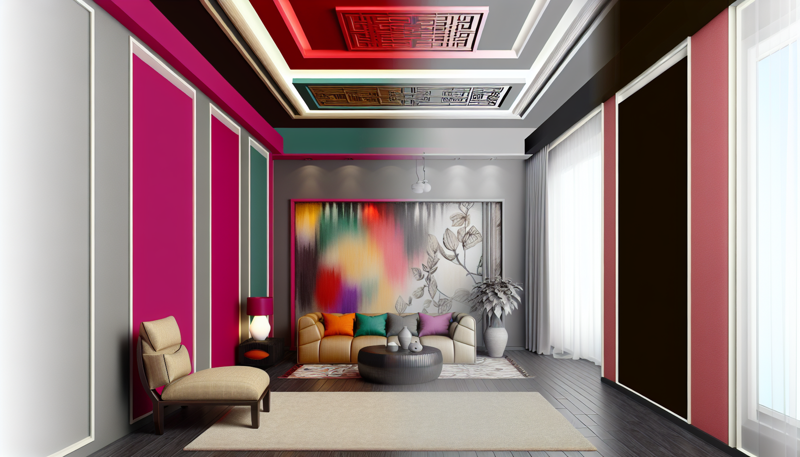
Color Blocking for Impact: Bold and Beautiful
This isn’t just about straight lines. Think about geometric shapes, perhaps a large rectangle or a diagonal slice of color, creating a dramatic block on your accent wall. This approach is fantastic for modern or contemporary spaces, bringing a real artistic flair. It’s like creating a mural without actually painting figures. A really eye-catching trick.
Deeper Meanings: The Psychological Punch of Your Choices
Did you know colors can seriously mess with your head—in a good way, usually? Blues often evoke calm and trust. Greens speak of nature and renewal. Yellows can be cheerful, downright energetic. Reds? Passion, power, even hunger (which is why you see it in so many restaurants!). When you’re choosing your two tones, consider the mood you want to set. A serene bedroom might lean towards cool blues and soft greys. A vibrant living room could handle a splash of orange with a grounding cream. It’s about more than just picking what looks good; it’s about how it *feels*. This is where design truly becomes an experience.
Beyond the Horizon: Innovative Two-Tone Techniques
Who says paint has to be applied in neat, straight lines? Let’s get a little wild, shall we?
The Ombre Effect: A Seamless Fade
This is where two colors gently blend into each other, creating a soft, gradient effect. It’s dreamy, it’s artistic, and it’s surprisingly achievable, even for DIYers. You usually start with the darker color at the bottom, graduating to a lighter shade towards the top. It creates such a calming, almost ethereal atmosphere. It’s more work, definitely, but the payoff is exquisite.
Geometric Play: Angles, Stripes, and Shapes
Why stick to the predictable? Use painter’s tape to create bold stripes, chevron patterns, or even abstract geometric shapes. Imagine a sharp, contrasting diagonal line slicing across your wall, with one color filling each section. This technique is fantastic for adding a modern, edgy vibe and can truly make a wall a piece of art. It’s a little more advanced, but the impact? Huge.
Architectural Highlights: Emphasizing Existing Features
Got picture rails, wainscoting, or unique architectural details? Use your two-tone scheme to highlight them! Paint the wainscoting one color and the wall above another. This not only adds visual interest but also draws attention to the craftsmanship of your home. It’s like giving your house a little bit of extra character.
Choosing Your Palettes: Practical Advice from a Pro (Almost!)
Alright, armed with a bit of theory and some techniques, how do you actually pick the *right* colors? This is often the trickiest part, honestly. It’s where doubt creeps in, where you start second-guessing yourself. Don’t worry, I’ve got some pointers.
Consider the Room’s Function: Mood Matters
What’s the room for? A bedroom needs quiet, relaxing colors. A home office might benefit from colors that promote focus and creativity. A living room can be more social, welcoming. The function of the space is paramount in guiding your color choices. You’re not going to paint your baby’s nursery a stark black and white, right? (Unless you’re going for a very specific, high-contrast visual stimulation, but that’s another article!)
Natural Light: Friend or Foe?
This is HUGE. A color that looks amazing in a brightly lit showroom might look completely different in your north-facing room. Always, ALWAYS get paint samples and swatch them directly on your wall. Look at them at different times of day. See how the natural light—or lack thereof—changes the hue. Artificial lighting also plays a role, so consider that, too. Believe me, skipping this step leads to heartache and re-painting.
Existing Furnishings: The Unsung Heroes
Unless you’re gutting the entire room, your existing furniture, artwork, and textiles are part of the equation. Your two-tone accent wall should complement, not clash with, these elements. Pull colors from a favorite rug, a piece of art, or even throw pillows. It creates a cohesive, put-together look effortlessly. It’s like finding the perfect accessories for an outfit and making everything just *click*.
Tester Pots Are Your Best Friends (Seriously!)
I can’t stress this enough. Buy tester pots. Paint decent-sized swatches on your accent wall. Live with them for a few days. See how the colors interact with each other, with the light, with your room’s vibe. What looks good on a tiny chip can be overwhelming on a whole wall. This small investment saves you a massive headache down the line. It’s truly a non-negotiable step in the process. Some companies, like Sherwin-Williams, even offer peel-and-stick samples now, which means less mess and quick changes!
Tool Time: Gearing Up for Your Colorful Conquest
Alright, you’ve got your colors picked, your scheme all figured out. Now, let’s talk shop. What do you actually *need* to make this magic happen? It’s not just paint and a brush, my friend.
The Essentials: Not Just Pretty Paints
- High-Quality Painter’s Tape: This is non-negotiable for crisp lines. Don’t skimp here! FrogTape is a personal favorite for its clean edges.
- Drop Cloths: Protect your floors and furniture. Seriously, embrace the drop cloth.
- Rollers and Brushes: Good quality makes all the difference. Get a brush for cutting in and rollers for larger areas.
- Paint Trays: Obvious, but worth mentioning.
- Measuring Tape and Level: Crucial for those perfectly straight lines.
- Sponges/Rags: For quick clean-ups, because spills happen.
Getting Those Lines Sharp: A DIYer’s Secret Weapon
Here’s a little trick for razor-sharp lines when dealing with two colors: after applying your painter’s tape, paint a coat of your *base* color (the one already on the wall, or the first one you’re applying) *over* the edge of the tape. What this does is seal the tape, preventing the second color from bleeding underneath. Once that first seal coat dries, then paint your second color. When you peel off the tape, you’ll have beautifully crisp lines. It’s an extra step, but oh-so-worth-it for a professional finish. It’s a trade secret folks often forget about while being in a hurry.
Common Pitfalls and How to Dodge Them (Because We All Make Mistakes)
Look, nobody’s perfect, especially when tackling a DIY project. But knowing what *not* to do can save you a lot of grief (and paint!).
Ignoring Your Trim: It’s Part of the Ensemble
Don’t forget about your trim, molding, and baseboards. They’re part of the overall picture. Often, a crisp white or a very light neutral works best to frame your two-tone masterpiece. But sometimes, painting the trim the same color as the lower portion of your wall can create a seamless, built-in look. Think about how the trim interacts with your chosen hues.
Overlooking the Ceiling: The Fifth Wall, People!
The ceiling isn’t just a white expanse up there; it’s the “fifth wall.” A light ceiling can make a room feel taller and airier, especially if you have a darker color on your wall. But sometimes, a slightly tinted ceiling (perhaps a very pale version of one of your accent colors) can create a truly enveloping, sophisticated space. It bears consideration, even if you just stick with classic white.
Fear of Commitment: It’s Just Paint!
Honestly, the biggest mistake people make is being too timid. It’s paint! If you hate it, you can repaint it. It’s not a permanent tattoo. Experiment, take a chance, and trust your gut. Design is supposed to be fun, a reflection of *you*. So, go on, be brave. The worst thing that happens is you learn what you *don’t* like. And that’s still a win in my book. In fact, many designers consider a “mistake” a form of creative iteration. Who are we to argue with that, right? For some great visual inspiration and to see how others have tackled these ideas, check out sites like Pinterest for two-tone wall ideas.
Final Thoughts: Your Walls, Your Story
So there you have it. Two-tone accent walls aren’t just a fleeting trend; they’re a powerful design tool. They offer depth, define space, infuse personality, and frankly, they just look really, really good when done right. From the subtle elegance of a monochromatic blend to the dramatic flair of complementary contrasts, the possibilities are genuinely exciting.
It’s about making your home your sanctuary, a place that genuinely reflects who you are and how you want to feel. So go ahead, grab those tester pots, unleash your inner designer, and transform a wall (or two!). You’ll be amazed at the difference a little bit of color, thoughtfully applied, can make. Happy painting!
Frequently Asked Questions About Two-Tone Accent Walls
Disclaimer
Please remember that while this article offers general advice and creative inspiration for two-tone accent walls, individual results may vary based on specific room conditions, paint brands, application techniques, and personal aesthetic preferences. Always prioritize safety when working with paints and tools, and adhere to manufacturer guidelines for product use and ventilation. If you’re unsure about any aspect of a painting project, seeking advice from a professional painter or interior designer is always recommended.
Categories
- Accent Walls & Ceilings (61)
- Art Curation & Gallery (62)
- Bedding Style Trends (68)
- Bedroom Makeover (81)
- Bohemian & Eclectic Styles (58)
- DIY & Budget-Friendly Decor (64)
- Eco-Friendly Design (62)
- Furniture Care (71)
- Home Decor & Design Ideas (162)
- Home Wellness Spaces (59)
- Integrated Outdoor Living (67)
- Japandi Style (61)
- Kids and Nursery Decor (59)
- Living Room Decor (79)
- Mix & Match Techniques (73)
- Modern & Contemporary Design (66)
- Rug Sizing & Placement (73)
- Scandinavian Design Inspiration (20)
- Seasonal Home Decor (79)
- Small Space Solutions (73)
- Wall Art & Painting Tips (77)
Recent Comments
Archives
Product Gallery
-
 Large Area Green Rugs for Bedroom Nordic Living Room Decoration Shaped Carpet Irregular Plush Lounge Rug Home Thick Washable Mat
Rated 5.00 out of 5$36.00 – $225.00Price range: $36.00 through $225.00
Large Area Green Rugs for Bedroom Nordic Living Room Decoration Shaped Carpet Irregular Plush Lounge Rug Home Thick Washable Mat
Rated 5.00 out of 5$36.00 – $225.00Price range: $36.00 through $225.00 -
 Nordic Style Rugs for Bedroom Morandi Living Room Decoration Carpet Large Area Geometry Lounge Rug Home Cloakroom Non-slip Mat
Rated 5.00 out of 5$26.00 – $387.00Price range: $26.00 through $387.00
Nordic Style Rugs for Bedroom Morandi Living Room Decoration Carpet Large Area Geometry Lounge Rug Home Cloakroom Non-slip Mat
Rated 5.00 out of 5$26.00 – $387.00Price range: $26.00 through $387.00 -
 Irregular Shapes Living Room Decoration Carpet Modern Style Rugs for Bedroom Home Thicken Plush Rug Fluffy Soft Lounge Floor Mat
Rated 4.83 out of 5$37.00 – $225.00Price range: $37.00 through $225.00
Irregular Shapes Living Room Decoration Carpet Modern Style Rugs for Bedroom Home Thicken Plush Rug Fluffy Soft Lounge Floor Mat
Rated 4.83 out of 5$37.00 – $225.00Price range: $37.00 through $225.00