Color Palette Secrets: Mixing Modern and Vintage Like a Designer
Color is the silent storyteller of our lives — it influences our moods, reflects our identities, and shapes our perceptions. Ever walked into a room and felt an immediate vibe? It’s all in the color palette. Blending modern and vintage elements can feel like a daunting task, but it doesn’t have to be. So, let’s untangle this colorful conundrum.
Understanding the Power of Color
Have you ever thought about how color sways our feelings? Whether it’s the fiery reds of a sunset or the cool blues of the ocean, colors evoke emotions and memories. To effectively mix vintage and modern palettes, start by grasping this power.
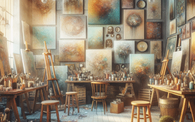
The Allure of Vintage Colors
There’s something inherently enchanting about vintage colors. Think about soft pastels, muted tones, or rich jewel shades from days gone by. These hues tell stories, whispering of nostalgia and history. Have you noticed how a dusty rose can instantly add warmth and character to a room? Embrace the remnants of bygone eras as you venture into this colorful journey.
Modern Colors: Bold and Brilliant
Modern color palettes are often bolder, relying on bright and vibrant hues to create an impactful presence. They exude confidence — really, who doesn’t love a splash of neon or a striking contrast? Balancing these elements with their vintage counterparts can be like dancing with time; it requires finesse but can yield breathtaking results.
Finding Your Balance
How do you strike that perfect balance? Here’s the trick: Start with a neutral base. Imagine a blank canvas — your wall, perhaps. Layer in vintage colors, and freshen them up with pops of modern shades. You can think of it as seasoning your favorite dish; it’s all about enhancing the flavors!
Creating a Cohesive Color Palette
A cohesive color palette is your ticket to harmony. Consider the color wheel. Opposites attract, right? Experiment with analogous colors for a seamless look, or dive into complementary shades for that extra punch. Think of your palette as an ensemble cast in a movie — each character (or color) has a role but works together for a fantastic finale.
Tips for Mixing Modern and Vintage Palette
Feeling a bit lost? Here are some solid tips that can help steer you in the right direction:
- Start small: Try introducing one or two vintage elements to a modern space.
- Use textures: Pair vintage fabrics with modern designs for depth.
- Accessorize wisely: Vintage finds can pop against sleek, modern backgrounds.
- Play with scale: Mix large modern art pieces with small vintage accents.
All About Undertones
Let’s talk undertones. Every color has a hidden personality, and understanding these can be a game changer. Warm undertones in vintage greens can enhance the coolness of modern gray, creating a soothing contrast. It’s like finding common ground in a conversation — sometimes, less is more.
Picture This: Room Scenarios
Visualizing your space can be tough, so let’s paint a few scenarios:
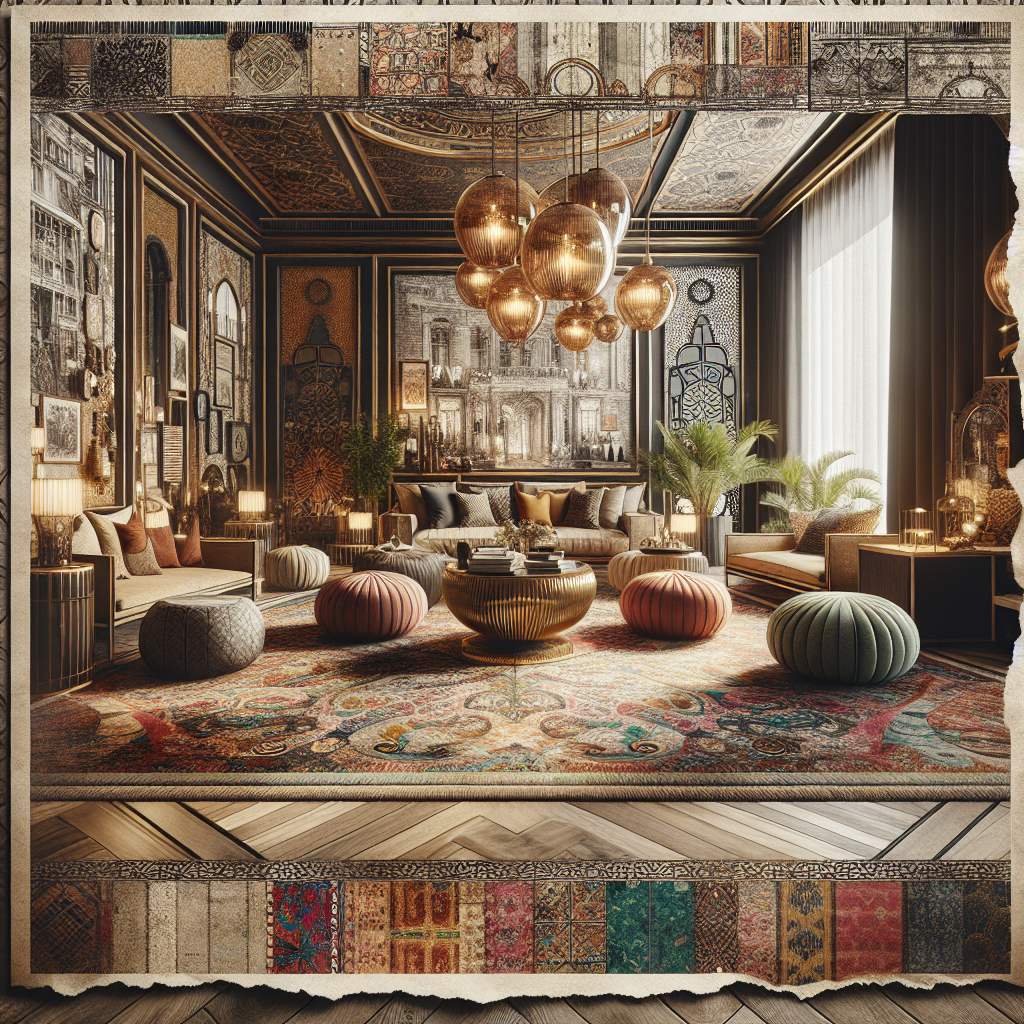
1. The Cozy Living Room
Picture a cozy space with a creamy white sofa, a vintage wooden coffee table, and modern abstract artwork in bold oranges and blues. It feels balanced, right? The vintage elements ground the space, while the modern touches keep it lively.
2. Eclectic Dining Area
How about a dining area? Imagine a sleek, modern table paired with vintage chairs in rich velvet. Add an oversized contemporary light fixture above—talk about a conversation starter!
3. Serene Bedroom
Consider a bedroom that combines soft vintage florals with crisp, modern bedding. The warmth of the vintage tones invites comfort while the modern aesthetic keeps it fresh and clean.
The Emotional Touch
Colors can be deeply personal. Have you ever chosen a paint color based on a cherished memory? Mixing modern and vintage can evoke feelings of nostalgia while embracing the present. Think about how your choices impact not only your space but your well-being!
The Science of Color Psychology
Let’s get a bit nerdy for a moment. Color psychology tells us that certain colors can modify our mood and behavior. For instance, blues can be calming, while yellows can energize. As you mix your color palette, consider how each hue might impact your daily life. Are you feeling more relaxed or motivated in your newly colored space?
Real-World Examples: Designers Who Nail It
Look at various designers who seamlessly weave vintage and modern together. One standout is Ellen Pompeo; her home is a masterclass in mixing styles. From mid-century furniture to contemporary art, it all feels like a harmonious tapestry. This isn’t just a trend; it’s a lifestyle choice.
Tools for Choosing Your Palette
Struggling to narrow down your colors? Try color-matching apps like Sherwin-Williams’ ColorSnap or Behr’s ColorSmart. They’re like having your personal color assistant right in your pocket. Plus, the visualizer feature lets you see how those hues would look right on your walls. Pretty nifty, huh?
Seasonal Considerations
Think about the seasons, too. A color that feels fresh and light in spring can feel heavy in winter. Incorporate seasonal accents into your palette for a refreshing change. For example, warm earth tones in autumn can complement modern grays beautifully.
Mixing Patterns as a Pro
Here’s where it gets fun! Mixing patterns can also add depth to your color palette. Pair a vintage floral print with a contemporary geometric design. In essence, it’s just like going out; sometimes, the most unlikely combinations can result in the most delightful experiences!
Final Touch: Personalize Your Palette
Don’t forget to touch on what makes you feel at home. Colors that resonate with your personality or reflect your travels can drive the heart of your space. It’s all about finding those little pieces that remind you of cherished moments or aspirations.
Conclusion: Your Color Journey Awaits
Color mixing isn’t just a science — it’s an art form. Mixing modern and vintage doesn’t have to give you a headache; in fact, it can be surprisingly fulfilling! With the right palette, your rooms can express who you are in ways that mere furniture can’t. So grab those paint swatches and get ready to create your personal masterpiece!
Frequently Asked Questions
Typically, earthy tones with bright accent colors work well together. Muted vintage hues paired with bolder modern colors create a lovely balance.
Consider repainting furniture in a modern color or updating hardware for a fresh look. Pairing vintage pieces with contemporary decor can also bridge the gap.
No, you can achieve the look through accents! Throw pillows, art, and textiles can introduce modern touch without overwhelming the space.
Your focal point could be a striking piece of art or a beautifully upholstered chair. Ensure it’s in a shade that resonates with both palettes for cohesion.
Absolutely! Just keep to a unified color scheme to maintain harmony, while allowing each pattern to stand out.
While there are no hard rules, a good rule of thumb is to let one style dominate and allow the other to complement it!
Disclaimer
This article is intended for informational purposes only and isn’t a replacement for professional advice. Always consult with a qualified expert for your specific needs.
Categories
- Accent Walls & Ceilings (61)
- Art Curation & Gallery (62)
- Bedding Style Trends (68)
- Bedroom Makeover (81)
- Bohemian & Eclectic Styles (58)
- DIY & Budget-Friendly Decor (64)
- Eco-Friendly Design (62)
- Furniture Care (71)
- Home Decor & Design Ideas (162)
- Home Wellness Spaces (59)
- Integrated Outdoor Living (67)
- Japandi Style (61)
- Kids and Nursery Decor (59)
- Living Room Decor (79)
- Mix & Match Techniques (73)
- Modern & Contemporary Design (66)
- Rug Sizing & Placement (73)
- Scandinavian Design Inspiration (20)
- Seasonal Home Decor (79)
- Small Space Solutions (73)
- Wall Art & Painting Tips (77)
Recent Comments
Archives
Product Gallery
-
 Large Area Green Rugs for Bedroom Nordic Living Room Decoration Shaped Carpet Irregular Plush Lounge Rug Home Thick Washable Mat
Rated 5.00 out of 5$54.94 – $346.41Price range: $54.94 through $346.41
Large Area Green Rugs for Bedroom Nordic Living Room Decoration Shaped Carpet Irregular Plush Lounge Rug Home Thick Washable Mat
Rated 5.00 out of 5$54.94 – $346.41Price range: $54.94 through $346.41 -
 Nordic Style Rugs for Bedroom Morandi Living Room Decoration Carpet Large Area Geometry Lounge Rug Home Cloakroom Non-slip Mat
Rated 5.00 out of 5$39.46 – $597.66Price range: $39.46 through $597.66
Nordic Style Rugs for Bedroom Morandi Living Room Decoration Carpet Large Area Geometry Lounge Rug Home Cloakroom Non-slip Mat
Rated 5.00 out of 5$39.46 – $597.66Price range: $39.46 through $597.66 -
 Irregular Shapes Living Room Decoration Carpet Modern Style Rugs for Bedroom Home Thicken Plush Rug Fluffy Soft Lounge Floor Mat
Rated 4.83 out of 5$55.84 – $347.37Price range: $55.84 through $347.37
Irregular Shapes Living Room Decoration Carpet Modern Style Rugs for Bedroom Home Thicken Plush Rug Fluffy Soft Lounge Floor Mat
Rated 4.83 out of 5$55.84 – $347.37Price range: $55.84 through $347.37