Ever walked into a room and instantly felt a specific way? Sometimes it’s a sense of calm, other times an undeniable surge of energy, or perhaps a feeling of unease. This isn’t just about the furniture arrangement or the natural light. It’s often the subtle yet powerful influence of color. Understanding how to Color Your Mood: The Psychology of Home Decor isn’t just about picking pretty hues; it’s about intentionally shaping your emotional landscape, boosting productivity, fostering relaxation, and even enhancing relationships within your living spaces.
Our homes are more than just shelters; they’re extensions of ourselves, sanctuaries where we unwind, create, and connect. Yet, many of us approach home decor decisions based solely on aesthetics or fleeting trends, overlooking the profound impact colors have on our subconscious. Imagine turning your chaotic office into a hub of focused creativity, or transforming a restless bedroom into a haven of serene slumber, simply by understanding the science behind colors. This comprehensive guide will unlock the secrets of color psychology, empowering you to design spaces that don’t just look good, but genuinely make you feel good.
We’ll delve into the very fabric of how colors work on our minds, explore the specific emotional responses each shade evokes, and provide actionable, expert strategies to apply these principles to every room in your home. From vibrant living rooms to tranquil bathrooms, and from stimulating workspaces to cozy nurseries, you’ll learn to harness the power of the palette. Get ready to embark on a transformative journey where every brushstroke, every throw pillow, and every piece of art becomes a deliberate choice in crafting your ideal emotional environment. By the end of this article, you’ll possess the knowledge to curate spaces that truly resonate with your desired mood and lifestyle.
The Science Behind the Shades: Understanding Color Psychology in Your Home
Before we dive into specific colors, it’s crucial to grasp the fundamental principles of color psychology. This isn’t pseudoscience; it’s a field of study that examines the impact of color on human behavior, mood, and even physical reactions. From ancient civilizations using colored pigments for healing to modern marketing professionals leveraging hues to influence purchasing decisions, the power of color is undeniable. In the context of home decor, it’s about creating environments that support your well-being and daily activities.
How Our Brains Process Color: More Than Just Light
When light hits an object, some wavelengths are absorbed, and others are reflected. Our eyes detect these reflected wavelengths, and our brains interpret them as color. But the process doesn’t stop there. This sensory input triggers a cascade of psychological and physiological responses. For instance, studies have shown that exposure to certain colors can alter heart rate, blood pressure, and even body temperature. Think about the invigorating rush from a bright red, or the cooling calm of a serene blue. These are not arbitrary feelings; they’re deeply ingrained responses shaped by evolution, culture, and personal experiences. The brain’s limbic system, responsible for emotions and memory, plays a significant role in how we react to different shades. This intricate connection means that the colors you surround yourself with are constantly, subtly, influencing your state of mind.
Cultural Nuances and Personal Associations: Beyond Universal Meanings
While some color associations are universal—like red often signifying passion or danger—it’s vital to recognize that cultural background and individual experiences heavily influence our perceptions. In Western cultures, white symbolizes purity, while in some Eastern cultures, it signifies mourning. Similarly, a vibrant yellow might evoke happiness for one person but anxiety for another due to a negative past association. When applying the psychology of home decor, it’s not just about generalized guidelines; it’s also about introspection. What do certain colors mean to *you*? What memories or feelings do they evoke? Integrating personal significance ensures your decor truly speaks to your soul, making your home uniquely yours.
The Dominance of Natural Light in Color Perception
Crucially, a color’s appearance changes dramatically based on the type and amount of light present. Natural daylight, particularly north-facing light, tends to be cooler and can make colors appear more subdued. South-facing light is often warmer and can intensify colors. Artificial light sources also play a huge role: incandescent bulbs cast a warm, yellowish glow, while fluorescent lights are typically cooler and bluer. LED lighting offers a broad spectrum of color temperatures, from warm to cool. Before committing to a paint color, always test a swatch on your wall and observe it throughout the day and night under various lighting conditions. This simple step can prevent costly mistakes and ensure the color you choose truly reflects your desired mood from dawn till dusk.
Beyond the Rainbow: Decoding Individual Color Meanings for Your Interiors
Now, let’s break down specific colors and their widely accepted psychological impacts, offering a strategic guide to integrating them into your home design. Each color brings a distinct energy and meaning, capable of transforming a room’s entire vibe.
Red: Energy, Passion, and Appetite
Red is the most intense color, associated with strong emotions like love, passion, anger, and courage. It’s a stimulating color that raises heart rate and increases energy. In decor, intense reds can be overwhelming in large doses but incredibly impactful as accents. Think of a bold red feature wall in a dining room to stimulate conversation and appetite, or smaller elements like throw pillows, artwork, or a statement chair to add a dynamic focal point. It can also be very effective in an entryway to create a powerful first impression, signaling warmth and enthusiasm. Be cautious with excessive red in bedrooms, as its stimulating nature might hinder relaxation.
- Ideal Rooms: Dining rooms, entryways, accents in living rooms.
- Impact: Stimulates, energizes, evokes passion, increases appetite, promotes social interaction.
- Tips: Use as an accent or in rooms where high energy is desired. Pair with neutrals to balance its intensity.
Orange: Enthusiasm, Creativity, and Warmth
Orange is a vibrant, friendly, and inviting color. It combines the energy of red with the happiness of yellow, creating a sense of warmth, enthusiasm, and joy. This color is often linked to creativity, fun, and optimism. A touch of orange can bring a cheerful and welcoming atmosphere to any space. It’s excellent for rooms where you want to foster social interaction or encourage playful activity. Consider it for a craft room, a playful children’s bedroom, or as a warm accent in a family living area. Desaturated or earthy oranges, like terracotta, can provide warmth without the high energy of brighter shades.
- Ideal Rooms: Playrooms, creative studios, living rooms (as accents), kitchens.
- Impact: Encourages socialization, stimulates enthusiasm, fosters creativity, delivers warmth.
- Tips: Great for common areas. Use brighter shades for high-energy spots, softer tones for warm comfort.
Yellow: Happiness, Optimism, and Mental Clarity
Yellow is the color of sunshine, universally associated with happiness, optimism, and enlightenment. It’s known to stimulate mental activity and encourage communication, making it an excellent choice for learning environments or areas where you need to focus. A sunny yellow kitchen can make mornings brighter, while a yellow accent wall in an office can boost concentration. However, much like red, too much bright yellow can sometimes lead to feelings of anxiety or overstimulation, especially in highly saturated forms. Pale yellows, like a creamy buttercup, can bring warmth and light to a room without overpowering it, making smaller spaces feel larger and more welcoming.
- Ideal Rooms: Kitchens, home offices, children’s rooms, naturally dark rooms.
- Impact: Boosts mood, encourages optimism, stimulates intellect, enhances communication.
- Tips: Use brighter yellows sparingly or in spaces requiring alertness. Softer yellows offer gentle warmth.
Green: Balance, Harmony, and Renewal
Green is the color of nature, tranquility, and growth. It’s often associated with peace, health, and stability. Because it falls in the middle of the color spectrum, green is considered a highly balanced and calming color, making it perfect for almost any room. It can help alleviate stress and promote a sense of well-being. Think of a muted sage green in a bedroom for a restorative sleep environment, or a rich emerald in a living room for an elegant yet grounding feel. Bringing plants into your decor also enhances this green connection, literally bringing nature indoors to amplify its calming effects. Psychology Today often discusses the restorative power of natural elements and colors like green.
- Ideal Rooms: Bedrooms, bathrooms, offices, living rooms – virtually any room.
- Impact: Calming, balancing, promotes well-being, encourages productivity, reduces stress.
- Tips: Versatile and soothing. Lighter greens for spaciousness, deeper greens for sophistication.
Blue: Serenity, Trust, and Productivity
Blue is consistently ranked as one of the most popular colors globally. It evokes feelings of calmness, serenity, trust, and stability. Unlike red, blue has a cooling effect and has been shown to lower blood pressure and heart rate. This makes it an ideal choice for bedrooms, bathrooms, and meditation spaces where relaxation is paramount. Lighter blues can make a room feel expansive and airy, reminiscent of the sky and ocean. Deeper blues, like navy or sapphire, convey sophistication and authority, making them suitable for home offices or formal living areas, promoting focus without agitation. Be mindful that too much cool blue in a naturally cold space might make it feel unwelcoming.
- Ideal Rooms: Bedrooms, bathrooms, home offices, studies.
- Impact: Calming, promotes relaxation, enhances focus, stimulates productivity, instills trust.
- Tips: Excellent for rest and concentration. Combine with warm accents to prevent a sterile feel.
Purple: Luxury, Creativity, and Spirituality
Historically associated with royalty, purple represents luxury, creativity, and spiritual depth. It merges the stability of blue with the energy of red, creating a powerful and enigmatic hue. Lighter shades of purple, like lavender or lilac, are gentle and calming, ideal for bedrooms or meditation spaces, promoting introspection and peace. Deeper purples, such as aubergine or deep plum, add a dramatic flair and sense of sophistication to living rooms, dining rooms, or powder rooms. This color can inspire creativity and promote a sense of thoughtfulness, making it a great choice for a creative studio or a cozy reading nook. Its unique character makes it a standout choice for adding personality.
- Ideal Rooms: Bedrooms (lighter shades), creative spaces, accent walls in living/dining rooms, powder rooms.
- Impact: Inspires creativity, evokes luxury, promotes spirituality, encourages introspection.
- Tips: Use lighter shades for tranquility, deeper shades for drama and elegance.
Pink: Nurturing, Compassion, and Playfulness
Derived from red but softened, pink embodies nurturing, compassion, and playfulness. It’s often associated with femininity, love, and tenderness. While historically seen as a “girly” color, modern applications of pink in decor are far more sophisticated. Millennial pink, dusty rose, and blush tones offer a soothing, calming presence perfect for bedrooms, nurseries, or even as a chic accent in a living space. It can create an inviting and comforting atmosphere, promoting feelings of warmth and empathy. Light pinks can be surprisingly versatile, adding a soft, optimistic glow without being overly sweet. It’s a color that evokes joy and gentle affection.
- Ideal Rooms: Bedrooms, nurseries, bathrooms, living rooms (as soft accents).
- Impact: Soothing, nurturing, compassionate, enhances comfort, promotes gentle feelings.
- Tips: Use blush or dusty pinks for sophisticated warmth; brighter pinks for playful accents.
Brown: Earthiness, Stability, and Comfort
Brown is a grounding, earthy color associated with stability, warmth, and resilience. It evokes feelings of reliability, comfort, and security, much like the solid earth beneath our feet. In decor, brown can be incredibly versatile, ranging from light tan to deep chocolate. It forms an excellent neutral base for many decor styles, providing a sense of natural warmth and connection to the outdoors. Often found in natural materials like wood, leather, and stone, brown brings an organic, cozy feel to any room. It pairs beautifully with greens, blues, and creams, creating a sophisticated and welcoming ambiance ideal for living rooms, studies, or dining areas. It’s the color of enduring strength.
- Ideal Rooms: Living rooms, studies, dining rooms, bedrooms (especially as wood tones).
- Impact: Grounding, stable, comforting, warm, reliable, natural.
- Tips: Use in rich, natural textures. Great as a base color or for large furniture pieces.
Gray: Sophistication, Balance, and Modernity
Gray is the ultimate neutral, positioned between black and white. It symbolizes sophistication, balance, and modernity. A wonderfully versatile color, gray can be cool and sleek, or warm and inviting depending on its undertones (blue undertones are cool, beige undertones are warm). It provides a strong, elegant backdrop that allows other colors and textures to shine. Light grays can make a space feel expansive and airy, while darker charcoals offer drama and intimacy. Gray is a popular choice for contemporary and minimalist designs, creating a calm and composed atmosphere, ideal for professional settings like offices or sophisticated living spaces. However, be cautious; too much cool gray can sometimes feel sterile or detached if not balanced with warmer elements.
- Ideal Rooms: Living rooms, bedrooms, offices, bathrooms, kitchens.
- Impact: Sophisticated, balanced, calming, modern, versatile backdrop.
- Tips: Choose warm grays for cozy feels, cool grays for modern elegance. Always add pops of color.
Black: Power, Elegance, and Drama
Black is a powerful and assertive color, often associated with elegance, sophistication, and a sense of drama. In interior design, black used strategically can add depth, contrast, and definition to a space. It can make a strong statement in a modern living room, or add a touch of glamour to a dining area. Black accent walls, trim, or furniture pieces can ground a room and make other colors pop. However, it’s important to use black judiciously, as too much can make a room feel small, heavy, or somber. When paired with metallic accents, rich textures, or vibrant colors, black can create a truly luxurious and impactful environment, demonstrating confidence in design.
- Ideal Rooms: Modern living rooms, dining rooms, accent walls, studies, powder rooms.
- Impact: Sophisticated, powerful, elegant, dramatic, creates contrast and definition.
- Tips: Use as an accent or for architectural features. Balance with lighter colors and textures.
White: Purity, Simplicity, and Spaciousness
White is the quintessential neutral, representing purity, simplicity, and cleanliness. It reflects light, making spaces feel larger, airier, and more open. White walls provide a perfect canvas for artwork, furniture, and decorative elements to stand out. It’s a timeless choice that offers a crisp, fresh aesthetic. However, white comes in countless shades, each with different undertones—from cool, stark whites with blue or gray hints to warm whites with yellow or pink undertones. Choosing the right white is crucial to prevent a room from feeling sterile. Warm whites create a cozier, more inviting atmosphere, while cooler whites are often favored for modern, minimalist designs. When considering Color Your Mood: The Psychology of Home Decor, white is your ultimate versatile foundation.
- Ideal Rooms: Any room, especially small spaces, bathrooms, kitchens.
- Impact: Expansive, clean, pure, simple, airy, fresh, versatile.
- Tips: Choose warm whites for comfort, cool whites for crisp modernity. Layer textures to add warmth.
Strategic Application: Curating Colors for Every Room
Understanding individual color psychology is one thing; effectively applying it room by room is another. Different spaces in your home serve different functions, and thus require a tailored approach to color. The goal is to optimize each area for its primary purpose, enhancing the emotional experience for those who use it.
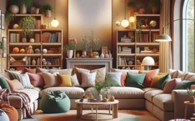
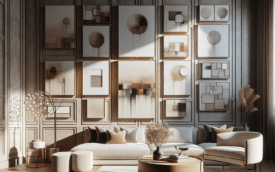
The Living Room: Social Hub & Relaxation Zone
Your living room is often the heart of your home – a place for gathering, relaxation, and entertainment. The color scheme here should foster comfort and conversation.
Common Goal: Welcoming, comfortable, conducive to conversation.
Color Choices:
- Warm Neutrals (Beige, Taupe, Cream): Excellent foundation for warmth and versatility. They create a cozy, inviting atmosphere and allow other colors to pop as accents.
- Soft Blues & Greens: Introduce calm and serenity, promoting relaxation. A muted sage or a gentle robin’s egg blue can enhance a peaceful ambiance.
- Understated Reds/Oranges (Terracotta, Rust, Burnt Orange): Used as accents in form of pillows, throws, or artwork, these can add warmth, energy, and stimulate interaction without overwhelming the space.
Consideration: Aim for balance. If using a strong color on one wall, balance it with softer tones elsewhere. Layering textures (velvet, knits, wood) with your chosen colors adds depth and sophistication.
The Kitchen: Energy, Appetite & Cleanliness
The kitchen is a bustling activity zone where creativity, conversation, and culinary delights converge. Colors here should ideally stimulate alertness and appetite while maintaining a clean, fresh feel.
Common Goal: Inviting, stimulating appetite, feeling clean and efficient.
Color Choices:
- Yellow: Bright, cheerful, and known to stimulate appetite. A sunny yellow on cabinetry or as an accent can make mornings feel brighter and more optimistic.
- White: Promotes a sense of cleanliness, spaciousness, and freshness. Classic white kitchens remain popular for their timeless appeal and ability to make a space feel hygienic.
- Warm Grays or Neutrals: Provide a sophisticated backdrop, allowing for colorful appliances, dishes, or fresh produce to become focal points. They can also prevent a clinical feel often associated with stark white.
- Blues (Light to Mid Tones): Believe it or not, some blues can be great for kitchens, particularly in coastal or farmhouse styles. They can offer a fresh, clean vibe without being too stimulating.
Consideration: Balance vibrant colors with neutrals. A splash of red in accessories can also subtly stimulate appetite and conversation. Natural wood tones beautifully integrate warmth into any kitchen palette.
The Bedroom: Sanctuary for Rest & Romance
The bedroom is your personal sanctuary, a place for relaxation, rest, and intimacy. Colors should promote tranquility, comfort, and a sense of calm. Avoid overly stimulating hues.
Common Goal: Relaxing, peaceful, conducive to sleep and intimacy.
Color Choices:
- Blues: Widely recognized for their calming effect, blues reduce anxiety and promote restful sleep. Soft sky blues, deep navy, or tranquil teal are excellent choices.
- Greens: Earthy and soothing, greens connect us to nature, offering a sense of balance and renewal. Sage, olive, or even a deep forest green can be incredibly peaceful.
- Soft Pinks & Lavenders: Nurturing and gentle, these shades create a serene, romantic, and dreamy atmosphere. Blush pinks and muted purples can be highly comforting.
- Warm Neutrals (Cream, Light Gray, Greige): Provide a cozy and sophisticated canvas that can be accented with other calming colors. They help create a soft, enveloping feel.
Consideration: Texture is key in bedrooms. Velvet, linen, and soft knits in calming colors enhance the relaxation factor. Avoid bright reds and oranges, which can be too stimulating for sleep.
The Home Office: Focus, Productivity & Inspiration
Your home office needs to inspire focus, productivity, and creativity. The colors chosen can significantly impact your mental clarity and work ethic.
Common Goal: Productive, focused, inspiring, reduced stress.
Color Choices:
- Blues: Light to medium blues are known to enhance focus and productivity while providing a calming backdrop, reducing stress. A thoughtful choice for sustained concentration.
- Greens: Offer the calming effect of nature, reducing eye strain and promoting a sense of well-being, which is crucial during long work sessions.
- Yellow (Accents): A touch of yellow can boost optimism and stimulate mental activity without being overwhelming if used sparingly, perhaps in a notice board or desk accessories.
- Gray: A sophisticated neutral that promotes a sense of balance and professionalism. Warm grays can be very comforting while maintaining a sharp look.
Consideration: Incorporate natural elements like plants to enhance the green effect. Ensure good lighting to prevent eye fatigue. Avoid overly busy patterns or extremely bright, distracting colors in your direct line of sight.
- Case Study Integration: The “Blue-Collar” Productivity Boost: A study by the National Institutes of Health (while not specifically about home offices) showed that certain colors could influence efficiency. Many interior designers note the consistent request for blues in office environments, linked to improved concentration and a reduction in perceived stress during demanding tasks.
The Bathroom: Refreshment, Cleanliness & Tranquility
Bathrooms are spaces for cleansing and refreshing, both physically and mentally. The color palette should reflect this, evoking cleanliness, tranquility, and, for some, a spa-like retreat.
Common Goal: Clean, fresh, tranquil, sometimes invigorating.
Color Choices:
- Whites: The classic choice for cleanliness and brightness. Different shades of white can significantly change the mood, from sterile cool to soft, inviting warm whites.
- Blues & Greens: Reminiscent of water and nature, these colors are naturally calming and refreshing. Spa-like aquas, seafoam greens, or deep ocean blues create a serene oasis.
- Grays: A sophisticated and calming neutral. Light grays create an airy feel, while charcoal can add a touch of modern luxury, especially when paired with white fixtures.
- Light Pinks/Blush: Can provide a soft, warm glow, making skin tones appear healthier and creating a very flattering atmosphere.
Consideration: Good lighting is paramount. Reflective surfaces (mirrors, polished chrome) can interplay with light and color to enhance spaciousness. Add natural textures like wood or wicker to prevent a cold, sterile feeling.
Kids’ Rooms: Playfulness, Comfort & Growth
Designing for children involves balancing stimulating play with peaceful rest. Colors need to support both their boundless energy and their need for calm.
Common Goal: Stimulating play, fostering creativity, promoting relaxation.
Color Choices:
- Soft Yellows & Oranges: In moderation, these can promote cheerfulness and creativity. Avoid overly bright shades, which can overstimulate.
- Greens: Create a calming, natural environment that supports learning and growth.
- Light Blues & Pinks: Excellent for promoting a sense of calm and nurturing, ideal for sleep areas.
- Muted or Pastel Shades: Generally preferred over highly saturated primary colors, as pastels offer visual interest without overstimulation.
Consideration: Allow for flexibility. Kids’ tastes change rapidly. Use neutral base colors on walls and introduce bolder colors through easily changeable elements like bedding, toys, and wall decals. This allows the room to evolve with them.
The Art of Combining Hues: Crafting Harmonious Color Palettes
Rarely does a room feature a single color. The true magic of color psychology in home decor lies in how colors interact. Understanding color theory and mastering palette creation allows you to wield emotional influence with precision.
Monochromatic Magic: Subtle Depth and Serenity
A monochromatic scheme uses variations of a single color, playing with different shades, tints, and tones. For example, a room designed with varying shades of blue—from a deep navy sofa to sky blue walls and light blue accents—creates a cohesive, sophisticated, and tranquil space. This approach is inherently harmonious and can make a room feel larger and more unified. It’s often chosen to create a serene, minimalist aesthetic, where texture, pattern, and form become the heroes, adding interest without visual clutter. This strategy is excellent for promoting a single, dominant mood, such as calm (with blues) or sophistication (with grays).
Analogous Harmony: Nature’s Gentle Transitions
Analogous color schemes use colors that are next to each other on the color wheel, such as blue, blue-green, and green. These palettes are naturally pleasing to the eye because they often occur together in nature. They create a sense of harmony, comfort, and flow. An analogous scheme feels rich and inviting without being overly bold. Imagine a living room blending a rich olive green with soft teal accents and subtle blue undertones in the wall color. This combination offers a balanced yet distinct visual experience, promoting a sense of calm and organic connection. It offers more visual interest than monochromatic without the high contrast of complementary schemes.
Complementary Contrasts: Dynamic Energy & Bold Statements
Complementary colors are opposite each other on the color wheel (e.g., red and green, blue and orange, yellow and purple). When used together, they create a vibrant, energetic contrast that can be very striking. A complementary palette is inherently dramatic and impactful. Think of a bold fuchsia accent pillow on a deep green sofa, or a vibrant orange vase against a cobalt blue wall. While powerful, this scheme needs careful handling; using equal amounts of highly saturated complementary colors can be overwhelming. Often, one color serves as the dominant shade, and its complement is used sparingly as an accent to provide a punch of energy and visual excitement. This strategy is perfect for spaces where you want to make a bold statement and invigorate the mood.
Triadic Balance: Playful & Balanced Vibrancy
A triadic color scheme uses three colors evenly spaced around the color wheel, such as red, yellow, and blue. This creates a vibrant and playful palette that is inherently balanced because of the even spacing. Triadic schemes are often seen in children’s decor, but can be sophisticated when using desaturated or muted versions of the colors. A living room with a muted mustard yellow wall, a deep teal armchair, and terracotta accents could be both sophisticated and subtly playful. This scheme delivers energy and visual interest, making it engaging without being jarring, perfect for inspiring creativity or social interaction.
The 60-30-10 Rule: A Designer’s Secret
This is a foundational rule in interior design for achieving balanced color palettes.
- 60% Dominant Color: This is your main color, typically used on walls or other large surfaces. It sets the overall mood.
- 30% Secondary Color: This color supports the dominant color but is different enough to create interest. It often appears in upholstery, curtains, or an accent wall.
- 10% Accent Color: This is your ‘pop’ of color, used sparingly in accessories like throw pillows, artwork, or decorative objects. It provides visual interest and a burst of personality.
Applying the 60-30-10 rule ensures that your chosen colors work together harmoniously, guiding the eye and creating a cohesive, professionally designed feel.
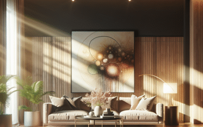
Beyond Paint: Integrating Color Through Textiles, Art & Accessories
Color isn’t just about paint. You can infuse color and its psychological benefits through various elements:
- Textiles: Rugs cover significant floor space, adding warmth and color. Curtains and drapes can provide large blocks of color. Throw pillows and blankets are easy, low-commitment ways to introduce accent colors or seasonal shifts.
- Artwork: Paintings, prints, and sculptures are powerful vehicles for color, acting as focal points and conversation starters. Choose art that evokes the mood you desire.
- Furniture: A brightly upholstered armchair or a colored console table can become a powerful accent piece, dramatically shifting a room’s energy.
- Accessories: Vases, books, plant pots, and decorative objects offer subtle ways to reinforce your color scheme and add interest.
- Lighting: Colored light bulbs (e.g., smart bulbs) can temporarily transform the mood of a room, creating specific atmospheres for relaxation, parties, or focus.
- Natural Elements: Fresh flowers, vibrant fruit bowls, or lush green plants bring natural color and life into a space.
These elements allow for flexibility and experimentation, letting you “try on” different moods without repainting. They are fantastic tools to fine-tune the psychology of home decor in your personal spaces.
Troubleshooting & Advanced Tips for Color Mastery
Even with a solid understanding of color psychology, applying it flawlessly can present challenges. Here are advanced strategies to troubleshoot common issues and elevate your design decisions.
When a Room Feels Cold or Empty: Infusing Warmth
A common complaint is a room feeling too sterile or unwelcoming. This often happens with too much cool gray, stark white, or minimal use of texture.
Solutions:
- Introduce Warm Neutrals: Swap out cool grays for greiges or creamy whites.
- Incorporate Earth Tones: Bring in browns, terracotta, and subdued oranges through wood furniture, leather, or woven accents.
- Add Warm Lights: Use lamps with a warmer Kelvin temperature (2700K-3000K) to cast a softer, cozier glow.
- Layer Textiles: Velvet throws, thick rugs, and textured cushions in warm colors can instantly add comfort and visual warmth.
- Use Warm Metallics: Gold, brass, or copper accents reflect light beautifully and add a touch of luxury and warmth.
Tip: Even a single piece of wooden furniture or a natural fiber rug can dramatically shift the perception of warmth in a cool-toned room, making your understanding of how to color your mood much more effective.
When a Room Feels Overly Stimulating or Energetic: Calming the Chaos
Too much of a good thing can be, well, too much. Rooms dominated by bright, saturated colors can feel overwhelming and lead to restlessness.
Solutions:
- Desaturate: Replace highly saturated colors with their more muted, toned-down versions (e.g., bright red to terracotta, electric yellow to mustard).
- Introduce Neutrals: Paint one wall a calming neutral like a soft gray or off-white to provide visual relief. Break up large blocks of color.
- Increase Cool Tones: Add elements of blue or green in smaller doses (artwork, plants, pillows) to introduce a sense of calm.
- Embrace Negative Space: Declutter and remove unnecessary items. A simpler environment allows the eye to rest.
- Diffuse Lighting: Harsh, direct lighting can intensify colors. Use dimmer switches and diffuse light sources to soften the overall effect.
Tip: Sometimes, simply removing one highly energetic item can break the overwhelming feeling. It’s about balance, not necessarily eliminating all vibrant color.
Maximizing Small Spaces with Color
Color is a powerful tool for tricking the eye and making small rooms feel more spacious and inviting.
Strategies:
- Light Colors: Whites, pastels, and light neutrals reflect light, making walls recede and creating an illusion of greater space.
- Monochromatic Schemes: Using different shades of a single color (especially a light one) blurs the visual boundaries, making the room feel more continuous and larger.
- Cool Colors: Blues and greens are often perceived as ‘receding’ colors, which can make walls appear further away than they actually are.
- Accent Wall (Strategically): A darker, slightly bolder color on the shortest wall can make a long narrow room feel wider. Painting the ceiling a lighter color than the walls can make it feel taller.
- Strategic Contrast: While not the main color, a small, dark accent can ground the room without making it feel claustrophobic, adding depth.
Tool Recommendation: Consider using a color visualizer app (many paint brands offer them) to preview colors in your actual space with varying light conditions. This can save you from costly mistakes and allow for extensive experimentation with color psychology in home decor.
The Power of Undertones: A Subtle Yet Significant Detail
Every color has an undertone—a subtle hue beneath the main color that influences how it appears and interacts with other colors. Ignoring undertones is a common mistake that leads to palettes feeling “off.”
Understanding Undertones:
- Warm Undertones: Golds, yellows, reds, oranges. A “warm gray” might have beige or yellow undertones.
- Cool Undertones: Blues, greens, purples. A “cool white” might have blue or gray undertones.
Scenario: You paint your walls a “greige” (gray-beige) expecting warmth, but it clashes with your cool-toned sofa. This is likely due to the greige having a cool undertone (more gray than beige) or vice-versa.
Testing Undertones:
- Always look at paint samples in your actual room, on all walls, throughout the day.
- Compare your chosen color to a pure version of its underlying hue (e.g., a pure yellow for a warm undertone, a pure blue for a cool undertone).
- When in doubt, consult a color expert or use large peel-and-stick samples (like those from Samplize).
Matching undertones across your palette—from paint to furniture to textiles—ensures a cohesive and harmonious design, creating the precise mood you envisioned.
When to Break the Rules: Intuition & Personal Expression
While color psychology provides powerful guidelines, remember that your home is ultimately a reflection of you. If a particular color combination brings you joy, even if it “breaks” a traditional rule, embrace it. Personal association and intuition can sometimes override universal psychological principles.
Example: A vibrant purple bathroom might seem counterintuitive to “calm,” but if purple is your absolute favorite color and deeply resonates with feelings of happiness and luxury, then for *you*, it creates the desired mood.
Guideline: Use the established principles as a foundation, but allow room for personal expression. Test out bold choices in smaller, less committed ways (like removable wallpaper, accessories) before full immersion. Your emotional response is the ultimate barometer of success when you color your mood in your home.
FAQs: Your Top Questions on Color & Mood Answered
Q: Can a single color really change my mood?
A: Absolutely! While a single color won’t instantly cure all your woes, it significantly influences your subconscious. For example, studies show blue can reduce anxiety and green promotes restorative feelings. Consistent exposure to certain hues in your environment can subtly but effectively shift your daily emotional experience, promoting calm, energy, focus, or relaxation, depending on the chosen color’s psychological associations.
Q: What’s the best color for a bedroom to promote sleep?
A: The best colors for sleep are generally cool, muted tones that promote tranquility. Soft blues, serene greens (like sage or seafoam), gentle lavenders, and warm, pale grays are excellent choices. These colors are known to reduce heart rate and blood pressure, creating a calming atmosphere conducive to rest. Avoid bright reds, oranges, and highly saturated yellows, which are stimulating.
Q: My living room feels dull. How can I add life with color without repainting?
A: You can dramatically inject energy and warmth into a dull room using accessories. Consider colorful throw pillows, a vibrant area rug, bold artwork, or even a statement piece of furniture (like an accent chair) in an energetic hue (e.g., warm yellow, rich orange, or even a deep teal). Don’t forget fresh flowers or lush green plants; their natural colors bring instant life and freshness without any paint.
Q: Are there colors I should avoid in specific rooms?
A: Generally, avoid highly saturated reds or oranges in bedrooms, as their stimulating nature can interfere with sleep and relaxation. In home offices, be cautious with overly distracting bright colors that might hinder concentration. While no color is entirely “bad,” it’s about context. Use very strong, vibrant colors as accents rather than the dominant shade in areas where calm and focus are priorities.
Q: How do I know if a color will look good in my home before committing?
A: Always test. Purchase sample pots and paint large swatches (at least 2×2 feet) on several walls in the room you intend to paint. Observe these swatches at different times of day (morning, afternoon, evening) and under various lighting conditions (natural light, artificial lights). Also, consider using large peel-and-stick paint samples. This method is the most reliable way to see how light and existing decor will interact with your chosen hue.
Q: What’s the difference between “warm” and “cool” grays?
A: The difference lies in their undertones. “Warm” grays (often called “greige”) have subtle beige, yellow, or brown undertones, making them feel cozier and more inviting. “Cool” grays have blue, green, or purple undertones, giving them a crisper, more modern, and sometimes more formal feel. Understanding these undertones is crucial for coordinating with existing furniture and creating a cohesive mood.
Q: Can different shades of the same color evoke different moods?
A: Absolutely! A highly saturated, bright red evokes energy and passion, while a deep, muted burgundy feels sophisticated and grounded. A pale sky blue is airy and serene, but a deep navy blue is authoritative and stable. The intensity, brightness, and undertone of a color significantly alter its psychological impact, allowing for a vast spectrum of moods within a single hue family.
Conclusion: Your Home, Your Mood Masterpiece
You’ve navigated the vibrant spectrum of color psychology in home decor, and now you understand that designing your living spaces is far more than just picking colors you like. It’s an intentional art form, a powerful tool for well-being, and a direct pathway to shaping your daily emotional experience. From the stimulating reds that spark conversation in your dining room to the tranquil blues that invite restful sleep in your bedroom, each hue has a story to tell and a mood to evoke. By thoughtfully selecting and combining colors, you’re not just decorating; you’re actively creating environments that support your lifestyle, enhance your productivity, and foster genuine happiness.
Remember, your home is your canvas, and you are the artist. Start small by introducing accent colors, experiment with different palettes in less-used spaces, and always trust your intuition. What makes *you* feel good is paramount. As you continue to refine your understanding of color and its impact, you’ll find that your home transforms from a mere collection of rooms into a curated masterpiece—a space that truly makes you feel seen, supported, and serene. Begin your journey today and watch as your home, and your mood, come alive with every deliberate splash of color. Ready to unlock the full potential of your living spaces? The power is now in your hands.
Next Steps:
- Audit Your Current Spaces: Walk through each room and consider what mood it currently evokes. Are there discrepancies with your desired feelings?
- Create Mood Boards: Collect images, fabric swatches, and paint chips that represent the colors and textures you’re drawn to.
- Test, Don’t Guess: Always buy samples and observe them in your home’s unique lighting conditions before committing to a larger project.
- Embrace Nature: Integrate natural elements like plants and natural light to amplify calming and refreshing effects.
- Explore More: Continue your journey through our articles on Mindful Design for Wellbeing or Creating a Zen Bedroom for deeper insights into creating harmonious environments.
Content Disclaimer
The information provided in this article regarding color psychology and home decor is intended for general informational and educational purposes only. It is not professional interior design advice. While based on widely accepted psychological principles, individual responses to color can vary greatly due to personal experiences and cultural backgrounds. Always consult with a qualified interior designer or color consultant for personalized advice tailored to your specific needs and preferences. Our recommendations for products or services are offered for convenience and are based on general industry standards; results may vary.
Categories
- Accent Walls & Ceilings (61)
- Art Curation & Gallery (62)
- Bedding Style Trends (68)
- Bedroom Makeover (81)
- Bohemian & Eclectic Styles (58)
- DIY & Budget-Friendly Decor (64)
- Eco-Friendly Design (62)
- Furniture Care (71)
- Home Decor & Design Ideas (162)
- Home Wellness Spaces (59)
- Integrated Outdoor Living (67)
- Japandi Style (61)
- Kids and Nursery Decor (59)
- Living Room Decor (79)
- Mix & Match Techniques (73)
- Modern & Contemporary Design (66)
- Rug Sizing & Placement (73)
- Scandinavian Design Inspiration (20)
- Seasonal Home Decor (79)
- Small Space Solutions (73)
- Wall Art & Painting Tips (77)
Recent Comments
Archives
Product Gallery
-
 Large Area Green Rugs for Bedroom Nordic Living Room Decoration Shaped Carpet Irregular Plush Lounge Rug Home Thick Washable Mat
Rated 5.00 out of 5$55.01 – $346.86Price range: $55.01 through $346.86
Large Area Green Rugs for Bedroom Nordic Living Room Decoration Shaped Carpet Irregular Plush Lounge Rug Home Thick Washable Mat
Rated 5.00 out of 5$55.01 – $346.86Price range: $55.01 through $346.86 -
 Nordic Style Rugs for Bedroom Morandi Living Room Decoration Carpet Large Area Geometry Lounge Rug Home Cloakroom Non-slip Mat
Rated 5.00 out of 5$39.51 – $598.43Price range: $39.51 through $598.43
Nordic Style Rugs for Bedroom Morandi Living Room Decoration Carpet Large Area Geometry Lounge Rug Home Cloakroom Non-slip Mat
Rated 5.00 out of 5$39.51 – $598.43Price range: $39.51 through $598.43 -
 Irregular Shapes Living Room Decoration Carpet Modern Style Rugs for Bedroom Home Thicken Plush Rug Fluffy Soft Lounge Floor Mat
Rated 4.83 out of 5$55.91 – $347.82Price range: $55.91 through $347.82
Irregular Shapes Living Room Decoration Carpet Modern Style Rugs for Bedroom Home Thicken Plush Rug Fluffy Soft Lounge Floor Mat
Rated 4.83 out of 5$55.91 – $347.82Price range: $55.91 through $347.82