Stepping into a home that feels both fresh and inviting starts with the walls. Far more than just a backdrop, the right paint color sets the mood, defines the space, and even influences how you feel. If you’re looking to infuse your living spaces with a modern sensibility, understanding contemporary wall colors for every room is absolutely essential. Gone are the days of sterile white being the only “modern” option. Today’s contemporary palette embraces depth, subtlety, and personalized expression, blending sophisticated neutrals with unexpected pops of color.
But with an overwhelming array of choices, how do you pick the perfect shade that reflects your style while staying current? It’s a common dilemma. Many homeowners feel paralyzed by decision fatigue, worried about making a costly mistake in their paint choices. You might wonder: “Will this color make my small room feel tiny?” or “How can I make my open-plan space feel cohesive?” Rest assured, you’re not alone in these questions. This comprehensive guide is designed to cut through the confusion, offering clear, actionable advice to transform your home with stunning, modern hues.
In this article, we’ll dive deep into the world of contemporary wall paint, exploring the psychology behind color, debunking common myths about modern design, and providing practical room-by-room recommendations. You’ll learn how to choose colors that not only look fantastic today but stand the test of time, creating environments that are both stylish and uniquely yours. Get ready to unlock the secrets of modern color palettes and confidently select the ideal contemporary wall colors for every single room in your home.
The Evolution of Contemporary: What Defines Modern Color Palettes?
The term “contemporary” in design often sparks images of minimalist, stark spaces. However, the true essence of contemporary design has significantly evolved. It’s less about rigid rules and more about a fluid, forward-thinking approach that prioritizes comfort, functionality, and personal well-being. This shift profoundly impacts our choices for contemporary wall colors.
Beyond White: Understanding the Nuances of Modern Neutrals
While white will always be a classic, contemporary neutrals are far more sophisticated than the stark brights of yesteryear. We’re talking about complex greys, warm off-whites, and inviting greiges that serve as a perfect foundation. These aren’t just background colors; they actively contribute to the ambiance, reflecting light and enhancing furnishings. Understanding their undertones is key:
- Warm Neutrals: Think creamy whites, soft beiges with yellow or red undertones, and sandy tones. These colors create coziness and are excellent for rooms where comfort is paramount. They can prevent larger, open spaces from feeling cold.
- Cool Neutrals: Greys with blue or green undertones, cool whites, and muted taupes fall into this category. They offer a sense of calm and sophistication, making spaces feel expansive and airy. Ideal for balancing vibrant artwork or furniture.
- Greige: The chameleon of neutrals, greige is a blend of grey and beige. Its versatility makes it a top choice for contemporary spaces, adaptable to both warm and cool decor elements. It’s often the go-to when you can’t decide between grey and beige.
Embracing Subtle Color: The Rise of Muted Tones and Earthy Hues
Contemporary palettes aren’t afraid of color, but they lean towards muted, desaturated versions rather than bold, primary shades. This adds depth and character without overwhelming the space. Think about colors found in nature – they inspire harmony and tranquility.
- Dusty Blues and Greens: These tranquil shades evoke nature, promoting relaxation. A muted sage green or a soft periwinkle can transform a room into a serene retreat.
- Terracotta and Ochre: Earthy tones bring warmth and an organic feel, moving away from cool industrial looks. These shades inject personality and warmth without being overly bright.
- Deep Jewel Tones (Used Sparingly): While not primary wall colors, deep emerald, sapphire, or amethyst can be used as accent walls or in small, dedicated spaces for a touch of drama and luxury, reflecting a contemporary embrace of rich textures and layered design.
The Importance of Light: How Illumination Transforms Contemporary Wall Colors
A color chip in the store will look drastically different on your wall, and light is the main culprit. Natural light (north, south, east, west-facing rooms) and artificial lighting (warm vs. cool bulbs) inherently alter how a color appears. A north-facing room, for instance, receives cooler, indirect light, making colors appear more muted or even greyed out. A south-facing room, bathed in warm, bright light, will intensify colors and make them appear sunnier.
Always, and we mean always, sample paint colors on your walls. Paint large swatches (at least 2’x2′) on different walls in the room you plan to paint. Observe them at various times throughout the day – morning, noon, and evening – and under both natural and artificial light. This crucial step will save you from costly repaints and ensure your chosen contemporary wall color truly sings in its environment.
Image Suggestion: Infographic showing the same room painted in a neutral, then illustrating how warm vs. cool light changes its appearance, and how northern vs. southern exposure affects it.
Living Room Luminosity: Contemporary Wall Colors for Social Spaces
The living room is often the heart of the home, a place for relaxation, entertainment, and connection. As such, the contemporary wall colors chosen for this space need to be versatile, inviting, and reflective of your personal style. Striking the right balance is key to creating a truly harmonious atmosphere.
Creating an Inviting Ambiance: Top Contemporary Neutrals
For many, the living room serves multiple functions, from quiet evenings to lively gatherings. Neutrals provide a sophisticated and flexible canvas.
- Soft Greiges: A popular choice, greige offers the warmth of beige with the sophistication of grey. It’s incredibly adaptable, pairing well with almost any furniture style or accent color. Consider shades like Sherwin-Williams’ Agreeable Gray or Benjamin Moore’s Revere Pewter.
- Warm Off-Whites: These are a step up from stark white, adding a subtle touch of warmth without losing that clean, expansive feel. Look for whites with a hint of cream, yellow, or even a very light beige undertone. They brighten a room beautifully while still feeling cozy. Think Farrow & Ball’s Wimborne White or Benjamin Moore’s White Dove.
- Muted Earth Tones: Beyond traditional neutrals, muted browns, and even very desaturated greens (like a soft moss or olive) can create an incredibly grounded and organic living space. These colors evoke a sense of calm and connection to nature, perfect for a cozy yet modern feel.
Case Study Integration: Showcase a living room photo that uses varying shades of greige, contrasting it with a pop of a deeper, complementary color in accessories or a single piece of furniture. Discuss how the neutral fosters versatility.
Adding Depth and Personality: Accent Walls and Focused Hues
While an entirely neutral living room is elegant, sometimes a single accent wall or even a strategic pop of color can elevate the entire space, giving it a contemporary edge. This is where you can be a bit bolder.
- Deep Blues or Greens: A feature wall in a rich navy, a smoky teal, or a deep forest green can add dramatic flair and sophistication. These colors are often associated with tranquility and depth, making them excellent for creating a focal point, perhaps behind a fireplace or a large shelving unit.
- Muted Terracotta or Rust: For a warmer, more bohemian contemporary vibe, consider an accent wall in a refined terracotta or a deep rust. These shades pair beautifully with natural woods, woven textures, and metallic accents.
- Charcoal or Black (Yes, Black!): In smaller, defined areas like a reading nook or an alcove, a charcoal grey or even a matte black can create a powerful statement. It adds an urban, chic feel and allows artwork or brightly colored furniture to truly pop against it. This is a bold contemporary wall color choice, but highly effective when used sparingly.
When using an accent wall, ensure it complements the primary wall color. The goal is cohesion, not clashing chaos. The accent color should echo something else in the room – a piece of art, upholstery, or even a throw pillow. Test these bolder shades with even more rigor than your primary colors, as their impact is significant.
Image Suggestion: Before and after photos of a living room, where the “after” shows a neutral room enhanced by a thoughtfully placed deep blue accent wall.
Kitchen & Dining Delights: Contemporary Wall Colors for Culinary Spaces
The kitchen isn’t just for cooking; it’s a hub of activity, a place for family gatherings, and often the heart of daily life. Contemporary wall colors in these areas should be clean, uplifting, and conducive to both functionality and social interaction. For dining areas, the aim is to create an inviting atmosphere that encourages good conversation and lingering meals.
Fresh & Functional: Kitchen Color Schemes
Kitchens benefit from colors that feel fresh and bright. While white cabinetry is a perennial favorite, the walls offer an opportunity to add subtle character.
- Crisp Off-Whites & Light Greys: These choices ensure the kitchen feels clean and expansive. They reflect light beautifully, which is crucial in a workspace. They also provide a neutral backdrop for colorful appliances, backsplashes, or kitchen island accents. Consider Benjamin Moore’s Chantilly Lace or Farrow & Ball’s Pavilion Gray.
- Soft Sage Greens: A very popular contemporary choice, sage green brings the tranquility of nature indoors. It’s subtle enough to feel neutral but adds a gentle pop of color that is both calming and fresh. It pairs wonderfully with white, natural wood, and even dark grey cabinetry.
- Muted Blues: Light, desaturated blues promote a sense of cleanliness and calm, perfectly suited for a kitchen environment. They can make the space feel cooler and more expansive. Think a sky blue or a faded denim shade.
Tool Recommendation: Discuss Sherwin-Williams’ ColorSnap Visualizer or Benjamin Moore’s Color Portfolio app for “trying” colors in a kitchen virtually before painting. Explain how these tools can help visualize contemporary wall colors with existing cabinetry and countertops.
Dining Room Dimensions: Setting the Mood for Meals
The dining room offers a chance to be a bit more expressive with contemporary wall colors, often allowing for deeper, more enveloping hues that still maintain a modern sensibility.
- Earthy Terracotta or Clay: These warm, inviting shades can make a dining room feel incredibly cozy and intimate. They are particularly effective when paired with natural wood furniture and organic textures. They bring an inviting, rustic-modern feel, perfect for encouraging long conversations over dinner.
- Deep Teal or Emerald Green: For a more sophisticated and luxurious dining experience, consider a rich teal or a deep emerald. These jewel tones create a dramatic, elegant backdrop, especially striking in rooms with good natural light or statement lighting fixtures. They pair well with brass, gold, and dark wood finishes.
- Charcoal or Slate Grey: A darker, moody grey can create a very chic and modern dining space. It offers a sophisticated backdrop that makes dishes and glassware really stand out, adding a touch of restaurant-like elegance. This works wonderfully with minimalist decor and metallic accents.
Comparison Element: Table comparing best contemporary wall colors for small vs. large dining rooms, noting how lighter shades expand and darker shades can cocoon.
| Room Size | Recommended Contemporary Wall Colors | Effect |
|---|---|---|
| Small Dining Room | Light Greys, Soft Off-Whites, Muted Blues, Light Sage | Expands space, enhances light, feels open and airy |
| Large Dining Room | Deep Teal, Emerald Green, Terracotta, Charcoal Grey, Navy | Creates intimacy, adds drama, establishes focal points, feels luxurious |
Bedroom Bliss: Contemporary Wall Colors for Private Sanctuaries
Your bedroom is your sanctuary, a place for rest, rejuvenation, and personal reflection. The choice of contemporary wall colors here is paramount in fostering a calm, peaceful, and inviting atmosphere that helps you unwind and truly relax. This is where color psychology truly shines, guiding selections that promote serenity.
Calming & Serene: The Power of Subdued Hues
For a bedroom, the goal is often tranquility. Contemporary palettes excel here with their range of desaturated and calming tones.
- Dusty Blues and Greens: Perhaps the most classic choices for bedrooms, these hues are inherently calming. A dusty sky blue can evoke the feeling of a bright, clear day, while a soft sage or a deeper, muted olive green connects you with nature. These colors are known to lower heart rate and blood pressure, promoting better sleep. Brands like Behr and Valspar offer extensive selections in these calming contemporary wall colors.
- Warm Greys & Greiges: Avoid cold, sterile greys in the bedroom. Instead, opt for those with warm undertones (beige, yellow, or even a touch of pink) that create a cozy, cocoon-like feel. These subtle shifts in grey provide a sophisticated backdrop without feeling stark.
- Soft Lavenders & Mauves: Often overlooked, a very pale, muted lavender or a dusty mauve can bring a beautiful, romantic softness to a bedroom. These colors are soothing and sophisticated, moving far beyond traditional pastels to offer a grown-up, contemporary aesthetic.
Expert Quote: “Color is the most powerful tool in your design toolkit when it comes to influencing mood. In the bedroom, we want colors that encourage relaxation and detachment from the day’s stresses. Think about the colors of a cloudy sky, a misty forest, or a warm stone – these are your comfort zones.” – Sarah Atkinson, Interior Psychologist.
Adding Personal Touches: Accent Walls & Material Pairings
Even in a serene bedroom, an accent wall or thoughtful material choices can elevate the contemporary design without sacrificing calm.
- Behind the Headboard: This is the ideal spot for a deeper, more impactful contemporary wall color. A charcoal grey, a deep teal, or a rich, earthy brown can create a dramatic focal point, making the bed feel even more luxurious and grounded.
- Textured Walls: Beyond paint, consider contemporary wall coverings that offer subtle texture – perhaps a grasscloth wallpaper in a neutral tone, or a Venetian plaster finish in a soft grey. These add depth and visual interest, making the room feel more bespoke and luxurious.
- Pairing with Wood Tones: Contemporary bedroom colors often sing when paired with natural wood furniture – light oak, walnut, or even painted pieces. The warmth of the wood balances the coolness of many muted blues and greens, creating a harmonious and inviting space.
Visual Content Suggestion: A mood board infographic for a contemporary bedroom, showing paint swatches paired with fabric samples (linen, wool), wood finishes, and metallic accents (brushed brass, matte black).
Bathroom & Utility Brilliance: Contemporary Wall Colors for Functional Spaces
Bathrooms and utility rooms, though often smaller, present a unique opportunity to infuse contemporary style. These spaces require colors that are practical, promote cleanliness, and contribute to a sense of calm and efficiency. The right contemporary wall colors can make compact areas feel expansive and inviting.
Clean & Serene: Bathroom Hues
Bathrooms naturally benefit from colors that convey hygiene and tranquility. Contemporary choices balance brightness with subtle character.
- Crisp Whites & Off-Whites: A classic for a reason, pure or slightly warmed whites make a bathroom feel sparkling clean and spacious. They are timeless, allowing fixtures and tiles to be the stars. Consider pairing with matte black or brushed gold hardware for a contemporary contrast.
- Light Blues & Greens: Echoing themes of water and nature, light blues (like serene sky blue or soft aqua) and greens (such as pale mint or seafoam) are perfect for creating a spa-like atmosphere. These contemporary wall colors promote relaxation and feel incredibly fresh.
- Pale Greys & Greiges: Modern greys with cool or warm undertones can give a bathroom a sophisticated, minimalist feel. They are excellent for creating a backdrop that allows white porcelain and chrome fixtures to pop, appearing brighter and cleaner.
- Darker Shades (for Powder Rooms): For smaller powder rooms, don’t be afraid to go bold. A deep charcoal, navy, or even a rich emerald green can create an unexpected jewel box effect, making a tiny space feel luxurious and dramatic. This unexpected touch is very contemporary.
Actionable Insight: When choosing contemporary wall colors for bathrooms, consider the impact of lighting. LED lights with different color temperatures (warm vs. cool white) will drastically change how the paint appears. Test swatches under your actual bathroom lighting at night.
Efficient & Inviting: Utility Room & Laundry Area Colors
Utility spaces, often tucked away, can still benefit from a cohesive and practical color scheme. The goal here is usually brightness and organization.
- Bright Whites: Maximize light and cleanliness in laundry rooms, pantries, or mudrooms with bright whites. They make the space feel larger and cleaner, important for task-oriented areas.
- Light Greys: A light, cool grey can mask minor imperfections or scuffs better than pure white, while still appearing bright and organized. It’s a pragmatic choice for high-traffic or utility-focused areas.
- Soft Blues or Greens: If you want to add a touch of personality, a very light, desaturated blue or green can make a utility space feel less utilitarian and more inviting. These are especially nice in mudrooms or entryways where you transition from outdoors to in.
Case Study Integration: Show a small, well-organized utility room before and after painting. The “before” is dingy white, the “after” is a bright but slightly tinted white or a soft, neutral light grey, demonstrating how paint improves functionality and aesthetics.
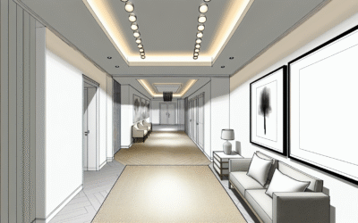
Hallways, Foyers & Open Concepts: Unifying Contemporary Wall Colors
Hallways and foyers are the arteries of your home, connecting different living spaces. In open-concept layouts, the challenge is to create flow and cohesion without everything looking uniform or bland. Selecting the right contemporary wall colors for these transitional zones is crucial for establishing a harmonious overall aesthetic and making your home feel effortlessly connected.
Creating Flow: Seamless Transitions
The primary goal for these areas is to link diverse spaces gracefully. The paint color should act as a subtle connector, guiding the eye from one room to the next.
- Consistent Neutrals: This is the golden rule for open concepts and hallways. Using the same warm off-white, greige, or light grey throughout these areas creates a seamless flow. It means that when you look from the living room into the dining area, the wall color provides a continuous backdrop, even as décor style might subtly shift. This unity makes the entire home feel larger and more cohesive.
- Slight Variations within a Palette: If you want a bit more distinction, choose colors that are adjacent on a paint strip or have the same undertones. For instance, a slightly darker greige in a hallway leading to a lighter greige in the living room provides subtle definition without jarring breaks.
- Consider Lighting: Hallways, often lacking natural light, benefit immensely from lighter contemporary wall colors that reflect whatever light is available. This prevents them from feeling like dark tunnels and instead makes them welcoming passages.
Expert Tip: “Think of your home’s main common areas and hallways as a continuous canvas. A unified neutral palette here provides immense flexibility for individual room expressions and makes spaces feel larger. It’s the silent hero of contemporary design flow.” – Emily Clark, Residential Designer.
Architectural Details & Accents: Elevating the Space
Beyond the primary wall color, consider how contemporary design leverages architectural details and strategic accents in these transitional areas.
- Painting Trim and Doors: While white trim is classic, contemporary design often plays with variations. Painting trim the same color as the walls (for a sophisticated, seamless look) or a slightly darker/lighter shade can add depth. For a bold statement, consider painting interior doors black or a deep accent color to create visual interest.
- Accent Walls in Foyers: If your foyer is a distinct space, an accent wall in a deeper, welcoming hue (like a rich navy, a smoky green, or even a dark floral wallpaper with a contemporary pattern) can make a powerful first impression, setting the tone for the rest of the home.
- Art as Color: In hallways, especially long ones, using a neutral contemporary wall color allows artwork to truly shine. A gallery wall of varied sizes and styles can add dynamic pops of color and personality without overwhelming the space, demonstrating how color isn’t just about paint.
Visual Content Suggestion: An illustration showing an open-concept floor plan with different rooms flowing into each other, highlighting how a consistent neutral wall color unifies the entire space.
Kids’ Rooms & Nurseries: Contemporary Wall Colors for Growing Minds
Designing spaces for children offers a unique blend of fun, functionality, and future-proofing. Contemporary wall colors for kids’ rooms and nurseries move beyond traditional saccharine pastels or overly bright primary colors, embracing sophisticated yet playful palettes that can adapt as your child grows. The goal is to create stimulating environments that also feel calming and versatile.
Playful Yet Poised: The New Palette for Little Ones
Modern nurseries and kids’ rooms focus on colors that support imagination and calm, often incorporating desaturated versions of classic children’s colors.
- Soft, Muted Pastels: Think dusty rose, pale mint green, or a muted sky blue. These aren’t your grandmother’s baby colors; they have a grey or earthy undertone that makes them feel grounded and sophisticated. They offer a serene backdrop for colorful toys and textiles, and can grow with the child into their pre-teen years without needing an immediate repaint.
- Warm Neutrals (with Character): Instead of pure white, consider warm off-whites, a light greige, or even a very pale, warm peach or terracotta. These colors create a cozy, inviting atmosphere. They are excellent for nurseries, as they feel gentle and soft, promoting rest.
- Gender-Neutral Tones: Contemporary design often embraces gender-neutral palettes from the outset. This includes shades like soft yellows (think buttercup or pale mustard), gender-neutral greens (sage, mint), and versatile greys, allowing for flexibility as the family grows or the room changes hands.
Actionable Insight: When selecting contemporary wall colors for a child’s room, consider the light. Bright, energetic hues might be great during playtime but could hinder sleep. Muted tones offer a better balance, supporting both activity and rest.
Beyond the Paint Can: Creative Accents and Adaptability
Contemporary kids’ rooms aren’t just about the base paint; they involve creative use of accents and features that can evolve.
- Accent Walls with Pattern: A single wall can host a playful yet sophisticated wallpaper (think subtle geometric patterns, watercolor animal prints, or a constellation motif) or a creative paint treatment (stripes, color blocking, or mountain murals). This adds personality without committing the entire room to a specific theme.
- Chalkboard Paint or Magnetic Paint: For older kids, a section of a wall painted with chalkboard or magnetic paint offers a functional and fun element crucial for creativity and organization. It’s practical, interactive, and fits perfectly into a contemporary, functional design ethos.
- Color Blocking: Instead of wallpaper, consider painting different geometric shapes or blocks of color on a wall. This allows for incorporating bolder, more stimulating colors (like a deep navy or a vibrant coral) in smaller doses, while the majority of the wall remains a calming neutral. This technique is highly contemporary and easy to update.
- Focus on Furniture & Accessories: With a neutral base on the walls, you can introduce splashes of brighter, more youthful colors through bedding, rugs, curtains, and storage bins. This strategy makes it incredibly easy and cost-effective to update the room’s look as the child’s interests and age change, making your initial investment in contemporary wall colors last longer.
- 60% Dominant Color: This is your primary contemporary wall color. It sets the overall tone for the room. In most cases, this will be a neutral or a very subdued, calming hue that covers the largest surface area (your walls).
- 30% Secondary Color: This color provides contrast and interest. It’s generally used for upholstery, curtains, statement furniture pieces, or even an accent wall. It supports the dominant color but brings its own personality.
- 10% Accent Color: This is your boldest shade, used sparingly for decorative items like throw pillows, vases, artwork, or small accessories. It’s the “pop” that injects personality and vibrancy, preventing the room from feeling flat.
- Flooring: Your flooring (hardwood, tile, carpet) has a significant impact. Warm wood tones pair beautifully with cool greys and blues, while darker floors can ground lighter wall colors. Take a swatch of your flooring when looking at paint samples.
- Furniture: Large pieces of furniture, like sofas, beds, or dining tables, are major investments. Choose contemporary wall colors that harmonize with their existing upholstery or wood finishes. If your sofa is a specific shade of grey, find a wall color with similar undertones or one that provides a pleasing contrast without clashing.
- Artwork and Decor: If you have beloved artwork or distinctive decor pieces, let them inspire your wall color. A neutral wall allows a vibrant painting to truly pop, while a deep, moody wall color can create a gallery-like effect for lighter, minimalist pieces.
- Matte vs. Eggshell vs. Satin Finishes:
- Matte/Flat: Best for ceilings and low-traffic areas. Absorbs light, creating a sophisticated, velvety appearance. Hides imperfections well, but less durable and harder to clean. Ideal for an elegant, contemporary wall color look.
- Eggshell/Satin: Most common for walls. Offers a subtle sheen, making it more durable and easier to clean than matte. It reflects a bit of light, adding a soft glow. Great for living rooms, bedrooms, and dining rooms.
- Semi-Gloss/Gloss: Very durable and washable, often used for trim, doors, and bathrooms/kitchens due to its ability to withstand moisture and frequent cleaning. Its high sheen can make wall imperfections more noticeable.
- Textured Wallpapers & Finishes: Contemporary design increasingly incorporates subtle textures like grasscloth wallpaper, linen-look wallpaper, or limewash paint. These finishes add depth and warmth to a wall, even in a neutral color, making the space feel richer and more custom. Venetian plaster, raw concrete finishes, or even textured paint techniques can transform an ordinary wall into a work of art, offering a dynamic and sensory experience beyond flat paint.
Advanced Strategies for Choosing Contemporary Wall Colors
Moving beyond basic color selection, truly mastering contemporary wall colors involves understanding how different elements of your home interact. It’s about creating a cohesive narrative throughout your space, leveraging principles of design to make informed and impactful choices that reflect your unique style and enhance your daily living.
The 60-30-10 Rule: Balancing Your Color Palette
A time-tested interior design principle, the 60-30-10 rule provides a simple yet effective framework for balancing colors in any room, ensuring a harmonious and sophisticated look when choosing contemporary wall colors:
Applying this rule ensures that even if you use bolder contemporary choices for your 30% or 10%, your room still feels balanced and inviting. It helps avoid overwhelming the senses and allows each color to play its designated role effectively.
Considering Existing Elements: Furniture, Flooring, and Art
Your walls don’t exist in a vacuum. The most successful contemporary wall color schemes are those that consider and complement existing permanent fixtures and large movable items.
Don’t be afraid to pull inspiration directly from a favorite rug or a piece of fabric. These items often contain a hidden color story that can inform your wall choices for a perfectly tailored contemporary look.
Beyond Paint: Incorporating Texture and Finish
Contemporary wall design isn’t just about the hue; it’s also about the tactile qualities and how light interacts with the surface. Integrating texture and understanding paint finishes are crucial.
The choice of finish can dramatically alter how a contemporary wall color appears and performs in a room. Experiment with samples of different finishes to see how they interact with your lighting and desired aesthetic.
Image Optimization Ready: Include alt-text suggestions like: “Contemporary living room with greige walls and textured rug,” “Modern kitchen with sage green cabinets and white subway tile,” “Serene bedroom with dusty blue walls and natural wood furniture.”
FAQs: Your Top Questions About Contemporary Wall Colors Answered
What are the most popular contemporary wall colors right now?
Right now, the trend in contemporary wall colors leans heavily towards sophisticated neutrals like warm off-whites, versatile greiges, and complex light greys. Muted, desaturated blues and greens (like sage, dusty blue, or smoky teal) are also incredibly popular for adding subtle color. Earthy tones such as terracotta, muted rust, and clay are also gaining traction for their warmth and organic feel.
How do I choose a contemporary paint color that won’t go out of style quickly?
To choose a timeless contemporary wall color, focus on versatility and subtlety. Neutrals with nuanced undertones (like a warm greige or a cool grey) are always a safe bet. When incorporating color, opt for desaturated or muted versions of popular hues, as these tend to have broader appeal and longevity than bright, trendy shades. Always consider your home’s fixed elements like flooring and natural light, as these permanence factors dictate suitability.
Can I use dark wall colors in a small room in a contemporary style?
Absolutely, yes! While counter-intuitive, darker contemporary wall colors can actually make a small room feel cozy and intimate, rather than smaller. This effect is especially strong in powder rooms, reading nooks, or bedrooms where you desire a cocoon-like sanctuary. Use matte finishes to absorb light and create depth. Ensure you have adequate lighting (both natural and artificial) to prevent the space from feeling overwhelmingly dark. It’s a bold, but very effective, contemporary design choice.
What’s the best way to test paint samples to ensure I pick the right contemporary wall color?
The best way to test paint samples is to paint large swatches (at least 2×2 feet) directly onto different walls in the actual room you plan to paint. Observe these swatches at various times throughout the day and night. Pay attention to how natural light, existing artificial lighting, and surrounding furniture colors affect the hue. Never rely solely on a tiny paint chip; professional designers often recommend living with the swatches for a few days before making a final decision.
How does natural light affect my contemporary wall color choices?
Natural light significantly impacts how a contemporary wall color appears. North-facing rooms receive cooler, indirect light, making colors appear more muted or greyed. South-facing rooms get bright, warm light, which can intensify colors. East-facing rooms have warm morning light and cooler afternoon light, while west-facing rooms get intense, warm afternoon light. Always test your chosen colors in the specific room at various times to see their true appearance under different light conditions.
Should all the rooms in my open-concept house have the same contemporary wall color?
For an open-concept house, using a consistent contemporary wall color, typically a versatile neutral, across connected spaces creates a seamless flow and makes the entire area feel larger and more cohesive. However, you don’t have to use the exact same color everywhere. You can use shades with the same undertones or complementary colors from the same family to provide subtle definition between zones while maintaining overall harmony. Accent walls or variations in texture can further differentiate areas.
What kind of accessories pair well with contemporary wall colors?
With contemporary wall colors, especially neutrals and muted tones, you have enormous flexibility with accessories. Focus on natural materials like wood, linen, wool, and ceramic. Metallic accents (brushed brass, matte black, chrome), abstract art, geometric patterns, and layered textures all complement contemporary palettes beautifully. The idea is to add depth and interest without overwhelming the subtle sophistication of the walls, allowing the chosen contemporary wall colors to really shine.
Conclusion: Painting Your Vision of Contemporary Living
Choosing the perfect contemporary wall colors for every room in your home is more than just picking a shade; it’s about curating an experience, defining moods, and crafting spaces that truly resonate with your lifestyle. We’ve explored the evolution of contemporary palettes, moving beyond stark minimalism to embrace sophisticated neutrals, muted tones, and strategic pops of color that add depth, character, and comfort. From the inviting warmth of a greige living room to the serene calm of a dusty blue bedroom, and the crisp freshness of a sage kitchen, the right contemporary wall color can transform your house into a personalized modern haven.
Remember the key takeaways: always test samples extensively in your space, consider the impact of natural and artificial light, and factor in your existing furniture and flooring. Don’t be afraid to experiment with accent walls or subtle textures to add personality. By applying the principles of color psychology and design balance, you can confidently select colors that not only look stunning today but will continue to inspire and delight for years to come.
Now that you’re armed with this comprehensive guide, it’s time to translate inspiration into action. Pick up those paint swatches, observe your spaces, and envision the possibilities. Your journey to a beautifully colored, contemporary home starts now. What color will you choose to define your next chapter?
Ready to select your ideal paint? Explore top paint brands like Benjamin Moore or Sherwin-Williams for their extensive contemporary color collections. For more design inspiration, visit reputable interior design resources such as Architectural Digest.
Content Disclaimer
The information provided in this article about contemporary wall colors is for general educational and informational purposes only and does not constitute professional design advice. While efforts have been made to ensure accuracy, individual results may vary based on specific room conditions, lighting, and personal preferences. Always consult with a qualified interior designer or painting professional for personalized recommendations tailored to your unique home and needs.
Categories
- Accent Walls & Ceilings (61)
- Art Curation & Gallery (62)
- Bedding Style Trends (68)
- Bedroom Makeover (81)
- Bohemian & Eclectic Styles (58)
- DIY & Budget-Friendly Decor (64)
- Eco-Friendly Design (62)
- Furniture Care (71)
- Home Decor & Design Ideas (162)
- Home Wellness Spaces (59)
- Integrated Outdoor Living (67)
- Japandi Style (61)
- Kids and Nursery Decor (59)
- Living Room Decor (79)
- Mix & Match Techniques (73)
- Modern & Contemporary Design (66)
- Rug Sizing & Placement (73)
- Scandinavian Design Inspiration (20)
- Seasonal Home Decor (79)
- Small Space Solutions (73)
- Wall Art & Painting Tips (77)
Recent Comments
Archives
Product Gallery
-
 Large Area Green Rugs for Bedroom Nordic Living Room Decoration Shaped Carpet Irregular Plush Lounge Rug Home Thick Washable Mat
Rated 5.00 out of 5$36.00 – $225.00Price range: $36.00 through $225.00
Large Area Green Rugs for Bedroom Nordic Living Room Decoration Shaped Carpet Irregular Plush Lounge Rug Home Thick Washable Mat
Rated 5.00 out of 5$36.00 – $225.00Price range: $36.00 through $225.00 -
 Nordic Style Rugs for Bedroom Morandi Living Room Decoration Carpet Large Area Geometry Lounge Rug Home Cloakroom Non-slip Mat
Rated 5.00 out of 5$26.00 – $387.00Price range: $26.00 through $387.00
Nordic Style Rugs for Bedroom Morandi Living Room Decoration Carpet Large Area Geometry Lounge Rug Home Cloakroom Non-slip Mat
Rated 5.00 out of 5$26.00 – $387.00Price range: $26.00 through $387.00 -
 Irregular Shapes Living Room Decoration Carpet Modern Style Rugs for Bedroom Home Thicken Plush Rug Fluffy Soft Lounge Floor Mat
Rated 4.83 out of 5$37.00 – $226.00Price range: $37.00 through $226.00
Irregular Shapes Living Room Decoration Carpet Modern Style Rugs for Bedroom Home Thicken Plush Rug Fluffy Soft Lounge Floor Mat
Rated 4.83 out of 5$37.00 – $226.00Price range: $37.00 through $226.00