Designing for Well-being: Your Guide to Color Psychology in Every Room
Do you ever walk into a room and instantly feel a shift in your mood? Perhaps a surge of energy in a vibrant space, or a wave of calm in a serene one? It’s not just the decor or the furniture; often, it’s the quiet, powerful influence of color at play. Our homes are more than just four walls and a roof; they are sanctuaries, workspaces, and havens for relaxation. So, why wouldn’t we optimize them for our ultimate comfort and mental well-being? This comprehensive guide dives deep into designing for well-being by harnessing the incredible power of color psychology in every room of your home. We’ll show you how to transform your living spaces into environments that not only look beautiful but genuinely support your daily life, mood, and overall health.
Forget fleeting trends. We’re talking about creating lasting harmony. By understanding how different hues affect our emotions, our cognitive processes, and even our physical responses, you can intentionally select the perfect palette for each area. This isn’t just about picking a favorite shade; it’s about strategic design that elevates your quality of life. Get ready to unlock the secrets of color and design a home that genuinely nurtures your soul. From tranquil bedrooms to productive home offices, we’ll cover it all, ensuring you have the knowledge to make informed, impactful decisions for every corner of your personal sanctuary.
The Unseen Influence: What is Color Psychology?
Before we dive into specific rooms, let’s establish a foundational understanding of what color psychology actually is. Often underestimated, color isn’t merely a decorative choice; it’s a powerful non-verbal communicator. It speaks to our primal instincts, cultural associations, and personal experiences, all at once. Simply put, color psychology is the study of how colors affect human behavior, mood, and emotions. Think about it: a red stop sign immediately commands attention and signals danger, while a green light suggests safety and permission. These are learned associations, but many color impacts are far more subtle and deeply ingrained.
For centuries, different cultures have assigned meanings to colors, influencing everything from ceremonies to clothing. In modern contexts, marketers use color to elicit specific feelings about brands, and artists manipulate palettes to evoke particular atmospheres. When it comes to interior design, understanding these effects allows you to move beyond aesthetic preference and towards intentional design that supports your desired lifestyle. It’s about crafting an environment that feels intrinsically right, promoting everything from calm concentration to joyful social interaction. The goal of designing for well-being truly begins here, with a mindful approach to your chosen palette.
The Science Behind the Shades: How Colors Affect Us
It’s not just “woo-woo” theory. The impact of color has a basis in science. When light hits our eyes, it causes a cascade of biological responses. Our brains process different wavelengths of light as distinct colors, and these signals can trigger various physiological and psychological reactions. For instance, warmer colors like reds and oranges can stimulate the sympathetic nervous system, increasing heart rate and metabolism. Cooler colors such as blues and greens, conversely, tend to activate the parasympathetic nervous system, promoting relaxation and lowering stress.
Research published in the Journal of Experimental Psychology has shown that color can influence performance on cognitive tasks, with green potentially enhancing creative thinking and red improving attention to detail. This isn’t to say every individual will react identically to every color – personal preferences and cultural backgrounds certainly play a role – but there are broad, observable trends that savvy designers (and homeowners!) can capitalize on. Understanding this underlying science provides a robust framework for effectively applying color psychology in every room.

Image Suggestion: Infographic titled “Color Psychology 101” showing a spectrum of colors with brief emotional associations (e.g., Red: Energy, Passion; Blue: Calm, Trust; Green: Nature, Growth).
Mastering the Mood: Color Psychology in Common Spaces
Now that we understand the ‘why,’ let’s get into the ‘how.’ Different rooms serve different purposes, and therefore, demand different energetic contributions from color. Matching the right palette to the intended function of a space is key to successful designing for well-being. We’ll explore the ideal colors for the most common rooms in your home, ensuring each space functions optimally for your lifestyle.
The Heart of the Home: Kitchen Color Psychology
The kitchen is often described as the heart of the home – a place for culinary creativity, family gatherings, and morning coffee rituals. Colors here should encourage appetite, conversation, and a sense of cleanliness. Warm, inviting colors often work best, but too much vibrancy can be overstimulating.
- Yellow: Associated with happiness, energy, and warmth. A sunny yellow can make a kitchen feel bright and inviting, stimulating metabolism and conversation. Think less canary yellow, more muted lemon or buttery cream.
- Orange: A potent blend of red’s energy and yellow’s cheerfulness, orange promotes enthusiasm and warmth. It’s excellent for stimulating appetite and fostering social interaction. Use it in accents or a feature wall rather than overwhelming the space.
- Red: In small doses, red can infuse a kitchen with excitement and energy, even boosting appetite. However, be cautious; too much red can create urgency or even aggression. Consider an accent wall, bar stools, or appliances.
- Green: Connects us to nature and freshness. Muted greens can provide a sense of calm and health, perfectly complementing a kitchen focused on fresh ingredients and healthy cooking.
- White/Off-White: Evokes cleanliness, spaciousness, and simplicity. A classic choice, white kitchens feel fresh and bright. Pair with natural wood or metallic accents to add warmth and prevent sterility.
Kitchen Color Strategy:
For a bustling, social kitchen, lean into warm, appetizing colors like muted yellows or oranges. If your kitchen is more about calm, mindful cooking, consider refreshing greens or serene whites with natural wood elements.
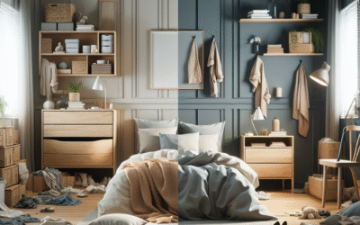
Sanctuary of Sleep: Bedroom Color Psychology
Your bedroom is your escape, your retreat, your personal sanctuary for rest and rejuvenation. The colors here should promote calm, relaxation, and intimacy. Avoid anything overly stimulating or jarring.
- Blue: Universally revered for its calming properties, blue lowers heart rate and blood pressure, making it ideal for bedrooms. Light blues evoke tranquility; deeper blues offer sophistication and peace. It’s a prime example of designing for well-being through serenity.
- Green: Mimicking nature, soft greens bring a sense of balance, harmony, and renewal. They can feel secure and restful, perfect for winding down after a long day.
- Lavender/Violet: Often associated with spirituality and peace, lavender is a soothing shade that can reduce anxiety and promote relaxation. Lighter shades are more calming than deep purples.
- Soft Grays: A sophisticated neutral, soft gray can be incredibly tranquil. Paired with warm lighting and natural textures, it creates a serene, contemporary oasis.
- Warm Neutrals (Beiges, Creams): These colors offer a cozy, embracing feel without being overwhelming. They provide a stable, comforting backdrop for sleep, allowing other decor elements to add subtle pops of color.

Image Suggestion: A bedroom featuring light blue or soft green walls, plush bedding, and calming elements.
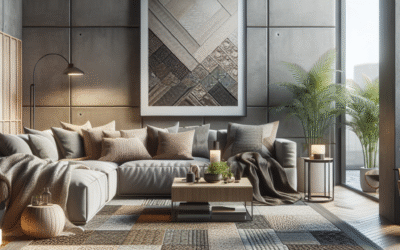
The Social Hub: Living Room Color Psychology
The living room is where life happens – conversations, entertainment, relaxation. The colors here should reflect the atmosphere you wish to cultivate: inviting, comfortable, and conducive to connection. This is where designing for well-being often means balancing vibrancy with comfort.
- Warm Neutrals (Tan, Beige, Greige): These provide a timeless, versatile base that fosters a sense of grounded comfort. They allow furniture, art, and accessories to introduce pops of personality.
- Blues: Gentle blues can evoke a sense of calm and openess, making a living room feel spacious and inviting without being overly stimulating.
- Greens: Sage or olive greens can bring the outside in, creating a harmonious and balanced environment perfect for relaxation and natural connection.
- Deep Reds (Accent): In moderation, a rich, deep red can add warmth, passion, and a touch of drama, perfect for a cozy reading nook or a feature wall. Too much red can be overwhelming in a main communal space.
- Muted Oranges/Terracotta: These earthy tones can imbue a living space with warmth, creativity, and a welcoming, bohemian vibe, encouraging conversation and comfort.
Focused Productivity: Home Office Color Psychology
With more people working from home, the home office needs to be a zone of concentration, productivity, and minimal distraction. Colors here should support focus and reduce eye strain, while potentially boosting creativity or analytical thought.
- Blues: Light to medium blues are excellent for promoting clear thought and concentration. They create a stable, calming backdrop for mental tasks, reducing stress and enhancing focus.
- Greens: Soft greens can improve efficiency and concentration, creating an environment that feels refreshing and less prone to burnout. Often linked to innovation and calm growth.
- Grays: A sophisticated neutral, gray can be a fantastic base color, especially in cooler tones. It provides a balanced, unobtrusive background that allows the mind to focus on work. Pair with a brighter accent color for inspiration.
- Yellow (Accent): A touch of yellow, perhaps in an accent chair or desk accessories, can spark creativity and optimism without being overstimulating, as too much can distract.
- White: When paired with elements of wood or texture, white can provide a clean, uncluttered, and bright workspace, promoting clarity. Avoid stark, sterile whites, which can feel harsh.
Home Office Color Comparison: Blue vs. Green
When selecting between blue and green for your home office, consider your primary work type:
| Color | Primary Benefit | Best for Tasks Involving… |
|---|---|---|
| Blue | Focus, Calm, Clarity | Analytical thinking, complex problem-solving, sustained concentration. |
| Green | Creativity, Harmony, Reduced Strain | Creative endeavors, writing, tasks requiring innovation, long periods of screen time. |
Many designers recommend a combination, perhaps a base of soft blue with green accents, to harness both benefits for optimal designing for well-being.
Revitalizing Retreat: Bathroom Color Psychology
The bathroom is often a place for personal care, rejuvenation, and quiet reflection. Colors here should evoke cleanliness, relaxation, and a spa-like tranquility. Light and airy shades are typically preferred.
- White: The ultimate symbol of cleanliness and purity. White bathrooms feel fresh, spacious, and bright. Pair with natural woods or plants to prevent a sterile feel.
- Light Blue/Aqua: Reminiscent of water and sky, these cool tones are incredibly refreshing and calming, perfect for creating a spa-like atmosphere.
- Soft Greens: Like a tranquil garden, pale greens can make a bathroom feel organic, soothing, and connected to nature.
- Grays: Light, cool grays can offer a sophisticated and clean backdrop, especially when combined with marble or chrome fixtures.
- Pinks (Soft Blush): A very soft blush pink can add warmth and a flattering glow, making the space feel nurturing and comforting, excellent for self-care rituals.
Beyond the Basic Hues: Advanced Color Harmony and Application
Simply choosing a single color for a room is just the first step. True mastery of designing for well-being through color involves understanding how colors interact, how to use them in different proportions, and how to integrate them holistically into your home. This section delves into more nuanced techniques, moving you from mere painter to a true color strategist.
The 60-30-10 Rule: A Professional Designer’s Secret
Ever wonder how professional designers make spaces look so balanced and aesthetically pleasing? Often, they implicitly (or explicitly!) follow the 60-30-10 rule. This simple guideline helps you proportion your colors effectively, creating a harmonious and layered look rather than a flat, monochromatic space.
- 60% Dominant Color: This is your main color, applied to large areas like walls, flooring, or a dominant piece of furniture. It sets the overall mood and tone of the room.
- 30% Secondary Color: This color should complement your dominant shade and be used on elements like curtains, accent furniture, rugs, or a feature wall. It adds depth and interest without competing with the dominant color.
- 10% Accent Color: This is your pop of personality! Used on smaller items such as throw pillows, artwork, decorative objects, or floral arrangements. This color should provide a strong contrast or bold statement, drawing the eye and adding vibrancy.
Applying the 60-30-10 rule ensures that your chosen color psychology in every room is thoughtfully distributed, creating a dynamic yet balanced environment. For instance, a bedroom might use soft blue (60%) for walls, warm gray (30%) for bedding and a rug, and a muted mustard yellow (10%) for throw pillows and a piece of art.
Tonal Harmony: Monochromatic vs. Analogous Schemes
For more sophisticated palettes, consider these two popular approaches:
- Monochromatic Schemes: This involves using different shades, tints, and tones of a single color. Think various strengths of blue – from deep navy to sky blue to pale powder blue. This creates a cohesive, serene, and elegant look, perfect for promoting tranquility and focus. The key is to incorporate diverse textures to prevent the room from feeling flat.
- Analogous Schemes: These schemes use colors that are next to each other on the color wheel (e.g., blue, blue-green, and green). This creates a harmonious, pleasing flow that feels natural and relaxed. Analogous colors are often found together in nature and thus tend to evoke a sense of calm and balance.

Image Suggestion: A simple color wheel highlighting examples of monochromatic (e.g., various blues) and analogous (e.g., blue-green-yellow) schemes.
The Role of Neutrals: More Than Just Background
Neutrals (whites, grays, beiges, browns) are the unsung heroes of interior design. While they may not immediately spring to mind when thinking of “color psychology,” they play a critical role in designing for well-being. Neutrals provide a foundation, a visual resting place that prevents overstimulation. They allow brighter colors to pop without overwhelming the senses and create a timeless appeal.
- Warm Neutrals (Beige, Taupe, Cream): Offer comfort, coziness, and approachability. They can make a space feel more inviting and grounding.
- Cool Neutrals (Gray, Off-White): Provide a sense of calm, sophistication, and modernity. They can make a room feel larger and often serve as an excellent backdrop for vibrant art or furniture.
Don’t dismiss neutrals as boring! Their subtle variations can profoundly impact the mood of a room. A greige (gray-beige) can be warmer than a pure gray, while a cream can soften the starkness of a pure white. Thoughtful application of neutrals creates a sophisticated and enduring canvas for your colorful explorations.
Implementing Your Color Strategy: Practical Tips and Considerations
You’ve got the knowledge; now it’s time to apply it. Painting a room can be a big undertaking, so a little planning goes a long way. Here are practical steps to ensure your color choices bring you closer to your goal of designing for well-being.
Considering Light Sources: Natural vs. Artificial
This is often overlooked but absolutely crucial. The way a color appears can drastically change depending on the light it receives. A paint sample seen in bright daylight might look completely different under warm incandescent bulbs or cool LED lights.
- Natural Light: Rooms facing north tend to receive cooler, bluer light, making warm colors appear more balanced and cool colors potentially colder. South-facing rooms get warmer, brighter light, which can intensify warm colors and make cool colors feel crisp.
- Artificial Light:
- Incandescent (Warm White): Emphasizes reds, yellows, and oranges, making rooms feel cozier but can dull cool colors.
- Fluorescent (Cool White): Can cast a cooler, sometimes greenish tint, making blues and greens pop but potentially making warm colors look flat.
- LEDs (Tunable): Many modern LEDs allow you to adjust color temperature, offering flexibility. Use warmer tones for relaxing spaces, cooler tones for task-oriented areas.
Pro Tip: Test Your Paint Samples!
Always buy small sample pots and paint large swatches (at least 2’x2′) on different walls in your room. Observe them throughout the day under natural light, and at night under artificial light, before making your final decision. This simple step can save you immense regret and cost.
Incorporating Texture and Material
Color isn’t just paint on a wall. The texture and material of surfaces also play a huge role in how we perceive a color and how a room *feels*. Integrating different textures enhances the sensory experience, adding depth and richness to your chosen palette.
- Soft textures (Velvet, chenille): Add warmth, comfort, and luxury, making colors appear richer and deeper. Perfect for cozy living rooms and bedrooms.
- Rough textures (Linen, jute, raw wood): Introduce an organic, natural, and grounded feel. They can soften strong colors and add an elemental touch, ideal for rustic or minimalist styles.
- Reflective surfaces (Glass, polished metals, mirrors): Amplify light and can make a room feel more expansive and modern. They can also create interesting plays of light on colored surfaces.
- Matte finishes: Absorb light, giving colors a softer, more sophisticated look. They can make a space feel more intimate and understated.
- Glossy finishes: Reflect light, making colors appear more vibrant and energetic. Often used for trim or specific furniture pieces to add sparkle.
For example, a serene blue bedroom wall will feel even more calming when paired with soft, textured linens and a plush rug. The combination elevates the impact of the color, fully embracing designing for well-being.
Small Spaces, Big Impact: Color in Compact Areas
Smaller rooms, like powder rooms, hallways, or cozy nooks, offer unique opportunities for bolder color choices without overwhelming the senses. Since you spend less time in these spaces, you can afford to experiment more.
- Dark Colors: Counterintuitively, a deep, rich color in a small space can create a dramatic, jewel-box effect rather than making it feel smaller. Think a deep navy powder room or an emerald green reading nook. This intense color envelops you, creating a sense of intimacy and luxury.
- Light Colors: Whites, pale blues, and soft grays can make small spaces feel larger, airier, and brighter by reflecting light.
- Monochromatic Schemes: Using different shades of a single color in a small space can create a cohesive flow that visually expands the area and maintains a sense of calm.
- Strategic Accents: In a narrow hallway, a vibrant runner or a single piece of statement art can inject personality without the commitment of painting all walls a bold color.
Personalizing Your Palette: Beyond the Rules
While color psychology offers powerful general guidelines, your home is ultimately *your* personal space. Designing for well-being means creating an environment that resonates with *you*. Don’t be afraid to break a few “rules” if it feels right. Your personal history, cultural background, and emotional responses to color are just as valid as any scientific study.
Cultural and Personal Associations with Color
The meanings we assign to colors aren’t purely universal. For some, red signifies love and passion; for others, it’s anger or danger. Yellow might mean happiness to one, but jealousy to another. Consider your own personal experiences:
- What colors bring back positive memories? (e.g., the calm blue of your childhood bedroom, the vibrant yellow of a favorite vacation spot)
- Are there colors you genuinely dislike or that make you feel uncomfortable, regardless of typical associations?
Incorporating colors that hold positive personal significance can create a deeply comforting and joyful home, even if they deviate from conventional psychological advice for a given room. This personal connection is a strong component of your individual well-being.
The Power of Intention: Designing Your Emotional Blueprint
Before you even pick up a paint swatch, think about the *feeling* you want to evoke in each room. This is the cornerstone of designing for well-being. Close your eyes and visualize:
- Bedroom: Do you want deep, restorative sleep, or a more romantic, intimate setting?
- Living Room: Casual conversations, lively parties, or quiet family time?
- Home Office: Intense focus, creative flow, or a balanced study space?
“Color is not just an aesthetic choice; it’s an emotional choice. When we choose colors for our homes, we’re not just decorating, we’re curating our feelings.”
– Sarah L. Peterson, Interior Psychology Expert
Your intention will guide your color choices, helping you weigh the psychological impacts against your desired outcomes. Sometimes, a “wrong” color for a space, if chosen with clear intention, can become profoundly “right” for you.
Case Study: A Transformative Living Space
Let’s consider a practical example of designing for well-being. Sarah, a freelance graphic designer, found herself constantly battling stress and lack of focus in her previous home. Her living room, where she often worked, was painted a stark, cool grey – modern, but emotionally sterile. The bedroom was an overwhelming deep red, chosen years ago for “romance,” but now only evoked restlessness.
The Problem: Sarah felt anxious and fatigued. Her living room lacked warmth and inspiration, hindering creativity. Her bedroom prevented truly restful sleep.
The Solution (Applying Color Psychology):
- Living Room Redesign: Sarah started by repainting the living room walls a soft, earthy sage green (60%), chosen for its calming, creative, and grounding properties. She integrated warm, textured beige accents (30%) in the sofa and curtains. For a touch of creativity and optimism, she added a few vibrant yellow throw pillows and an abstract art piece (10%).
- Bedroom Transformation: The deep red was replaced with a serene, medium-grayish blue (60%), paired with calming off-white linens (30%). To add a subtle touch of warmth and luxury without stimulating, she chose deep purple velvet cushions and a dimmable bedside lamp (10%).
The Result: Within weeks, Sarah reported a significant improvement in her mental state. Her living room became a space where ideas flowed more freely and client calls felt less stressful. Her sleep quality improved dramatically in the blue bedroom, and she woke feeling more rested. This intentional use of color psychology in every room truly transformed her home into a supportive environment.
Tool & Resource Recommendations for Your Color Journey
Ready to embark on your own color journey? Here are some tools and resources to help you make informed decisions:
- Sherwin-Williams ColorSnap Visualizer: A fantastic app that lets you “paint” your rooms virtually. Upload a photo of your room and try out different shades. While not 100% accurate, it’s a great starting point for visualizing.
- Pantone Color Institute: While primarily for graphic design, understanding Pantone’s yearly Color of the Year and their insights can offer broader inspiration for trends and the emotional impact of contemporary colors.
- Online Design Blogs & Forums: Sites like Houzz, Apartment Therapy, or even Pinterest are treasure troves of visual inspiration. Search for “calming bedroom colors” or “energetic kitchen design” to see real-world applications.
- Professional Interior Designers: If you’re undertaking a major renovation or feel overwhelmed, a professional designer experienced in color psychology can provide personalized guidance tailored to your home and personality.
Remember, the best tool is your own intuition, combined with the knowledge you’ve gained about designing for well-being. Trust what feels right for you and your family.
Frequently Asked Questions About Color Psychology in Home Design
Q: Can too much of a “good” color be bad for a room?
A: Yes, absolutely. Even the most calming colors, like blue, can feel cold or unwelcoming if used
monotonously without varied textures or complementary accents. Similarly, too much stimulating red or yellow can lead to
overstimulation and anxiety. The key to successful designing for well-being is balance and strategic application,
often following the 60-30-10 rule for distribution.
Q: How do I choose colors if multiple people use a room and have different preferences?
A: This is a common challenge! Start with a neutral base (60%), which is generally less polarizing. Then, use the secondary (30%) and
accent (10%) colors to incorporate elements that appeal to different individuals. For example, if one person likes blue for
calm and another likes green for creativity, a neutral living room could have blue wall art and green cushions,
harmonizing both preferences while designing for well-being for everyone.
Q: Are there colors I should generally avoid for certain rooms?
A: While personal preference dictates a lot, generally avoid overly vibrant reds or oranges in bedrooms,
as they can be too stimulating for sleep. Similarly, very muted or cool tones in a kitchen might
dampen appetite or make the space feel less inviting. Stark, featureless white can sometimes feel
sterile in areas meant for comfort. Always consider the primary function and desired mood when applying
color psychology in every room.
Q: Does color psychology only apply to wall paint?
A: Not at all! While wall color has a significant impact due to its expansive surface area,
color psychology applies to all elements: furniture, textiles (rugs, curtains, upholstery),
artwork, decorative objects, and even lighting. A thoughtfully chosen accent color in a throw
pillow or a piece of art can subtly shift the entire emotional temperature of a room, showcasing
the versatility of designing for well-being through various elements.
Q: How important is lighting when considering color choices?
A: Lighting is paramount! It can dramatically alter how a color is perceived. A cool gray in a room
with warm, yellow lighting can appear greenish-beige, while the same color in a room with cool,
blueish lighting will look crisper. Always test paint swatches in your room under both natural
daylight and your typical artificial evening lighting to ensure the color performs as expected,
which is vital for effective designing for well-being.
Conclusion: Your Home, Designed for Your Best Self
Congratulations! You’ve journeyed through the intricate yet immensely rewarding world of designing for well-being using the power of color psychology. You now understand that color is far more than just a decorative element; it’s a silent architect of your emotions, your focus, and your overall sense of peace within your home. By thoughtfully applying color psychology in every room, you’re not just painting walls; you’re crafting an emotional blueprint, an environment that actively supports your lifestyle and enhances your mental and physical health.
Remember, the goal isn’t perfection, but intention. Start small, experiment with accents, observe how colors make you feel, and gradually build a home that is a true reflection of your desired well-being. From serene bedrooms to inspiring home offices, your abode can become a powerful tool for self-care and personal growth. Take these insights and start transforming your living spaces into sanctuaries that truly nurture your best self. Your home is waiting to be reimagined!
Ready to take the next step? Explore our related articles on The Art of Minimalist Decor for a Calmer Home or dive deeper into Bringing Nature Indoors: Fundamentals of Biophilic Design for more holistic approaches to creating a harmonious living environment.
Content Disclaimer
The information provided in this article regarding color psychology and home design is intended for educational and general informational purposes only, and does not constitute professional design advice. While based on common psychological principles and design practices, individual reactions to colors can vary culturally and personally. Always consult with a qualified interior designer or relevant professional for personalized advice tailored to your specific circumstances and preferences. This content is not intended to diagnose, treat, cure, or prevent any psychological or medical condition. Please consider your own sensitivities and preferences when making design decisions for your home.