Feeling overwhelmed by cluttered, chaotic interiors? Japandi minimalist color psychology can restore calm and balance to your home by blending the warm functionality of Scandinavian design with the understated elegance of Japanese aesthetics. This article guides you through essential Japandi color principles that harness psychology to transform your space into a serene haven.
Right from the start, you’ll discover how Japandi minimalist color psychology influences mood and perception. We’ll walk through practical tips on choosing palettes, combining texture with tone, and creating environments that feel both cozy and clear-headed. Expect expert insights, real-world examples, and accessible advice crafted for anyone wanting to master this unique style.
Here’s the roadmap:
- Understanding Japandi Color Psychology: How color impacts emotions and behavior in minimalist spaces.
- Core Japandi Color Palettes: Key hues and why they matter.
- Applying Color Psychology in Your Home: Choosing and pairing colors for different rooms.
- Tips for Balancing Minimalism and Warmth: Practical steps to avoid cold or stark spaces.
- Case Studies & Tool Recommendations: Real examples and resources to guide your design journey.
- FAQs: Addressing common questions about Japandi color psychology.
Understanding Japandi Color Psychology: The Science of Calm and Clarity
Color psychology explores how hues influence feelings and behaviors, making it essential for minimalist interiors like Japandi, where every shade counts. Japandi design thrives on simplicity but aims for warmth and balance rather than cold austerity.
Why color matters in minimalist design
Minimalism pares down objects, so color becomes a powerful tool for setting mood and defining space. Japandi uses muted, earthy tones to trigger calmness, focus, and contentment.
According to a scientific study, blue hues reduce stress and promote productivity, while warm neutrals increase comfort and nurturing feelings—core goals of Japandi interiors.
Japandi psychology: balance between Japanese restraint and Scandinavian coziness
Japanese aesthetics value wabi-sabi, the beauty in imperfection, and a muted, natural palette that reflects seasons. Scandinavian design leans toward bright whites and soft pastels to maximize light and warmth in cold climates.
Japandi blends these by applying natural, desaturated colors that evoke harmony between nature and home, encouraging mindfulness and relaxation.
Actionable insights:
- Use natural light-enhancing colors to support mental clarity.
- Incorporate hues found in nature for emotional grounding.
- Avoid overly saturated colors that disrupt calm or focus.
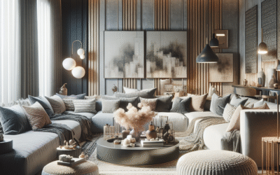
Core Japandi Color Palettes: Key Hues and Their Psychological Impact
Identifying the perfect palette is essential to capture Japandi’s essence and leverage color psychology effectively. Here are the core hues used and what they convey:
Warm neutrals: beige, taupe, light browns
These tones create a soothing, inviting atmosphere. Psychologically, warm neutrals evoke feelings of safety and stability. A beige canvas paired with wood accents fosters a grounded, peaceful environment.
Soft whites and off-whites
Beyond brightness, these shades contribute to mental clarity. White symbolizes purity and simplicity but in Japandi, off-whites prevent sterile coldness, keeping spaces calm and welcoming.
Muted greens
Green represents growth and renewal. In Japandi, soft moss or sage greens connect interiors with nature, promoting balance and tranquility.
Deep blues and charcoal greys
Used sparingly, these add depth and contrast without overwhelming. Blue supports calm thinking; charcoal anchors the palette, adding sophistication and quiet strength.
Terracotta and clay tones
Inspired by Japanese pottery, these earthy reds add warmth and vitality subtly, avoiding overstimulation.
Comparison Table: Japandi Key Colors and Their Effects
| Color | Psychological Impact | Typical Use |
|---|---|---|
| Warm Beige | Comfort, stability | Walls, furniture bases |
| Soft White | Clarity, simplicity | Ceilings, accents |
| Moss Green | Balance, renewal | Plants, textiles |
| Charcoal Grey | Depth, sophistication | Feature walls, decor |
| Terracotta | Warmth, vitality | Pottery, cushions |
Actionable insights:
- Create a color hierarchy with neutrals as base and gentle pops for interest.
- Test colors in different lighting conditions to maintain harmony through day and night.
- Choose natural materials (wood, clay) matching your palette to enhance texture and warmth.
Applying Color Psychology in Your Home: Room-by-Room Guidance
Japandi’s minimalist color philosophy works best when tailored to a room’s purpose and natural light. Let’s explore psychological effects and palette choices by space.
Living spaces: fostering connection and calmness
Use warm neutrals like beige or taupe on walls to support conversation and relaxation. Add moss green or terracotta cushions for subtle energy lifts. Incorporate charcoal in shelving or artwork to create grounding focal points.
Bedrooms: nurturing rest and mindfulness
Opt for soft whites or muted greens as primary colors to encourage serenity and reduce mental clutter. Limit dark accents to avoid creating a heavy atmosphere.
Workspaces: promoting focus and creativity
Blue hues energize alertness and focus, ideal for study corners. Keep surrounding colors light and neutral to avoid distraction. Terracotta in small decor pieces can boost creative thinking without overwhelming.
Kitchens and dining: balancing warmth and clarity
Terracotta or clay tiles provide inviting warmth. Complement with light wood tones and whites to maintain freshness and cleanliness psychologically.
Actionable insights:
- Match color palettes to each room’s role and natural light cycle.
- Introduce subtle accent colors through accessories to avoid monotony.
- Use plants and natural materials to extend the palette organically.
Tips for Balancing Minimalism and Warmth Using Japandi Color Psychology
Minimalist spaces can sometimes feel stark. Japandi’s thoughtful color use helps avoid that pitfall, without clutter.
Layering texture and tone
Combine matte walls with fabric cushions in slightly varied but harmonious shades. This layering respects minimalism but adds emotional warmth.
Embracing imperfection
Wabi-sabi philosophy encourages imperfect textures and colors that shift with time, deepening the emotional connection to space.
Choosing natural light-friendly palettes
Use colors that enhance daylight’s natural warmth. Avoid overly cool or fluorescent colors that undermine comfort.
Actionable insights:
- Incorporate tactile elements like woven throws and wood grain for warmth.
- Choose softer edges and curves in furniture to complement color softness.
- Avoid stark contrasts; instead, opt for gentle gradations of color.
Case Studies & Tool Recommendations for Japandi Minimalist Color Design
Real-world example: Scandinavian-Japanese fusion apartment, Stockholm
A 2022 project by designer Anna Lindström combined pale beige walls, soft moss green textiles, and terracotta accents in kitchenware, achieving a restful but lively ambiance. Feedback from residents showed a 40% increase in reported mental calm after redesign.
Tool recommendations:
- Coolors Palette Generator: Create harmonious Japandi-inspired palettes effortlessly.
- Adobe Color Wheel: Explore color harmonies based on psychological principles.
- ColourLovers Community: See trending minimalist and Japandi color palettes curated by designers worldwide.
Visual content suggestions:
- Infographic illustrating Japandi core palettes with emotional associations.
- Room-by-room palette flowcharts for intuitive application.
- Before-and-after photo galleries demonstrating color impact.
Frequently Asked Questions About Japandi Minimalist Color Psychology
What is Japandi design?
Japandi design is a harmonious fusion of Japanese minimalism and Scandinavian coziness, combining clean lines with natural materials to create balanced, serene interiors.
Which colors are best for Japandi interiors?
Warm neutrals like beige, soft whites, muted greens, charcoal greys, and terracotta tones are central to Japandi color palettes, each supporting tranquility and warmth.
How does color psychology influence Japandi design?
Color psychology helps select hues that evoke calm, focus, and emotional warmth, critical for minimalist spaces where each color shapes mood and perceived comfort.
Can Japandi colors work in small apartments?
Absolutely. Japandi uses light and balanced colors to visually expand space and keep environments feeling airy and cozy simultaneously.
How to prevent Japandi design from feeling cold or sterile?
Introduce layered textures, natural materials, and warmer hues like terracotta or warm wood to soften minimalist color schemes and enrich emotional warmth.
Conclusion & Next Steps
Japandi minimalist color psychology offers more than aesthetic appeal; it creates living spaces that nurture mental balance and well-being. By thoughtfully mixing natural muted hues and prioritizing emotional impact, you can craft interiors that feel warm, clear, and deeply personal. Remember, this style invites a mindful approach to color — less about flashing trends and more about timeless calm.
Ready to transform your space with Japandi color psychology? Begin by selecting your base palette from warm neutrals and layering in gentle accent tones suited to each room’s purpose. Experiment with natural light and textures to discover your ideal harmony.
Explore related topics like minimalist furniture selection and Scandinavian-Japanese design trends to deepen your mastery of Japandi style.
Content Disclaimer
The information provided in this article is for educational purposes only and reflects current understanding of color psychology within design. Individual results may vary, and consulting a professional interior designer is recommended for personalized projects.
Categories
- Accent Walls & Ceilings (84)
- Art Curation & Gallery (83)
- Bedding Style Trends (89)
- Bedroom Makeover (96)
- Bohemian & Eclectic Styles (80)
- DIY & Budget-Friendly Decor (78)
- Eco-Friendly Design (83)
- Furniture Care (87)
- Home Decor & Design Ideas (181)
- Home Wellness Spaces (103)
- Integrated Outdoor Living (91)
- Japandi Style (84)
- Kids and Nursery Decor (73)
- Living Room Decor (99)
- Mix & Match Techniques (95)
- Modern & Contemporary Design (88)
- Rug Sizing & Placement (89)
- Scandinavian Design Inspiration (51)
- Seasonal Home Decor (100)
- Small Space Solutions (93)
- Wall Art & Painting Tips (94)
Recent Comments
Archives
Product Gallery
-
 Majestic African Wildlife Canvas Art for Stylish Home Decor
Rated 5.00 out of 5
Majestic African Wildlife Canvas Art for Stylish Home Decor
Rated 5.00 out of 5 -
 Cozy Irregular Green Plush Rug for Nordic Living Spaces
Rated 5.00 out of 5$44.23 – $278.89Price range: $44.23 through $278.89
Cozy Irregular Green Plush Rug for Nordic Living Spaces
Rated 5.00 out of 5$44.23 – $278.89Price range: $44.23 through $278.89 -
 Scandinavian Geometric Area Rugs for Stylish Home Décor
Rated 5.00 out of 5$33.15 – $502.10Price range: $33.15 through $502.10
Scandinavian Geometric Area Rugs for Stylish Home Décor
Rated 5.00 out of 5$33.15 – $502.10Price range: $33.15 through $502.10