Feeling overwhelmed by clutter and seeking a design aesthetic that truly calms the soul? The answer might just lie in the elegant fusion of Japanese serenity and Scandinavian simplicity: **Japandi minimalist style**. It’s not just a trend; it’s a philosophy, a way of living that prioritizes function, natural elements, and understated beauty. But how do you achieve this balance, especially when it comes to injecting color without disrupting the inherent tranquility of Japandi? That’s where **color blocking tips** become your secret weapon.
This comprehensive guide will unpack the essence of Japandi aesthetics and provide actionable strategies for mastering color blocking. You’ll learn to select the perfect muted palettes, understand the power of contrast, and apply these principles from furniture to textiles. Get ready to transform your living spaces into havens of balance and aesthetic harmony, embracing the subtle art of color that elevates rather than dominates. We’ll explore everything from foundational principles to advanced techniques, ensuring your Japandi minimalist style vision becomes a tangible reality.
Understanding the Core Principles of Japandi Minimalist Style
Before diving into color blocking, it’s crucial to grasp the foundational tenets of Japandi minimalist style. This aesthetic isn’t about stark emptiness; it’s about thoughtful curation, natural textures, and a profound appreciation for craftsmanship.
Merging Japanese Wabi-Sabi and Scandinavian Hygge
Japandi stands at the intersection of two powerful design philosophies: **Japanese wabi-sabi** and **Scandinavian hygge**. Wabi-sabi celebrates imperfection, transience, and the beauty of natural materials aging gracefully. Think handmade pottery with slight irregularities or a wooden table showing the marks of time. Hygge, on the other hand, embodies coziness, comfort, and well-being. It’s about creating an atmosphere of warmth and contentment, often through soft lighting, natural textiles, and inviting spaces.
The synergy creates a style that is both refined and relaxed. It embraces practical elegance, shunning excess in favor of a curated selection of purposeful and beautiful items. The goal isn’t just a pretty room, but a space that enhances your daily life, reducing stress and fostering a sense of peace. This underlying philosophy directly influences the choice and application of colors.
The Importance of Natural Materials and Textures
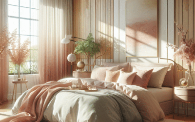
In Japandi, materials are paramount. Surfaces tell a story, invoking a connection to nature. Prioritize natural woods (light ash or dark walnut), bamboo, rattan, concrete, linen, cotton, wool, and ceramics. These materials bring inherent texture and warmth, forming the backdrop against which your color blocking will play out. Their natural hues often dictate the initial color palette, emphasizing earthy and organic tones.
For example, a rough-hewn concrete wall juxtaposed with a smooth, light oak floor provides a subtle, inherent color block even before you introduce additional hues. The variations in texture add depth and visual interest without needing vibrant colors. This focus on materiality is a cornerstone of Japandi minimalist style and informs every design decision.
Emphasizing Functionality and Simplicity
Every item in a Japandi space serves a purpose. Clutter is the enemy. Furniture is selected for its clean lines, practical use, and ability to blend seamlessly into the environment. Storage solutions are often integrated and discreet. This minimalist approach extends to color: every hue introduced should have a reason, contributing to the overall sense of tranquility and functionality. Color blocking in Japandi is about defining zones, highlighting architectural features, or adding subtle artistic flair, not about creating visual noise. It’s simplicity elevated.
The Japandi Color Palette: Your Foundation for Color Blocking
The cornerstone of successful Japandi color blocking lies in understanding its characteristic palette. It’s subdued, sophisticated, and deeply rooted in nature.
Neutrals: The Unsung Heroes of Japandi
Neutrals form the vast majority of any Japandi palette. Think of them as your canvas. This includes a range of:
- Warm Whites: Not stark, clinical whites, but those with undertones of cream, ivory, or subtle grey, providing a soft, inviting backdrop. They reflect light beautifully, making spaces feel open and airy.
- Soft Greys: From pale, almost off-white greys to deeper charcoal tones. Greys offer sophistication and grounding, mimicking natural stone or raw concrete.
- Earthy Beiges and Tans: These hues connect directly to natural wood, sand, and woven fibers. They bring warmth and an organic feel, preventing spaces from feeling cold or sterile.
- Muted Browns: Rich, deep browns from untreated timber or darker ceramics provide a sense of timelessness and anchor the space.
These neutrals aren’t just backdrops; they can be subtly color blocked themselves. Imagine a wall painted in a warm white, with a lower section in a slightly darker beige. This subtle shift creates visual interest without resorting to bold colors, embodying the subtle elegance of Japandi minimalist style.
Adding Depth with Muted, Desaturated Hues
While neutrals dominate, Japandi isn’t entirely devoid of color. When color is introduced, it’s done sparingly and deliberately. The key is “muted” or “desaturated.” This means colors with a significant amount of grey or white mixed in, reducing their vibrancy. Consider:
- Dusty Pinks and Terra Cottas: Evoking traditional Japanese ceramics or subtle clay tones.
- Sage Greens and Moss Greens: Reflecting nature, plants, and serene landscapes. These are excellent for bringing the outdoors in.
- Muted Blues (Indigo, Cerulean, Sky Blue): Calm and contemplative, reminiscent of water or distant horizons. Indigo is particularly popular for its connection to traditional Japanese textiles.
- Subtle Terracotta and Rust: Warm and grounding, especially when paired with natural wood.
These accent colors should feel like an organic extension of the natural materials, not a jarring interruption. They are used to create focal points or define areas, making them ideal for the principles of color blocking.
High-Contrast Accents (Used Sparingly)
Sometimes, a very small, deliberate touch of high contrast can elevate a Japandi space, but this should be used with extreme caution. A single black line, a deep charcoal accent wall, or a striking piece of dark wood furniture can provide a strong visual anchor. The contrast is not about shouting; it’s about providing a subtle yet powerful definition, drawing the eye to a specific element. This is a crucial element when considering advanced color blocking tips for your Japandi minimalist style.
Implementing Color Blocking Tips in Japandi Spaces
Now that you’re armed with the Japandi palette, let’s explore practical ways to apply color blocking in your home, enhancing its inherent tranquility and sophisticated simplicity.
The Power of Two-Tone Walls
This is arguably the most straightforward and impactful form of color blocking. Dividing a wall horizontally or vertically into two distinct color sections creates immediate visual interest and architectural definition.
- Horizontal Divide: Paint the lower two-thirds of a wall a deeper, grounding neutral (like a warm grey or beige) and the upper third a lighter neutral (soft white or lighter grey). This can make ceilings feel higher and adds a subtle layering effect. Alternatively, a muted accent color (like sage green) on the bottom, with a neutral above, can delineate a seating area.
- Vertical Strips/Panels: Use a contrasting but muted color (e.g., a dark charcoal on a light grey wall) to define a specific zone, like a reading nook or behind a bed. This adds depth without overwhelming the space. Think of it as painting an invisible frame.
When applying two-tone walls in Japandi minimalist style, precision is king. Use painter’s tape for crisp lines. The colors chosen should flow harmoniously, often within the same tonal family or complementary desaturated hues.
Defining Zones with Area Rugs and Flooring
Color blocking isn’t confined to walls. The floor is powerful too. An area rug in a contrasting, yet muted, color can define a living area within an open-plan space. A dark, natural fiber rug on a light wood floor immediately grounds the seating arrangement and visually separates it from the dining area or kitchen.
Consider combining different flooring materials. A section of polished concrete flowing into warm wooden planks subtly color blocks and adds textural interest. This creates a visual transition that feels organic and purposeful, a hallmark of excellent Japandi design.
Furniture as Functional Color Blocks
Furniture in Japandi is clean-lined and often made from natural wood. But chosen strategically, it can serve as a primary color block. Imagine a deep, dark walnut coffee table placed on a light natural rug. The contrast in material and color creates a strong focal point. A single upholstered armchair in a muted indigo or a deep forest green can provide a sophisticated pop of color against a largely neutral room, without the need for additional ornamentation.
Look for pieces with simple geometric forms that naturally lend themselves to being perceived as distinct blocks of color or texture. The key is using a few well-chosen pieces rather than many. This aligns directly with the “less is more” philosophy intrinsic to Japandi minimalist style.
The Art of Layering Textiles and Art
Textiles are your friends when it comes to soft, flexible color blocking. A stack of linen throw pillows in varying shades of grey and beige, coupled with one in a muted dusty pink, creates a subtle gradient effect on a neutral sofa. A large, abstract piece of art with a clean composition, featuring two to three desaturated colors, can act as a dynamic color block on a plain wall. These elements add warmth and personality without sacrificing the minimalist aesthetic.
Think about the interplay of textures here too. A rough-woven linen cushion next to a smooth, soft wool throw adds another layer of subtle interest. This thoughtful layering enhances the sensory experience of the room, another core tenet of Japandi minimalist style environments.
Strategic Use of Architectural Features and Nooks
Don’t overlook the built-in elements of your home. Alcoves, recessed shelves, or even window frames can be highlighted through subtle color blocking. Paint the inside of a shelving unit a slightly darker shade than the wall it’s built into, creating depth and a curated backdrop for displaying a few ceramic pieces. Frame a window with a subtle accent color that draws the eye outwards, connecting the interior to the external environment. This technique leverages existing structures to create natural divisions and focal points, seamlessly integrating color blocking into your Japandi minimalist style.
Choosing Your Japandi Color Blocking Palette: Practical Steps
Selecting the right colors can feel daunting, but a systematic approach ensures harmony and flow.
1.
Start with Your Existing Elements
Before buying a single paint swatch, assess your current space. What are the dominant colors in your flooring, large furniture pieces, or architectural elements? Are they warm wood tones, cool concrete, or neutral walls? These form your natural baseline.
For instance, if you have light oak floors and a grey sofa, these are your primary neutrals. Any new color you introduce should complement them, not clash. This foundational step is critical for successful Japandi minimalist style execution.
2.
Define Your Dominant Neutral
Choose one primary neutral that will cover the largest surface area – often walls. This could be a warm white, a light greige, or a soft, almost off-white grey. This color will set the overall mood and provide the overarching calm of your Japandi space.
3.
Select Your Secondary Neutral (for Contrast)
Pick a second neutral that contrasts subtly with your dominant one. If your walls are warm white, perhaps a light beige for a horizontal color block on a wall, or a charcoal grey for a rug. This secondary neutral introduces depth without sacrificing the serene feel. This gentle contrast is key to effective Japandi minimalist style color blocking.
4.
Choose 1-2 Muted Accent Colors
This is where you introduce subtle personality. Select one or two desaturated hues from the Japandi palette (sage green, dusty blue, terracotta, soft pink). These should be used sparingly – for textiles, a single piece of art, or a small accent wall section. Too many accent colors will defeat the purpose of Japandi minimalism. Remember, less is truly more when achieving a cohesive Japandi minimalist style.
5.
Test, Test, Test!
Never commit to a color without testing it in your space. Paint large swatches on your walls and observe them at different times of day, under various lighting conditions. Colors change dramatically depending on the light source (natural vs. artificial, and its temperature) and surrounding elements. What looks perfect in the store might appear entirely different in your living room. Lighting is crucial for effective Japandi minimalist style color blocking.
Advanced Japandi Color Blocking Techniques
Once you’ve mastered the basics, consider these more sophisticated approaches to elevate your Japandi minimalist style.
Monochromatic Color Blocking with Texture
This technique relies on using varying shades of a single color, often a neutral, to create depth and interest. For example, a room painted in different shades of warm white, from creamy on the walls to a deeper ivory on skirting boards. The “blocking” comes from the shift in shade, but the real interest is in contrasting textures within that single color family. Think a rough linen sofa against a smooth plaster wall, or a matte ceramic vase on a polished wooden surface, all in similar off-white tones. This subtle interplay adds richness without introducing new hues, a true testament to refined Japandi minimalist style.
Curated Vignettes and Still Lifes
Japandi design often incorporates carefully arranged vignettes – small groupings of objects that tell a story. Use color blocking within these arrangements. Place a dark, unglazed ceramic vase on a light wood tray, flanked by a piece of dried foliage. The dark vase acts as a color block against the lighter elements. These small, deliberate arrangements provide pockets of visual interest without disrupting the overall calm. Consider the negative space around these objects as part of the composition – minimalism thrives on thoughtful emptiness.
Highlighting Architectural Features with Subtle Shifts
Go beyond just painting walls. If you have a fireplace, an interesting archway, or built-in shelving, use a slightly darker or lighter shade of your dominant neutral to highlight it. The contrast is subtle but effective, drawing the eye to the architectural details rather than busy decor. This isn’t about painting a feature wall in a bold color; it’s about a sophisticated tonal shift that brings attention to form and structure, embodying smart Japandi minimalist style.
Incorporating Nature as Dynamic Color Blocks
Large, sculptural plants like a Fiddle Leaf Fig or a Japanese maple can act as living color blocks. Their natural greens and browns provide organic contrast against neutral walls. Grouping a few plants with varying leaf shapes and shades of green can create a rich, layered effect that breathes life into the space, especially in a bright corner. This is perhaps the most authentic form of color blocking in Japandi minimalist style, blending aesthetics directly with natural elements. Always ensure your plant choices are low maintenance and align with the minimalist ethos.
Maintaining the Japandi Aesthetic with Color Blocking
Achieving Japandi isn’t a one-time setup; it’s an ongoing commitment to intentional living and design. Effective color blocking supports this long-term vision.
The Role of Lighting in Enhancing Color
Lighting profoundly impacts how colors are perceived. Natural light is paramount in Japandi design. Maximize it with sheer linen curtains or no window coverings where privacy allows. Supplement with warm, diffused artificial lighting (2700K-3000K). Lamps with natural materials like paper, wood, or ceramic diffuse light softly, preventing harsh shadows that can disrupt your careful color blocking. Spotlights should be avoided; instead, opt for ambient lighting that washes surfaces evenly. The right lighting truly enhances the subtle contrasts in your Japandi minimalist style color blocking.
Choosing Sustainable and Ethical Materials
Align your color blocking choices with the Japandi emphasis on connection to nature and thoughtful living. Opt for low-VOC paints, and furniture made from sustainably sourced wood or recycled materials. This commitment extends beyond aesthetics to responsible consumption, a deep-seated value in both Japanese and Scandinavian cultures. This ethical approach subtly reinforces the harmonious feel of your Japandi minimalist style space.
Curating, Not Accumulating
The biggest threat to a Japandi space, and your meticulously applied color blocking, is clutter. Continuously evaluate what you bring into your home. Does it serve a purpose? Is it beautiful? Does it fit the aesthetic? Every item should feel deliberate. Storage is often integrated and discreet, allowing the beauty of materials and the intentionality of color blocking to shine through. Regular decluttering sessions are essential for maintaining the clean lines and serene atmosphere of your Japandi minimalist style.
A Timeless Investment
Japandi is not about chasing fleeting trends. Its emphasis on natural materials, functionality, and timeless design means your color blocking choices will remain relevant and beautiful for years. The muted palette and subtle contrasts ensure longevity, making it a wise investment in your home and well-being. This enduring quality is a major advantage of embracing Japandi minimalist style.
FAQ: Japandi Minimalist Style Color Blocking
What is the typical color palette for Japandi minimalist style?
How can I use color blocking on walls in a Japandi interior?
Can I use dark colors in Japandi minimalist style?
How do natural materials contribute to color blocking in Japandi?
What role do textiles play in Japandi color blocking?
How do I ensure my Japandi color blocking doesn’t feel too stark or cold?
Are bold patterns or prints part of Japandi color blocking?
Conclusion: Embracing Harmony with Japandi Color Blocking
Mastering **Japandi minimalist style color blocking** is about more than just painting walls or arranging furniture. It’s about cultivating a deeper understanding of balance, purpose, and the inherent beauty of natural materials. By integrating Japanese wabi-sabi principles with Scandinavian hygge, you create spaces that are not only visually stunning but also deeply comforting and functionally intelligent. We’ve explored how to select the perfect muted palette, strategically apply two-tone walls, use furniture and textiles as discreet blocks of color, and even leverage natural light to enhance your design.
Remember, the goal is never to overcomplicate. It’s about thoughtful choices, subtle contrasts, and an appreciation for negative space. Your color blocking efforts should serve to enhance the tranquility and clean lines of your Japandi minimalist style, not detract from it. So, take these **color blocking tips**, experiment with subtle tonal shifts, and allow your creativity to flow within the calm constraints of this beautiful aesthetic. The result will be a home that feels both a sanctuary and a testament to timeless design.
Ready to start your Japandi transformation? Consider these actionable next steps to begin your journey towards a more serene and aesthetically pleasing home:
- Analyze Your Space: Identify existing dominant colors and materials.
- Create a Mood Board: Collect images of Japandi interiors and color palettes that resonate with you.
- Order Paint Swatches: Test potential wall colors in your home’s unique lighting conditions.
- Declutter and Purge: Embrace the minimalist ethos by removing unnecessary items.
- Invest in Key Pieces: Start with one or two high-quality, clean-lined furniture pieces that reflect the Japandi aesthetic.
Explore more on Japandi furniture selection or delve into the art of minimalist decluttering to further refine your serene sanctuary. Discover the art of Wabi-Sabi philosophy to truly immerse yourself in the authentic Japandi lifestyle.
Content Disclaimer
The information provided in this article regarding Japandi minimalist style and color blocking tips is intended solely for general informational and educational purposes. While we strive to provide accurate and up-to-date content, design preferences and outcomes are subjective and individual results may vary. This content does not constitute professional design advice. We recommend consulting with a qualified interior designer or relevant expert for personalized guidance tailored to your specific needs and circumstances. The suggestions within this article are based on common design principles for the Japandi aesthetic; however, personal taste and specific home environments should always be considered before undertaking any design changes.
Categories
- Accent Walls & Ceilings (61)
- Art Curation & Gallery (62)
- Bedding Style Trends (68)
- Bedroom Makeover (81)
- Bohemian & Eclectic Styles (58)
- DIY & Budget-Friendly Decor (63)
- Eco-Friendly Design (62)
- Furniture Care (71)
- Home Decor & Design Ideas (163)
- Home Wellness Spaces (59)
- Integrated Outdoor Living (67)
- Japandi Style (61)
- Kids and Nursery Decor (59)
- Living Room Decor (79)
- Mix & Match Techniques (73)
- Modern & Contemporary Design (66)
- Rug Sizing & Placement (73)
- Scandinavian Design Inspiration (12)
- Seasonal Home Decor (80)
- Small Space Solutions (73)
- Wall Art & Painting Tips (77)
Recent Comments
Archives
Product Gallery
-
 Large Area Green Rugs for Bedroom Nordic Living Room Decoration Shaped Carpet Irregular Plush Lounge Rug Home Thick Washable Mat
Rated 5.00 out of 5$36.00 – $225.00Price range: $36.00 through $225.00
Large Area Green Rugs for Bedroom Nordic Living Room Decoration Shaped Carpet Irregular Plush Lounge Rug Home Thick Washable Mat
Rated 5.00 out of 5$36.00 – $225.00Price range: $36.00 through $225.00 -
 Nordic Style Rugs for Bedroom Morandi Living Room Decoration Carpet Large Area Geometry Lounge Rug Home Cloakroom Non-slip Mat
Rated 5.00 out of 5$26.00 – $387.00Price range: $26.00 through $387.00
Nordic Style Rugs for Bedroom Morandi Living Room Decoration Carpet Large Area Geometry Lounge Rug Home Cloakroom Non-slip Mat
Rated 5.00 out of 5$26.00 – $387.00Price range: $26.00 through $387.00 -
 Irregular Shapes Living Room Decoration Carpet Modern Style Rugs for Bedroom Home Thicken Plush Rug Fluffy Soft Lounge Floor Mat
Rated 4.85 out of 5$37.00 – $225.00Price range: $37.00 through $225.00
Irregular Shapes Living Room Decoration Carpet Modern Style Rugs for Bedroom Home Thicken Plush Rug Fluffy Soft Lounge Floor Mat
Rated 4.85 out of 5$37.00 – $225.00Price range: $37.00 through $225.00