Mastering the Art of Mixing Neutral and Bold Colors for a Perfectly Balanced Look
Why Mixing Colors Feels Like Walking a Tightrope
You know, combining neutral tones with bold colors can feel a bit like balancing on a tightrope. Too much boldness makes things look loud, maybe even chaotic. But go heavy on the neutrals and you risk the whole scene feeling dull, almost forgettable. So, is there a sweet spot in the middle? Absolutely — and finding it is less about formulas and more about embracing a mindful approach.
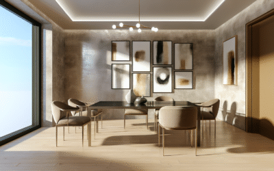
Let’s be honest, neutral colors—like warm beiges, soft grays, or creamy whites—offer a calming backbone. Bold colors like emerald green, fiery red, or electric blue grab your attention, demanding to be noticed. The magic happens when these two worlds collide just right, creating a look that’s dynamic yet grounded, eye-catching yet soothing.
Breaking Down the Basics: What Are Neutrals and Bold Colors Anyway?
Before we get into the nitty-gritty, here’s the lowdown. Neutral colors include shades like white, black, gray, tan, beige, and sometimes muted pastels. They’re the quiet players on the palette—think of a calm lake at dawn. Bolder colors? They’re like fireworks lighting up the night sky—bright reds, intense blues, vivid oranges, even shiny metallics.
The interesting thing is, neutrals are often considered “safe,” almost invisible in a way. But in reality, they provide essential contrast and relief, making bold colors pop without getting overwhelmed. Without neutrals, bold colors can feel like a shouting match. With neutrals, you get a genuine conversation.
Unearthing the Emotional Layer: Why Color Combinations Matter More Than You Think
Color choice is way more than aesthetics. They stir feelings—comfort, excitement, calm, or even tension. Ever notice how a navy blue paired with taupe can feel so reassuring, almost like a hug? Or how neon pink with charcoal gray might spark energy but keep chaos at bay? See, it’s emotional chemistry at work.
So, mixing neutrals with bolds isn’t just a technical dance; it’s about mood-setting. Designers know this instinctively. When you walk into a space or glance at a website, those hues are whispering a story to your brain. That’s why learning this art feels less like clockwork and more like tuning into a subtle dialogue.
How to Mix Neutral and Bold Colors — The Rules, the Myths, and the Fun Exceptions
Alright, let’s talk strategy, but not in a boring, rulebook sort of way. A lot of “color experts” throw around a must-follow list, but honestly, creativity doesn’t always like rules—it likes guidelines with wiggle room.
- Rule #1: The 60-30-10 Principle — It’s a classic for a reason. Pick 60% neutral tones as your base, 30% a secondary color, and 10% a bold statement hue. This ratio keeps things balanced and visually digestible.
- Myth Busted: You don’t always have to start with neutrals. Sometimes, a bold color can anchor your palette if your neutrals are muted enough.
- Play with Textures: Adding texture like a velvet throw pillow or a matte finish on bold paint can soften or amplify color impact without changing your palette.
And here’s an easy way to think about it—imagine your room or design as an orchestra. The neutrals are the steady rhythm, the bold colors are the lead violin or trumpet. You want the soloist to shine without drowning out the harmony.
When Neutrals Take the Lead: Subtle Powerhouses Worth Celebrating
Neutrals rarely grab the spotlight, but that’s their secret charm. They’re versatile and timeless, acting as a canvas for your bold colors. Consider the tactile warmth of an oatmeal wool rug against a cobalt blue armchair. That contrast makes the blue sing without overwhelming your senses.
Neutrals are also surprisingly complex—they can be cool, warm, or somewhere delightfully in-between. Think warm greige (a mix of gray and beige) versus a cooler dove gray. Depending on the undertones, neutrals can shift your entire color story. So don’t just think “beige = boring.” They are incredibly nuanced players in this balancing act.
Bold and Beautiful: How to Let Bold Colors Speak Without Yelling
Bold colors have a personality. Red is assertive, navy blue is trustable, chartreuse is quirky and fun. Here’s where many stumble—loading up all the bolds and ending up with a visual circus. The trick? Pick one dominant bold color and let neutrals act as the buffer zones.
Picture a striking mustard yellow couch against a backdrop of soft gray walls. The yellow demands your attention, but the grays let it breathe. When bold colors get elbow room, they’re downright charismatic, not aggressive.
Mixing Tips That Actually Work (and Won’t Make You Rethink Your Life)
Here’s the real kicker: mixing colors is subjective. But some strategies do tend to save headaches:
- Sample small areas before committing. Paint swatches on your wall, try a throw pillow, or a piece of art.
- Use digital palettes on sites like Coolors or Adobe Color to test combos virtually.
- Consider lighting—natural and artificial light can change how your colors look. A bold teal in bright daylight might feel different than under soft incandescent light.
- Experiment with layering. Sometimes, a bold accent on a neutral background isn’t enough; introduce shades that bridge the two.
You’d be surprised how a simple pop of burnt orange paired with sandy taupe can feel unexpected yet utterly harmonious.
Color Psychology 101: What Your Palette Says About You
Ever walked into a room and instantly felt at ease or fired up? That’s no accident. Colors send messages — intentional or not. Neutrals often communicate stability, seriousness, and calm. Bold colors shout confidence, creativity, or even rebellion.
Choosing your color mix is like wearing an outfit. Sometimes you want to blend in smoothly, other times you want to turn heads. Understanding this subtle language helps you design spaces or visuals that feel authentic to you.
Seasonal Shifts: Why Your Palette Might Need a Little Sprucing
Here’s something we don’t talk about enough: seasons matter. Just like you change your wardrobe, your color choices shake up the mood depending on the time of year. A bold pumpkin orange works wonders in fall but might feel out of place in spring.
Neutrals, thankfully, transition well across seasons. But pairing them with seasonal bolds can keep your space or design fresh. Think: icy blues in winter with soft crème neutrals, or electric coral with light beige in summer.
Practical Uses: Where to Mix Neutrals and Bold Colors Like a Pro
From interior design to branding, having a handle on this mix is invaluable. Imagine a website—too many bright colors and users are overwhelmed, too many neutrals and the site feels bland. Same in fashion: a bright scarf against a cream sweater can elevate an outfit effortlessly.
In interiors, using bolds in accents—think cushions, lampshades, an accent wall—and neutrals in larger swathes like sofas or floors, helps balance energy and calm. It’s a way to bring personality without chaos.
Tools, Resources, and the Right Eye for Color
Don’t feel lost amid the countless color palettes out there. Websites like Adobe Color let you explore combinations and save them. Pantone’s seasonal color reports also offer a peek into trendy palettes if you want to stay ahead.
Sometimes, the best tool is just your own experimentation. Trading ideas with friends or professionals can reveal combos you wouldn’t imagine solo. Honestly, there’s a bit of trial and error—and a whole lot of joy—in playing with color.
FAQ Section
The 60-30-10 rule is a great starting point: 60% neutrals, 30% secondary color, and 10% bold accent. It helps create balance without overwhelming the space.
Neutrals can sometimes feel flat if they lack depth or warmth, but choosing neutrals with undertones or subtle variations keeps the palette lively and balanced.
Colors like navy, emerald green, or burnt orange tend to pair beautifully with most neutrals since they bring richness without clashing.
Very important. Natural and artificial light can alter how colors appear, shifting tone and brightness. Always test colors under your room’s typical lighting.
Generally, bold colors work best as accents to avoid overpowering a space. But if paired with the right muted neutrals, bolds can sometimes hold large areas effectively.
Use seasonal bolds in smaller elements like cushions or décor items to refresh your space without needing a full overhaul.
Explore design blogs, Pinterest boards, and tools like Coolors or Adobe Color. Visiting art galleries can also spark fresh ideas.
Disclaimer
This article offers general advice and insights about color mixing. Individual preferences and contexts vary widely; what works for one might not suit another. Always consider personal taste, lighting conditions, and intended atmosphere before making final decisions.
Categories
- Accent Walls & Ceilings (84)
- Art Curation & Gallery (83)
- Bedding Style Trends (89)
- Bedroom Makeover (96)
- Bohemian & Eclectic Styles (80)
- DIY & Budget-Friendly Decor (78)
- Eco-Friendly Design (83)
- Furniture Care (87)
- Home Decor & Design Ideas (181)
- Home Wellness Spaces (103)
- Integrated Outdoor Living (91)
- Japandi Style (84)
- Kids and Nursery Decor (73)
- Living Room Decor (99)
- Mix & Match Techniques (95)
- Modern & Contemporary Design (88)
- Rug Sizing & Placement (89)
- Scandinavian Design Inspiration (51)
- Seasonal Home Decor (100)
- Small Space Solutions (93)
- Wall Art & Painting Tips (94)
Recent Comments
Archives
Product Gallery
-
 Majestic African Wildlife Canvas Art for Stylish Home Decor
Rated 5.00 out of 5
Majestic African Wildlife Canvas Art for Stylish Home Decor
Rated 5.00 out of 5 -
 Cozy Irregular Green Plush Rug for Nordic Living Spaces
Rated 5.00 out of 5$45.53 – $287.11Price range: $45.53 through $287.11
Cozy Irregular Green Plush Rug for Nordic Living Spaces
Rated 5.00 out of 5$45.53 – $287.11Price range: $45.53 through $287.11 -
 Scandinavian Geometric Area Rugs for Stylish Home Décor
Rated 5.00 out of 5$34.12 – $516.89Price range: $34.12 through $516.89
Scandinavian Geometric Area Rugs for Stylish Home Décor
Rated 5.00 out of 5$34.12 – $516.89Price range: $34.12 through $516.89