Why Color Matters in Interior Design
Choosing the right colors for your home isn’t just about aesthetics; it’s about creating a mood. Did you know that colors can impact your emotions and behavior? Modern color palettes for interiors are emerging as key elements in designing spaces that are not only beautiful but also functionally beneficial. In this article, you will learn about the latest color trends, how to select palettes that suit your personality, and practical steps to implement these hues effectively.
We’ll explore various sections, including:
- Understanding Color Theory
- Top Modern Color Palettes
- Practical Tips for Applying Color
- Case Studies on Colorful Transformations
- Common Mistakes to Avoid
Understanding Color Theory
Basic Principles of Color
Color theory forms the foundation of any design project. It encompasses the scientific relationships between colors and their psychological effects. Here are a few key concepts:
- Color Wheel: A visual tool that shows the relationship between colors.
- Complementary Colors: Colors opposite each other on the wheel, creating vibrant contrasts.
- Analogous Colors: Colors next to each other on the wheel, producing harmonious designs.
The Psychology of Color
Colors evoke emotions. For instance:
- Blue: Calming and serene.
- Red: Energetic and bold.
- Green: Refreshing and revitalizing.
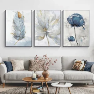
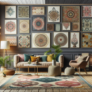
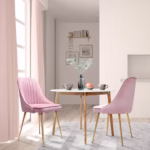
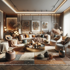
Top Modern Color Palettes
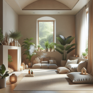
1. Earthy Neutrals
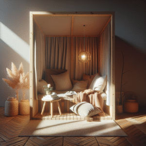
Earthy tones like taupe, beige, and terracotta are trending. These hues bring warmth and groundedness to any space.
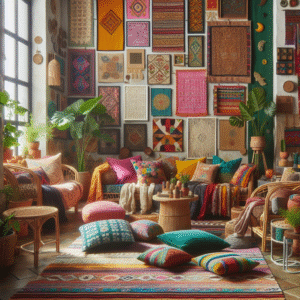
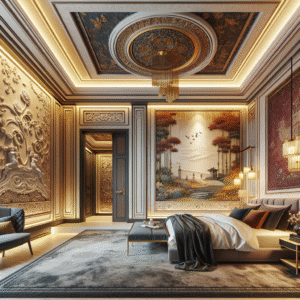
2. Bold Jewel Tones
Deep greens, rich blues, and ruby reds add a luxurious flair to interiors, suitable for accent walls or statement furniture.
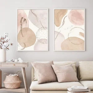
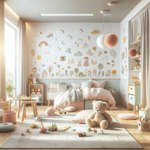
3. Pastel Shades
Soft pastels are excellent for creating a tranquil and inviting atmosphere, especially in bedrooms and nurseries.
4. Monochromatic Schemes
A monochromatic palette can create a sophisticated look by using varying shades of a single color.
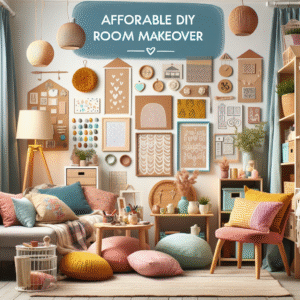
5. Bright Accents
Incorporating vibrant accents like sunny yellows or electric pinks into a neutral setup can rejuvenate a room.
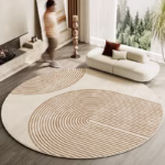
Practical Tips for Applying Color
Creating Balance
Use the 60-30-10 rule: 60% for dominant color, 30% for secondary color, and 10% for accent color for a balanced design.
Testing Before Commitment
Always test your color choices with samples in different lighting conditions before making a final decision.
Utilizing Natural Light
Observe how your space looks at different times of the day. This can greatly impact the color’s appearance.
Case Studies on Colorful Transformations
Case Study 1: From Drab to Fab
A dated living room was transformed using a bold navy and gold palette. The room now feels regal and inviting.
Case Study 2: Minimalism Meets Color
A Scandinavian-style home incorporated pastel hues for a pop of charm without overwhelming the minimalistic design.
Common Mistakes to Avoid
Rushing the Process
Choosing colors quickly can lead to regret. Take your time to discover the perfect palette.
Ignoring Lighting
Failing to consider natural versus artificial light can dramatically alter how colors appear.
Overusing Bold Colors
Instead of saturating a room with vivid hues, experiment with accents to avoid overwhelming the eye.
FAQs
What are the trending colors for interiors in 2023?
Some of the trending colors include earthy neutrals, bold jewel tones, and soft pastels. These tones provide various emotional influences perfect for creating inviting spaces.
How do I choose a color palette for my room?
Start by identifying your style, then select a base color. Use the 60-30-10 rule for balance and test colors under different lighting conditions.
Can I mix different color palettes?
Yes! Mixing palettes can create unique designs, but ensure they complement each other to maintain harmony in your space.
How do colors affect mood?
Colors have psychological effects; for example, blue can create calmness, while red can evoke excitement. Choose colors that align with the desired atmosphere.
What is the best way to incorporate color into a neutral scheme?
Use vibrant accessories like cushions, art, or plants as focal points against a neutral backdrop to make the color pop.
Conclusion & Next Steps
Incorporating modern color palettes into your interiors can dramatically elevate the atmosphere of your home. We’ve explored essential theories, trending palettes, practical tips, and common pitfalls.
Next, consider creating a mood board based on the palettes discussed here and start experimenting in your own space. Feel free to check out our related articles on color theory and interior decor tips for more inspiration.
Content Disclaimer
The information presented in this article is for educational purposes only. For specific design advice, please consult a professional interior designer.