If you’ve ever walked into a room and felt instantly at ease, you’ve likely been enveloped by one of the many incredible modern neutral color schemes. These palettes invoke feelings of calmness and sophistication, yet many people worry about how to effectively integrate them into their spaces. Whether you’re redecorating or simply looking to refresh your design palette, understanding neutral hues is essential. In this guide, you’ll learn how to choose, combine, and implement modern neutral color schemes that speak to your style while appealing to modern aesthetics.
This article provides an in-depth look into neutral colors, practical implementation tips, and inspiration that will help you create beautiful, harmonious designs.
- Defining modern neutral colors
- How to choose the right neutral palette
- Combining neutrals with other colors
- Case studies and real-world examples
- FAQs about neutral color schemes
What are Modern Neutral Colors?
Modern neutral colors are hues that don’t strongly evoke any specific color emotion but create a soothing backdrop for various design elements. They include shades like beige, taupe, gray, and white. These colors are versatile, allowing for endless combinations and styles while serving multiple purposes in any design, from minimalistic to rustic.
Characteristics of Neutrals
- Timelessness: Neutral colors never go out of style.
- Versatility: They pair well with almost any hue.
- Calmness: They create a tranquil environment.
How to Choose the Right Neutral Palette
Choosing a neutral palette requires careful consideration of your space, lighting, and personal style. Here are actionable steps to guide you in selecting the right shades:
1. Evaluate Your Space
Consider the size and lighting of your room. Lighter neutrals expand a space, while darker shades can bring coziness. Use samples to see how colors change with natural and artificial light.
2. Understand Undertones
Be mindful of color undertones. Warm neutrals (with yellow or pink undertones) create inviting atmospheres, while cool neutrals (with blue or gray undertones) invoke tranquility.
3. Consider Compatibility
Choose colors that complement existing furniture and decor. Effective combinations will enhance rather than clash.
Combining Neutrals with Other Colors
While neutrals stand strong on their own, they harmonize beautifully with other colors to create depth and interest in any design.
Accent Colors
Select one or two accent colors that resonate with your vision. Jewel tones, pastels, or even pops of vibrant shades can add warmth or energy to a neutral palette.
Texture vs. Color
Incorporate various textures to elevate a space. Textured fabrics, wood finishes, and metallic accents can create visual intrigue alongside neutral colors.
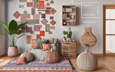
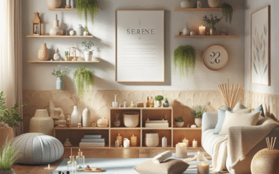
Case Studies: Real-World Applications of Neutral Color Schemes
Here are a few real-world examples showcasing the effective use of neutral colors:
1. Modern Minimalism
In a recent residential design project, a palette comprising shades of white and soft gray was used to accomplish a minimalistic look. This design effectively showcased clean lines and an open layout, making the only splash of color come from green plants.
2. Rustic Chic
A café successfully combined warm taupes with rich wood finishes and ornamental black accents. The result was a warm and inviting space that encouraged customers to linger.
Frequently Asked Questions
What are some popular neutral colors?
Popular neutral colors include soft grays, beiges, taupes, and whites. These shades can adapt to various decor styles.
Can I use bold colors with neutral schemes?
Absolutely! Bold colors can provide a stunning contrast with neutral shades, adding interest to your design.
How do I choose neutrals for small spaces?
Use lighter neutral shades to make small rooms feel larger. Incorporate textures to avoid monotony.
Are neutral color schemes still in style?
Yes, neutral color schemes are timeless and continue to be a popular choice among designers for their versatility.
Conclusion: The Versatility of Modern Neutral Color Schemes
Modern neutral color schemes offer endless possibilities for any design project. By understanding how to choose and combine these hues effectively, you can create stunning spaces that are both functional and aesthetically pleasing.
Ready to transform your space with neutral colors? Try incorporating some of these tips and see how your space transforms into a chic haven.
Content Disclaimer
This content is intended for educational purposes only. It is not a substitute for professional design advice. Always consult a qualified interior designer for personalized recommendations.
Categories
- Accent Walls & Ceilings (61)
- Art Curation & Gallery (62)
- Bedding Style Trends (68)
- Bedroom Makeover (81)
- Bohemian & Eclectic Styles (58)
- DIY & Budget-Friendly Decor (64)
- Eco-Friendly Design (62)
- Furniture Care (71)
- Home Decor & Design Ideas (162)
- Home Wellness Spaces (59)
- Integrated Outdoor Living (67)
- Japandi Style (61)
- Kids and Nursery Decor (59)
- Living Room Decor (79)
- Mix & Match Techniques (73)
- Modern & Contemporary Design (66)
- Rug Sizing & Placement (73)
- Scandinavian Design Inspiration (20)
- Seasonal Home Decor (79)
- Small Space Solutions (73)
- Wall Art & Painting Tips (77)
Recent Comments
Archives
Product Gallery
-
 Large Area Green Rugs for Bedroom Nordic Living Room Decoration Shaped Carpet Irregular Plush Lounge Rug Home Thick Washable Mat
Rated 5.00 out of 5$36.00 – $225.00Price range: $36.00 through $225.00
Large Area Green Rugs for Bedroom Nordic Living Room Decoration Shaped Carpet Irregular Plush Lounge Rug Home Thick Washable Mat
Rated 5.00 out of 5$36.00 – $225.00Price range: $36.00 through $225.00 -
 Nordic Style Rugs for Bedroom Morandi Living Room Decoration Carpet Large Area Geometry Lounge Rug Home Cloakroom Non-slip Mat
Rated 5.00 out of 5$26.00 – $387.00Price range: $26.00 through $387.00
Nordic Style Rugs for Bedroom Morandi Living Room Decoration Carpet Large Area Geometry Lounge Rug Home Cloakroom Non-slip Mat
Rated 5.00 out of 5$26.00 – $387.00Price range: $26.00 through $387.00 -
 Irregular Shapes Living Room Decoration Carpet Modern Style Rugs for Bedroom Home Thicken Plush Rug Fluffy Soft Lounge Floor Mat
Rated 4.83 out of 5$37.00 – $225.00Price range: $37.00 through $225.00
Irregular Shapes Living Room Decoration Carpet Modern Style Rugs for Bedroom Home Thicken Plush Rug Fluffy Soft Lounge Floor Mat
Rated 4.83 out of 5$37.00 – $225.00Price range: $37.00 through $225.00