Do you ever walk into a room, browse a clothing rack, or scroll through a website and just feel… *right*? There’s a magnetic pull. A balanced energy. More often than not, this feeling stems from a masterful blend of colors – specifically, the **smart mixing of neutrals and joyful colors**. It’s the secret sauce that elevates a空间 from ordinary to extraordinary, infusing personality without sacrificing sophistication.
The challenge? Finding that sweet spot. Too many vibrant hues can overwhelm, leading to visual chaos. Too many neutrals can feel stark or uninspired. But when a discerning eye combines them with intention, the result is a symphony of style that speaks volumes. This isn’t just about aesthetics; it’s about crafting environments, outfits, and brands that truly resonate, evoking specific emotions and telling compelling stories.
In this comprehensive guide, we’ll dive deep into the art and science behind perfectly pairing foundational neutrals with captivating joyful colors. You’ll learn the psychological impact of various shades, discover proven design principles, and unlock actionable strategies to confidently apply these concepts to interior design, fashion, branding, and even your personal aesthetic. Get ready to transform your understanding of color and inject more harmony and joy into every aspect of your world. By the end, you’ll be a true maestro of vibrant yet balanced palettes.
The Foundational Playbook: Understanding Neutrals and Joyful Colors
Before we embark on the journey of smart mixing, let’s establish a clear understanding of our two core players: neutrals and joyful colors. These aren’t just arbitrary categories; they represent distinct roles in any successful color story.
What Exactly Are Neutrals? More Than Just Beige!
When you hear “neutral,” what comes to mind? Often, people default to beige or gray. While these are certainly prime examples, the world of neutrals is far richer and more nuanced. Fundamentally, neutrals are colors that lack strong chromatic intensity. They’re typically understated, allowing other colors to take center stage, and they often draw their inspiration from natural elements.
The Spectrum of Neutrals:
- Warm Neutrals: Think creamy off-whites, ecru, linen, camel, sand, taupe, and warmer grays with brown or yellow undertones. These often evoke feelings of comfort, warmth, and classic elegance. They pair beautifully with earthy tones and jewel tones.
- Cool Neutrals: Silver gray, charcoal, slate, cool beige (with a hint of green or blue), and crisp whites fall into this category. They tend to create a more modern, sleek, and often calming atmosphere. Cool neutrals are fantastic anchors for cool-toned joyful colors.
- True Neutrals: Black and white are the ultimate true neutrals. They are often used for stark contrast or to provide a clean, modern base. While powerful, they must be used thoughtfully to avoid harshness.
- “Chameleon” Neutrals: Certain shades, like olive green, deep navy, or even dusty rose, can act as neutrals in certain contexts. Because they have a muted quality or are deeply saturated without being overtly bright, they can ground a palette similarly to traditional neutrals.
The power of neutrals lies in their versatility. They provide a canvas, a resting place for the eye, and a backdrop that allows bolder hues to shine without competing. They’re the silent heroes of impeccable design.
Defining Joyful Colors: Bringing the Energy
Joyful colors are, quite simply, colors that evoke happiness, energy, optimism, and vibrancy. They are often saturated, bright, and make an immediate visual impact. These are the show-stoppers, the conversation starters, the shades that infuse a space or outfit with personality.
Characteristics of Joyful Colors:
- High Saturation: They often contain a strong pigment, making them appear rich and vivid.
- Brightness: Many joyful colors are lighter in value, reflecting more light and appearing more energetic.
- Emotional Resonance: Think sunny yellows, sky blues, vibrant fuchsias, emerald greens, and fiery oranges. Each carries an inherent emotional charge.
- Diversity: Joyful colors aren’t limited to primary colors. They can be pastels (if used with intention to create lightheartedness), neons, or deep, rich jewel tones that still pack a punch.
When chosen wisely, joyful colors can stimulate creativity, boost mood, and add a much-needed pop of character. They’re the elements that infuse life and tell a story, making an environment unique and memorable.
The Inherent Connection: Why Neutrals Need Joyful Colors (and Vice-Versa)
Imagine a symphony with only percussion, or a painting made solely of shades of gray. While interesting in limited doses, they lack the full spectrum of emotion and dynamism. This is precisely why the **smart mixing of neutrals and joyful colors** is crucial.
Neutrals provide stability. They prevent joyful colors from becoming chaotic, allowing them to truly “pop” rather than clash. They offer balance, grounding, and a sense of timelessness. Without neutrals, a collection of joyful colors can feel overwhelming, child-like, or even stressful.
Joyful colors provide personality. They save neutrals from becoming bland, boring, or sterile. They inject life, warmth, and emotion into a space or ensemble. Without joyful colors, an all-neutral palette, while sophisticated, might feel uninviting or lack character.
It’s a symbiotic relationship, a dialogue between calm and excitement, tradition and innovation. The goal is not just to combine them, but to combine them *intelligently* for maximum impact and harmony.
Mastering the Art: Principles for Smart Mixing of Neutrals and Joyful Colors
Achieving that perfect blend isn’t accidental. It relies on a few fundamental design and color theory principles. Understanding these will unlock your ability to create truly balanced and beautiful palettes.
1. The 60-30-10 Rule: Your Blueprint for Balance
This classic interior design rule is a fantastic starting point for any color scheme, offering a balanced visual distribution of color. It helps you proportion your neutrals and joyful colors effectively:
- 60% Dominant Color: This is typically your primary neutral. It covers most of the space – walls, large furniture pieces, or foundational elements. Think of this as your backdrop, the vast canvas.
- 30% Secondary Color: This can be another neutral, a softer joyful color, or a complementary tone. It’s used on medium-sized elements like accent furniture, curtains, rugs, or secondary walls. It adds depth and builds interest.
- 10% Accent Color: This is where your bright, joyful colors typically steal the show. Used sparingly on accessories, artwork, cushions, or small decorative items, this 10% delivers punch and personality.
Example: In a living room, 60% might be soft gray walls and a cream sofa. 30% could be dark wood furniture and navy blue curtains. The final 10% would be a vibrant yellow throw pillow, a small piece of abstract art with fuchsia tones, or a few potted plants with bright green leaves. This creates visual interest without overwhelming the eye.
Image Alt Text Suggestion:
Infographic illustrating the 60-30-10 rule with a balanced room showing dominant neutral gray, secondary blue, and accent yellow.
2. Contrast and Harmony: Playing with Opposites and Companions
Color theory teaches us about contrast and harmony, both vital for smart mixing. Contrast grabs attention, while harmony provides a sense of peace.
- High Contrast (Neutrals + Bold Joyful): Pairing a very light neutral (like crisp white) with a highly saturated joyful color (like electric blue) creates a dramatic, modern, and energetic look. Similarly, black with bright pink offers a stark, fashionable statement.
- Low Contrast (Neutrals + Muted Joyful/Pastels): Combining a soft neutral (like warm beige) with a gentle joyful color (such as a blush pink or sage green) results in a serene, sophisticated, and calming aesthetic. This is excellent for creating gentle transitions and a cohesive feel.
- Monochromatic Neutrals with a Pop: Use varying shades of a single neutral (e.g., charcoal, medium gray, light gray) and then introduce one single, decisive joyful color for a refined, yet impactful look.
Understanding the difference between cool and warm undertones in both your neutrals and joyful colors is also key. Warm neutrals (cream, taupe) often harmonize best with warm joyful colors (coral, golden yellow), while cool neutrals (gray, stark white) complement cool joyful colors (mint green, periwinkle blue). However, a deliberate mix of warm and cool can also add intriguing complexity.
3. The Power of Texture: Adding Depth Beyond Color
When working with neutrals, texture becomes incredibly important. A room with only smooth, flat gray surfaces will quickly feel dull. Introduce texture to make those neutrals sing and create a richer backdrop for your joyful colors.
- For Neutrals: Think chunky knits, plush velvet, raw wood, nubby linen, polished concrete, woven baskets, or metallic finishes. These textures add visual interest and tactile appeal, preventing a neutral palette from becoming boring.
- For Joyful Colors: Texture can also enhance joyful hues. A vibrant silk pillow has a different impact than a vibrant cotton one. A matte bright orange vase feels different than a glossy one.
Texture adds a subtle layer of complexity, making even a minimalist color scheme feel rich and inviting. It’s a key ingredient in making smart mixing truly effective.
4. Visual Weight and Placement: Directing the Eye
Just as in photography, color has “visual weight.” Brighter, more saturated colors carry more weight and naturally draw the eye. Neutrals tend to recede. Strategically placing your joyful colors can direct attention and influence the perceived spaciousness of a room or the focal point of an outfit.
- Create Focal Points: Use a concentrated burst of a joyful color in a specific area – a gallery wall, an accent chair, or a statement necklace – to immediately draw the eye.
- Balance the Room: If you have a large, joyful piece on one side of a room, consider a smaller touch of that same color, or a complementary joyful color, on the opposite side to balance the visual weight.
- Consider Scale: A large piece of joyful art makes a statement. Small, repeated pops of color (e.g., several small yellow vases) create a sense of rhythm and energy.
This principle is about creating a visual flow, ensuring that while joyful colors stand out, they don’t overpower the overall harmony established by your neutrals.
Real-World Applications: Smart Mixing Across Domains
The principles of smart mixing aren’t confined to a single discipline. They are universal, translating beautifully across various fields.
Interior Design: Crafting Inviting and Dynamic Spaces
This is perhaps where the **smart mixing of neutrals and joyful colors** shines brightest. A home should feel like a sanctuary, yet also reflect the personality of its inhabitants.
Strategies for Home Harmony:
- Start with Your Neutrals: Choose wall colors, large furniture (sofa, bed frame), and flooring in your preferred neutral palette (warm, cool, or a mix). This establishes your foundation.
- Introduce Joyful Layers: Bring in throws, pillows, artwork, ceramics, books, or fresh flowers in your chosen joyful colors. These are easy to change with seasons or mood.
- Anchor with an Unexpected Pop: A single, bold piece of furniture – an emerald green armchair against tan walls, or a vibrant orange credenza in a gray room – can be a stunning focal point without overwhelming.
- Kitchen & Bath: Don’t shy away from playful tiles or colorful small appliances in these functional spaces. Crisp white subway tiles with a band of bright yellow or cobalt blue can be incredibly impactful.
- Children’s Rooms: These are naturally expressive spaces! Balance playful walls with neutral furniture, or keep walls neutral and go wild with bedding, rugs, and storage solutions in primary or secondary joyful colors.
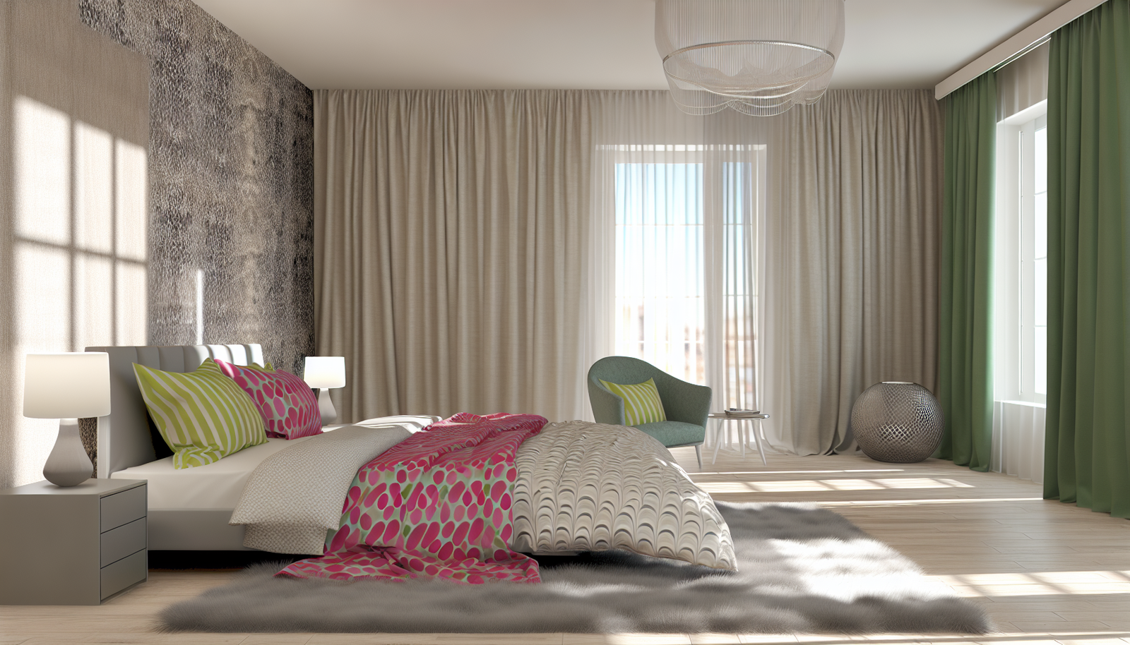
Example Case Study: A client wanted a serene living room but felt her previous all-beige space was “boring.” We opted for light gray walls (60%), a cream sectional, and then introduced natural wood elements and a large area rug with abstract patterns in deep teal and mustard yellow (30%). For the 10%, we added throw pillows in both teal and mustard, a vibrant botanical print, and fresh flowers in a rich magenta. The result was calm yet engaging, sophisticated but clearly joyful.
Image Alt Text Suggestion:
Modern living room with gray sofa and yellow accent cushions, demonstrating neutral base with joyful color pops.
Fashion & Personal Style: Expressing Yourself with Confidence
Your wardrobe is a powerful tool for self-expression. The smart mixing of neutrals and joyful colors can elevate your daily look from basic to brilliant.
Tips for a Stylish Wardrobe:
- Build a Strong Neutral Base: Invest in quality neutral staples – jeans, black trousers, white shirts, gray sweaters, a camel coat. These form the backbone of your closet.
- Accessorize with Joy: This is the easiest way to incorporate joyful colors. Think a vibrant scarf, a colorful handbag, a pair of bright sneakers, statement jewelry, or a bold lip color.
- The “One Pop” Rule: If you’re new to joyful colors, start by wearing one vibrant item with an otherwise neutral outfit. A bright green blazer over a white tee and black pants; fuchsia heels with a gray dress.
- Layering for Impact: Layer a joyful colored camisole under a neutral cardigan, or let a patterned shirt peek out from beneath a neutral sweater.
- Consider Your Complexion: Some joyful colors will make your skin glow, while others might wash you out. Experiment to find the shades that best complement your natural coloring.
Tool Recommendation: Online wardrobe planners or style apps (e.g., Stylebook, Cladwell) can help you visualize outfits and identify gaps in your neutral or joyful color collections. They encourage thoughtful purchasing over impulse buys.
Image Alt Text Suggestion:
Woman wearing a neutral camel trench coat with a vibrant red handbag and scarf, demonstrating fashion color mixing.
Branding & Marketing: Creating Memorable Visual Identities
In the competitive world of business, color is a silent messenger. The **smart mixing of neutrals and joyful colors** is essential for creating brand identities that are both professional and memorable.
Brand Color Strategies:
- Define Your Brand Personality: Is your brand playful, sophisticated, eco-friendly, innovative? Your joyful colors will reflect this, while your neutrals will ground it.
- Website Design: Use neutrals for backgrounds, text, and foundational elements to ensure readability and professionalism. Introduce joyful colors for calls-to-action, important headlines, or illustrative graphics.
- Logo Design: A neutral logo with a small, strategic joyful accent can be highly effective – think a minimalist black and white design with a single, brightly colored icon or wordmark.
- Packaging: Combine an elegant neutral base (e.g., matte white, kraft paper) with a vibrant pop of color to make your product stand out on the shelf. This signals quality and excitement simultaneously.
- Social Media: Maintain a consistent brand palette by using your core neutrals as backgrounds or borders, and then rotating through your chosen joyful colors for specific campaigns or posts.
Example: Mailchimp successfully uses a neutral gray and white interface, but their joyful yellow chimp logo and occasional pops of vibrant color in illustrations make their brand feel approachable, friendly, and memorable. Google’s use of a largely white interface with small, colorful icons and the iconic multi-colored logo is another prime example of effective smart mixing.
Image Alt Text Suggestion:
Website design mockup showing a clean white background with bright orange call-to-action buttons.
Common Pitfalls and How to Avoid Them
Even with the best intentions, it’s easy to stumble when mixing colors. Being aware of these common mistakes can save you from style missteps.
1. Overwhelm: Too Many Joyful Colors, Too Little Cohesion
The most common mistake is getting carried away with too many bright hues. This leads to visual cacophony, where no single color can truly shine.
- Solution: Stick to 1-3 joyful accent colors at most. Let your neutrals do the heavy lifting of grounding the palette. Consider choosing one dominant joyful color and one or two supportive ones.
2. Underwhelm: Neutrals Without a Punch
Conversely, a space or outfit composed only of neutrals, even with varying textures, can sometimes feel a bit flat or uninspired without any joyful intervention.
- Solution: Even the most minimalist aesthetic benefits from a subtle pop. A single, well-placed vibrant element can transform a room from “safe” to “sophisticated.” Consider deeply saturated jewel tones if bright pastels feel too much.
3. Clashing Undertones: The Subtle Sabotage
Mixing warm neutrals with cool joyful colors (or vice-versa) can sometimes work for a deliberate, edgy contrast, but it can also lead to an uncomfortable visual tension if not done artfully.
- Solution: Pay attention to the undertones. A warm beige might not look its best with a stark, icy blue. Try pairing warm neutrals with warm joyful colors (think terracotta, mustard, olive) and cool neutrals with cool joyful colors (like mint, sky blue, lavender). If you *do* mix undertones, do it intentionally for a specific effect.
4. Neglecting Scale and Proportion
A tiny joyful accent can get lost, while a massive wall of bright color can dominate inappropriately without enough neutral balance. The size of your color application matters.
- Solution: Revisit the 60-30-10 rule. Think about what impact you want to make. A large joyful art piece or a single colorful accent chair makes a statement; smaller items provide pops of interest. Distribute your joyful colors thoughtfully to guide the eye.
5. Forgetting the Context: Environment Matters
The same color palette might feel different in a small, dimly lit room versus a large, brightly lit space. Seasonal changes or geographic location can also influence how colors are perceived.
- Solution: Consider the natural light in a room. Experiment with swatches. Think about the mood you want to create and how exterior views or local climate might play a role. A vibrant tropical palette might feel out of place in a Scandinavian-inspired snowy locale, for example, unless that’s a deliberate stylistic choice.
Advanced Strategies: Elevating Your Color Palettes
Once you’ve mastered the basics of **smart mixing of neutrals and joyful colors**, you’re ready to explore more sophisticated techniques that add depth and individuality to your designs.
1. The “Color Bridge”: Harmonizing Disparate Hues
Sometimes, you want to combine a very warm neutral with a very cool joyful color, and they just don’t seem to “talk” to each other. A color bridge is an intermediary shade that helps them connect.
- How it Works: Introduce a third color that shares qualities with both the neutral and the joyful color. For example, to bridge a warm beige and a cool navy, you might introduce a rich, earthy green or a deep, muted teal. These “bridge” colors often have complex undertones themselves, carrying hints of both warmth and coolness.
Comparison Table: Color Bridging Examples
| Neutral Base | Joyful Accent (Potential Clash) | Bridge Color (Harmonizer) | Resulting Harmony |
|---|---|---|---|
| Warm Ivory | Vibrant Teal | Dusty Sage Green | Soft, natural transition |
| Cool Gray | Sunny Yellow | Muted Gold/Brass Accents | Elegant, subtle warmth |
| Black | Pastel Pink | Deep Burgundy/Plum | Dramatic depth, sophisticated pop |
2. The Unexpected Neutral: When a Color Acts as a Base
Sometimes, a color that isn’t traditionally “neutral” can function as one, especially when muted or used extensively. This opens up exciting possibilities for more vibrant foundational palettes.
- Examples: A deep forest green, a rich navy blue, charcoal brown, or even a dusty rose can act as a neutral backdrop if paired with brighter, more contrasting joyful colors. For instance, a living room with deep navy walls and cream furniture might have pops of coral and yellow. Here, navy is the *new* neutral.
- Usage: This approach creates a bolder, more personality-driven base while still providing the stability that traditional neutrals offer. It’s often seen in maximalist or bohemian styles, but can be incredibly chic in modern settings too.
3. Embracing Analogous and Complementary Joyful Pairings
Once your neutral base is set, consider how your joyful colors relate to each other on the color wheel:
- Analogous Joyfuls: Colors next to each other on the color wheel (e.g., blue, blue-green, green). This creates a harmonious, flowing, and often serene joyful palette. Imagine a neutral living room with accents of various harmonious blues and greens.
- Complementary Joyfuls: Colors opposite each other on the color wheel (e.g., blue and orange, red and green). These create high contrast and vibrancy. Use them with caution and often in smaller doses, letting the neutrals cool down their intensity. A neutral room with small, powerful touches of complementary colors can be incredibly dynamic.
4. Leveraging Metallic Finishes as “Glam Neutrals”
Metallics – gold, silver, bronze, copper – aren’t joyful colors, but they aren’t bland neutrals either. They act as “glam neutrals” or “sparkle neutrals,” adding shine, sophistication, and a touch of luxury without competing with your main color story.
- Application: Use them in light fixtures, hardware, picture frames, decorative accents, or even subtle threads in fabrics. Gold adds warmth, silver adds coolness, and copper can bridge both. They work brilliantly to elevate both standard neutrals and joyful pops.
Remember, these advanced strategies require a certain level of confidence and experimentation. Don’t be afraid to try different combinations and see how they make you feel. The beauty of smart mixing is that it’s a journey of discovery!
The Psychological Impact of Color: More Than Just Pretty Hues
Colors resonate deeply with our emotions and influence our perceptions. Understanding this psychology is key to the **smart mixing of neutrals and joyful colors** for intentional impact.
How Neutrals Influence Emotion: Stability and Calm
- White: Purity, cleanliness, freshness, simplicity, spaciousness. Can feel sterile if not balanced.
- Black: Sophistication, power, elegance, mystery, seriousness. Can feel oppressive if overused.
- Gray: Balance, neutrality, sophistication, calm. Can feel melancholy or monotonous without vibrant accents.
- Beige/Cream/Taupe: Comfort, warmth, reliability, naturalness, coziness. Can feel bland or dated without contrast.
Neutrals generally provide a sense of stability and act as a psychological anchor, allowing the mind to rest and process other stimuli. They are the backdrop against which higher-energy colors play their role.
The Emotional Resonance of Joyful Colors: Energy and Expression
- Red: Passion, energy, excitement, love, urgency. Stimulating, but can also signal aggression.
- Orange: Enthusiasm, creativity, warmth, playfulness, excitement. Welcoming and stimulating.
- Yellow: Happiness, optimism, energy, cheerfulness, intellect. Can be overwhelming in large doses.
- Green: Nature, growth, freshness, tranquility, harmony, health. Calming yet vibrant.
- Blue: Serenity, trust, stability, peace, intelligence. Can feel cool or distant in excess.
- Purple: Luxury, creativity, wisdom, royalty, ambition. Can feel spiritual or mysterious.
- Pink: Playfulness, romance, sweetness, youth, compassion. Can be seen as feminine.
By consciously selecting your joyful colors, you can strategically infuse a space or a brand with a desired emotional tone, amplified by the grounding presence of your neutrals.
Case Study: A Cafe’s Color Story
Consider a bustling urban cafe. They want to feel energetic and inviting, but also sophisticated and a place people can relax. They might use a base of warm gray walls (neutral for sophistication and calm) and raw wooden tables (warm neutral for earthiness). Then, they introduce joyful pops: bright orange chairs (energy, social, welcoming), touches of cheerful yellow in their branding (optimism, happiness), and vibrant green plants (freshness, calm). The **smart mixing of neutrals and joyful colors** perfectly balances the desire for energy with an underlying sense of sophisticated comfort.
Implementing Your Newfound Knowledge: Actionable Steps
Ready to put these principles into practice? Here are some concrete next steps to confidently start or refine your color mixing journey.
1. Assess Your Current Palette
- Interior: Look around your home. What are the dominant neutrals? Do you have any joyful colors? Are they working together? Where could you add more balance or personality?
- Wardrobe: Go through your closet. What are your staples? Are they mostly neutral? What joyful colors do you gravitate towards? Are there any missing elements that would bridge the two?
- Brand: Examine your website, logo, and marketing materials. Is there a clear presence of both neutrals and joyful colors? Do they communicate your brand’s desired emotion?
2. Gather Inspiration
- Digital Mood Boards: Use Pinterest, Instagram, or dedicated mood board apps (e.g., Milanote). Collect images of spaces, outfits, and branding that resonate with you. Pay attention to how colors are used.
- Nature: The ultimate color teacher. Observe how neutrals like tree bark, stone, and clouds perfectly complement joyful colors like flowers, sunsets, and water.
- Magazines & Books: Tear out pages, create physical collages. Seeing colors in print can give a different perspective.
3. Experiment Fearlessly (and Temporarily)
- Paint Swatches: Never commit to a wall color without seeing it in your space first. Observe it at different times of day.
- Accessories: This is your playground! Buy a joyful colored throw pillow, a vibrant vase, or a brightly colored scarf. See how it interacts with your existing neutrals before making larger commitments.
- Digital Mock-ups: For branding, create multiple digital versions of your designs with different color combinations. Gather feedback.
4. Start Small, Think Big
- Begin with small changes. A brightly colored front door can transform the exterior of a home. A new pair of joyful colored shoes can uplift an entire outfit.
- As you gain confidence, you can tackle larger projects like painting a room, investing in a bold piece of furniture, or undertaking a brand refresh.
5. Trust Your Gut
While principles and rules are incredibly helpful, ultimately, color is deeply personal. If a combination feels right to you, even if it breaks a “rule,” go for it! The goal of **smart mixing of neutrals and joyful colors** is to create environments and styles that bring *you* joy and reflect *your* authentic self.
For more insights on creating personalized spaces, delve into our guide on Crafting a Timeless Aesthetic, or explore effective strategies for Minimalist Design with Maximal Impact.
FAQ: Smart Mixing of Neutrals and Joyful Colors
What is the best way to introduce joyful colors into a neutral room without overwhelming it?
The best approach is to start with small, deliberate accents. Think throw pillows, blankets, a piece of art, stylish vases, or fresh flowers. These elements are easily interchangeable and allow you to experiment with different joyful hues to see what resonates. Follow the 60-30-10 rule by keeping the majority of your room neutral (60%), adding a secondary color for depth (30%), and reserving a small percentage for your joyful accents (10%).
Can I mix warm and cool neutrals with joyful colors?
Yes, absolutely! While pairing warm neutrals with warm joyful colors (and cool with cool) often creates seamless harmony, mixing warm and cool undertones can create a more dynamic and sophisticated look. The key is intentionality and balance. For example, a crisp cool gray wall paired with a warm mustard yellow accent forms a striking yet balanced contrast. Consider using a common texture or a “bridge color” to tie them together.
How do I choose joyful colors that won’t go out of style quickly?
Opt for joyful colors that are slightly desaturated or have a deeper, richer tone rather than very bright, trendy neons. Jewel tones (emerald, sapphire, ruby) or earthy, vibrant shades (terracotta, olive green, mustard) tend to have more longevity. Alternatively, keep your large, expensive items neutral and introduce joyful colors purely through easily changeable accessories, allowing you to update your palette as trends evolve.
Is it okay to use black and white as neutrals with bright colors?
Yes, black and white are incredibly powerful true neutrals that provide stark contrast and a modern foundation for joyful colors. A predominantly black and white space or outfit can look incredibly chic with a single, bold pop of color like fuchsia, electric blue, or vibrant green. The strong contrast makes the joyful color stand out even more, creating a dramatic and intentional aesthetic.
What’s the role of texture when mixing neutrals and joyful colors?
Texture is crucial, especially with neutrals, as it adds visual interest and depth that plain color alone cannot provide. In a neutral scheme, varied textures (chunky knits, smooth silk, raw wood, polished metal) prevent flatness and make the background more engaging. When adding joyful colors, texture can also enhance their impact – a velvety emerald green feels luxurious, while a linen emerald green feels more casual and organic. It enriches the overall sensory experience.
How can I use lighting to enhance my mixed color palette?
Lighting profoundly affects how colors appear. Warm lighting (lower Kelvin temperature) can make joyful colors appear richer and deepen warm neutrals, while cool lighting (higher Kelvin temperature) can brighten cool joyful colors and make cool neutrals feel crisper. Natural light provides the truest representation. Experiment with different light sources (lamps, overheads, natural light) to see how your chosen palette transforms throughout the day and evening.
Conclusion: Crafting Your Masterpiece of Hues
The journey of **smart mixing of neutrals and joyful colors** is not just about aesthetics; it’s about intentional design, emotional connection, and personal expression. We’ve explored how neutrals provide the calming, elegant foundation, allowing joyful colors to burst forth with personality and energy. From the trusted 60-30-10 rule to understanding the psychology of shades, you now have a robust toolkit to create spaces, styles, and brands that are both visually stunning and deeply resonant.
Remember that color is a powerful language, and you are its speaker. Don’t be afraid to experiment, to break a “rule” when your intuition guides you, and to constantly seek inspiration. The goal isn’t perfection, but rather the creation of harmony, balance, and joy. By applying these strategies, you’re not just decorating or dressing; you’re crafting environments and personal narratives that inspire, comfort, and delight. Go forth and mix with confidence, transforming the ordinary into the truly extraordinary!
For further inspiration on interior color theory, explore resources from Pantone, the global authority on color. You can also delve into the architectural and design psychology behind color at Architectural Digest.
Content Disclaimer
The information provided in this article is for educational and informational purposes only. While every effort has been made to ensure accuracy and completeness, color perception and design principles can be subjective and vary greatly based on individual preferences, cultural context, and lighting conditions. This content is not intended as a substitute for professional advice from an interior designer, fashion consultant, or branding specialist. Individual results and experiences may vary. Always conduct your own research and consult with experts for specific needs and applications.
Categories
- Accent Walls & Ceilings (61)
- Art Curation & Gallery (62)
- Bedding Style Trends (68)
- Bedroom Makeover (81)
- Bohemian & Eclectic Styles (58)
- DIY & Budget-Friendly Decor (65)
- Eco-Friendly Design (62)
- Furniture Care (71)
- Home Decor & Design Ideas (162)
- Home Wellness Spaces (59)
- Integrated Outdoor Living (67)
- Japandi Style (61)
- Kids and Nursery Decor (59)
- Living Room Decor (79)
- Mix & Match Techniques (73)
- Modern & Contemporary Design (66)
- Rug Sizing & Placement (73)
- Scandinavian Design Inspiration (20)
- Seasonal Home Decor (79)
- Small Space Solutions (73)
- Wall Art & Painting Tips (77)
Recent Comments
Archives
Product Gallery
-
 Large Area Green Rugs for Bedroom Nordic Living Room Decoration Shaped Carpet Irregular Plush Lounge Rug Home Thick Washable Mat
Rated 5.00 out of 5$36.00 – $225.00Price range: $36.00 through $225.00
Large Area Green Rugs for Bedroom Nordic Living Room Decoration Shaped Carpet Irregular Plush Lounge Rug Home Thick Washable Mat
Rated 5.00 out of 5$36.00 – $225.00Price range: $36.00 through $225.00 -
 Nordic Style Rugs for Bedroom Morandi Living Room Decoration Carpet Large Area Geometry Lounge Rug Home Cloakroom Non-slip Mat
Rated 5.00 out of 5$26.00 – $387.00Price range: $26.00 through $387.00
Nordic Style Rugs for Bedroom Morandi Living Room Decoration Carpet Large Area Geometry Lounge Rug Home Cloakroom Non-slip Mat
Rated 5.00 out of 5$26.00 – $387.00Price range: $26.00 through $387.00 -
 Irregular Shapes Living Room Decoration Carpet Modern Style Rugs for Bedroom Home Thicken Plush Rug Fluffy Soft Lounge Floor Mat
Rated 4.83 out of 5$37.00 – $225.00Price range: $37.00 through $225.00
Irregular Shapes Living Room Decoration Carpet Modern Style Rugs for Bedroom Home Thicken Plush Rug Fluffy Soft Lounge Floor Mat
Rated 4.83 out of 5$37.00 – $225.00Price range: $37.00 through $225.00