Stepping into a living room should feel like a warm embrace, a sanctuary that reflects your personality while offering comfort and visual appeal. But far too often, our spaces miss the mark. They can feel chaotic, bland, or simply not ‘right’. Why is it so challenging to create a cohesive, balanced aesthetic? The answer often lies in understanding the subtle yet profound power of color. This is where The Color Compass becomes your indispensable guide, helping you navigate the endless possibilities to achieve perfect balance in your living room decor.
Imagine a living room that instantly calms you, energizes you, or inspires lively conversation, all orchestrated by the thoughtful application of color. This isn’t just about picking pretty hues; it’s about mastering the art and science of color theory to craft a living space that feels inherently balanced and beautiful. From the overarching mood to the smallest accent, every color choice contributes to the overall harmony or discord. In this comprehensive guide, we’ll explore how to harness The Color Compass to transform your living room into a masterclass of design. We’ll delve into foundational color principles, explore psychological impacts, and provide actionable strategies to ensure every shade you choose aligns perfectly with your vision for balance.
By the end of this journey, you’ll not only understand the principles of balanced decor but also possess the tools and confidence to apply them. Get ready to unlock the secret language of color and use it to curate a living room that truly resonates with you and your loved ones.
Understanding The Color Compass: Foundations of Harmony
Before we embark on our decor adventure, it’s crucial to grasp the core concepts that define The Color Compass. This isn’t just a metaphor; it’s a framework built on fundamental color theory principles. Think of it as your internal GPS, directing you away from random choices and towards intentional, harmonious selections for your living room decor.
The Color Wheel: Your Primary Map
At the heart of The Color Compass lies the color wheel. This circular diagram organizes colors based on their relationships to one another and is indispensable for understanding how hues interact. Understanding its segments is the first step towards achieving balance.
- Primary Colors (Red, Blue, Yellow): The foundational colors from which all other colors are mixed. They cannot be created by combining other colors.
- Secondary Colors (Green, Orange, Violet): Created by mixing two primary colors.
- Tertiary Colors: Formed by mixing a primary and a secondary color (e.g., red-orange, blue-green).
- Warm Colors (Reds, Oranges, Yellows): These colors tend to advance, creating a sense of warmth, energy, and intimacy. They can make a large living room feel cozier.
- Cool Colors (Blues, Greens, Violets): These colors tend to recede, evoking calmness, serenity, and spaciousness. Ideal for smaller living rooms or spaces where tranquility is desired.
- Neutrals (Black, White, Gray, Beige, Tan): Form the backbone of many successful living room decor schemes. They provide a grounding effect and allow other colors to pop.
Image Suggestion: Infographic of a simplified color wheel, clearly labeling primary, secondary, and tertiary colors, with warm and cool segments highlighted.
Color Schemes: Navigating the Paths to Cohesion
Using the color wheel, we can identify various color schemes that provide inherent balance and visual appeal. These are the pre-set routes on The Color Compass that lead to proven harmony in your living room decor.
- Monochromatic: Utilizes different shades, tints, and tones of a single color. Creates a subtle, sophisticated, and calming living room. Example: various shades of blue from sky blue to navy.
- Tip: Introduce texture variations to prevent a monochromatic scheme from feeling flat.
- Analogous: Combines colors that are next to each other on the color wheel (e.g., blue, blue-green, green). Offers a gentle transition and harmonious feel. Ideal for creating a serene living room.
- Tip: Choose one dominant color, and use the others as accents.
- Complementary: Pairs colors directly opposite each other on the color wheel (e.g., red and green, blue and orange). Creates high contrast and visual excitement. Perfect for adding a bold statement to your living room decor.
- Tip: Use one color dominantly and the other as an accent to avoid overwhelming the space.
- Triadic: Uses three colors equally spaced on the color wheel (e.g., red, yellow, blue). Offers a vibrant, balanced scheme with strong visual appeal.
- Tip: For a more subdued look, use muted versions of the colors or let one color dominate while the others serve as accents.
- Split-Complementary: Uses a base color and the two colors adjacent to its complement. Provides strong visual contrast but with less tension than a direct complementary scheme.
The Psychology of Color: Setting the Mood for Your Living Room
Colors don’t just look good; they make us feel things. Understanding the psychological impact of different hues is a cornerstone of using The Color Compass effectively. What mood do you want to cultivate in your living room? The answer will heavily influence your color choices.
Emotional Impact of Key Hues
-
Red: Energy, passion, warmth, excitement. Can stimulate conversation and create a cozy atmosphere. Too much can feel aggressive or overwhelming. Ideal for accent walls or statement pieces in your living room.
-
Blue: Calm, serenity, stability, trust. Excellent for creating a relaxing and spacious feel. Light blues suggest airiness, deeper blues evoke sophistication. It’s a popular choice for creating tranquil living spaces.
-
Yellow: Happiness, optimism, warmth, cheerfulness. Can brighten a room and evoke a welcoming feel. Overuse can lead to irritability, especially in bright, highly saturated forms.
-
Green: Nature, balance, harmony, growth, renewal. A versatile color that can be calming or invigorating depending on the shade. Popular for creating a connection to the outdoors in living room decor.
-
Orange: Enthusiasm, creativity, warmth, boldness. Can add a playful or exotic touch. Best used as an accent in most living rooms to avoid overwhelming the space.
-
Purple/Violet: Luxury, spirituality, creativity, wisdom. Lighter purples (lavender) can be soothing; darker purples (plum) evoke drama and richness. Consider it for a sophisticated touch.
-
Black: Sophistication, power, drama, elegance. Best used as an accent or for furniture. Can make a space feel smaller or oppressive if overused.
-
White: Purity, freshness, cleanliness, spaciousness. Creates a sense of openness and simplicity. Can feel stark if not balanced with textures and other colors.
-
Grey: Neutrality, sophistication, modernity, balance. A highly versatile color that sets a calm, understated backdrop. Paired with warm colors, it can feel inviting; with cool colors, it can be crisp.
Warm vs. Cool Palettes: Directing the Energy
Your desired mood directly correlates with choosing a dominant warm or cool palette. Warm tones make a living room feel intimate and cozy, while cool tones promote spaciousness and relaxation. The Color Compass encourages you to define this first before diving into specific hues.
- Cozy Retreat: Opt for rich reds, deep oranges, and warm browns. Add textures like velvet and wood.
- Serene Sanctuary: Lean into blues, greens, and soft grays. Incorporate natural light and organic materials.
- Vibrant Hub: Use pops of complementary or triadic colors against a neutral base. Think bold art or throws.
Balancing Act: The 60-30-10 Rule and Beyond
One of the most practical guidelines for implementing The Color Compass in your living room decor is the 60-30-10 rule. This ratio provides a clear framework for distributing your chosen colors, ensuring visual balance and preventing any single color from dominating inappropriately.
The 60-30-10 Rule Explained for Living Rooms
This rule dictates the proportion of your primary, secondary, and accent colors:
- 60% Dominant Color: This is the main color of your living room, typically covering large surfaces like walls, large rugs, or major furniture pieces (sofa). It sets the overall tone and mood. This color should be the foundation upon which your Color Compass journey begins.
- 30% Secondary Color: This color supports the dominant hue and adds depth and contrast. It can be found in curtains, smaller furniture pieces (armchairs, accent tables), bedding, or a feature wall. It acts as the visual interest, complementing the dominant color without competing.
- 10% Accent Color: This is your splash of personality. Used in small doses, it provides visual punches, highlights, or draws attention to specific elements. Think throw pillows, decorative objects, artwork, or fresh flowers. This percentage allows for bold choices without overwhelming the elegant balance of your living room decor.
Let’s illustrate with an example:
Your living room walls are painted a soothing light gray (60%). You choose a deep navy blue sofa and drapery (30%). To complete the look, you add mustard yellow throw pillows, a small ceramic vase, and a piece of abstract art with touches of the same mustard (10%). The result is a sophisticated, balanced, and inviting living room.
Beyond the Rule: Adding Depth and Interest
While the 60-30-10 rule is an excellent starting point, The Color Compass also guides you to add nuance and texture for richer living room decor.
- Varying Tints, Tones, and Shades: Within each of your 60-30-10 colors, don’t stick to just one exact hue.
- Tint: Color + White (makes it lighter)
- Shade: Color + Black (makes it darker)
- Tone: Color + Gray (makes it duller/softer)
Using variations adds visual interest without introducing new colors. For example, if your 60% is a light beige, incorporate off-white or cream in trim or lighter furniture. If your 30% is forest green, use sage cushions on an accent chair.
- Texture as Color: Texture significantly impacts how a color is perceived. A plush velvet sofa in gray will feel richer and absorb light differently than a slick, matte gray wall. Incorporating a variety of textures (wood, metal, fabric, glass) adds visual weight and interest, essential for balanced living room decor.
- Pattern Play: Patterns introduce multiple colors and tones. Use them carefully, ensuring they align with your chosen color scheme. A geometric rug might bring in your secondary and accent colors, while patterned cushions can introduce complementary hues.
Applying The Color Compass: Transforming Your Living Room Decor
Now that we’ve covered the theoretical framework, let’s get practical. The Color Compass empowers you to make confident design choices, starting with the largest surfaces and moving to the smallest details in your living room.
Step 1: Define Your North Star (Dominant Color & Mood)
Before you pick up a paint swatch, ask yourself: What is the primary feeling I want this living room to evoke? Is it a tranquil oasis, a vibrant social hub, or a cozy retreat? This will determine your dominant 60% color and overall warm/cool palette.
- For Tranquility: Blues, greens, soft grays, calming neutrals.
- For Energy: Warmer grays, whites, bold primary or secondary accents.
- For Coziness: Earthy tones, deep reds, warm browns.
Consider the existing elements you cannot change easily, like flooring, large built-ins, or natural light. These might already be dictating some of your color choices, acting as subtle guides on your Color Compass.
Step 2: Plotting Your Course (Secondary & Accent Colors)
Once your dominant color is set, use the color wheel and your desired mood to select your 30% secondary color and 10% accent color.
Case Study Example: Sarah wanted a serene living room. She chose a soft, muted sage green for her walls (60%). For her 30%, she opted for natural wood tones in furniture and a large ivory rug, complementing the green beautifully. Her 10% accent was a subtle lavender in throw pillows and abstract artwork, adding a touch of soothing contrast and unexpected elegance. This thoughtful application of The Color Compass created a truly harmonious and calming space.
Choosing Your Secondary:
- Analogous Harmony: If your walls are blue, a deep teal sofa or green armchair provides a flow.
- Subtle Contrast: If your walls are a light neutral, choose a bold sofa in a complementary color, or a rich, dark version of a neutral for depth.
Selecting Your Accent:
- Pop of Energy: A complementary color to your dominant/secondary choice can provide a vibrant pop.
- Unexpected Delight: A tertiary color that isn’t immediately obvious but provides a unique twist.
- Metallic Sheen: Gold, silver, copper, or bronze can act as elegant accent ‘colors’, adding sparkle and reflection.
Step 3: Anchoring Your Compass (Large Furniture & Rugs)
These are the anchors of your living room decor and often represent a significant portion of your 60% or 30%. A large sectional, an area rug, or built-in shelving can dictate much of your color scheme.
- Sofa: A neutral sofa (grey, beige, white, navy) offers flexibility for changing accent colors. A bolder sofa can become your 30% or even 60% if surrounded by very light walls and flooring.
- Area Rug: An area rug is a fantastic way to introduce your 60% or 30% color, or to tie all your chosen colors together in a patterned design. It literally anchors the space and defines the seating area, acting as a critical point on The Color Compass.
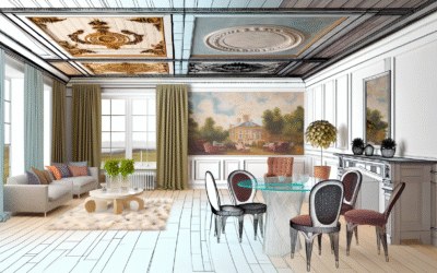
Image Suggestion: Before & After comparison showing a living room with mismatched colors transforming into a balanced space using the 60-30-10 rule. Alt text: “Living room color balance before and after 60-30-10 rule application.”
Step 4: Steering with Accessories (Pillows, Art, Decor)
This is where your 10% comes to life! Accessories are your opportunity to add character, texture, and those vibrant splashes that personalize your living room decor. This mutable layer allows for seasonal changes and trend integration without major commitment.
- Throw Pillows: The easiest way to introduce accent colors and patterns. Mix solids with subtle patterns that include your dominant and secondary colors.
- Artwork: A powerful tool for color introduction. Art can feature all three colors of your scheme, or simply serve as a bold accent color against a neutral wall.
- Decorative Objects: Vases, sculptures, books, and bowls offer small doses of color and texture.
- Greenery: Plants add a natural, organic “color” that almost always harmonizes with any scheme, contributing to a sense of balance and life. They are a universal positive on The Color Compass.
Step 5: The Finishing Touches (Lighting & Natural Elements)
Often overlooked, lighting significantly alters how colors are perceived. Natural light’s direction and intensity during the day can change the appearance of your chosen hues.
- Natural Light: A north-facing room gets cooler light, making colors appear more subdued. A south-facing room gets warm, bright light, making colors appear more vibrant. Test paint swatches in different lights.
- Artificial Light:
- Warm Light (2700K-3000K): Enhances reds, oranges, yellows. Ideal for cozy, inviting living rooms.
- Cool Light (4000K-5000K): Enhances blues, greens. Good for modern, crisp spaces.
- Metallic Accents: Gold and brass add warmth; silver and chrome add coolness. These small elements act as subtle directional indicators for The Color Compass.
Overcoming Common Obstacles with The Color Compass
Even with the best intentions, navigating color can present challenges. Here’s how The Color Compass helps you troubleshoot common living room decor dilemmas.
Problem 1: My Room Feels Monochromatic and Flat.
You’ve stuck to one color, and now it lacks dimension.
Solution: Introduce texture and varying shades/tints/tones. If your room is all beige, add a chunky knit throw, a sleek leather ottoman, and a jute rug. Use brighter beige artwork and darker beige cushions. Consider a metallic accent (gold) to bounce light and add sparkle. These variations enrich your Color Compass palette.
Problem 2: My Room Feels Too Busy/Overwhelming.
Too many colors, patterns, or bold statements without enough breathing room.
Solution: Revisit the 60-30-10 rule. Chances are, your ratios are off. Reduce the number of accent colors or patterns. Increase your dominant neutral color to provide more visual rest. Consolidate patterned items into one or two larger pieces (e.g., one patterned rug, not multiple patterned cushions and drapes). Simplify your Color Compass, leaning more on neutral territory.
Problem 3: I Love a Bold Color, But I’m Scared to Commit.
You’re drawn to a vibrant emerald green or fierce fuchsia, but fear daily regret.
Solution: Use it as your 10% accent color! A couple of throw pillows, a small piece of abstract art, or a single statement vase. If you still love it after a few months, consider graduating it to a 30% secondary color for an accent chair or smaller rug. This cautious approach ensures your Color Compass guides you gently.
Problem 4: My Living Room Feels Disconnected from Other Rooms.
Each room in your home feels like a standalone project.
Solution: Create a whole-home color palette, even if subtle. Your living room’s dominant color could be a secondary or accent in an adjacent room. Using a consistent neutral base throughout your home often provides this cohesive flow. Consider using open-concept color schemes that allow colors to transition smoothly, guided by The Color Compass.
Problem 5: I Have Artwork or Furniture I MUST Keep, But It Conflicts.
Inherited or beloved pieces don’t quite fit your vision.
Solution: Use the piece as a starting point for your Color Compass. If it’s a vibrant painting, pull a subtle color from it to be your 60% dominant wall color, and another to be your 30% secondary. If it’s a dark wooden antique, use it as a grounding dark neutral (or a dark accent) and build a lighter, brighter scheme around it to provide contrast and balance.
The Role of Lighting: Amplifying Your Color Compass Choices
As we briefly touched upon, light is not merely illumination; it is a critical component that dramatically influences how colors are perceived in your living room decor. Ignoring its impact is like trying to use a Color Compass in the dark—you won’t get an accurate reading.
Natural Light: Your Ever-Changing Canvas
- North-Facing Rooms: Receive cooler, indirect light. Colors here might appear duller or have a blueish cast. Opt for warmer tones (creamy whites, soft yellows, warm grays) to counteract the coolness, or embrace cool tones for a truly tranquil living room.
- South-Facing Rooms: Bathed in bright, warm light throughout the day. Colors will appear truer and more vibrant. You have more flexibility here, but be cautious with overly saturated warm colors, as they could become overwhelming.
- East-Facing Rooms: Receive warm, bright morning light, then cooler light in the afternoon. Best for bedrooms or breakfast nooks, but for living rooms, consider colors that can transition well, such as versatile neutrals or muted tones.
- West-Facing Rooms: Get warm, intense afternoon light and spectacular sunsets. Colors in these rooms will appear vibrant and exciting in the evening. Cool colors can provide a refreshing contrast to the warm light.
Actionable Tip: Always test paint swatches on your walls and observe them at different times of day before committing. A color that looks perfect in the showroom might transform unexpectedly in your living room’s unique lighting conditions. This is a crucial step in fine-tuning your The Color Compass navigation.
Artificial Lighting: Sculpting the Mood
Beyond natural light, the type of artificial lighting you choose is paramount. The “color temperature” of light bulbs affects everything.
- Warm White (2700K-3000K): Mimics incandescent bulbs. Casts a soft, yellowish glow that enhances warm colors (reds, oranges, yellows) and makes spaces feel cozy and inviting. Ideal for a traditional or relaxed living room ethos.
- Cool White (3500K-4100K): More neutral, with hints of blue. Good for task lighting or modern, uncluttered living rooms where clarity is desired. Can make warm colors appear duller.
- Daylight (5000K-6500K): Closest to natural daylight. Very bright white light. Can make rooms feel stark or sterile for a living space, but excellent for task-oriented areas or if you desire a very crisp, pure color rendition.
Layering Light: For balanced living room decor, use a combination of ambient (general illumination), task (for reading), and accent lighting (to highlight art or architectural features). Each layer can contribute to the overall color perception and mood:
- Ambient: Often from recessed lights or a large ceiling fixture, setting the overall tone.
- Task: Floor lamps or table lamps with specific bulb types can create pockets of warmth or brightness.
- Accent: Spotlights on artwork can make colors pop; dimmable sconces can add a soft, romantic glow.
By consciously considering both natural and artificial light, you add another dimension to your The Color Compass, ensuring that your chosen hues truly shine in your living room, day or night.
Seasonal Shifts and Trends: Keeping Your Compass Flexible
Your living room decor doesn’t have to be static. While the core principles of The Color Compass remain constant, your application can evolve with seasons or trends. The key is to keep your major investments (60% and 30% rule elements) neutral or timeless, allowing your 10% accents to be the flexible elements.
Embracing Seasonal Transitions
- Spring/Summer: Bring in lighter, brighter accent colors. Think pastels, vibrant florals, crisp whites, and light greens. Swap out heavy throws for lighter fabrics.
- Fall/Winter: Introduce deeper, richer accent colors. Jewel tones, warm oranges, deep reds, and forest greens. Layer with cozy textures like faux fur, velvet, and chunky knits.
This approach allows you to refresh your living room decor and adapt to the changing light and mood of the year without costly overhauls. Your Color Compass reminds you that change is natural.
Navigating Trends Wisely
Don’t chase every trend. Instead, consider how current color trends might integrate as your 10% accent color.
For example, if “Terracotta” is trending, you might not paint your entire living room wall that color. Instead, integrate it with a terracotta-toned planter, a few accent cushions, or a piece of pottery. This allows you to stay current without sacrificing the timeless balance you’ve achieved with The Color Compass.
By keeping your primary color scheme grounded in classic balance, you ensure your living room always feels cohesive, even as you experiment with fashionable flair in your accessories. Trust The Color Compass to guide you to enduring style, not fleeting fads.
Frequently Asked Questions About Living Room Color & Balance
How do I choose a color scheme if I have existing furniture?
Start with your largest existing piece, like a sofa or a prominent rug. Identify its dominant color and any secondary colors within its pattern. Use these as your starting point for the 60% or 30% of your new scheme. Then, consult the color wheel to find harmonious complementary or analogous colors for your walls and smaller accents. Your existing pieces become key reference points on The Color Compass.
Can I use black in a small living room without making it feel smaller?
Absolutely! Black can add sophistication and depth, even in small spaces. Use it judiciously as an accent: a sleek black coffee table, picture frames, or a few graphic black-and-white pillows. Pairing black with light neutrals and reflective surfaces (mirrors, glass) will prevent it from closing in the room, maintaining balance and elegance in your living room decor.
What’s the best way to test paint colors for my living room?
Don’t just rely on tiny swatches. Purchase sample pots and paint large (at least 2×2 feet) patches on multiple walls in your living room. Observe them throughout the day and in different lighting conditions (natural morning, afternoon, evening, and artificial light). The color can change significantly depending on the light, helping you ensure your Color Compass points to the right shade.
How do I introduce warmth into a room with cool colors?
To balance cool tones (blues, grays), integrate warm accents. This could be through natural wood furniture, gold or brass metallics, warm-toned lighting (2700K bulbs), or textiles like rust-colored throws or a few touches of warm yellow in artwork. These elements provide visual warmth without disrupting the overall cool, serene feel established by The Color Compass.
Is it okay to mix different wood tones in a living room?
Yes, mixing wood tones adds depth and an organic, layered feel. The key is to ensure there’s a cohesive element, whether it’s similar undertones (all cool-toned woods or all warm-toned woods) or a clear dominant wood tone with others used as accents. Avoid too many wildly disparate wood species. Think of it as adding complementary textures, enhancing the complexity of your Color Compass without creating conflict.
How can I make a neutral living room feel more inviting?
Neutral rooms can be incredibly inviting when thoughtfully done. Focus on layering textures (knits, linen, velvet, wood, metal), incorporating natural elements (plants, stone), and adding subtle pops of warm accent colors (terracotta, soft gold, muted greens, muted blues). Varying shades of your neutrals also adds depth. The right balance with The Color Compass turns bland into beautiful.
Charting Your Course: Achieving Lasting Balance in Your Living Room
Navigating the vast sea of color choices for your living room decor can feel daunting, but with The Color Compass, you now possess the essential tools and knowledge to chart a successful course. We’ve explored the foundational elements of color theory, delved into the powerful psychology of hues, and armed you with practical strategies like the 60-30-10 rule. Importantly, we’ve highlighted how to troubleshoot common dilemmas and leverage lighting to enhance your chosen palette.
Remember, achieving balance in your living room decor isn’t about rigid adherence to rules; it’s about understanding why certain combinations work and then applying those principles to express your unique style. Your living room is more than just a collection of items; it’s a reflection of your personality, an extension of your comfort, and a backdrop for cherished memories. By consciously applying the wisdom of The Color Compass, you create a space that not only looks beautiful but feels intuitively right.
Take these insights, experiment with confidence, and allow your creativity to flourish. The journey to a perfectly balanced living room is a rewarding one, and the results — a harmonious, inviting, and personalized sanctuary — are truly priceless. Start applying The Color Compass today and transform your living space into the haven you’ve always dreamed of.
Explore Harmonious Living Room Layouts Next!
Discover the Power of Texture in Decor!
Content Disclaimer
The information provided in this article is intended for educational and informational purposes only. While every effort has been made to ensure accuracy and provide helpful guidance regarding living room decor and color balance, individual results may vary. Decorating advice should be adapted to your specific circumstances, preferences, and local building codes if applicable. This content does not constitute professional interior design advice. Always consult with a qualified professional for specific design challenges or structural modifications.
Categories
- Accent Walls & Ceilings (84)
- Art Curation & Gallery (83)
- Bedding Style Trends (89)
- Bedroom Makeover (96)
- Bohemian & Eclectic Styles (80)
- DIY & Budget-Friendly Decor (78)
- Eco-Friendly Design (83)
- Furniture Care (87)
- Home Decor & Design Ideas (181)
- Home Wellness Spaces (103)
- Integrated Outdoor Living (91)
- Japandi Style (84)
- Kids and Nursery Decor (73)
- Living Room Decor (99)
- Mix & Match Techniques (95)
- Modern & Contemporary Design (88)
- Rug Sizing & Placement (89)
- Scandinavian Design Inspiration (51)
- Seasonal Home Decor (100)
- Small Space Solutions (93)
- Wall Art & Painting Tips (94)
Recent Comments
Archives
Product Gallery
-
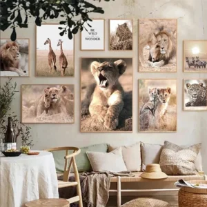 Majestic African Wildlife Canvas Art for Stylish Home Decor
Rated 5.00 out of 5
Majestic African Wildlife Canvas Art for Stylish Home Decor
Rated 5.00 out of 5 -
 Cozy Irregular Green Plush Rug for Nordic Living Spaces
Rated 5.00 out of 5$51.36 – $323.87Price range: $51.36 through $323.87
Cozy Irregular Green Plush Rug for Nordic Living Spaces
Rated 5.00 out of 5$51.36 – $323.87Price range: $51.36 through $323.87 -
 Scandinavian Geometric Area Rugs for Stylish Home Décor
Rated 5.00 out of 5$38.49 – $583.08Price range: $38.49 through $583.08
Scandinavian Geometric Area Rugs for Stylish Home Décor
Rated 5.00 out of 5$38.49 – $583.08Price range: $38.49 through $583.08