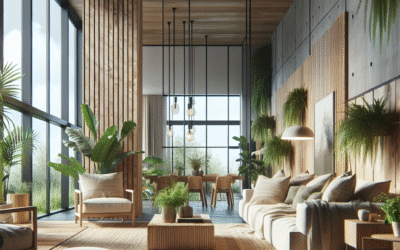
Stepping into your living room should feel like a deep breath, a comforting embrace, a place where harmony reigns supreme. Yet, for many, it’s a space that feels off-kilter. Perhaps the sofa seems too dominant, the walls too stark, or a lingering sense of disquiet makes it hard to truly relax. The truth is, achieving that perfect equilibrium in your most communal space isn’t about expensive furniture or trendy accents; it’s about mastering the subtle, yet profound, art of the Color Compass: Navigating Balance in Your Living Room Decor. This guide isn’t just about picking paint swatches; it’s about understanding how colors interact, how light transforms them, and how your living room can become a genuine sanctuary, reflecting your unique style while nurturing peace and comfort.
We’ll dive deep into the psychology of hues, uncover the secrets of impactful focal points, and explore how textures and materials play a vital role. From understanding foundational color schemes to identifying common pitfalls, this article will equip you with actionable strategies to transform your living room from merely a room into a balanced, inviting haven. Get ready to embark on a colorful journey that promises not just a beautiful space, but a feeling of calm and contentment every time you walk through the door.
The Unseen Language of Color: Psychology in Home Decor
Before any brush touches a wall or any fabric is chosen, understanding the unseen language that colors speak is crucial. Every hue, shade, and tint possesses an inherent psychological impact that influences our mood, perception of space, and even our energy levels. In your living room, where relaxation, conversation, and entertainment converge, harnessing this power is key to creating harmony. This fundamental grasp of color psychology is your first true north on the Color Compass.
Decoding the Emotional Palette: How Colors Affect Us
- Warm Colors (Reds, Oranges, Yellows): These hues are vibrant and energetic. They can stimulate conversation and bring a sense of coziness and intimacy, making large spaces feel more inviting. However, too much can feel overstimulating or aggressive. Think a terracotta accent wall bringing warmth, not an entirely crimson room.
- Cool Colors (Blues, Greens, Purples): Often associated with calmness, serenity, and introspection. Blues can evoke stability and peace, while greens connect us to nature and renewal. Purples, especially deeper shades, signify luxury and creativity. These colors are excellent for creating a tranquil retreat, making smaller living areas feel more expansive due to their receding nature.
- Neutrals (Grays, Beiges, Whites, Blacks): The backbone of nearly every successful living room decor scheme. Neutrals provide a quiet backdrop, allowing other elements to shine. They offer versatility, evoke sophistication, and create a sense of spaciousness. Whites feel crisp and clean, grays are modern and versatile, while beiges offer warmth and earthiness. Blacks provide dramatic contrast and anchor a space.
The Art of Contrast and Harmony: Balancing Energies
A balanced living room isn’t about using just one type of color; it’s about a thoughtful interplay of different energies. Imagine a serene blue-gray living room (cool) punctuated with vibrant mustard yellow throw pillows (warm). This contrast creates visual interest and prevents the space from feeling monotonous. Harmony, on the other hand, comes from using colors with similar undertones or from the same color family, creating a cohesive, flowing aesthetic.
The trick is to use contrast as a spark and harmony as the steady flame. A pop of complementary color invigorates, while a cohesive palette provides the foundation of peace. By understanding these intrinsic properties, you begin to steer your Color Compass with intention, ensuring every choice contributes to the overall emotional landscape of your living room.
Mastering Color Schemes: Your True North on the Decor Map
Choosing a color scheme can feel overwhelming. Should you go bold or subtle? Monochromatic or eclectic? Thankfully, centuries of design principles offer a comprehensive map. Understanding these foundational color schemes is like having a reliable compass, guiding your choices to achieve balance and cohesion in your living room.
The Power of Three: Fundamental Color Relationships
Most successful living room designs leverage one of these classic schemes, often with a dominant neutral base:
- Monochromatic: Utilizes different shades, tints, and tones of a single color. For example, a living room might feature varying shades of blue – from a deep navy sofa to sky-blue walls and pale aqua accents. This scheme creates a cohesive, sophisticated, and calming effect, but requires varied textures to prevent flatness.
- Analogous: Combines colors that are next to each other on the color wheel (e.g., blue, blue-green, and green). This creates a harmonious, visually pleasing flow that mimics nature. It’s a low-contrast, relaxing scheme perfect for a serene living room, often with one dominant color and two supporting ones. For instance, a living room might combine olive green, sage, and a hint of forest green.
- Complementary: Uses two colors directly opposite each other on the color wheel (e.g., blue and orange, red and green, yellow and purple). This scheme offers high contrast and dynamism, making individual colors pop. This is ideal for creating focal points and adding energy. A common application in living rooms is a neutral base with complementary accents, like a gray sofa with orange and blue throw pillows.
- Triadic: Employs three colors equally spaced on the color wheel (e.g., red, yellow, and blue). This scheme is vibrant and balances all three primary or secondary colors. It’s bold and playful, often seen in more contemporary or eclectic living rooms. The key is using one dominant color, and the other two as accents.
Beyond the Basics: Blending Schemes for Unique Flair
While the fundamentals are essential, real mastery comes from understanding how to subtly blend these principles. You might primarily use an analogous scheme for your main upholstered pieces and wall color, then introduce a complementary accent color through art or decorative objects. Consider these refined approaches:
- Split-Complementary: Instead of using a direct complementary color, you use the two colors adjacent to it. For example, if your primary color is blue, instead of orange, you’d use red-orange and yellow-orange. This offers good contrast but feels less intense than a standard complementary scheme.
- Rectangle (Tetradic): Uses two pairs of complementary colors. This offers the richest array of colors but can be challenging to balance. It’s often best executed with one dominant color, and the others used more sparingly.
- Square (Tetradic): Similar to the rectangle, but uses four colors equally spaced on the color wheel. Again, balancing this requires careful planning and often a neutral canvas.
The real secret is choosing one dominant color (often a neutral) that covers about 60% of your living room, a secondary color for 30%, and an accent color for 10%. This 60-30-10 rule is a powerful tool on your Color Compass for achieving visual balance and professional-looking results. It gives structure to your creative impulses, ensuring your living room feels harmonious, not chaotic.
The Canvas and Its Players: Walls, Furniture, and Accents
Once you’ve plotted your course with a chosen color scheme, it’s time to apply it to the physical elements of your living room. Think of your living room as a canvas, where different components play distinct roles in bringing your vision to life. Each choice, from the expanse of your walls to the smallest decorative knot, impacts the overall balance and feel. Here, we outline the key players and how they contribute to your living room’s equilibrium.
Walls: The Background Score
Your walls are the largest surface area in your living room and typically form the base of your chosen color scheme. They set the mood and often dictate how light behaves in the space.
- Neutral Foundations: For most living rooms, a neutral wall color (warm white, light gray, beige, greige) provides a timeless backdrop. This allows your furniture, art, and accessories to be the focal points and gives you flexibility to change decor seasonally.
- Accent Walls: Introducing a bolder color or wallpaper on one wall can create an instant focal point, drawing the eye and adding depth. This is an excellent technique for experimenting with a complementary or more vibrant hue without overwhelming the room.
- Consider Light: Always test paint swatches on your walls throughout the day, observing how natural and artificial light changes their appearance. A color that looks great in a brightly lit showroom might appear dull or too intense in your living room’s specific lighting conditions.
Major Furniture Pieces: The Anchors of Your Space
Your sofa, chairs, and larger case goods (like media consoles or sideboards) are the anchors of your living room. Their colors and textures contribute significantly to the 60-30-10 rule, often forming the 60% or 30% of your color distribution.
- Strategic Neutrals: Investing in neutral-colored major furniture (gray, cream, tan, chocolate brown) offers longevity and adaptability. These pieces can easily be re-styled with different accent colors over time, providing a flexible foundation.
- Statement Pieces: A bold-colored sofa or armchair can be a powerful statement, serving as a primary focal point. If choosing a statement piece, ensure it aligns with your chosen color scheme and that other elements in the room support, rather than compete with, its presence.
- Material Matters: Beyond color, the material of your furniture impacts texture and light reflection. A velvet sofa will absorb light and add richness, while a sleek leather sofa will reflect light and offer a modern feel.
Accent Pieces: The Personality and Pop
This is where your living room truly comes alive and reflects your personality. Throw pillows, blankets, rugs, curtains, art, and decorative objects are the 10% of your color scheme that create visual interest and layers.
- Layering Textiles: Use throw pillows and blankets in varying textures, patterns, and colors that complement your main scheme. These are easy and inexpensive ways to inject color and comfort. For example, a neutral sofa comes to life with a mix of deep blues, burnt oranges, and a soft cream throw.
- Rugs as Zone Creators: A large area rug can define the living room space within an open-plan area or add significant color and pattern. Its color should coordinate with your overall scheme and ideally anchor your furniture grouping.
- Art and Accessories: Wall art, sculptures, vases, and books are perfect opportunities to introduce your accent colors. They draw the eye and provide opportunities for storytelling. Ensure these elements are appropriately scaled to prevent clutter or an unbalanced feel.
Remember, the goal is balance. Each element should contribute to the overall aesthetic without overpowering another. By carefully selecting the colors and materials for your walls, furniture, and accents, you are effectively orchestrating a symphony of style within your living room, guided by the principles of the Color Compass.
Light and Shadow: The Unsung Heroes of Color
Color rarely exists in a vacuum. Its appearance is profoundly affected by light – both natural and artificial. This often-overlooked aspect is a critical determinant of how colors read in your living room and, consequently, how balanced and inviting the space feels. Understanding the interplay of light and shadow is like having an advanced sensor on your Color Compass, allowing for truly nuanced decor decisions.
Natural Light: Friend or Foe?
The direction your living room faces significantly impacts the quality and intensity of natural light throughout the day. This dictates which colors will truly shine and which might fall flat.
- North-Facing Rooms: Receive indirect, cool light. Colors tend to appear duller and darker. To counteract this, opt for warmer, lighter colors on walls to inject cheerfulness and warmth. Avoid cool grays unless you intend to embrace a truly subdued, moody atmosphere.
- South-Facing Rooms: Bask in bright, warm light all day. These rooms can handle cooler, darker colors without feeling oppressive, as the natural light will brighten them. They are also forgiving of complex patterns and rich textures.
- East-Facing Rooms: Get bright, warm morning light, which then fades to cooler light in the afternoon. Colors will look their best in the morning. Consider soft, warm neutrals to keep the room welcoming throughout the day.
- West-Facing Rooms: Receive warm, intense light in the afternoon and evening. This can make colors appear more saturated. Cooler tones can help balance the intensity, while warm tones will glow beautifully during sunset.
Always observe how a paint swatch or fabric sample looks in your actual living room at different times of day before committing. Lighting truly transforms color.
Artificial Illumination: Sculpting the Mood
Beyond natural light, the type and placement of artificial lighting are paramount. Lighting acts as a mood setter, highlighting features and casting shadows that add depth and character to your living room. There are three main types of artificial lighting:
- Ambient Lighting: Provides overall illumination for the room (e.g., ceiling fixtures, recessed lighting). This is your foundation.
- Task Lighting: Focused lighting for specific activities (e.g., reading lamps next to a chair). These often add direct pools of light that can make specific colors pop.
- Accent Lighting: Highlights specific features like artwork or architectural details (e.g., spot lights, picture lights). This is where you can intentionally draw attention to your chosen accent colors.
Color Temperature of Light Bulbs:
Light bulbs come in different color temperatures, measured in Kelvins (K):
- Warm White (2700K-3000K): Emits a soft, yellowish glow, similar to incandescent bulbs. This enhances warm colors (reds, oranges, yellows) and makes a living room feel cozy and inviting. Ideal for creating a relaxed atmosphere.
- Cool White/Daylight (4000K-5000K+): Emits a crisper, bluer light. This can make cool colors (blues, greens, purples) appear more vibrant and can make a room feel brighter and more energetic. It’s often too stark for a living room, making it feel less cozy.
For most living rooms, a blend of warm ambient light and targeted task/accent lighting at a comfortable warm white color temperature (around 2700K-3000K) is ideal. This ensures that the colors you’ve carefully selected are presented in their best, most harmonious light, contributing to the balanced feel of your space.
Neglecting light means your Color Compass is missing a crucial sensor. By consciously considering how both natural and artificial light interact with your chosen palette, you unlock the full potential of your living room’s design, creating dynamic spaces that evolve throughout the day and night.
Beyond Hue: Texture, Pattern, and Scale for True Depth
While color is undeniably powerful, a truly balanced and engaging living room transcends mere chromatic choices. Texture, pattern, and scale are the silent partners of color, adding depth, breaking monotony, and ensuring your space feels rich and inviting, not flat or overwhelming. These elements provide crucial layers on your Color Compass, guiding you towards a sophisticated and dynamic living environment.
Texture: The Tactile Dimension
Texture refers to the perceived surface quality of an object. It can be visual (seen) or tactile (felt). Varying textures create visual interest and add depth, preventing a living room from feeling sterile or one-dimensional, even in a monochromatic scheme.
- Softness: Think plush velvet pillows, a thick shag rug, or a knitted throw blanket. These invite touch and contribute to a sense of comfort and coziness.
- Roughness: Jute rugs, linen upholstery, distressed wood, or woven baskets introduce an earthy, rustic feel. They provide a grounding element and contrast nicely with smoother surfaces.
- Smoothness/Gloss: Polished metal accents, glass tabletops, sleek leather furniture, or lacquered wood surfaces create a modern, refined look. They reflect light and add a sense of sophistication.
- Incorporating Texture: Don’t just think about large furniture. Consider the weave of your curtains, the finish of your coffee table, the material of your lamp bases, and the intricate details on decorative objects. A balanced living room often features a mix of at least three distinct textures. For example, a smooth leather sofa, with a shaggy wool rug, and a rustic wooden beam.
Pattern: The Visual Rhythm
Patterns introduce visual rhythm, energy, and personality. However, too many clashing patterns can create chaos. The key is strategic integration.
- Scale and Variety: Mix patterns of different scales – a large geometric rug, medium-sized floral curtains, and small-scale striped throw pillows. This variation prevents patterns from competing.
- Cohesive Color Palette: Ensure all patterns share at least one common color found within your living room’s overall scheme. This ensures they feel connected, even if the patterns themselves are diverse.
- Placement: Use patterns on elements you want to highlight: an accent chair, throw pillows, an area rug, or wallpaper on an accent wall. If your main furniture is neutral, patterns on accessories are an excellent way to inject personality and color.
- Types of Patterns:
- Geometric (stripes, chevrons, plaids) add structure and modern appeal.
- Organic (florals, botanicals, abstract curves) bring softness and natural elegance.
- Abstract (splatters, irregular shapes) add a contemporary, artistic flair.
Scale and Proportion: The Silent Architects of Balance
Scale refers to the size of an object relative to other objects in the room and the room itself. Proportion is the pleasing relationship of parts within a whole. Incorrect scale or proportion can make a room feel cramped, sparse, or off-kilter, regardless of the color scheme.
- Furniture Sizing: Ensure your main furniture pieces (sofa, coffee table, rug) are appropriately sized for your living room. A massive sofa in a small room will overwhelm it; tiny furniture in a large room will get lost.
- Negative Space: Don’t fill every available surface. Allowing for “negative space” or “white space” around furniture and decor allows the eye to rest and prevents visual clutter.
- Varying Heights: Create visual interest by varying the heights of your furniture and decorative objects. A tall bookshelf, a mid-height armchair, and a low coffee table create a more dynamic and balanced look than everything being at the same level.
- Art and Mirrors: Ensure wall art and mirrors are scaled appropriately for the wall they are on and the furniture below them. A tiny picture on a vast wall looks insignificant; an oversized piece can dominate.
By thoughtfully integrating textures that invite touch, patterns that provide visual rhythm, and ensuring all elements are in appropriate scale and proportion, you weave a richer, more complex tapestry for your living room. This multi-layered approach ensures your Color Compass points not just to aesthetically pleasing hues, but to a truly inviting and harmoniously balanced space.
Common Pitfalls and How to Correct Them: Staying on Course
Even with the best intentions, it’s easy to make a wrong turn when navigating a design project. Recognizing common pitfalls and knowing how to correct them is crucial for maintaining balance in your living room decor. Think of these as common headwinds your Color Compass helps you anticipate and adjust for, ensuring your design journey is smooth and successful.
Pitfall 1: Overuse of a Single Color or Too Many Colors
The Problem: A living room that is entirely one color (e.g., all beige) can feel bland, monotonous, and lack character. Conversely, a room with too many disparate colors can feel chaotic, overwhelming, and visually restless.
The Solution: Revisit the 60-30-10 rule.
- Too Monochromatic: Introduce varying textures (rough jute, smooth silk, plush velvet) in the same color family to add depth. Intersperse a subtle pattern in a slightly darker or lighter shade. Most importantly, introduce an accent color via throw pillows, artwork, or decorative objects. A pop of complementary or analogous color can instantly lift a dull space.
- Too Many Colors: Identify the dominant colors and decide which ones truly resonate with your desired mood. Remove extraneous items that don’t fit, and try to unify the remaining colors by finding a common underlying tone or by pairing them with a neutral foundation. For example, if you have several bright colors, introduce a large neutral rug or paint a wall a soothing light gray to provide visual calm. Reduce the number of accent colors to one or two.
Pitfall 2: Ignoring Light’s Impact
The Problem: Choosing colors purely based on how they look in a showroom, without considering your living room’s natural and artificial light. This can result in colors appearing drastically different – too dark, too bright, or with unexpected undertones.
The Solution: Test, test, test!
- Obtain large paint swatches and fabric samples.
- Tape them to different walls in your living room and observe them at various times throughout the day (morning, noon, evening) and under different lighting conditions (natural light only, lamps on, overhead lights on).
- Also, evaluate your light bulbs. If you’re struggling with color perception, check if your bulbs are casting a very cool or very warm light that’s distorting your chosen palette. Adjust bulb color temperatures to suit your desired ambiance.
Pitfall 3: Lack of Focal Point
The Problem: A room without a clear focal point feels unfocused and lacks direction, making it hard for the eye to rest or for the space to feel cohesive.
The Solution: Create a visual anchor.
- Identify a natural focal point, such as a fireplace, a large window with a view, or a built-in bookshelf.
- If no natural one exists, create one! This could be a large piece of captivating artwork, an accent wall with a bold color or wallpaper, a uniquely designed media console, or even a statement-making furniture piece like a vibrantly colored sofa.
- Arrange furniture to face or highlight the focal point, naturally drawing the eye. Use lighting to spotlight it.
Pitfall 4: Neglecting Texture and Pattern
The Problem: A living room with flat, uniform textures and patterns can feel sterile, uninviting, and lack visual richness, even if the colors are pleasant.
The Solution: Layer, layer, layer.
- Introduce a variety of textures: smooth (glass, polished wood), soft (velvet, faux fur, chunky knit), rough (linen, jute, distressed wood), and plush (shag rug).
- Mix patterns of different scales and styles (geometric, organic, abstract) within a consistent color palette to add dynamism without chaos. Think a patterned rug, solid sofa with patterned pillows, and textured curtains.
- Even in a neutral room, varying textures can create immense depth and interest. A room full of just cotton or just smooth surfaces will feel less inviting.
Pitfall 5: Poor Scale and Proportion
The Problem: Furniture that is too large or too small for the room, or elements that are visually unbalanced (e.g., tiny art on a huge wall). This makes a room feel awkward or uncomfortable.
The Solution: Measure and visualize.
- Measure your living room accurately. Before buying, measure furniture pieces and map out their placement using painter’s tape on the floor or by creating a floor plan.
- Ensure there is adequate negative space around furniture so the room doesn’t feel cramped.
- Vary heights of furniture and accessories to create visual interest. For instance, combine a tall floor lamp with a low-slung coffee table and a medium-height armchair.
- When hanging art, ensure it’s proportional to the wall space and any furniture below it. As a general rule, a piece of art or mirror should be about two-thirds the width of the furniture it hangs above.
By learning to identify and address these common issues, you elevate your design skills. Your Color Compass becomes not just a guide for initial direction but also a powerful tool for correctional navigation, ensuring your living room always feels perfectly balanced and truly reflective of your harmonious vision.
Implementing Your Vision: Practical Steps to Living Room Harmony
Theory is one thing; practical application is another. Translating your newfound understanding of the Color Compass into a tangible, balanced living room requires a step-by-step approach. This section outlines actionable strategies to move from concept to creation, ensuring your design vision comes to life with precision and purpose.
Step 1: Define Your Desired Mood & Function
Before you pick a single paint chip, ask yourself: What do I want my living room to feel like? Is it a lively hub for entertaining, a serene refuge for quiet evenings, or a versatile space for family activities? The function will strongly influence your color choices.
- Lively/Energetic: Consider bolder accent colors, perhaps hints of red, orange, or vibrant yellow.
- Calm/Relaxing: Lean towards cool blues, greens, soft grays, and warm neutrals.
- Sophisticated/Elegant: Deep jewel tones, charcoal, muted metallics, and rich textures.
This initial clarity is your first bearing on the Color Compass.
Step 2: Take Stock of Existing Elements
Do you have existing furniture, flooring, or artwork you love and want to keep? These pieces will act as your starting point, influencing your new color choices. Determine their dominant colors and undertones to ensure new additions complement them. For instance, if your rug has a strong warm beige undertone, cool grays might clash.
Step 3: Choose Your Primary Color Scheme (60-30-10)
Based on your desired mood and existing pieces, select your core color scheme using one of the explored relationships (monochromatic, analogous, complementary, etc.).
- 60% Dominant Color: Usually walls and large furniture (sofa, large rug). Often a neutral or a very subtle cool/warm tone.
- 30% Secondary Color: Accent chairs, curtains, secondary major furniture pieces. This can be a bolder version of your dominant color or a contrasting hue.
- 10% Accent Color: Throw pillows, artwork, decorative objects, small accessories. This is where you inject personality and stronger contrasting colors.
Be disciplined with this rule; it’s a powerful tool for balance.
Step 4: Gather Samples and Test, Test, Test!
This cannot be stressed enough. Get large paint swatches (or even better, paint test patches directly on your walls), fabric swatches for upholstery, and samples for rugs and curtains. Observe them in your living room under various natural light conditions (morning, noon, evening) and with your artificial lighting on.
Tool Recommendation: Use online room visualizers or apps provided by paint companies (e.g., Sherwin-Williams ColorSnap Visualizer, Benjamin Moore Personal Color Viewer) to get a sense of how colors will look on your walls, though real-life samples are always superior.
Step 5: Layer in Texture and Pattern
Once your core colors are set, begin layering in textures and patterns. Think about:
- Soft furnishings: Variety in throw pillows (linen, velvet, knit), blankets (chunky wool, silk), and curtains (sheer, thick linen).
- Rugs: Introduce a rug that compliments your scheme, adding underfoot texture and defining the space.
- Furniture materials: Mix wood, metal, glass, and different fabric types.
- Accessories: Baskets, ceramic vases, trays, and carved wood elements all add tactile appeal. Integrate patterns on pillows, throws, or a statement piece of art.
Step 6: Incorporate Lighting Thoughtfully
Install dimmers on overhead lights. Add various layers of lighting: floor lamps for ambient light, table lamps for task lighting, and picture lights or spotlights for accent lighting. Use appropriate LED bulbs (2700K-3000K for a warm, inviting glow in most living rooms). Lighting completely transforms how your chosen colors are perceived.
Step 7: Accessorize and Curate
The final touch for balance and personality. Arrange books, cherished objects, and plants. Hang thoughtfully chosen artwork at eye level. Remember to allow for negative space; don’t overcrowd surfaces. Step back and assess. Does the room feel inviting? Is there a sense of calm or energy as desired? Small adjustments often make a big difference.
Step 8: Live and Refine
Your living room is exactly that – a place for living. Once your design is in place, live with it for a few weeks. Notice what feels good and what doesn’t. Perhaps a certain corner feels too dark, or a color is too overpowering. Interior design is an iterative process. Don’t be afraid to make small tweaks. A balanced living room is a dynamic space that evolves with you.
By following these practical steps, you’re not just decorating; you’re consciously crafting environments. Your Color Compass ensures that every decision, from the broadest stroke to the finest detail, contributes to a living room that doesn’t just look good, but truly feels good.
Visualizing Harmony: Infographic & Image Ideas
While words can paint a vivid picture, visual aids are invaluable when discussing concepts like color, balance, and design. Here are ideas for complementary infographics and images that would enhance this article, making complex ideas more immediate and actionable for the reader:
Infographic Idea 1: The “60-30-10 Rule” Visual Explained
- Title: The Golden Ratio of Design: Your 60-30-10 Color Guide
- Content: A pie chart or segmented diagram clearly showing segments for 60%, 30%, and 10%.
- 60%: Room background (walls, large rug, sofa) – represented by a neutral or primary color.
- 30%: Secondary color (accent chairs, curtains, secondary furniture) – a complementary or analogous color.
- 10%: Accent color (throw pillows, art, decor) – a bold pop of color.
- Visual: A minimalist graphic of a living room, with key elements color-coded to match the percentages, demonstrating the rule in practice. Could include small examples of color palettes.
- Alt Text Suggestion: Infographic illustrating the 60-30-10 color rule in interior design for balanced living rooms.
Infographic Idea 2: Color Psychology Spectrum
- Title: The Emotional Compass: What Colors Say About Your Living Room
- Content: A visual spectrum or distinct color swatches (Red, Orange, Yellow, Green, Blue, Purple, Neutrals) each with:
- Keywords for associated emotions (e.g., Red: Passion, Energy; Blue: Calm, Serenity; Green: Nature, Renewal; Gray: Sophistication, Stability).
- Brief descriptions of their typical impact in a living room.
- Small icons representing common feelings.
- Visual: A clean, modern design using color gradients or distinct blocks for each color.
- Alt Text Suggestion: Infographic showing the psychological effects of different colors in home decor, from warm to cool tones.
Image Idea 1: Before & After (Highlighting Balance Correction)
- Content: A split image or slider showing:
- “Before” (Unbalanced): A living room with too much of one color, or clashing colors, or poor scale (e.g., tiny rug in a large space). Could also show a room lacking a focal point.
- “After” (Balanced): The same room, or one clearly demonstrating the correction. Perhaps new paint, strategic accent colors, appropriately scaled furniture, or a clear focal point established.
- Visual: High-quality, well-lit photographs.
- Alt Text Suggestion: Before and after image illustrating balanced living room decor achieved through color and scale adjustments.
Image Idea 2: Texture Showcase Collage
- Content: A collage of high-resolution close-up images showcasing various textures working in harmony within a cohesive color palette.
- Examples: A velvet throw pillow, a chunky knit blanket, a woven jute rug, a smooth marble coffee table, a natural wood side table.
- Visual: Focus on tactile richness and complementary colors/tones.
- Alt Text Suggestion: Collage of diverse textures (velvet, wood, knit, jute) demonstrating depth in living room decor.
Image Idea 3: Lighting Effect Comparison
- Content: A pair of images of the same living room setup, photographed under different lighting temperatures.
- Image A: Room illuminated with cool white (4000K+) light, showing how colors might appear stark or dull.
- Image B: Same room with warm white (2700K-3000K) light, showing how colors become richer and more inviting.
- Visual: Subtle but noticeable difference in ambiance and color vibrancy.
- Alt Text Suggestion: Comparison of living room ambiance under cool white vs. warm white lighting, highlighting color perception.
These visuals would not only break up the text but also serve as powerful learning tools, reinforcing key concepts and making the article more engaging and memorable. They allow readers to visualize the principles of the Color Compass directly, enhancing their ability to apply them in their own homes.
FAQ: Navigating Common Living Room Decor Questions
How do I choose a living room color scheme if my partner and I have different preferences?
This is a common challenge! Start by identifying common ground. Perhaps you both like cool tones, but one prefers blue and the other green. Consider an analogous scheme that incorporates both in varying shades. Or, agree on a neutral base color that you both find appealing (like a warm gray or soft white), then let each person choose an accent color they love, using the 60-30-10 rule to ensure one is dominant and the other is a subtle pop. Compromise is key; remember, a balanced living room is one that makes everyone feel comfortable.
My living room is small. How can I make it feel larger using color?
To make a small living room feel larger, prioritize light, cool, and neutral colors. Painting walls in soft blues, greens, light grays, or warm whites can make the space feel more open and airy as these colors tend to recede. Use monochromatic or analogous schemes to reduce visual clutter. Incorporate reflective surfaces like mirrors and glass, and ensure furniture is appropriately scaled – too much or too bulky furniture will negate the airy feel of light colors.
Should my living room colors match the rest of my house?
Not necessarily “match,” but they should flow harmoniously. Aim for a cohesive feeling throughout your home, perhaps by using a consistent neutral palette (e.g., all warm neutrals or all cool neutrals) in transitional areas like hallways. Then, allow different rooms, like the living room, to have their own distinct accent colors or more dominant hues. This creates a sense of intentional design without every room being identical, allowing each space its unique personality while still feeling connected.
How can I incorporate bold colors without overwhelming my living room?
The key is strategic placement and proportion. Use bold colors as accents (the 10% in the 60-30-10 rule). Think throw pillows, a single piece of striking artwork, a vibrant accent chair, a colorful vase, or carefully selected books. An accent wall is another excellent way to introduce a bold color without committing to the entire room. Pair bold colors with ample neutral foundations to provide visual relief and allow the bold element to truly pop rather than dominate.
What’s the best way to choose a rug color for my living room?
Your rug acts as an anchor and often defines the seating area. It should either support your dominant color or introduce your secondary or accent color. If your furniture and walls are mostly neutral, a patterned rug with multiple colors can tie the whole scheme together. If your furniture is already colorful, opt for a more neutral or solid-colored rug. Ensure its size is appropriate: all front legs of your main seating furniture should ideally sit on the rug to create a cohesive zone.
My living room feels a bit “cold.” How can I add warmth?
To add warmth, introduce more warm colors (soft yellows, muted oranges, terracotta, terracotta-reds) through accents like pillows, throws, or artwork. Incorporate warm-toned natural materials such as wood (especially medium to dark tones), natural fibers like jute or sisal, and brass or gold metallic accents. Use warm-white light bulbs (2700K-3000K). Even varying textures, like a chunky knit blanket or a plush velvet, can make a space feel far more inviting and comfortable.
How do I ensure my living room feels both trendy and timeless?
Achieve timelessness by choosing neutral major pieces (sofa, large rug, wall color). These form your enduring foundation. Then, bring in trends through easily changeable and less expensive elements: throw pillows, blankets, decorative accessories, and smaller pieces of art. This allows you to update your living room with current styles without having to overhaul the entire space, ensuring it always feels fresh yet classic. Focus on quality textures and good lighting for a truly lasting appeal.
Conclusion: Your Living Room, Harmonized
Embarking on the journey of balancing your living room decor with the Color Compass is more than just a renovation project; it’s an exploration into the art of creating spaces that truly resonate. We’ve unraveled the psychological impact of hues, demystified complex color schemes, and illuminated the vital role of light, texture, and scale. You now have a robust understanding of how to orchestrate a symphony of elements, transforming your living room from a mere collection of items into a cohesive, inviting, and truly harmonious sanctuary.
Remember, the ultimate goal isn’t perfection, but balance. It’s about creating a living room that feels right for you, a space that reflects your personality, supports your lifestyle, and offers a quiet sense of comfort every time you step inside. By applying the principles of the Color Compass, by testing, layering, and trusting your intuition, you equip yourself to make intentional design choices that truly elevate your home.
Now, take what you’ve learned, grab your samples, and begin to chart your own course. Your living room is waiting to be harmonized. Ready to dive deeper into creating balanced and beautiful spaces? Explore our guides on Optimizing Furniture Arrangement for Flow and Mastering Living Room Lighting for Ambiance to further refine your interior design skills.
Content Disclaimer
The information provided in this article is for general informational and educational purposes only, and does not constitute professional interior design advice. While we strive to provide accurate and helpful guidance, individual results may vary based on unique room dimensions, lighting conditions, personal preferences, and product availability. Always exercise caution and common sense when making design decisions. Consider consulting with a qualified interior designer or decorator for personalized advice tailored to your specific needs and circumstances.
Categories
- Accent Walls & Ceilings (84)
- Art Curation & Gallery (83)
- Bedding Style Trends (89)
- Bedroom Makeover (96)
- Bohemian & Eclectic Styles (80)
- DIY & Budget-Friendly Decor (78)
- Eco-Friendly Design (83)
- Furniture Care (87)
- Home Decor & Design Ideas (181)
- Home Wellness Spaces (103)
- Integrated Outdoor Living (91)
- Japandi Style (84)
- Kids and Nursery Decor (73)
- Living Room Decor (99)
- Mix & Match Techniques (95)
- Modern & Contemporary Design (88)
- Rug Sizing & Placement (89)
- Scandinavian Design Inspiration (51)
- Seasonal Home Decor (100)
- Small Space Solutions (93)
- Wall Art & Painting Tips (94)
Recent Comments
Archives
Product Gallery
-
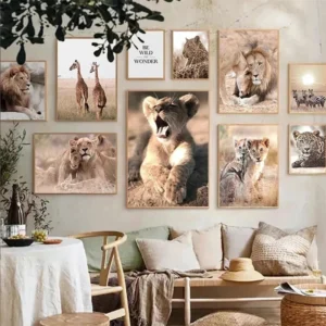 Majestic African Wildlife Canvas Art for Stylish Home Decor
Rated 5.00 out of 5
Majestic African Wildlife Canvas Art for Stylish Home Decor
Rated 5.00 out of 5 -
 Cozy Irregular Green Plush Rug for Nordic Living Spaces
Rated 5.00 out of 5$44.23 – $278.89Price range: $44.23 through $278.89
Cozy Irregular Green Plush Rug for Nordic Living Spaces
Rated 5.00 out of 5$44.23 – $278.89Price range: $44.23 through $278.89 -
 Scandinavian Geometric Area Rugs for Stylish Home Décor
Rated 5.00 out of 5$33.15 – $502.10Price range: $33.15 through $502.10
Scandinavian Geometric Area Rugs for Stylish Home Décor
Rated 5.00 out of 5$33.15 – $502.10Price range: $33.15 through $502.10