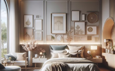
Let’s be real, sometimes our homes just need a little something, right? That touch of personality, a spark that says “this is me.” And while a whole room repaint can feel like scaling Mount Everest, an accent wall? That’s more like a pleasant hike with a fantastic view at the top. But not just any accent wall – we’re talking painted stripes. Oh, honey, the magic these linear beauties can weave in a room is just something else. They’re like the secret sauce for adding depth, drama, and a whole lot of style without breaking the bank or your spirit.
You know what? For the longest time, stripes got a bit of a bad rap. Maybe they felt too juvenile, too nautical, or just… well, too much. But modern design has really embraced them, turning them into sophisticated statements that can genuinely elevate any space. Think beyond the classic black and white – though those are still fantastic, by the way! We’re talking subtle tonals, bold contrasts, playful patterns, and even textured stripes. The possibilities are, frankly, endless. So, if you’ve been eyeing that blank wall, wondering how to make it sing, stick around. We’re about to demystify the art of the striped accent wall, making it feel less like a daunting DIY project and more like an exciting design adventure.
Why Stripes? The Undeniable Appeal of Linear Magic
Honestly, what is it about stripes that just… works? It’s not just a trend; it’s a timeless design element that architects and interior decorators have used for centuries. From the Romanesque arches to the sleek lines of Art Deco, our eyes are naturally drawn to order and rhythm. Stripes deliver that in spades. They trick the eye, creating illusions of greater height or width, making a room feel more expansive or cozier, depending on how you wield your paintbrush. It’s like having a superpower for manipulating perception, without needing a cape or a secret identity, though a good painting hat is always advised!
Beyond the optical wizardry, stripes inject a dynamic energy that solid colors just can’t quite replicate. They introduce pattern without overwhelming, offer a visual break, and can even act as a subtle guide, leading your gaze around the room. Plus, they’re incredibly versatile. Think about it: a crisp, narrow stripe can scream preppy elegance; wide, muted stripes can whisper serene sophistication; and an irregular, hand-painted stripe can shout bohemian chic. The personality of your space can really shine through with these lines, reflecting exactly the mood you want to create.
Picking Your Palette: More Than Just Colors, It’s a Vibe
Choosing your colors is arguably the most crucial step, right after deciding you actually want stripes. It’s not just about what looks good together; it’s about what feels right for the room, for your home, and frankly, for your soul. Do you want energetic and playful, or calm and comforting? The colors you select will set that tone immediately. For instance, a high-contrast pairing like deep charcoal and crisp white can feel incredibly modern and bold, perfect for a contemporary living room. On the other hand, soft blues and creams might evoke a more tranquil, coastal farmhouse feel in a bedroom.
Consider the existing elements in the room. Are you matching furniture, textiles, or artwork? You don’t have to perfectly replicate colors, but aim for a harmonious relationship. One common technique is to pull a color from a piece of art or an existing rug and use it as one of your stripe colors. This instantly creates a cohesive, thoughtfully designed look. And here’s a little trick: don’t be afraid of using different shades of the same color. A wall painted with varying tints and tones of, say, olive green can be incredibly sophisticated and subtle. It’s like a whisper of stripes instead of a shout, offering texture and depth without aggressive contrast.
Color Combinations That Always Deliver (And a Few Surprises!)
Let’s talk specifics for a moment. Some combinations are just timeless winners. Navy and white? Classic, nautical, always fresh. Gray and white? Modern, sophisticated, incredibly versatile. But what about something a little more adventurous? Imagine a terracotta accent wall with stripes of sage green – it’s earthy, warm, and unexpectedly chic, connecting to that whole warm neutral trend that’s so popular right now. Or what about a soft pink with a barely-there gold stripe? Absolutely luxurious for a dressing room or a child’s bedroom. Don’t shy away from metallics as an accent color; a subtle shimmer can be incredibly impactful.
And here’s a tip for those who are a bit color-shy: consider a monochromatic scheme. Pick two shades of the same color – a light and a slightly darker version. This creates a really elegant, understated stripe that adds texture and interest without overwhelming the space. It’s like a visual whisper, rather than a bold declaration. Think pale jade with a slightly deeper forest green, or a beige with a subtle taupe. It’s proof that sometimes, less truly is more, and impact doesn’t always need to scream for attention. Try it in a dining room for a serene backdrop, or maybe a home office to promote calm focus.
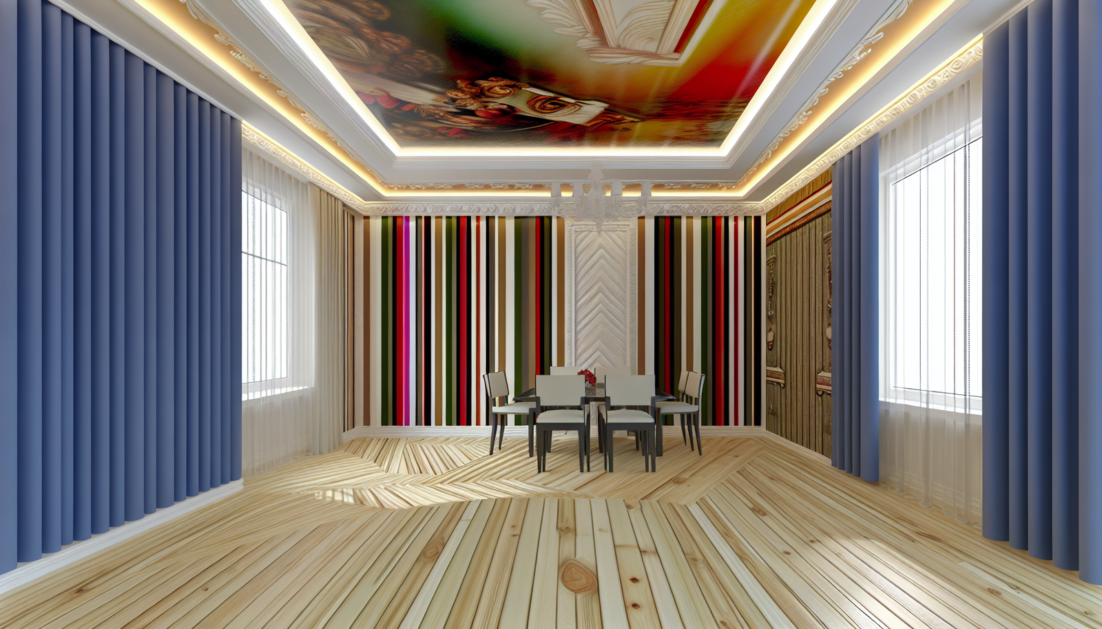
Horizontal, Vertical, or Something Wild? Choosing Your Stripe Direction
Okay, so you’ve got your colors figured out. Now, how do you want those stripes to march across your wall? This isn’t just an aesthetic choice; it’s a strategic one, impacting the perceived dimensions of your room. It’s like playing a visual trick on anyone who steps inside, making your ceilings soar or your room spread out. You can totally use this to your advantage!
Vertical Stripes: Adding Height and Grandeur
Want your room to feel taller, more expansive, almost regal? Vertical stripes are your best friend. They naturally draw the eye upwards, creating an illusion of height and making low ceilings feel more airy. This is particularly fantastic for those cozier rooms or older homes that sometimes lack that sense of spaciousness. Think long, elegant lines in a formal dining room or a sophisticated entryway. They can make a small powder room feel surprisingly grand, too. It’s about creating that elongating effect, giving the impression that the walls stretch further than they actually do. Imagine a stunning entryway where thin vertical stripes just guide your eyes up, making the space feel incredibly grand.
Horizontal Stripes: Expanding Space and Serenity
On the flip side, if you’re looking to make a narrow room feel wider or a vast space feel a bit cozier, horizontal stripes are your answer. They guide the eye across the room, lending a sense of breadth and expansiveness. This works wonders in a cramped hallway, making it seem less constricting, or in a long, skinny living room to balance its proportions. Horizontal stripes also tend to evoke a calmer, more serene feeling, often appearing in bedrooms or spaces where relaxation is key. They have a certain grounding effect, don’t they? They sort of anchor the room, making it feel more settled and peaceful. It’s less about reaching for the sky and more about spreading out and settling in.
Beyond the Straight and Narrow: Diagonal, Chevron, and More!
But who says stripes have to be perfectly straight? Oh no, my friend, that’s where the fun really begins! Diagonal stripes are incredibly dynamic and modern, injecting energy and movement into a room. They’re a bit bolder, a conversation starter, and can be fantastic in a playroom or a creative studio. Then there’s the chevron pattern – a zig-zag of stripes that’s super stylish and contemporary. It brings a lot of visual punch and can really define a space, especially if you use it in a bold color combination. Sherwin-Williams often features these kinds of dynamic patterns in their trend forecasts, showing just how versatile paint can be.
And let’s not forget irregular or hand-painted stripes. These aren’t about precision; they’re about character. Think slightly wavy lines, or stripes of varying widths and textures. This approach creates a more organic, artisanal feel, perfect for a bohemian vibe or a whimsical kid’s room. It’s less about adhering to strict geometry and more about embracing a relaxed, artistic expression. It might seem a little daunting to go freehand, but honestly, the charm is in the imperfection. It tells a story, doesn’t it?
The Nitty-Gritty: Prepping Your Wall Like a Pro (Without Being One!)
Alright, so you’re excited, you’ve got your colors, you’ve picked your direction. Now comes the part that many people dread: the prep work. But trust me, skimping on this step is like building a house on sand – it just won’t hold up. Proper preparation is truly the secret to those crisp, professional-looking stripes. You might think, “Oh, it’s just paint,” but a little effort here saves a lot of headaches later. And honestly, it’s not as bad as it sounds!
Clean, Fill, Sand: The Holy Trinity of Wall Prep
First things first, that wall needs to be spotless. A simple wipe-down with a damp cloth and a mild detergent (like dish soap diluted in water) will remove any dust, grime, or cobwebs that could interfere with paint adhesion. Let it dry completely, obviously. Next, inspect your wall for any dings, nail holes, or imperfections. Grab some spackle or wall filler and patch those up. Don’t forget to sand them smooth once dry. You’re aiming for a pristine canvas here. It’s a bit like preparing a good meal – you wouldn’t start with dirty ingredients, would you? The smoother the surface, the better the final result, plain and simple.
Prime Time: Why You (Probably) Need a Primer
Even if your wall is already painted, a coat of primer can be incredibly beneficial. It creates a uniform surface, ensures better adhesion for your new paint, and can help block any stains from bleeding through. If you’re going from a dark color to a light one, primer is non-negotiable. It’s your insurance policy against having to do extra coats, saving you time and paint in the long run. Plus, some primers are specifically formulated to help with crisp tape lines, which is a huge bonus when you’re doing stripes. Think of it as laying down a perfect foundation – you wouldn’t build a skyscraper on a shaky base.
Taping It Up: The Art of the Perfect Stripe
Now, this is where the magic (and a little bit of nerve) happens. Getting those lines perfectly straight and evenly spaced is key to a polished look. And let me tell you, there’s a technique to it. It’s not just slapping tape on the wall; it’s a careful, deliberate process. The right tools and a bit of patience will get you there. This is where most people get hung up, but honestly, with a good plan, it’s completely manageable.
Measuring Twice (or Thrice!), Painting Once
Before you even think about tape, you need to plan your stripe width and spacing. Grab a pencil, a reliable tape measure, and a level. Decide on your stripe width – do you want thin, elegant lines or bold, chunky bands? Will they be equally spaced, or will you vary the widths for a more dynamic look? Mark your measurements lightly with a pencil on the wall. A laser level can be an absolute lifesaver here, projecting a perfectly straight line for you to follow. If you don’t have one, a good old spirit level and a steady hand will do just fine. Remember, precision here translates to perfection later. You’re basically building a blueprint on your wall before you even reach for the paint.
Applying the Tape: The Secret to No Bleed-Through
This is it – the moment of truth for your tape. Use high-quality painter’s tape, like FrogTape or ScotchBlue, which are designed for crisp lines and clean removal. Apply the tape carefully along your pencil marks. Now, here’s the crucial step: once the tape is down, use a credit card or a putty knife to firmly press down along the edges of the tape. This creates a really tight seal, preventing paint from seeping underneath and giving you those professional, razor-sharp lines. Some pros even recommend painting a thin layer of your base color (the color already on the wall) over the edges of the tape first. Let that dry, and any bleed-through will be of the existing wall color, effectively sealing the tape before you apply your stripe color. Genius, right?
Painting Your Stripes: Layering the Color
With your wall prepped and taped, it’s time for the payoff! This is the exciting bit where your vision starts to materialize. Don’t rush it, but also don’t overthink it. The goal is even coats and smooth coverage. You want those stripes to look like they were always meant to be there, not like a rushed DIY project.
Roll With It: Applying Your Stripe Colors
Use a high-quality roller and brush combo. For wider stripes, a small foam roller can give you a smooth finish. For thinner stripes or cutting in edges, a good angled brush is your friend. Apply your stripe color(s) in thin, even coats. Two thin coats are always better than one thick, gloopy coat, which can lead to drips and uneven texture. Allow adequate drying time between coats, as per the paint manufacturer’s instructions. Patience really is a virtue here. Resist the urge to peel the tape too early; that’s a rookie mistake that can ruin everything! You’ve put in all this effort, so why rush the final stretch?
The Big Reveal: Peeling the Tape
This is arguably the most satisfying part of the whole process! Once your final coat of paint is dry to the touch (but not completely cured – usually within an hour or two, depending on your paint), gently and slowly pull off the painter’s tape at a 45-degree angle. Pull it towards you, slowly, allowing the paint to cleanly separate. If you pull straight back or wait too long, you risk tearing the paint or lifting pieces that have adhered to the tape. It’s like unwrapping a present; you want a clean reveal! Step back and admire your handiwork. There’s nothing quite like seeing those perfect, crisp lines appear. It’s a small victory, but a glorious one.
Styling Your Striped Accent Wall: Making It Sing
A striped accent wall is a statement piece all on its own, but to really make it pop, you’ve got to integrate it into the room’s overall aesthetic. It’s like having a star chef in your kitchen; you still need to plate the dish beautifully. You want it to feel intentional, not like an afterthought. This is where your sense of style and creativity really come into play. It’s about letting the wall be a focal point, but ensuring it plays nicely with everything else.
Furniture Placement: Less Is More (Sometimes)
When you have a bold accent wall, resist the urge to clutter it with too much furniture. Allow the stripes to breathe. Place key pieces of furniture, like a sofa or a console table, strategically so they complement the stripes rather than compete with them. A single, striking piece of artwork or a large mirror can look fantastic against stripes, providing a contrasting element that highlights both the art and the wall itself. Think about negative space; sometimes, an empty section of a striped wall is the most impactful design choice you can make. You’re curating a view, not filling a void.
Art and Decor: Playing with Contrast and Complement
Choosing art for a striped wall can be tricky, but incredibly rewarding. Generally, pieces with a simple frame and a strong central image tend to work best, preventing visual overload. Abstract art with bold shapes or solid blocks of color can really shine. If your stripes are subtle, you might be able to get away with more intricate artwork. Avoid busy gallery walls that might clash with the linear pattern. Instead, consider one or two impactful pieces. For decorative items, pull colors from your stripes or introduce contrasting textures – a plush velvet cushion against crisp lines, for example. The goal is balance and harmony, not a design shouting match.
Lighting: Illuminating Your Linear Masterpiece
Don’t underestimate the power of good lighting to enhance your striped wall. Strategic lighting can highlight the texture of your paint or the subtle variations in your stripe colors. Wall sconces placed on either side of the accent wall can cast beautiful shadows, emphasizing the verticality or horizontality of your stripes. A well-placed floor lamp can also draw attention to the area. Natural light is, of course, ideal, so think about how the light changes throughout the day and how it interacts with your design. Sometimes, a perfectly chosen light fixture can be the jewelry that completes your room’s ensemble.
Common Pitfalls and How to Skirt Them (Because We All Make Mistakes!)
Even the most seasoned DIYer can run into snags. That’s just human nature! But knowing what to watch out for can save you a lot of grief, time, and maybe even a few tears. It’s about anticipating the stumbling blocks and having a game plan, which, let’s be honest, applies to most things in life, not just painting stripes on a wall.
The “Oops, My Tape Bleed!” Moment
As mentioned, bleed-through happens. Even with the best tape, if you don’t seal the edges properly or if you apply too much paint, you might get a little seepage. Don’t panic! Small bleeds can often be cleaned up with a fine-tipped artist’s brush and a touch of your base wall color. Be gentle and precise. If it’s a bigger mishap, you might need to carefully sand the area and repaint. This is why the “seal the tape edge with base paint” trick is a lifesaver. Seriously, it’s a game-changer for those perfectly crisp lines.
“My Stripes Are Crooked!” The Leveling Nightmare
This is where proper measuring and leveling truly pay off. If you notice your stripes are veering off course while you’re still in the taping phase, don’t hesitate to adjust. It’s much easier to fix a crooked tape line than to try and paint over a wonky stripe. Take your time during the marking and taping stages, use that level diligently, and measure from multiple points to ensure consistency. A little extra time spent upfront saves you hours (and frustration) later. Remember, gravity is a cruel mistress, and eyes are surprisingly good at spotting imperfections.
Color Clashes and Overwhelm: When Your Vibe Goes Rogue
Sometimes, what looks good on a tiny paint swatch doesn’t translate well to an entire wall. If your chosen colors feel too jarring or the stripes are overwhelming the room, take a deep breath. You don’t have to repaint the entire room immediately. Try adjusting the surrounding decor – softer textiles, more natural elements, or larger, less busy artwork can help balance a bold wall. If the clash is truly unbearable, you might need to repaint one of the stripe colors to a more muted or toned-down shade. It happens! It’s all part of the creative journey, isn’t it?
Is a Striped Accent Wall Right for Your Space?
So, after all this talk, you might be asking yourself, “But is this really for my home?” And honestly, that’s a fair question. Accent walls, especially striped ones, are a commitment, even if it’s just one wall. They’re a fabulous way to inject personality, but they should also feel right for the overall aesthetic of your home and your personal style. No one wants to feel like they’re living in a clown car, unless, of course, that’s the vibe you’re going for!
Here’s the thing: stripes can work in almost any space, from ultra-modern minimalist apartments to cozy farmhouse cottages. It’s all about the execution – the colors, the width, the direction. A child’s room can have playful, multi-colored stripes; a serene master bedroom might feature subtle, monochromatic bands; a sophisticated office could boast crisp, equidistant lines in a deep hue. Think about the function of the room and the emotional response you want to evoke. Do you want it to feel energetic or calming? Grand or intimate? Stripes can deliver on almost any of these fronts, with the right touch. They truly are a chameleon of design elements.
Ultimately, a striped accent wall is a fantastic way to take a design risk that’s both impactful and manageable. It offers a huge bang for your buck in terms of visual interest and can completely transform the feel of a room without the commitment or expense of a full renovation. So, if you’re craving a change, a little design adventure, and a chance to truly make a statement, grab that tape measure and a paintbrush. Your walls are waiting to tell their striped story!
Frequently Asked Questions About Striped Accent Walls
Generally, pick a wall that naturally serves as a focal point, like the wall behind your bed, sofa, or dining table. Avoid walls with too many windows or doors, as these can interrupt the flow of the stripes and make the design look cluttered. The goal is to draw the eye without overwhelming it.
Absolutely! Using three or more colors can create a vibrant, playful look, perfect for a child’s room or a creative space. Just be mindful of the overall palette and ensure the colors harmonize. A good tip is to choose one dominant color and two accent colors that complement it.
After marking your desired starting point and stripe width, use a laser level to project a straight line. If you don’t have a laser level, a good old-fashioned spirit level and a yardstick will work. Mark light pencil lines for each stripe, then apply painter’s tape carefully along these lines, ensuring a tight seal with a credit card or putty knife.
It’s best to remove the painter’s tape when the paint is dry to the touch but not fully cured, usually within an hour or two of the final coat. If you wait too long, the paint can fully adhere to the tape, causing it to peel off with sharp edges or chunks of paint. Pull the tape slowly at a 45-degree angle for the cleanest lines.
It depends on the direction and width! Vertical stripes tend to make a room feel taller and more expansive by drawing the eye upwards. Horizontal stripes can make a room feel wider and sometimes cozier by expanding the perceived breadth. Thin, subtle stripes generally open up a space more than bold, wide ones.
Yes, absolutely! In a small room, consider using subtle, monochromatic stripes or narrow horizontal stripes to make the room feel wider. Vertical stripes can also make a low ceiling feel higher. The key is to avoid overly bold, high-contrast stripes that might overwhelm a small space. Less is often more effective here.
A “satin” or “egg-shell” finish is often a great choice as it offers a slight sheen that adds depth and is more durable and washable than flat paint. However, you can also play with contrasting finishes – for instance, using a matte finish for your base and a satin or semi-gloss for your stripes to create a subtle texture and visual interest without changing the color.
DISCLAIMER
The information provided in this article is intended for general guidance and informational purposes only. While we strive to offer accurate and up-to-date content, home improvement projects, especially those involving paint and tools, carry inherent risks. Always prioritize safety, wear appropriate protective gear, and follow manufacturer instructions for all products used. If you are uncertain about any step, consulting with a professional painter or contractor is highly recommended. We assume no responsibility for any property damage, injury, or loss that may arise from following the suggestions in this content.
Categories
- Accent Walls & Ceilings (61)
- Art Curation & Gallery (62)
- Bedding Style Trends (68)
- Bedroom Makeover (81)
- Bohemian & Eclectic Styles (58)
- DIY & Budget-Friendly Decor (64)
- Eco-Friendly Design (62)
- Furniture Care (71)
- Home Decor & Design Ideas (162)
- Home Wellness Spaces (59)
- Integrated Outdoor Living (67)
- Japandi Style (61)
- Kids and Nursery Decor (59)
- Living Room Decor (79)
- Mix & Match Techniques (73)
- Modern & Contemporary Design (66)
- Rug Sizing & Placement (73)
- Scandinavian Design Inspiration (20)
- Seasonal Home Decor (79)
- Small Space Solutions (73)
- Wall Art & Painting Tips (77)
Recent Comments
Archives
Product Gallery
-
 Large Area Green Rugs for Bedroom Nordic Living Room Decoration Shaped Carpet Irregular Plush Lounge Rug Home Thick Washable Mat
Rated 5.00 out of 5$54.94 – $346.41Price range: $54.94 through $346.41
Large Area Green Rugs for Bedroom Nordic Living Room Decoration Shaped Carpet Irregular Plush Lounge Rug Home Thick Washable Mat
Rated 5.00 out of 5$54.94 – $346.41Price range: $54.94 through $346.41 -
 Nordic Style Rugs for Bedroom Morandi Living Room Decoration Carpet Large Area Geometry Lounge Rug Home Cloakroom Non-slip Mat
Rated 5.00 out of 5$39.46 – $597.66Price range: $39.46 through $597.66
Nordic Style Rugs for Bedroom Morandi Living Room Decoration Carpet Large Area Geometry Lounge Rug Home Cloakroom Non-slip Mat
Rated 5.00 out of 5$39.46 – $597.66Price range: $39.46 through $597.66 -
 Irregular Shapes Living Room Decoration Carpet Modern Style Rugs for Bedroom Home Thicken Plush Rug Fluffy Soft Lounge Floor Mat
Rated 4.83 out of 5$55.91 – $347.82Price range: $55.91 through $347.82
Irregular Shapes Living Room Decoration Carpet Modern Style Rugs for Bedroom Home Thicken Plush Rug Fluffy Soft Lounge Floor Mat
Rated 4.83 out of 5$55.91 – $347.82Price range: $55.91 through $347.82