Ever walked into a room that just *feels* right? A space that instantly calms your mind, soothes your senses, and speaks volumes about sophisticated comfort? More often than not, such rooms master the art of color. But what if we told you that achieving this profound sense of tranquility and elevated design doesn’t require a rainbow of hues? In fact, it often hinges on embracing just one: Welcome to the world of color drenching tips for monochromatic bedding. This innovative design approach, focusing on a single color family, can transform your bedroom into a genuinely serene sanctuary.
In a world buzzing with visual noise, our bedrooms are supposed to be havens – places where we can unwind, recharge, and dream. Yet, often, they become a jumble of mismatched linens, competing patterns, and an overall sense of chaos that works against our need for calm. If you’ve ever struggled to create a cohesive, peaceful bedroom aesthetic, or if you’re simply craving a chic, high-end look without the complexity, then monochromatic styling is your secret weapon. We’re not talking about boring or flat; quite the opposite. When done right, monochromatic color drenching creates incredible depth, intriguing texture, and an understated luxury that’s simply captivating.
This comprehensive guide will dive deep into the art and science of color drenching your bedding. You’ll learn how to choose the perfect base color, unlock the power of texture and tone, and master the subtle nuances that bring a single-color scheme to life. We’ll cover everything from strategic layering to adding accent elements that elevate, rather than detract. By the end of this article, you’ll have all the tools and inspiration needed to transform your sleep space into a harmonious, visually stunning retreat. Get ready to embrace the elegance of simplicity and discover how monochromatic bedding can be anything but muted.
Understanding Color Drenching: The Power of a Single Hue
Before we sprinkle our color drenching tips for monochromatic bedding across your design canvas, let’s nail down what “color drenching” actually means. It’s more than just painting one wall: it’s the immersive application of a single color, or variations of that same color, across multiple surfaces within a space. Imagine wrapping your room in a single, comforting embrace of color – walls, furniture, decor, and yes, your bedding – all singing in harmony within the same tonal family. The result? A feeling of seamlessness, tranquility, and often, an illusion of expanded space.
Why Monochromatic? Beyond Just “One Color”
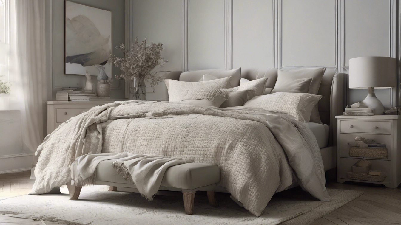
When people hear “monochromatic,” their minds often jump to “boring” or “flat.” But that couldn’t be further from the truth. A true monochromatic scheme isn’t about using the exact same shade everywhere; it’s about exploring the entire spectrum of a single hue. Think about a grey scheme: you’d use charcoal, slate, dove grey, and perhaps even a hint of silver. The magic lies in the subtle shifts, the varied undertones, and the interplay of light and shadow on different textures. This approach allows for incredible sophistication and visual interest without the distraction of competing colors. It fosters a sense of calm and order, making it perfect for a bedroom where relaxation is key.
For bedding specifically, monochromatic color drenching transforms your bed into a plush, inviting centerpiece. It’s like a perfectly composed symphony where every note (or in this case, every textile) contributes to the overall harmony. This method is exceptionally effective for creating a luxury hotel-suite feel, making your bed look incredibly inviting and high-end. Plus, it simplifies decision-making, allowing you to focus on quality textiles and thoughtful details.
Choosing Your Foundational Color: More Than Meets the Eye
The first and arguably most crucial step in applying color drenching tips for monochromatic bedding is selecting your foundational color. This isn’t just about picking your favorite shade; it’s about understanding its nuances, its psychological impact, and how it will interact with the natural light in your bedroom. Remember, your foundational color will set the entire mood for your sanctuary.
Popular Monochromatic Hues for Bedding and Their Moods
- Serene Whites and Creams: Timeless, crisp, and incredibly versatile. Whites evoke purity, simplicity, and a sense of fresh cleanliness. Creams and off-whites add warmth and softness.
Mood created: Airy, bright, clean, minimalist, high-end.

- Calming Greys and Taupes: Sophisticated neutrals that offer a myriad of possibilities. From cool steel grey to warm greige, these colors provide a stable, grounding foundation.
Mood created: Modern, urban, understated, elegant, grounding.

- Deep Blues and Navy: Evoke calmness, stability, and a sense of introspection. Darker blues add drama and depth, while lighter blues promote tranquility.
Mood created: Peaceful, introspective, classic, sophisticated, regal.

- Earthy Greens (Sage, Olive): Connect with nature, promoting growth, balance, and refreshment. Ideal for creating a restorative, organic feel.
Mood created: Natural, calming, rejuvenating, earthy, balanced.

- Warm Terracottas and Rusts: Rich, inviting, and grounding, these hues bring warmth and a touch of the exotic. They can create a cozy, lived-in feel.
Mood created: Cozy, artisanal, warm, bohemian, inviting.
- Soft Pinks and Blushes: Gentle, romantic, and soothing. These subtle hues add a touch of whimsy and tenderness.
Mood created: Romantic, soft, feminine, comforting, serene.
Considering Undertones and Lighting
Every color has an undertone – a subtle hint of another color. Greys can be cool (blue undertones) or warm (yellow/brown undertones). Whites can be crisp (blue/grey) or creamy (yellow/pink). Understanding these undertones is critical for a successful monochromatic scheme with your duvet covers and sheets. Mix a cool grey with a warm grey, and your scheme might feel disjointed.
Natural light plays an immense role. A color that looks vibrant in a south-facing room might appear dull in a north-facing one. Always test swatches of your chosen colors – whether paint or fabric – in your room at different times of day before committing. This simple step can prevent significant disappointment.
Layering Textures: The Secret Sauce of Depth
Once you’ve settled on your foundational color, the journey to perfecting your monochromatic bedding begins with texture. This is perhaps the most vital of all color drenching tips for monochromatic bedding. Without varied textures, a single-color scheme can indeed fall flat. With them, it becomes a multi-dimensional masterpiece, inviting touch and intriguing the eye.
A Symphony of Fabrics: How Different Textures Add Interest
Different materials reflect light in distinct ways, creating subtle variations in hue and adding tactile appeal.
- Crisp Cotton Percale: Offers a matte, clean finish. Excellent for sheets and duvet covers, providing a fresh base.
- Soft Sateen Cotton: Has a subtle sheen, giving a luxurious, silky feel. Perfect for shams or pillowcases to add a touch of elegance.
- Lush Velvet: Absorbs light, creating deep, rich tones and an incredibly opulent, soft texture. Consider a throw pillow or a patterned duvet cover for a focal point.
- Earthy Linen: Provides a relaxed, slightly crinkled texture that adds an organic, lived-in feel. Ideal for duvet covers or quilts for a casual elegance.
- Cozy Knits (Wool or Chunky Cotton): Invites warmth and comfort, introducing a comforting, tactile element. Think chunky knit throws or accent pillows.
- Sheer Organza or Silk: Incorporates delicate luminosity and a sense of ethereal luxury. Can be used for decorative pillow trims or subtle layering.
Practical Application: Start with your core bedding (sheets, duvet) in one texture. Then, introduce pillows, throws, and blankets in the same color family but varying textures. For example, a crisp white linen duvet could be paired with soft white knit throws, shiny white silk pillowcases, and a fluffy white faux fur pillow. Each element, though the same color, offers a unique sensory experience.

Playing with Tones and Shades: The Nuance of Depth
Beyond texture, the strategic use of tones and shades within your chosen color family is paramount. This is where monochromatic ceases to be “one color” and becomes a rich, dynamic palette. Leveraging light and dark variations is another essential aspect of monochromatic decorating and color drenching tips for monochromatic bedding.
From Tint to Shade: Building Visual Interest
- Tints: These are lighter versions of your original color (color + white). Think of a light sage green or a dusty rose. Tints add an airy, delicate feel.
- Tones: These are dulled versions (color + grey). A muted blue or a taupe fall into this category. Tones offer sophistication and softness.
- Shades: These are darker versions (color + black). Navy blue or charcoal grey are examples of shades. Shades provide depth, drama, and grounding.
Applying Tones & Shades to Bedding:
- Base Layer: Start with a mid-tone or a true shade of your chosen color for your duvet cover or main comforter. This acts as your anchor.
- Sheet Set: Opt for a lighter tint of the same color for your sheets and pillowcases. This brightens the area closest to the sleeper and creates a subtle contrast.
- Accent Pillows & Throws: This is where you can introduce the darkest shades and lightest tints. A deep charcoal throw on a mid-grey base, or a pale cream accent pillow on an ivory bed. These variations create visual stepping stones that lead the eye across the bed, highlighting the different elements.
This tonal variation prevents the bed from looking like a flat block of color. It mimics the natural variations found in nature and creates that coveted layered, luxurious look.
Strategic Pattern Integration: Subtle Visual Cues
Just because you’re working with a single color doesn’t mean patterns are off-limits. In fact, subtle patterns are among the most effective color drenching tips for monochromatic bedding, adding another layer of sophisticated visual interest without disrupting the peaceful aesthetic.
Types of Patterns That Work Best Monochromatically
- Tonal Patterns: These are patterns where the design is created using different shades or textures of the same color. Think of a jacquard weave where the pattern is raised or depressed, catching the light differently, but the color remains cohesive.
- Geometric Subtlety: Very fine stripes, discreet checks, or understated geometric patterns where the lines are barely discernible from the background color.
- Organic or Abstract: Gentle, flowing patterns that blend seamlessly into the fabric, often achieved through subtle changes in weave or very soft, diffused prints.
- Embroidered or Appliquéd: Raised patterns in the same color as the base fabric add tactile appeal and a sophisticated touch without introducing new hues.
Where to Integrate Patterns:
- Pillow Shams: A great place to introduce a subtle tonal damask or a delicate stripe.
- Throw Blankets: A textured knit with an intricate pattern or a velvet throw with an embossed design.
- Duvet Cover: Choose a duvet cover with a raised sateen stripe or a subtle jacquard pattern for an elegant base.
- Euro Shams: Often larger, they can carry a larger, but still subtle, pattern that anchors the head of the bed.
The key here is restraint. The pattern should *enhance* the monochromatic scheme by adding texture and depth, not compete with it. It should whisper, not shout.
Beyond the Bed: Extending the Monochromatic Vibe
Truly successful color drenching extends beyond just your bedding. To maximize the impact of your color drenching tips for monochromatic bedding, think about how the surrounding elements in your bedroom can support and amplify the monochromatic scheme. This creates a cohesive, wrap-around feeling that makes the room feel larger and more harmonious.
Walls, Furniture, and Accessories in Context
- Walls: Consider painting your walls in a slightly lighter or darker shade of your bedding’s foundational color. This bathes the room in the same hue, creating an enveloping, serene environment. Don’t be afraid to paint the ceiling too for ultimate color drenching!
- Curtains/Window Treatments: Choose curtains in the exact same color (or a very close tint/shade) and a similar texture to one of your bedding layers. This helps the window wall feel like a seamless extension of the room’s color story. Sheer linen or heavy velvet will offer different ambiance, but continuity in color remains key.
- Furniture: For a true monochromatic drench, furniture can echo the color. A bedside table painted in a shade of your primary color, or an upholstered headboard in the same hue. If painting isn’t an option, select furniture that’s neutral in tone (wood, metal, glass) but whose form complements the room’s aesthetic.
- Rugs: A rug in a similar tone or a contrasting texture (like a deep shag rug in a neutral bedroom) can anchor the space and extend the color story to the floor.
The goal is to eliminate visual clutter and ensure that every element contributes to the unified color narrative. This holistic approach makes the room feel intentionally designed and incredibly peaceful.
Accessorizing with Intention: The Final Touches
While the essence of color drenching tips for monochromatic bedding lies in the single-color approach, carefully chosen accessories can elevate the scheme from simple to sublime. These aren’t just “add-ons”; they’re strategic elements that enhance depth, personality, and visual interest.
Adding Personality Without Breaking the Monochromatic Rules
- Metallic Accents: Gold, silver, bronze, or brass frames, lamps, or small decorative objects add a touch of glamour and reflect light beautifully. They provide sparkle without introducing a new color. For example, warm brass against a deep navy scheme is stunning.
- Natural Materials: Introduce elements like wood (light or dark), stone, ceramic, or glass. They bring in organic texture and a grounding feel. A raw wood bedside table or a ceramic vase can complement a soft green or cream scheme beautifully.
- Subtle Art: Opt for abstract artwork or landscape prints where the dominant colors are reflections or analogous to your monochromatic scheme. Avoid pieces with clashing, vibrant colors. Black and white photography is always a safe and chic choice.
- Live Plants: Greenery always adds life. A lush plant in a monochromatic ceramic pot instantly brings freshness and a subtle natural contrast to any color scheme.
- Books: Arrange books by spine color, favoring those that align with your scheme or are neutral.
- Diffusers/Candles: Choose containers in glass, ceramic, or metal that blend with your decor, focusing on the scent for sensory appeal.
The key here is balance. Each accessory should feel like a deliberate choice, supporting the overall serene and sophisticated atmosphere rather than creating visual noise. Think of them as silent contributors to the overall color story.
Troubleshooting Common Monochromatic Challenges
Even with the best color drenching tips for monochromatic bedding, you might encounter a few hurdles. Here’s how to tackle them like a pro.
Avoiding Flatness and Boredom
- Problem: Your monochromatic bedding feels dull, like one big blob of color.
- Solution: You likely haven’t introduced enough textural variety or tonal differences. Go back and layer in more fabrics with distinct feels (velvet, linen, knit). Add lighter tints and darker shades of your base color. Consider a subtle tonal pattern. Remember, light reflects differently on different surfaces, creating visual intrigue.
Dealing with Clashing Undertones
- Problem: You’ve brought in different pieces that are technically the same color, but they just don’t look right together (e.g., a “grey” duvet looks greenish next to a “grey” pillow with blue undertones).
- Solution: This is an undertone issue. When shopping, bring swatches or photos of your existing items. Try to stick to either warm undertones (yellow, pink, brown) or cool undertones (blue, purple, green) within your chosen color family. If you have mixed them, consider replacing the clashing item or introducing a very strong neutral (like a crisp white or a true black) to visually separate them.
Integrating Existing Furniture or Room Elements
- Problem: You love the monochromatic idea for your bedding, but your large brown dresser or brightly colored armchair feels out of place.
- Solution:
- Accessorize Around It: Use throws, pillows, or art that tie the “off-color” element into the scheme. For instance, if you have a brown dresser and want a grey monochromatic bed, add some greige or warm grey pillows with brown accents, or a piece of art that incorporates both brown and grey.
- Create a “Zone”: Sometimes it’s okay for one element to stand out slightly if it’s visually separated. For example, a reading nook with a different color chair can be its own “zone” within the room.
- Paint or Refinish: If possible, consider painting or refinishing your furniture in a color that matches or complements your monochromatic scheme. Or reupholster that armchair!
Monochromatic design is an art of subtlety and precision. Don’t be afraid to experiment, and remember that even small adjustments in texture or tone can make a huge difference.
The Long-Term Benefits of Monochromatic Bedding
Beyond the immediate aesthetic appeal, choosing a monochromatic scheme for your bedding offers several enduring advantages for your space and your state of mind.
Timelessness and Evolving Style
Trends come and go, but simplicity and refined elegance endure. A monochromatic bedding scheme is inherently timeless. It doesn’t rely on fleeting fads, making it a wise investment in comfort and style. Should your taste evolve, or if you wish to introduce a new accent color, a monochromatic base acts as the perfect versatile canvas. A splash of a trending color in a throw pillow can instantly update the look without requiring an entire bedding overhaul.
Promoting Calm and Better Sleep
Our bedrooms are sanctuaries, and visual peace is paramount for restorative sleep. A monochromatic scheme, by its very nature, reduces visual clutter and overstimulation. The gentle repetition of a single color, subtly varied in tone and texture, creates a cohesive, harmonious environment that promotes relaxation and a sense of calm. This visual tranquility can contribute significantly to a better night’s sleep, making bedtime a truly inviting experience.
Making Small Spaces Feel Larger
When multiple colors are competing for attention in a small room, they can make the space feel chaotic and even smaller. A monochromatic scheme, particularly one using lighter tones, creates an unbroken flow of color that tricks the eye into perceiving more expansive dimensions. Because there are fewer visual breaks, the boundaries of the room seem to recede, fostering an airy and open feel. This is one of the most intelligent clever design tricks for small spaces.
Ultimately, investing in color drenching for your monochromatic bedding isn’t just about making your bed look good; it’s about investing in a lifestyle of tranquility, sophistication, and enduring style.
FAQ: Mastering Monochromatic Bedding
What is color drenching in interior design?
Color drenching is an interior design technique where a single color, or various shades and tints of that color, is applied across multiple surfaces in a room, including walls, furniture, and textiles like bedding. The goal is to create an immersive, cohesive, and enveloping atmosphere that feels seamless and sophisticated.
How can I make monochromatic bedding not look boring?
The key to exciting monochromatic bedding is layering. Focus on incorporating a variety of textures (e.g., crisp cotton, soft velvet, cozy knit, silky sateen) and different tones/shades of your chosen color. Subtle tonal patterns, interesting weave variations, and metallic or natural material accents also add depth and visual interest.
What are the best colors for monochromatic bedroom schemes?
Popular choices for serene monochromatic bedrooms include whites and creams for brightness, greys and taupes for modern sophistication, blues (especially navy and dusty blues) for calm, and earthy greens like sage or olive for a natural, grounding feel. The ‘best’ color depends on the mood you wish to create.
Can I add any accent colors to a monochromatic bedroom?
While strict monochromatic schemes stick to one color family, you can introduce very subtle accents without disrupting the harmony. Metallics (gold, silver, brass), natural wood tones, or greenery from plants are excellent choices. If you introduce a pop of color, ensure it’s small and thoughtfully placed, serving as a slight counterpoint rather than a competing element.
How do I deal with different undertones in monochromatic bedding?
Undertones are crucial. Try to stick to either warm (yellow, red, brown hints) or cool (blue, green, purple hints) undertones within your chosen color family. When shopping, compare items in natural light. If you have clashing items, try to replace one or add a very neutral element (like a pure white base layer) to break up the conflicting tones.
What types of patterns work well in a monochromatic bedding scheme?
Tonal patterns are ideal, where the design is created by variations in weave or texture of the same color. Subtle geometric patterns like pin stripes or very faint checks, or organic patterns that blend and flow, also work well. The key is that the pattern adds texture and depth without introducing a visible different color.
How does monochromatic bedding make a room feel bigger?
A monochromatic scheme creates a continuous flow of color throughout the space. By minimizing visual breaks and contrasts, the eye isn’t interrupted, making the room’s boundaries seem to recede. Lighter monochromatic schemes are particularly effective in creating an airy, expansive feel, giving the illusion of more space.
Conclusion: Your Path to a Monochromatic Dream Bedroom
You’ve now traversed the alluring landscape of color drenching tips for monochromatic bedding, armed with insights to transform your bedroom into a masterpiece of serene design. We’ve peeled back the layers, revealing that true sophistication doesn’t scream for attention with disparate hues, but rather whispers elegance through the harmonious interplay of a single color’s many faces.
Remember, the magic lies in the details: the foundational color you choose, the symphony of textures you layer, the nuanced dance between shades and tints, and the subtle integration of pattern and purposeful accessories. This isn’t just about decorating; it’s about curating a personal sanctuary that soothes your soul and elevates your everyday. Embrace the power of simplicity, and watch as your bedroom transforms into a truly calming and luxurious retreat.
Your Next Steps
- Identify Your Ideal Hue: Start by selecting the core color that speaks to you and the mood you wish to create in your bedroom.
- Gather Samples: Collect fabric swatches (or even just photos) of different textures and tones within that color family.
- Layer with Intention: Begin building your bedding from the base up, focusing on varied textures and subtle tonal shifts.
- Extend the Embrace: Consider how elements like walls, curtains, and minimal accessories can further enhance your monochromatic theme.
- Enjoy the Serenity: Step back and delight in the unparalleled calm and sophistication of your newly drenched monochromatic bedding.
For more design inspiration and practical home decor advice, explore our guides on Decorating Small Spaces or Mastering Bedroom Lighting to further enhance your tranquil haven. Begin your journey today; your dream bedroom awaits.