Mastering the Art of Contrast: A Guide to Mixing Black, White, and Color Prints
Do you often find yourself overwhelmed with choices when mixing black, white, and color prints in your designs? You’re not alone. In a world filled with vibrant colors and striking monochromes, mastering the art of contrast can feel like navigating a maze. But fear not! This guide is here to clarify the principles of contrast and equip you with actionable insights that elevate your design game.
In this comprehensive article, you will learn about the importance of contrast, explore techniques for mixing prints effectively, discover color theory essentials, and find out how to apply these principles to your projects. Plus, you’ll gain access to practical tips and visual inspiration to ensure your designs stand out.
Understanding Contrast in Design
Contrast in design refers to the juxtaposition of different elements — be it colors, shapes, or textures — to create visual interest and hierarchy. It’s essential in guiding the viewer’s eye toward important information while providing clarity.
The Importance of Contrast
Using contrast effectively can enhance appreciation of your work, making every element intentional. Consider famous works of art: their use of light and dark or vibrant colors against neutrals pulls the viewer in, inspiring emotion and engagement.
Types of Contrast
- Color Contrast: Using colors from opposite ends of the color wheel.
- Value Contrast: Combining light and dark tones.
- Texture Contrast: Mixing smooth and rough surfaces.
- Pattern Contrast: Juxtaposing different prints together, such as stripes and florals.
Mixing Black, White, and Color Prints
Basics of Mixing Prints
Knowing how to mix black, white, and colored prints is crucial in creating stunning contrasts. Here are a few foundational rules:
- Start Small: Begin with one foundational print and build around it.
- Use a Color Palette: Limit your palette to three to five colors for cohesion.
- Consider Scale: Vary the size of prints to create visual hierarchy.
Techniques for Effective Mixing
Here are some practical steps to enhance your designs:
- Balance Patterns: Pair bold prints with subtle tones to keep the focus.
- Layering Techniques: Use layers to add depth; for example, mix small prints under bolder designs.
- Whitespace Utilization: Allow whitespace to create breathing room, enhancing the contrast further.
Visual Examples
Consider creating a mood board with samples of black, white, and color prints to visualize how they work together. Integrating swatches of fabric or samples of artwork can provide real-world perspective.
Color Theory Essentials
Understanding the basics of color theory can greatly aid in your mixing process. Here’s what you need to know:
Color Wheel Dynamics
The color wheel illustrates the relationships between colors — primary, secondary, and tertiary colors. Familiarizing yourself with this can help in strategically choosing contrasting pieces.
Warm vs. Cool Colors
Warm colors (reds, oranges) evoke energy and passion, while cool colors (blues, greens) promote calmness. Mixing these can create diversified displays that balance emotional responses.
Complementary Colors vs. Analogous Colors
Complementary colors (e.g., blue and orange) provide high contrast, while analogous colors (e.g., blue, blue-green, green) result in harmony. Utilize both effects creatively.
Real-World Applications
Fashion Design
In fashion, designers often mix prints to create stunning outfits. For instance, pairing a floral dress with a striped blazer can add depth and intrigue.
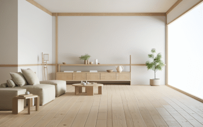
Interior Design
In interior spaces, utilizing black and white prints with statement colored accessories can tie a room together. The key is layering textures while keeping color cohesion.
Graphic Design
For digital graphic layout, contrast can lead to compelling imagery. Use contrasting typefaces and imagery to grab attention and convey messages effectively.
Tools and Resources for Effective Mixing
Design Software Recommendations
Utilize design software like Adobe Illustrator or Canva to experiment with mixing prints. These platforms allow for layering and easy adjustments to your designs.
Inspiration Sources
Seek inspiration on platforms such as Pinterest or design blogs. Often, visual feedback can guide your understanding of effective color and print mix.
Frequently Asked Questions
What is the best way to combine different prints?
Start by balancing larger prints with smaller ones and ensure that they share at least one color to create cohesion.
How can I ensure my prints don’t clash?
Use a limited color palette and pay attention to the scale of the prints. A unified theme helps in creating harmony among varying designs.
What tools can help in mixing prints?
Design tools like Adobe InDesign and Canva are great for visualizing mixed prints before finalizing your project.
Can I mix black and white prints with colored prints?
Absolutely! Black and white prints can serve as a neutral base while color adds vibrancy. Just ensure to maintain balance and cohesion.
What is color contrast?
Color contrast is the difference in luminance or color that makes an object distinguishable from its background.
Conclusion & Next Steps
Mastering the art of contrast—mixing black, white, and colored prints— is pivotal for creating impactful designs. By applying the techniques and principles discussed, you’re now equipped to bring beautiful contrast to your projects.
Ready to dive in? Practice mixing prints in a few sketches or digital layouts today! For more design tips, explore our content on color theory and print mixing strategies.
Content Disclaimer
Information provided in this article is for educational purposes only. Always consult a professional for personalized advice.
Categories
- Accent Walls & Ceilings (84)
- Art Curation & Gallery (83)
- Bedding Style Trends (89)
- Bedroom Makeover (96)
- Bohemian & Eclectic Styles (80)
- DIY & Budget-Friendly Decor (78)
- Eco-Friendly Design (83)
- Furniture Care (87)
- Home Decor & Design Ideas (181)
- Home Wellness Spaces (103)
- Integrated Outdoor Living (91)
- Japandi Style (84)
- Kids and Nursery Decor (73)
- Living Room Decor (99)
- Mix & Match Techniques (95)
- Modern & Contemporary Design (88)
- Rug Sizing & Placement (89)
- Scandinavian Design Inspiration (51)
- Seasonal Home Decor (100)
- Small Space Solutions (93)
- Wall Art & Painting Tips (94)
Recent Comments
Archives
Product Gallery
-
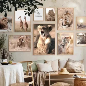 Majestic African Wildlife Canvas Art for Stylish Home Decor
Rated 5.00 out of 5
Majestic African Wildlife Canvas Art for Stylish Home Decor
Rated 5.00 out of 5 -
 Cozy Irregular Green Plush Rug for Nordic Living Spaces
Rated 5.00 out of 5$51.90 – $327.31Price range: $51.90 through $327.31
Cozy Irregular Green Plush Rug for Nordic Living Spaces
Rated 5.00 out of 5$51.90 – $327.31Price range: $51.90 through $327.31 -
 Scandinavian Geometric Area Rugs for Stylish Home Décor
Rated 5.00 out of 5$38.90 – $589.26Price range: $38.90 through $589.26
Scandinavian Geometric Area Rugs for Stylish Home Décor
Rated 5.00 out of 5$38.90 – $589.26Price range: $38.90 through $589.26