Mood and Ambiance: Color Trends Transforming Luxury Decor in 2025
Alright, let’s talk about what’s coming next in the world of luxury decor, specifically colors. We’re not just throwing hues on walls here; we’re crafting moods, setting vibes, and, honestly, making spaces that feel like a warm hug (or a power statement, depending on your taste). So, buckle up; we’re about to peek into 2025 and see what colors will be painting the luxury landscape.
The Core Palette: Setting the Stage
First off, you’ve gotta have your foundation, right? Think of it like a painter’s canvas; you need that base to build upon. What are the foundational colors that will be everywhere?
Earthy Neutrals Elevated
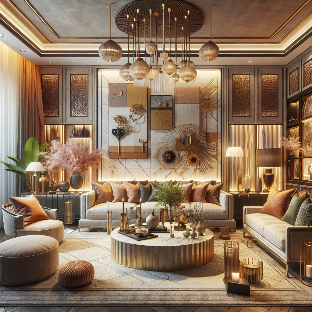
Okay, “neutrals” might sound boring, but trust me, we’re not talking about your grandma’s beige. We’re talking complex, soulful neutrals—think warm grays with a hint of lavender, creamy off-whites that lean towards amber, and taupes that whisper of far-off deserts. The key here is depth. These aren’t flat colors; they’ve got layers, nuances. They play with light in ways that make a room feel both grounded and ethereal. You know, the kind of space where you can kick off your shoes and actually breathe?
Muted Jewel Tones
Jewel tones are classics, sure, but in 2025, they’re getting a makeover. We’re dialing down the saturation and cranking up the sophistication. Imagine a sapphire blue that’s been kissed by twilight, an emerald green softened with a touch of sage, or a ruby red that’s more like aged wine. The goal isn’t to shout; it’s to murmur elegance. These colors add richness without being overwhelming, perfect for upholstery or accent walls where you want to make a statement without, well, screaming it.
Accent Hues: Personality Injection
Now, for the fun part! This is where you get to inject some personality. What are the accent colors that will pop in 2025? It’s all about making statements, but in a way that feels curated, not chaotic.
Spiced Terracotta
Terracotta is back, baby! But this isn’t the cheesy, 90s version. We’re talking about spiced terracotta – think cinnamon, paprika, and a dash of chili. It’s warm, inviting, and brings that earthy vibe right into your living room. Imagine a gorgeous terracotta vase on a sleek, modern table or a cozy throw pillow adding a pop of warmth to a cool, neutral sofa. It’s that unexpected touch that makes a space feel lived-in and loved. Honestly, what’s not to love about adding a little spice to your life…and your decor?
Dusty Rose
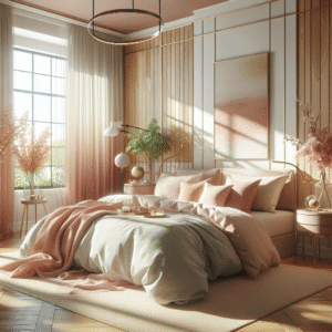
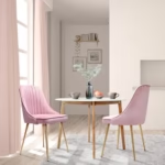
Rose, but make it sophisticated. Dusty rose is like the cooler, older sister of millennial pink. It’s muted, refined, and has this beautiful, almost melancholic quality. It works wonders in bedrooms (hello, serene sanctuaries!) but also shines in living spaces. Picture a velvet armchair in dusty rose paired with those earthy neutrals we talked about earlier. It’s a combo that just *works*, creating a vibe that’s both comforting and chic.
Icy Blue
On the opposite end of the spectrum, we have icy blue. This isn’t your typical bright, happy blue; it’s cooler, with a hint of gray, almost like looking at a glacier. It’s refreshing and adds a sense of calm to any space. Use it sparingly – maybe in artwork, accessories, or a single statement chair. It’s especially striking when paired with warmer tones, creating a delightful contrast.
Material Pairings: Textures that Talk
Color is only half the story, isn’t it? The materials you pair them with can make or break the entire ambiance. It’s that tactile element that elevates a space from visually appealing to truly luxurious.
Velvet and Bouclé
These two are having a major moment, and honestly, I’m here for it. Velvet adds that touch of opulence and drama, while bouclé brings in texture and coziness. Imagine a deep emerald velvet sofa adorned with bouclé cushions – the contrast is just *chef’s kiss*. These textures beg to be touched and add layers of depth to any room. They’re like the comfort food of the design world: endlessly satisfying.
Natural Stone and Wood
You know what’s timeless? Natural materials. Think marble, travertine, and richly grained woods like walnut and oak. But it’s all about how you use them. In 2025, we’re seeing these materials used in unexpected ways – a marble coffee table with a live edge, a travertine wall panel with subtle lighting. It’s about celebrating the inherent beauty of these elements and letting them speak for themselves. You might even see a resurgence of artisanal techniques, showcasing the hand-crafted quality of these materials.
Metals: Warmth is Key
Say goodbye to cool, stark metals. We’re embracing warmth in 2025. Think brushed brass, copper, and even rose gold. These metals add a subtle shimmer and reflect light in a way that feels inviting and sophisticated. Use them in lighting fixtures, hardware and even in subtle inlays in furniture pieces. They’re like jewelry for your home – those small touches that elevate the whole look.
Ambiance and Lighting: Setting the Mood
You can have the perfect colors and materials, but if your lighting is off, the whole thing falls flat. Lighting is the unsung hero of interior design, and it’s crucial for setting the right mood.
Layered Lighting Schemes
Overhead lighting alone? That’s a big no-no. In 2025, it’s all about layering your lighting. Think ambient lighting (soft, diffused light that fills the room), task lighting (focused light for specific activities), and accent lighting (to highlight architectural features or artwork). Dimmers are your best friend here. They allow you to adjust the intensity and create different moods throughout the day. Honestly, good lighting is like the perfect filter for your home – it just makes everything look better.
Smart Lighting Technology
Okay, let’s talk tech. Smart lighting systems are becoming more sophisticated and intuitive. We’re not just talking about turning lights on and off with your phone (though that’s still pretty cool). We’re talking about systems that can automatically adjust the color temperature based on the time of day, mimic natural daylight, and even respond to your circadian rhythm. Companies are doing some pretty impressive things. It’s all about creating a living space that supports your well-being.
Statement Lighting Fixtures
Don’t underestimate the power of a statement lighting fixture. Think chandeliers, pendant lights, and sconces that double as works of art. These aren’t just functional; they’re focal points that add a touch of personality and drama to any room. And they’re not necessarily about being the most expensive or extravagant. Often, it’s about finding something unique and unexpected – maybe a vintage chandelier or a hand-blown glass pendant. You know, something that tells a story.
Color Psychology: How Colors Make Us Feel
Here’s the thing: colors aren’t just pretty; they actually affect our emotions and moods. Understanding color psychology can help you create spaces that not only look good but also *feel* good.
Calming Blues and Greens
Blue and green are known for their calming and relaxing properties. They remind us of nature – the ocean, the sky, forests. These colors are perfect for bedrooms, bathrooms, and any space where you want to create a sense of tranquility. But remember, it’s all about the right shade. Too bright or too saturated, and you might end up feeling restless instead of relaxed.
Energizing Yellows and Oranges
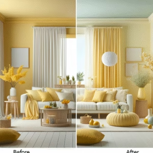
On the other end of the spectrum, we have yellows and oranges. These colors are associated with energy, optimism, and creativity. They’re great for home offices, kitchens, and any space where you want to feel inspired and motivated. But again, moderation is key. Too much yellow can be overwhelming, so use it sparingly – maybe as an accent color or in artwork.
Sophisticated Grays and Purples
Gray and purple are often associated with sophistication, elegance, and luxury. Gray is a versatile neutral that can be paired with just about any color, while purple adds a touch of drama and intrigue. These colors are perfect for living rooms, dining rooms, and any space where you want to create a sense of refined elegance. Think velvet sofas, silk curtains, and statement artwork.
Sustainability: Eco-Conscious Color Choices
Okay, we gotta talk about sustainability. It’s not just a trend; it’s a responsibility. And it extends to the colors we choose for our homes.
Natural Pigments and Dyes
More and more homeowners are opting for paints and dyes made with natural pigments. These are derived from plants, minerals, and other sustainable sources. Not only are they better for the environment, but they also tend to have a richer, more nuanced color than synthetic dyes. You know, the kind that really tells a story.
Low-VOC Paints
VOCs (volatile organic compounds) are chemicals that can be harmful to your health and the environment. Low-VOC paints are a much better option, as they release fewer of these harmful chemicals into the air. They’re becoming more widely available, so there’s really no excuse not to choose them. Plus, they perform just as well as traditional paints. It’s a win-win.
Upcycled and Recycled Materials
Think beyond just the paint on your walls. Consider using upcycled or recycled materials in your decor. Think reclaimed wood furniture, rugs made from recycled plastic bottles, and lighting fixtures made from repurposed metal. These pieces not only look great, but they also have a story to tell. They’re a conversation starter and a reminder that luxury can (and should) be sustainable.
So, there you have it! A sneak peek into the color trends that will be shaping luxury decor in 2025. It’s all about creating spaces that are not only visually stunning but also emotionally resonant and environmentally conscious. And it’s not just about following trends blindly; it’s about using these ideas as a starting point and creating a space that truly reflects your personality and style.
Here’s a related article you might enjoy – Architectural Digest
Another great resource – Elle Decor
FAQ Section
DISCLAIMER
Readers are advised that interior design trends are subjective and influenced by personal preferences and regional aesthetics. While the information provided aims to reflect industry forecasts for 2025, actual implementations may vary. Consult with professional interior designers for personalized advice.
Categories
- Art Curation & Gallery (15)
- Bedding Style Trends (34)
- Bedroom Makeover (18)
- Furniture Care (20)
- Home Decor & Design Ideas (96)
- Living Room Decor (19)
- Mix & Match Techniques (19)
- Rug Sizing & Placement (19)
- Seasonal Home Decor (19)
- Wall Art & Painting Tips (18)
Recent Posts
Recent Comments
Archives
Product Gallery
-
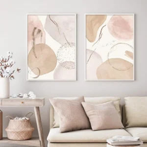 Abstract Bohemian Geometric Beige Poster Canvas Painting Wall Art Printing Picture Bedroom Living Room Home Decoration Picture
$3.82 – $22.12Price range: $3.82 through $22.12
-
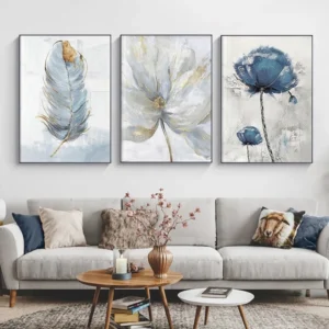 Scandinavian Flower Canvas Posters Nordic Art Wall Painting Print Abstract Flowers Feather Decoration Picture for Living Room
$5.73 – $32.74Price range: $5.73 through $32.74
-
 Abstract Native Indian riding Horse Figure Painting Canvas Posters and Prints Cuadros Art Wall Picture vintage room decor
$3.80 – $26.44Price range: $3.80 through $26.44

