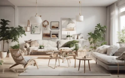
Finding the sweet spot between bold, expressive artwork and understated, subtle accessories is the secret to creating interiors that captivate and comfort. When you strike this perfect balance, your space tells a compelling story without overwhelming the senses. In fact, mixing bold art with subtle accessories helps to showcase personal style while maintaining harmony and flow in your home environment.
In this article, we’ll explore how to blend daring artistic pieces with low-key decor essentials. You’ll learn practical strategies to select and place art and accessories so each element shines. From material choices to color theory and spatial awareness, we’ll cover actionable steps you can take to elevate any interior. Whether you’re revamping a single room or designing an entire home, mastering this balance can transform your space into a stunning visual and emotional experience.
Here’s what you’ll discover:
- Why balancing bold art and subtle accessories matters in interior design
- How to select bold artworks and pair them with complementary subtle accents
- Techniques for color, scale, texture, and placement balancing
- Case studies demonstrating successful applications
- Recommended tools and resources for planning your decor
- Common pitfalls to avoid and troubleshooting tips
- Answers to frequently asked questions about art and accessory mixing
Why Balancing Bold Art with Subtle Accessories Enhances Interior Design
In interior design, imbalance often leads to visual chaos or dullness. Bold artworks demand attention but can easily dominate a room if not harmonized with the surroundings. Subtle accessories act as a visual counterweight, offering respite and cohesion. This dynamic interplay crafts a layered space that feels curated, not cluttered.
The Role of Bold Art in Interiors
Bold art pieces—think large canvases, vivid abstracts, or striking sculptures—serve as focal points. They inject personality, evoke emotion, and communicate your tastes. According to a study by ArchDaily, integrating statement art in living rooms can boost perceived room value by up to 20%.
The Importance of Subtle Accessories
Subtle accessories—decorative pillows, vases, simple frames—support and complement without stealing focus. Their understated presence helps unify the room’s palette and textures, smoothing the transition between bold art and surrounding furniture. These pieces can be essential conversation starters or emotional anchors.
Takeaway: Bold art grabs attention; subtle accessories sustain balance and flow. Both are essential for stunning interiors.
Selecting Bold Artwork and Complementary Subtle Accents
Choosing the right elements sets the tone for your design. This section breaks down how to pick bold art and match it with accessories that accentuate rather than clash.
Choosing the Right Bold Art
- Assess your space: Large walls accommodate bigger or multiple large artworks. Smaller rooms benefit from fewer bold pieces.
- Identify your style: Contemporary abstracts, classic portraits, or vibrant landscapes—choose pieces that resonate with you.
- Consider art placement: Entryways, above sofas, or mantels are ideal for anchoring bold pieces.
Selecting Subtle Accessories to Match
- Color coordination: Use accessories that pick up minor tones from the artwork for a cohesive look.
- Texture variety: Soft fabrics, ceramic finishes, or natural woods can contrast yet complement bold art surfaces.
- Keep shapes simple: Rounded vases or linear frames avoid competing with complex art forms.
Comparison Table: Bold Art vs. Subtle Accessories
| Aspect |
Bold Art |
Subtle Accessories |
| Visual Weight |
Heavy focal point |
Light supporting elements |
| Color |
Bright, contrasting |
Muted or accent hues |
| Scale |
Large or eye-catching |
Small to medium |
| Function |
Express personality, grab attention |
Unify space, enhance texture |
Techniques for Balancing Color, Scale, Texture, and Placement
Understanding how different design principles interact helps keep your interiors stunning and well-rounded.
Color Balance
To avoid visual confusion, extract 2–3 key colors from your bold artwork and echo them softly in accessories. For example, a cobalt blue painting can be paired with pale blue cushions or vases. Experts like ColorMatters emphasize complementary and analogous schemes as reliable ways to maintain harmony.
Scale and Proportion
Big art calls for more modest-sized accessories. For example, a large abstract canvas over a sofa pairs well with small throw pillows and minimalist lamps. Conversely, smaller art prints arrange nicely with slightly larger accent pieces to create layered interest.
Texture Play
Contrast smooth, glossy art surfaces with rougher or softer textures in accessories. A sleek metal sculpture looks compelling alongside woven baskets or linen throws. This tactile variety creates depth without overcrowding.
Strategic Placement
- Anchor the room: Install bold art where the eye naturally rests.
- Cluster subtle accessories: Group accessories in odd numbers around furniture or shelves to foster rhythm.
- Use negative space: Leave breathing room around bold pieces to avoid congestion.
Case Studies: Real-World Examples of Balanced Interiors
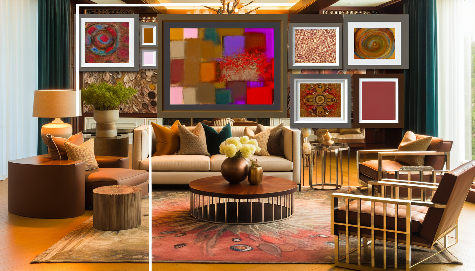
Case Study 1: Modern Minimalist Living Room
In a New York apartment, designer Carla Evans used a floor-to-ceiling abstract painting with bold reds and blacks as the focal point. She paired it with monochrome cushions, a single charcoal vase, and an unadorned black coffee table. The subtle accessories echoed muted tones from the painting, creating a sleek, cohesive space.
“Balancing bold statements with understated decor is key to making a room feel curated but lived-in,” explains Evans.
Case Study 2: Eclectic Bedroom Retreat
In Austin, interior stylist Mark Rich transformed a bland bedroom by adding a vivid floral canvas and soft beige textiles. Accessories included small terracotta pots, simple wooden frames, and a jute rug. This combination layered texture and color carefully, without overwhelming the senses.
Recommended Tools and Resources for Interior Planning
Planning your art and accessory mix is easier with the right tools. Here are some top picks:
- Canva: Great for digital mood boards to visualize color and artwork combinations.
- Houzz: Offers inspiration and connection with interior designers specializing in balance strategies.
- ColorSnap Visualizer by Sherwin-Williams: Helps test paint and accessory colors against artworks digitally.
Visual Content Suggestion
Include an infographic illustrating the “Color, Scale, Texture, Placement” principles with side-by-side examples of balanced and unbalanced interiors, to reinforce understanding visually.
Common Pitfalls and How to Avoid Them
- Overstuffing spaces: Avoid placing too many accessories that compete with bold art.
- Ignoring negative space: Allow breathing room around focal art.
- Mismatched color schemes: Choose accessories with subtle reference colors.
- Uneven scale: Balance large art with small accessories, not equally large pieces.
Frequently Asked Questions
How can I mix bold art with subtle accessories in a small room?
Focus on one bold piece to serve as a focal point. Pair it with a few minimalist accessories in muted colors, and keep furniture and decor simple to avoid crowding the space.
What colors work best for subtle accessories when I have vibrant bold art?
Choose accessory colors that appear as secondary or tertiary hues within the artwork. Neutrals like beige, gray, or soft pastels also complement bold colors gracefully.
Are there specific materials better suited for subtle accessories?
Natural materials like wood, linen, or ceramics usually provide understated textures that contrast well with glossy or vibrant bold art surfaces.
How do I know if my bold art is too overpowering?
If your eyes feel drawn only to the art and the rest of the room fades into the background, consider scaling down or adding more subtle accessories to balance the visual weight.
Can mixing too many accessories ruin the balance?
Yes, too many accessories can clutter space. Aim for a few well-chosen pieces that enhance rather than compete with your artwork.
Conclusion & Next Steps
Striking the perfect balance by mixing bold art with subtle accessories transforms interiors into engaging, harmonious spaces. Remember that bold pieces demand attention while subtle accessories maintain unity and comfort. By thoughtfully selecting colors, textures, and placement, your home can reflect your unique style with effortless elegance.
Start small: choose one bold artwork to anchor a room and test pairing it with complementary accessories. Observe how balance shifts and tweak accordingly. Over time, you’ll build a curated collection that feels both stunning and welcoming.
Explore related topics on our site about color coordination techniques, styling home accessories, and art placement strategies to deepen your interior design know-how.
Content Disclaimer
The information provided in this article is for educational purposes only. Individual results may vary based on personal taste and environmental factors. For personalized interior design advice, consult a licensed professional.