Transform Your Mood, One Wall at a Time: The Psychology of Home Color
Ever walked into a room and felt an immediate shift in your personal energy? Perhaps a vibrant yellow space made you feel joyful and energized, while a muted grey room left you feeling calm, or even a bit somber. This isn’t coincidence; it’s the profound influence of hue on human emotion. In fact, understanding how to transform your mood one wall at a time using the precise psychology of home color is more than just interior design—it’s about intentional well-being. Your home is your sanctuary, and the colors you choose for its walls can significantly impact your daily emotional landscape, productivity, and overall sense of peace. This article will delve deep into the fascinating interplay between color and consciousness, guiding you through an evidence-based approach to selecting wall colors that not only look aesthetic but genuinely enhance your life.
We’ll explore how different shades evoke specific feelings, from invigorating reds to tranquil blues, and provide actionable insights for every room in your house. Get ready to unlock the secret language of color and wield it to cultivate a home environment that actively supports your desired state of mind. By the end of this journey, you’ll possess the knowledge to confidently choose colors that elevate your mood, boost focus, and create a truly harmonious living space.
The Unseen Influence: How Color Psychology Shapes Our Lives
Color is more than just a visual perception; it’s a powerful non-verbal communicator. From the marketing of consumer products to the uniforms of sports teams, color is strategically employed to elicit specific responses. At home, its impact is even more intimate and pervasive. The human eye perceives color via specialized photoreceptor cells, and these signals travel to the brain, influencing emotions, physiological reactions, and even cognitive performance. This isn’t just fluffy theory; scientific research consistently demonstrates how different wavelengths of light—which we perceive as colors—can alter heart rates, blood pressure, and even stimulate areas of the brain associated with memory and emotion. For instance, ever wonder why fast-food restaurants often use reds and yellows? These stimulating colors are known to increase appetite and encourage quick decisions. Conversely, many spas lean into cool greens and blues to promote relaxation.
Beyond Aesthetics: The Scientific Basis of Color’s Emotional Impact
The field of psychology has extensively studied chromotherapy, the idea that colors can promote healing. While some applications remain on the fringes, the core principle that colors affect our psyche holds true. Our emotional responses to color are often a blend of universal human associations (e.g., green with nature, red with danger or passion) and cultural interpretations (e.g., white as mourning in some cultures, joy in others). Moreover, personal experiences play a significant role. A childhood spent in a beige room might lead to different adult associations than one spent in a vibrant, multi-colored space. When we talk about how to transform your mood one wall at a time, we’re tapping into these deep-seated psychological connections. It’s about consciously designing environments that resonate positively with your intrinsic emotional frameworks.
Evolutionary Roots and Cultural Contexts of Color Perception
Our responses to color are deeply intertwined with our evolutionary history. The vivid green of a healthy landscape signals safety and sustenance, while the ominous grey of a storm cloud triggers caution. Bright red might warn of ripe berries or venomous creatures, but also signifies warmth and vitality. These primal connections are hardwired into our brains. Culturally, these meanings are further refined. For example, in Western cultures, blue is often associated with sadness (“feeling blue”) but also with trust and authority. In other cultures, blue might symbolize divinity or immortality. Understanding these layers helps us move beyond simple preferences and make informed color choices for our living spaces that support desired feelings.
The Color Wheel of Emotions: A Room-by-Room Guide
Now, let’s get practical. To intentionally transform your mood one wall at a time, we need to understand the specific impacts of various colors. We’ll break down the major color families and suggest how they can be applied effectively in different areas of your home.
Warm Colors: Energy, Passion, and Comfort
Warm colors—reds, oranges, and yellows—are often described as energetic, inviting, and stimulating. They tend to advance, making spaces feel cozier and more intimate. If you’re looking to infuse vitality into a room, these are your go-to hues.
Red: Boldness, Energy, and Appetite
Red is the most intense of all colors. It excites, stimulates, and can elevate energy levels. Its presence has been shown to increase heart rate and breathing. Use red for a dramatic statement wall in a dining room to stimulate conversation and appetite, or in an entryway for a welcoming, energetic burst. However, too much red can be overwhelming or even evoke aggression, so use it judiciously. Consider deep burgundy for sophistication or brick red for a rustic, earthy feel.
- Best for: Dining rooms, entryways, accents in living rooms.
- Evokes: Passion, excitement, love, courage, hunger.
- Tip: Use as an accent or on a single wall to avoid overstimulation.
Orange: Creativity, Enthusiasm, and Warmth
Orange is a blend of red’s energy and yellow’s happiness. It’s vivacious and friendly, symbolizing enthusiasm, creativity, and warmth. Orange can be a fantastic choice for areas where you want to foster social interaction or creative thinking. A burnt orange in a family room can feel inviting, while a lighter peach can create a gentle, warm glow in a nursery. It’s less aggressive than red but still provides a stimulating lift.
- Best for: Playrooms, creative studios, family rooms, breakfast nooks.
- Evokes: Enthusiasm, joy, creativity, warmth, social interaction.
- Tip: Pair with neutrals to balance its vibrancy.
Yellow: Joy, Optimism, and Light
Yellow is the color of sunshine, happiness, and optimism. It’s uplifting, inspiring, and can make a room feel brighter and more spacious. Yellow promotes intellectual activity and communication, making it good for studies or kitchens. However, excessive bright yellow can lead to eye strain or anxiety in some individuals. Muted yellows or creams offer a softer, inviting glow, perfect for creating a cheerful atmosphere without sensory overload. The right shade can undeniably transform your mood one wall at a time.
- Best for: Kitchens, hallways, sunrooms, offices.
- Evokes: Happiness, energy, optimism, intellectual stimulation, light.
- Tip: Choose softer shades for larger areas; bright yellows work well as accents.
Cool Colors: Serenity, Calm, and Focus
Cool colors—blues, greens, and purples—are known for their calming, soothing, and relaxing qualities. They tend to recede, making spaces feel larger and more open. These are ideal for retreats and areas where tranquility is paramount.
Blue: Tranquility, Trust, and Stability
Blue is universally associated with peace, serenity, and stability. It can lower heart rate and blood pressure, promoting relaxation and focus. This makes it an excellent choice for bedrooms, bathrooms, and home offices where concentration is key. Light blues can create an airy, expansive feel, while deeper navy shades evoke a sense of sophistication and calm authority. Avoid using overly dark blues in rooms with insufficient natural light, as they might feel cold or melancholic.
- Best for: Bedrooms, bathrooms, home offices, meditation spaces.
- Evokes: Calm, peace, trustworthiness, stability, focus.
- Tip: Blue can feel cold; balance with warm textures or wood tones.
Green: Nature, Harmony, and Balance
Green symbolizes nature, growth, harmony, and renewal. It’s often considered the most restful color for the human eye, promoting a sense of balance and well-being. Green is versatile, ranging from vibrant lime to deep forest green. It’s perfect for any room where you want to feel refreshed and connected to the natural world. A soft sage green in a living room can be incredibly soothing, while a more vibrant emerald acts as an invigorating accent. It embodies the essence of how to transform your mood one wall at a time by bringing the outdoors in.
- Best for: Living rooms, bedrooms, kitchens, home offices.
- Evokes: Nature, growth, health, harmony, balance, freshness.
- Tip: Different shades offer different moods; sage is calming, emerald is vibrant.
Purple: Royalty, Creativity, and Spirituality
Purple, a mix of stable blue and energetic red, combines the best of both worlds. Historically associated with royalty and luxury, it also evokes creativity, wisdom, and spirituality. Lighter lavenders and lilacs can be soothing and romantic, ideal for bedrooms or bathrooms. Deeper, richer purples can create a dramatic, luxurious ambiance in a living room or formal dining area. Be mindful with darker purples, as they can sometimes feel heavy or melancholic if not balanced.
- Best for: Bedrooms, meditation rooms, creative spaces, formal living areas.
- Evokes: Luxury, creativity, spirituality, wisdom, romance.
- Tip: Use lighter shades for a calming effect, deeper shades for drama.
Neutrals & Beyond: Versatility, Sophistication, and Modernity
Neutrals often serve as the unsung heroes of interior design, providing a flexible backdrop that allows other elements to shine. Yet, they too carry psychological weight and considerable power to transform your mood one wall at a time.
White: Purity, Cleanliness, and Simplicity
White is the epitome of purity, cleanliness, and simplicity. It reflects light, making spaces feel larger, brighter, and more open. It provides a fresh canvas, allowing furniture, artwork, and textiles to pop. While often seen as sterile, different shades of white (warm whites with yellow undertones, cool whites with blue undertones) can drastically alter a room’s feel. It’s a timeless choice for modern, minimalist, or coastal aesthetics.
- Best for: Any room, especially small spaces, minimalist designs, kitchens.
- Evokes: Purity, freshness, openness, simplicity, clarity.
- Tip: Experiment with different undertones (warm vs. cool) to find the right white.
Black: Sophistication, Power, and Drama
Black is bold, sophisticated, and powerful. It can create a sense of drama and intimacy, especially in larger rooms. Used sparingly as an accent or on a single wall, it can make brighter colors and metallic finishes truly stand out. Too much black can feel oppressive or somber, so it’s often best balanced with ample natural light, reflective surfaces, and contrasting colors.
- Best for: Feature walls, accents, media rooms, sophisticated dining areas.
- Evokes: Sophistication, power, drama, elegance, modernity.
- Tip: Use with restraint and balance with lighter colors and good lighting.
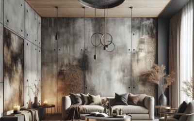
Grey: Balance, Serenity, and Modernity
Grey is the ultimate neutral, sitting between black and white. It offers balance, serenity, and a modern aesthetic. Like white, grey comes in countless shades, from cool greys with blue undertones to warm greys with beige or taupe undertones (greige). Cool greys are fantastic for creating a calm, collected atmosphere, while warm greys can add a subtle coziness. It’s a versatile choice that can make other colors and textures in a room stand out. Grey can truly transform your mood one wall at a time by providing a grounding base for any design.
- Best for: Living rooms, bedrooms, home offices, contemporary spaces.
- Evokes: Balance, sophistication, modernity, calm, stability.
- Tip: Beware of overly cool greys in north-facing rooms; tend towards warm greys.
Brown/Beige: Earthiness, Stability, and Comfort
Browns and beiges are classic earthy neutrals that evoke a sense of stability, comfort, and natural warmth. They create a cozy, grounded atmosphere and pair beautifully with other natural materials like wood and stone. Beige offers a lighter, softer alternative to white, providing warmth without overwhelming a space. Darker browns can feel rich and inviting, while lighter tans are wonderfully versatile. These hues are excellent at creating a welcoming feeling.
- Best for: Living rooms, bedrooms, studies, rustic or traditional decors.
- Evokes: Stability, warmth, comfort, earthiness, reliability.
- Tip: Layer different shades and textures of brown and beige to add depth.
Designing for Well-being: Room-Specific Color Strategies
Applying color psychology effectively means considering the primary function of each space. A bedroom requires a different emotional palette than a home office. Here’s how to tailor your color choices to optimize health, creativity, and calm.
Bedrooms: Sanctuary for Rest and Rejuvenation
The bedroom is your personal sanctuary, a place for rest, relaxation, and intimacy. Colors here should promote tranquility and coziness. Soft blues, greens, and lavenders are excellent choices for encouraging sleep and reducing stress. Pale, warm neutrals like cream or a very light greige can also create a soothing, cocoon-like effect. Avoid bright reds or oranges, as their stimulating nature can disrupt sleep. Imagine using a soft grey-blue to cultivate a tranquil escape, helping you truly transform your mood one wall at a time towards serenity.
- Recommended: Soft blues, greens, lavenders, warm greys, creams.
- To avoid: Bright reds, oranges, vibrant yellows.
- Consider: Painting the ceiling a slightly lighter shade of the wall color to create a seamless, expansive feel.
Living Rooms: Social Hub and Relaxation Zone
Living rooms are often multi-functional spaces for socializing, entertaining, and relaxing. The color scheme here needs to be versatile. Balanced neutrals (warm greys, beiges) provide a sophisticated backdrop, allowing you to introduce color through throws, pillows, and artwork. Muted greens and blues can foster a calm, inviting atmosphere. If you enjoy entertaining, a touch of warm orange or yellow as an accent can add cheer and encourage conversation without being overstimulating.
- Recommended: Warm neutrals (greys, beiges), muted greens, soft blues.
- Accents: Burnt orange, mustard yellow, deep teal.
- Consider: An accent wall to define a specific zone, such as a reading nook or fireplace area.
Kitchens: Energy, Cleanliness, and Appetite Stimulation
Kitchens are vibrant, active spaces. They benefit from colors that stimulate appetite and energy, while also conveying cleanliness. Whites and light greys are timeless choices, offering a clean, airy feel. Yellows can enhance cheerfulness and promote a sense of warmth, while subtle reds or oranges can stimulate the appetite. Greens that evoke freshness, like mint or sage, are also popular. A bright, cheerful yellow kitchen can instantly transform your mood one wall at a time, making mornings feel brighter.
- Recommended: Whites, light greys, yellows, fresh greens.
- Accents: Red, orange (in small doses).
- Consider: Cabinets in a contrasting color to the walls for added interest.
Home Offices/Studies: Focus, Productivity, and Creativity
For home offices, focus and productivity are paramount. Greens and blues are excellent choices as they are known to improve concentration and reduce eye strain. Green connects us to nature, offering a calming influence, while blue promotes clear thinking and stability. Avoid overly distracting or stimulating colors. If creativity is a central part of your work, a subtle lavender or a muted shade of orange as an accent might spark innovation. A focused blue-green can truly help you to transform your mood one wall at a time towards peak performance.
- Recommended: Blues, greens, muted purples, cool greys.
- To avoid: Bright reds, overwhelming yellows.
- Consider: A visual break with a gallery wall or a large plant to reduce monotony.
Bathrooms: Spa-like Retreat and Invigoration
Bathrooms are ideal for creating a spa-like retreat. Cool, clean colors like blues, greens, and whites work best, promoting a sense of freshness and calm. Light aqua or seafoam green can evoke a tranquil oasis, while white keeps the space feeling pristine and open. Consider a touch of vibrant color through towels or accessories for a pop of energy. These colors help ensure your bathroom really allows you to transform your mood one wall at a time, refreshing both body and mind.
- Recommended: Whites, light blues, aqua, seafoam greens.
- Accents: Bright yellow, coral.
- Consider: High-gloss paint finishes for durability and easy cleaning, plus added light reflection.
Practical Application: Beyond the Paint Swatch
Choosing a color is just the beginning. How you apply it, combine it with other elements, and consider the environmental factors are equally important. These practical steps will help you achieve the desired mood transformation.
Lighting: The True Color Changer
Lighting is arguably the most critical factor influencing how a paint color appears. A color swatch viewed under harsh fluorescent light will look drastically different in a north-facing room flooded with cool natural light, or a south-facing room bathed in warm, direct sunlight. Artificial lighting also plays a huge role. Incandescent bulbs cast a warm, yellowish glow, while LED lights can range from warm white to cool daylight. Always test paint swatches on your walls, allowing them to remain for at least 24-48 hours, observing them at different times of day and under various lighting conditions. This is crucial if you truly want to transform your mood one wall at a time successfully.
- Natural Light:
- North-facing rooms: Receive less direct light, often feeling cooler. Opt for warmer colors or warm undertones in neutrals.
- South-facing rooms: Receive abundant, warm light. Can handle cooler tones beautifully, or embrace the warmth with deeper hues.
- East-facing rooms: Get morning light (warm). Colors appear truest in the morning, cooler in the afternoon.
- West-facing rooms: Get afternoon light (warm). Colors appear cooler in the morning, warmer later in the day.
- Artificial Light:
- Warm White (2700K-3000K): Enhances reds, oranges, yellows. Softens blues and greens.
- Cool White (3500K-4500K): Closer to natural daylight. Can make warm colors appear dull, enhances blues and greens.
- Daylight (5000K-6500K): Brightest, bluest light. Can wash out warm tones, making them appear stark.
The Power of Undertones: More Than Just a Shade
Every color has an undertone—a subtle hue peeking through the dominant color. Understanding undertones is key to creating a cohesive palette. A seemingly neutral grey might have blue, green, or even purple undertones. A white can be warm (yellow/pink undertone) or cool (blue/grey undertone). When choosing colors, examine the undertones closely, especially in relation to existing elements like flooring, cabinetry, or fixed furniture. Mismatched undertones can make a room feel “off,” even if the main colors are appealing. Pay attention to those subtle shifts to perfectly transform your mood one wall at a time.
Color Combinations: Harmony, Contrast, and Balance
Rarely do we paint a room a single, monolithic color without any complementary elements. Learning to combine colors effectively means understanding basic color theory:
- Monochromatic: Using different shades, tints, and tones of a single color. Creates a sophisticated, serene look. (e.g., various shades of blue).
- Analogous: Using colors next to each other on the color wheel. Creates harmonious, comfortable schemes. (e.g., blue, blue-green, green).
- Complementary: Using colors directly opposite each other on the color wheel. Creates high contrast and energy. (e.g., blue and orange, red and green). Best used in moderation or with one color dominating.
- Split Complementary: Uses a base color and the two colors adjacent to its complement. Offers good contrast with less tension than a true complementary scheme.
- Triadic: Uses three colors evenly spaced on the color wheel. (e.g., green, orange, purple). Creates a vibrant, balanced scheme.
Think about the 60-30-10 rule: 60% dominant color (walls), 30% secondary color (furniture, accent walls), 10% accent color (accessories, art). This ratio helps maintain balance and prevents any single color from overwhelming the space.
Texture and Finish: Adding Depth to Color
The finish of your paint (matte, eggshell, satin, semi-gloss, gloss) significantly affects how light reflects off the walls and, consequently, how the color is perceived. Matte finishes absorb light, creating a softer, richer appearance that can make a room feel cozier. Glossier finishes reflect light, making colors appear brighter and more vibrant, and are easier to clean. Beyond paint finish, the textures you bring into a room (wood, fabric, stone masonry) can either play up or soften the chosen wall color. A textured wallcovering, for example, can add considerable depth to a neutral shade, allowing it to subtly yet powerfully transform your mood one wall at a time.
Common Color Conundrums and Expert Advice
Navigating the world of color can be daunting. Here are some common challenges and how to overcome them to effectively transform your mood one wall at a time.
“My Room Feels Too Small/Dark!”
This is a frequent complaint. To make a small room feel larger and brighter:
- Light Colors: Whites, pastels, and light neutrals reflect light and push walls outwards visually.
- Cool Colors: Blues and greens tend to recede, creating a sense of spaciousness.
- Monochromatic Schemes: Use varying tints of the same light color for a seamless, expansive feel.
- Vertical Stripes: Can make ceilings appear higher.
- Glossy Finishes: Reflect more light, adding to brightness.
Case Study: A client wanted to brighten a small, north-facing home office. We opted for a soft, warm white with a hint of yellow undertone, paired with light birch furniture and crisp white trim. The room instantly felt larger, airier, and more inviting, supporting focus without feeling cramped.
“I’m Afraid of Too Much Color!”
Many people shy away from bold colors. Start small!
- Accent Walls: Choose one wall for a bolder color. This allows you to experiment without committing to an entire room.
- Decor & Textiles: Introduce color through smaller, easily changeable elements like throw pillows, rugs, artwork, or curtains.
- Test Large Swatches: Don’t just rely on tiny paint chips. Buy sample pots and paint large swatches (at least 2’x2′) on your wall. Live with them for a few days to see how they change with light.
The goal is to gently transform your mood one wall at a time, not shock your system!
“How Do I Combine Different Room Colors Effectively?”
When selecting a whole-house palette, consider the flow between rooms:
- Use a “Bridge” Color: Often a neutral, like a consistent white trim or a shared neutral hallway color that connects different colored rooms.
- Harmonize Undertones: Ensure the undertones of adjacent colors work well together (e.g., don’t put a cool blue-grey next to a warm yellow-beige unless it’s a very intentional, high-contrast choice).
- Vary Intensity: If one room is bold, let an adjacent room be softer to create a visual resting place. For example, a vibrant dining room could open into a calming, muted living room.
Tools and Resources for the Color Explorer
Ready to embark on your color journey? These resources can help you make informed decisions and visualize your choices to confidently transform your mood one wall at a time.
- Paint Company Apps & Visualizers: Most major paint brands (Sherwin-Williams, Benjamin Moore, Behr, Dulux) offer online tools or apps that allow you to virtually “paint” a room using a photo of your own space. This is a fantastic way to preview colors without picking up a brush.
- Color Palettes/Generators: Websites like Coolors.co or Adobe Color provide tools to generate harmonious color palettes. You can start with a single inspiring color and build a complementary scheme around it.
- Interior Design Blogs & Magazines: Look for inspiration in reputable design resources. Pay attention to how color is used in different styles and how it makes you feel.
- Large Swatches & Sample Pots: This cannot be stressed enough. Always test! View your sample pots on the wall at different times of day and under various lighting conditions before making a final decision.
- Professional Color Consultation: If you’re struggling, consider hiring an interior designer or a color consultant for a few hours. Their expertise can save you time, money, and stress in the long run.
Frequently Asked Questions About Home Color Psychology
What is color psychology in home design?
Color psychology in home design is the study of how different hues and shades affect human emotions, moods, and behaviors within a living space. It’s about strategically choosing wall colors and decor to create specific feelings and enhance the well-being of the residents, whether for relaxation, productivity, or social interaction. The goal is to transform your mood one wall at a time through intentional color choices.
Which colors are best for promoting relaxation in a bedroom?
For promoting relaxation and sleep in a bedroom, cool, soft, and muted colors are generally most effective. These include light blues, soft greens (like sage or seafoam), gentle lavenders, and warm, pale neutrals such as cream or light greige. These colors help lower heart rate and blood pressure, creating a tranquil environment conducive to rest. Avoid stimulating reds or bright yellows.
Can wall color really affect my productivity in a home office?
Absolutely! Wall color significantly impacts productivity. Cool colors like blue and green are often recommended for home offices as they promote focus, concentration, and calm, reducing visual fatigue. Yellow can stimulate creativity and communication, making lighter shades suitable for creative roles. Avoid overly bright or distracting colors that can lead to restlessness or anxiety, hindering productivity.
Are there colors to avoid when painting a house?
There aren’t “bad” colors, but rather inappropriate usage. Extremely bright or saturated versions of energetic colors (like neon green, vivid orange, or fire engine red) can be overwhelming in large expanses, leading to anxiety or agitation. Similarly, very dark colors in small, poorly lit rooms can make them feel smaller and more somber. The key is balance, context, and moderation to achieve the desired effect when you transform your mood one wall at a time.
How do I choose the right white paint for my walls?
Choosing the right white paint involves understanding its undertones. Whites can have warm undertones (yellow, pink, beige) or cool undertones (blue, grey, green). Consider the room’s natural light (warm light from south-facing windows might benefit from cooler whites, while north-facing rooms often need warmer whites) and existing elements like flooring or furniture. Always test large swatches on your wall to see how the white appears throughout the day.
What is the 60-30-10 rule in interior design?
The 60-30-10 rule is a timeless guideline for creating balanced color schemes. It suggests that 60% of a room’s color should be the dominant hue (often walls), 30% should be a secondary color (furniture, curtains, accent walls), and 10% should be an accent color (accessories, artwork). This ratio ensures visual harmony and prevents any single color from overpowering the space, allowing you to elegantly transform your mood one wall at a time.
How does lighting affect paint color perception?
Lighting dramatically alters how paint colors are perceived. Natural light varies by direction (north, south, east, west) and time of day, affecting a color’s warmth or coolness. Artificial light sources (incandescent, LED warm, LED cool) also cast different color temperatures. A color may appear vibrant in one light and muted in another. Always view paint samples on your wall under all lighting conditions before committing.
Conclusion: Your Home, Your Masterpiece of Mood and Color
The journey to transform your mood one wall at a time is a powerful one, blending the art of interior design with the science of psychology. We’ve explored how individual hues, from the invigorating warmth of red to the tranquil depth of blue, exert a profound influence on our emotions, productivity, and overall well-being. Understanding these connections empowers you to move beyond purely aesthetic choices and create living spaces that actively support your desired state of mind.
Your home is more than just walls and furniture; it’s a dynamic environment that constantly interacts with your inner world. By thoughtfully selecting colors based on their psychological impact and the specific function of each room, you can craft a sanctuary that truly reflects and enhances your life. Remember to consider light, undertones, and how colors flow from one space to the next. Don’t be afraid to experiment with samples—they are your best friend in this process. Embrace the power of color to cultivate spaces that uplift, calm, inspire, and genuinely make you feel your best.
Ready to bring these insights to life? Take the first step today. Grab a few paint swatches, observe how they react to the light in your home, and start envisioning the incredible transformation. The power to design your emotional landscape through color is now in your hands.
Discover More Sustainable Home Decor Ideas!
Explore Creating Mindful Living Spaces!
Content Disclaimer
The information provided in this article regarding color psychology and home design is for educational and informational purposes only. While based on general principles and common associations, individual responses to color can vary greatly due to personal experiences, cultural background, and unique neurological factors. This content is not intended to be a substitute for professional interior design advice or psychological consultation. Always test paint colors in your specific environment and consult with qualified professionals for personalized recommendations.
Categories
- Accent Walls & Ceilings (84)
- Art Curation & Gallery (83)
- Bedding Style Trends (89)
- Bedroom Makeover (96)
- Bohemian & Eclectic Styles (80)
- DIY & Budget-Friendly Decor (78)
- Eco-Friendly Design (83)
- Furniture Care (87)
- Home Decor & Design Ideas (181)
- Home Wellness Spaces (103)
- Integrated Outdoor Living (91)
- Japandi Style (84)
- Kids and Nursery Decor (73)
- Living Room Decor (99)
- Mix & Match Techniques (95)
- Modern & Contemporary Design (88)
- Rug Sizing & Placement (89)
- Scandinavian Design Inspiration (51)
- Seasonal Home Decor (100)
- Small Space Solutions (93)
- Wall Art & Painting Tips (94)
Recent Comments
Archives
Product Gallery
-
 Majestic African Wildlife Canvas Art for Stylish Home Decor
Rated 5.00 out of 5
Majestic African Wildlife Canvas Art for Stylish Home Decor
Rated 5.00 out of 5 -
 Cozy Irregular Green Plush Rug for Nordic Living Spaces
Rated 5.00 out of 5$50.99 – $321.60Price range: $50.99 through $321.60
Cozy Irregular Green Plush Rug for Nordic Living Spaces
Rated 5.00 out of 5$50.99 – $321.60Price range: $50.99 through $321.60 -
 Scandinavian Geometric Area Rugs for Stylish Home Décor
Rated 5.00 out of 5$36.62 – $554.84Price range: $36.62 through $554.84
Scandinavian Geometric Area Rugs for Stylish Home Décor
Rated 5.00 out of 5$36.62 – $554.84Price range: $36.62 through $554.84